Examples
Check out the Usage section for details about how to design a burger menu properly, and the different configuration options we provide.
Basic example
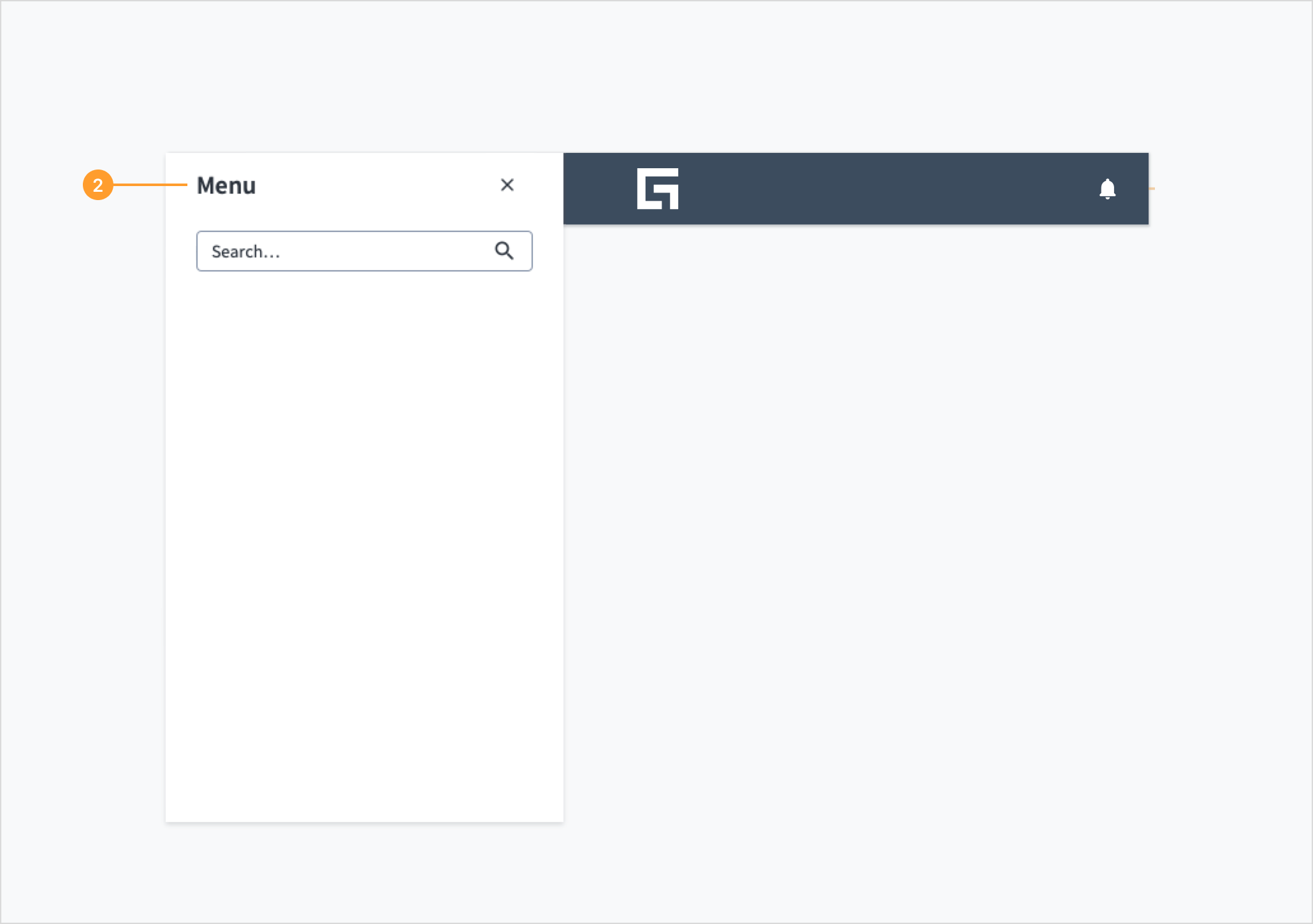
A basic burger menu is a wrapper placed around a number of child elements. This will render a collapsible menu at the side of the screen, which a user can access by clicking on it. You will also need to use the open state and setOpen hook from the React state to get the current state of the menu and change it when the button to open it is pressed.
Basic example demonstration on storybook.
function BurgerMenuBasic() {
  const [open, setOpen] = useState(false);
  const onOpenChange = (isOpen: boolean) => setOpen(isOpen);

return (
  <BurgerMenu open={open} onOpenChange={onOpenChange}>
    <h3>Menu</h3>
    <TextInput
      label="Search"
      hideLabel
      placeholder="Search..."
      />
  </BurgerMenu> ); }
You can add a custom button to collapse the burger menu as one of its child elements.
Custom button example demonstration on storybook.
function BurgerMenuCustomButton() {
  const [open, setOpen] = useState(false);
  const onOpenChange = (isOpen: boolean) => setOpen(isOpen);

  return (
      <BurgerMenu hideCloseButton {open} onOpenChange={onOpenChange}>
        <Button
                      label="Click the button to close the navigation"
                      hideLabel
                      icon={KeyboardArrowLeftIcon}
                      variant="secondary"
                      onClick={() => onOpenChange(!open)}
                  />
        <h3>Menu</h3>
        <TextInput
          label="Search"
          hideLabel
          placeholder="Search..."
        />
      </BurgerMenu>
  );
}
Usage
Overview
The burger menu is a layout component that provides a collapsible side container, typically used for navigation on smaller screens. It is triggered by a button and reveals a panel for holding other components.
As part of the Jutro flexible page layout system, this component's sole responsibility is the layout and behavior of the menu panel (that is, opening and closing). It is content-agnostic, meaning you are responsible for populating it with menu items, links, and implementing any associated routing.
When to use
Use the burger menu when you need to:
- Provide a compact navigation solution for responsive designs, especially for tablet and mobile viewports.
- House secondary actions or links that don't need to be persistently visible on the page.
- Build a custom page structure using the new page layout components that requires a toggleable side menu.
Anatomy

The burger menu component consists of the following elements:
- Trigger button: An icon button that toggles the visibility of the menu panel. The appearance is handled by the component.
- Menu Panel: A container that appears when the menu is opened. You can place any child components inside this panel, such as navigation lists, search fields, or action buttons.
Placement
The burger menu is designed to be placed within a header panel or at the top level of a custom page layout.
Behavior
- Interaction: Selecting the trigger button opens the menu panel. The panel can be closed by selecting the default close button, by clicking the area outside the menu, or by using a custom button.
- State: The component's visibility is controlled programmatically using the
open and onOpenChange props.
Best practices
Keep it lightweight
The burger menu is a container for other components. To ensure a good user experience, populate it with simple and focused content. Avoid overloading the panel with too many items or deeply nested structures.
Provide a clear exit
Users must always have an obvious way to close the menu. The component includes a close button by default. If you use the hideCloseButton prop, be sure to provide a custom element that allows users to dismiss the panel.
Use concise labels
If you add navigation links or other interactive elements inside the burger menu, their labels must be short, clear, and predictable. Use nouns for links to destinations (for example, "Dashboard," "Settings") and verbs for actions (for example, "Add user," "Export data").
Code
Basic example demonstration on storybook.
function BurgerMenuBasic() {
  const [open, setOpen] = useState(false);
  const onOpenChange = (isOpen: boolean) => setOpen(isOpen);

return (
  <BurgerMenu open={open} onOpenChange={onOpenChange}>
    <h3>Menu</h3>
    <TextInput
      label="Search"
      hideLabel
      placeholder="Search..."
      />
  </BurgerMenu> ); }
Import statement
import { BurgerMenu } from '@jutro/components';
Component contract
Make sure to understand the Design System components API surface, and the implications and trade-offs. Learn more in our introduction to the component API.
Properties
childrenrequired
DescriptionThe children elements to render inside the component.
DescriptionIf set to true, the Close button is not rendered.
onOpenChange
Type(open: boolean) => void
DescriptionCallback to run when the burger menu is opened or closed.
open
DescriptionIf set to true, the burger menu is currently open.
Hooks
No hooks are available for burger menu.
Translation keys
The burger menu component defines two translation keys:
| Key | Used for |
|---|
| jutro-components.BurgerMenu.openButtonLabel | Describing the look and function of the open button. |
| jutro-components.BurgerMenu.closeButtonLabel | Describing the look and function of the close button. |
Escape hatches
For more information, see our documentation about escape hatches.