Typography
Overview
Typography contributes to the overall sense of organization and purpose in product experiences by establishing the hierarchical structure and aesthetic values necessary for intelligible and friendly user interfaces.
These foundational typographic principles are implemented in applications using the Jutro typography component. The typography component uses a variant property to control visual style (for example, heading-1 and body-medium) and a tag property to ensure correct semantic HTML (for example, h1 and p).
These guidelines detail the core attributes of Jutro's typography, including Scale and Style.
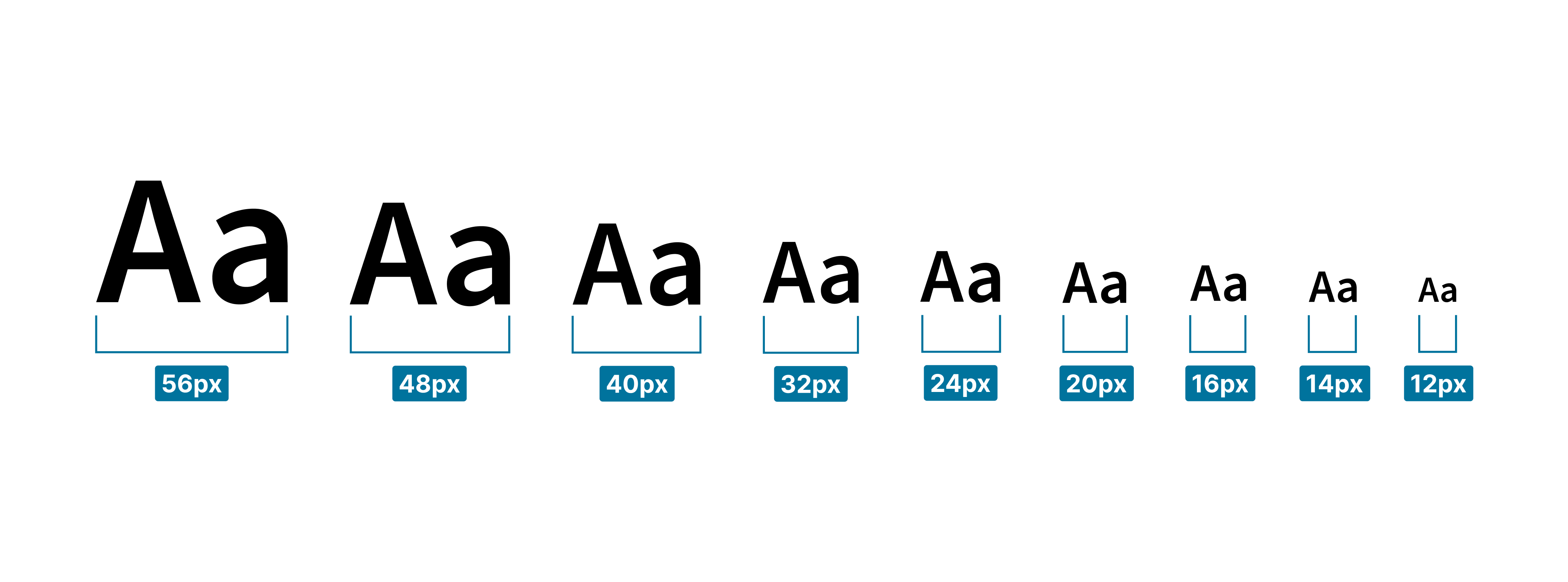
Type scale
The Jutro type scale uses an 8pt grid system, with most sizes based on an interval of 4. The available sizes are: 56, 48, 40, 32, 24, 20, 16, 14, and 12.
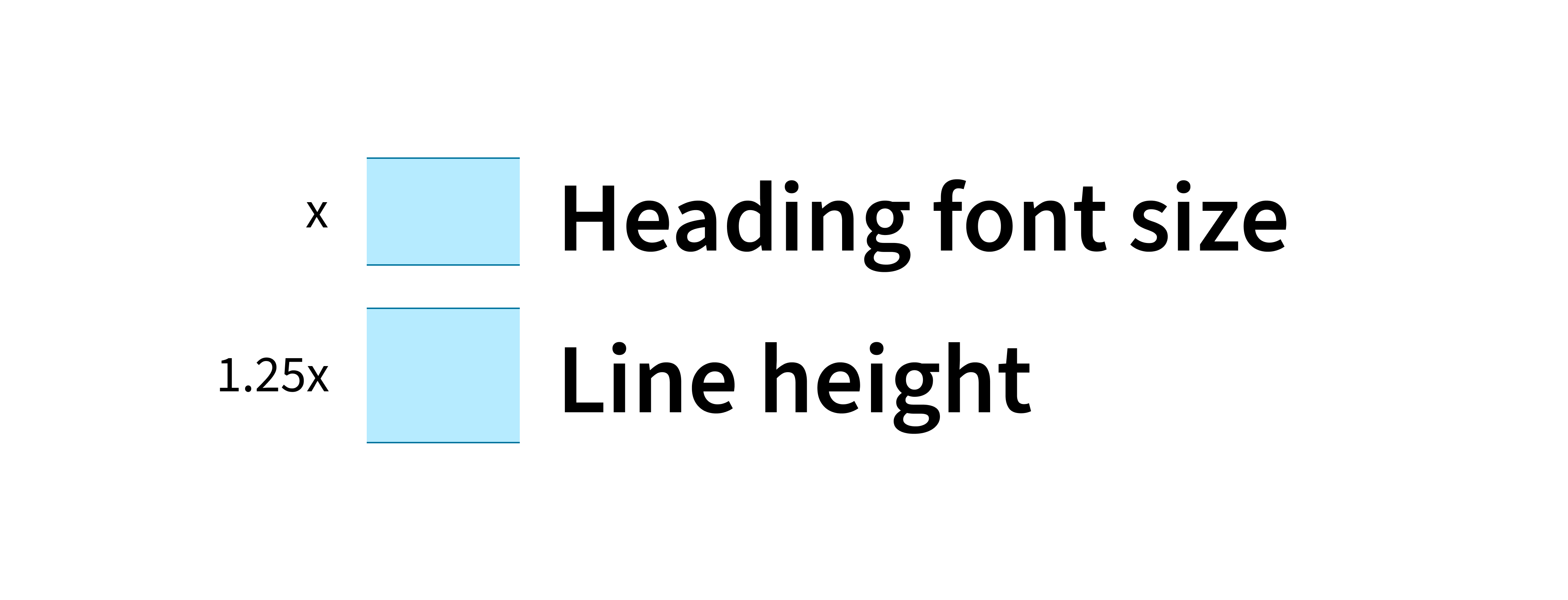
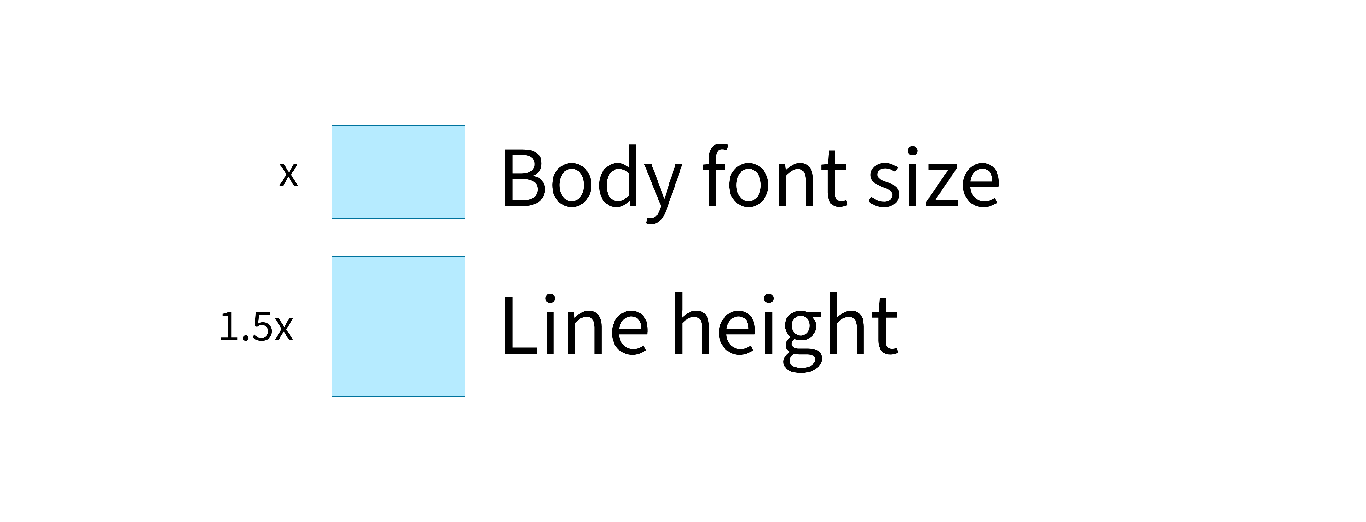
Line height
Line height—sometimes called leading—is the vertical distance between lines of text. Proper line height is essential for readability, as it prevents text from appearing too crowded or too sparse.
Jutro typography uses two primary line-height values: 1.25 (or 125%) for headings and 1.5 (or 150%) for body text. These values ensure a comfortable reading experience across different text sizes. Tighter leading is used for shorter lines of text (headings), while more generous leading is applied to longer blocks of text (body copy).
Open-source typeface
Jutro uses the open-source typeface Source Sans Pro as the primary font. Source Sans Pro complies with Web Content Accessibility Guidelines and accommodates custom browser font settings.
Fonts
A typeface can include variations in style and weight, such as bold, regular, and italic. These variations are used to convey structure and meaning to users. For example, bold fonts distinguish headings from paragraph (body) text. Bold can also be used within a paragraph to emphasize key words or phrases. Similarly, italic fonts are primarily used to denote titles and names of particular words or objects, allowing them to stand out from the surrounding sentence.
Jutro offers the following font choices for general usage.
Implementation with design tokens
Jutro typography is built on design tokens. These tokens—which define font sizes, weights, and line heights—are consumed by the typography component to ensure consistency. This approach allows for theming and customization of typographic styles to meet specific branding needs.
Learn about theming with design tokens
Sample typographic guide
The following layout samples are provided for reference examples of Jutro typography in applications (Desktop and Mobile):
Best practices
- Maintain a purposeful and consistent typographic hierarchy based on the content's structure, including elements such as headings, subheadings, default (primary) text, and label text.
- Use a minimal number of font sizes, weights, and colors. In many cases, a simple size hierarchy is sufficient. For example, this can include a header, a default (primary) size, a secondary size for less important text, and a tertiary/caption size.
- For optimal readability, aim for a line length of 60 to 80 characters. The final line length is determined by several factors, including typeface, type size, and margin width.
- To ensure legibility and accessibility, use a minimum of 16px for both primary body text and text inputs. This establishes a good readability standard on mobile devices and prevents browsers from force-zooming on input fields.
- Make secondary text, used for elements like lesser labels and captions, two sizes smaller than the primary text.
- Adjust type sizes based on the page's primary function:
- For text-heavy pages, use larger type sizes to improve readability for users who will spend a lot of time reading.
- For interaction-heavy pages, smaller type sizes can be sufficient and may help to visually compact data-heavy screens.
- Use larger font sizes for anything that needs to be glanceable.
- Avoid using all-caps text, or use it sparingly, as it introduces legibility issues.
- Always view designs on an actual device that may be preferred by users.
- Flag type sizes that are too small on a mobile phone early in the design process.
- Design typography to be legible even in suboptimal conditions.
Text and iconography
Text and icons are frequently combined to improve clarity and provide visual context. Common instances of this pairing include:
Actions and navigation
- Links with icons
- Buttons with icons
- Side navigation items (icon and name)
- App switcher (app icon and name)
- Avatar with profile name
Form elements and data display
- Input labels with info icons
- Tags
- Menu items in multi-select dropdowns
- Search results with category icons
Status and feedback
- Inline validation messages with status icons
- Inline loaders with text messages
- Notification and toast messages
- Notification badges (icon with a number)
- Tooltips attached to icons
Responsiveness and adaptiveness
Jutro typography is designed to be adaptive, offering a variety of sizes to meet the needs of enterprise and consumer applications across all devices. Enterprise applications, for instance, require greater data density and benefit from smaller typography that provides more screen real estate.
Accessibility
Validated in accordance with WCAG 2.1 AA accessibility guidelines that are applicable for this specific component. This means that Jutro typography can be:
- used without a mouse (keyboard only).
- used with assistive technologies including screen readers, screen magnification software, and braille displays.
- used without reliance on sound, color, animation, or timing.
Accessibility best practices
- Avoid changing content when an element receives focus.
- Ensure a logical keyboard navigation order for all text elements.
- Do not use styled text as a substitute for a link, or vice versa. Screen readers handle these elements differently, which can confuse users.
For specific authoring guidelines, refer to the typography component usage guide.