Building accessible experiences
Landmark regions
ARIA landmark roles help people using screen readers understand how content on a web page is organized and structured. Information that has a visual structure can be programmatically labelled so it can be understood by screen reader users. Landmarks can also act as targets for “skip links” and provide keyboard shortcuts for screen reader users so they can skip between sections of a page.
Implementing landmarks
The first step is to break a page into perceivable areas of content. Next, assign landmarks to each of these key sections. For example, banner, main, complementary, and contentinfo are top level landmarks. The Web Accessibility Initiative (WAI) provides a detailed explanation of all available landmark regions.
Landmarks cannot be set at a Jutro component level, so you will need to decide on which landmarks are most appropriate to use in your app.
Headings
Headings communicate how content on a page is structured. Assistive technology users, such as screen reader users, can also use shortcuts to navigate through a page when headings are used correctly.
Headings are nested by their level and these go from <h1>, the most important heading, to the least important <h6>. Wherever possible, avoid skipping heading levels as this can potentially cause confusion. For example, avoid following an <h2> immediately with an <h5>.
In Jutro, certain components and patterns are given a specific default heading level. You will need to make sure that, as new Jutro components are added to an application, the heading hierarchy remains logical. If text visually functions as a section heading, mark it up as a heading to ensure proper interpretation by assistive technologies.
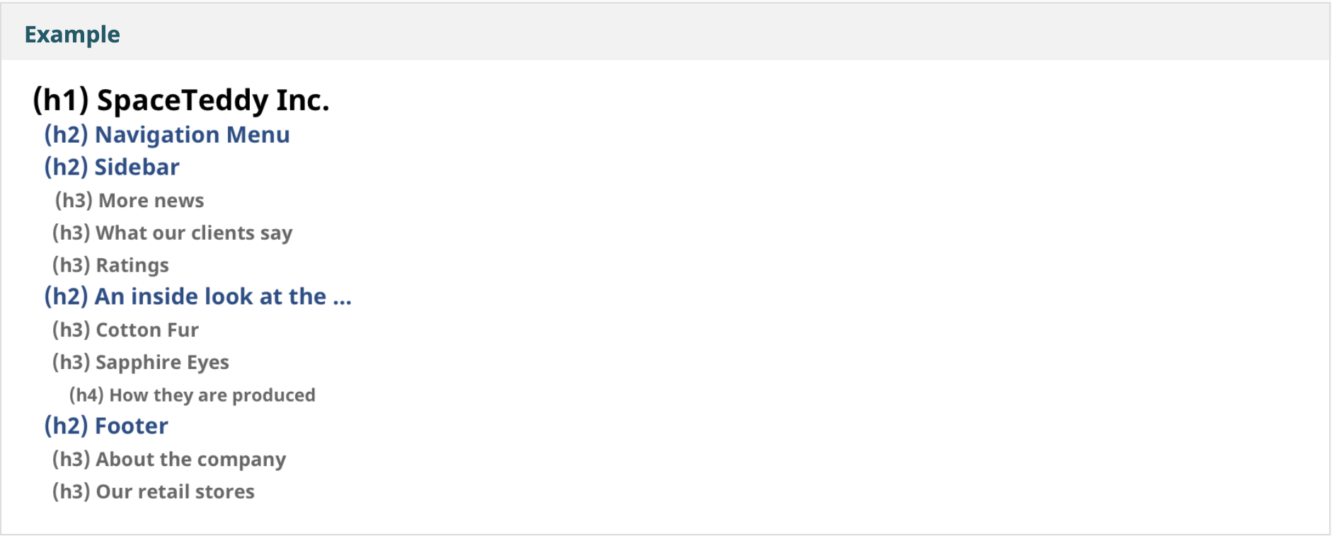
The following example from the Web Accessibility Initiative illustrates a hierarchical heading structure that prioritizes clear document organization for users:
Focus visibility
Provide a clearly visible focus indicator when navigating to a focusable item using a keyboard. Focusable items include links, buttons, and form controls. All Jutro components have a focus indicator with at least a 3:1 contrast ratio. However, you may need to customize the color of the focus indicator depending on your application's color theme. For example, if the default focus indicator is blue but you are using a similar blue background, the focus indicator may not stand out. The focus visibility can be quickly changed and applied consistently to applicable components using design tokens.
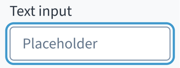
The following example illustrates a text input field on focus:
Validation
Form instructions
Jutro uses an asterisk to mark required fields. The asterisk precedes the field label. This helps users to easily locate which fields are required by scanning just the left-most character of the label.
In addition to marking required fields with an asterisk, it is recommended to include clear instructions at the top of the form, such as "All fields marked with an asterisk are mandatory," to ensure users understand the meaning of the asterisk.
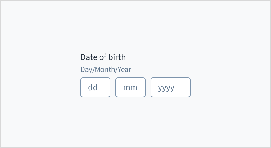
Important instructions must not be added as placeholder text as this can cause a number of issues for some users. Placeholder text often disappears as a user types, increasing the cognitive load, and placeholder text often has poor contrast. Instead, place hints and instructions, including formatting examples and requirements, outside of the field. For example, if a user needs to know the date format, it is preferable to include it as persistent help text.
If an input requires special characters, this must be clear from the instructions. For example, if a password needs to have at least 8 characters and a capital letter during a sign-up process, this must be shown before a user creates a password without these credentials.
Error messages
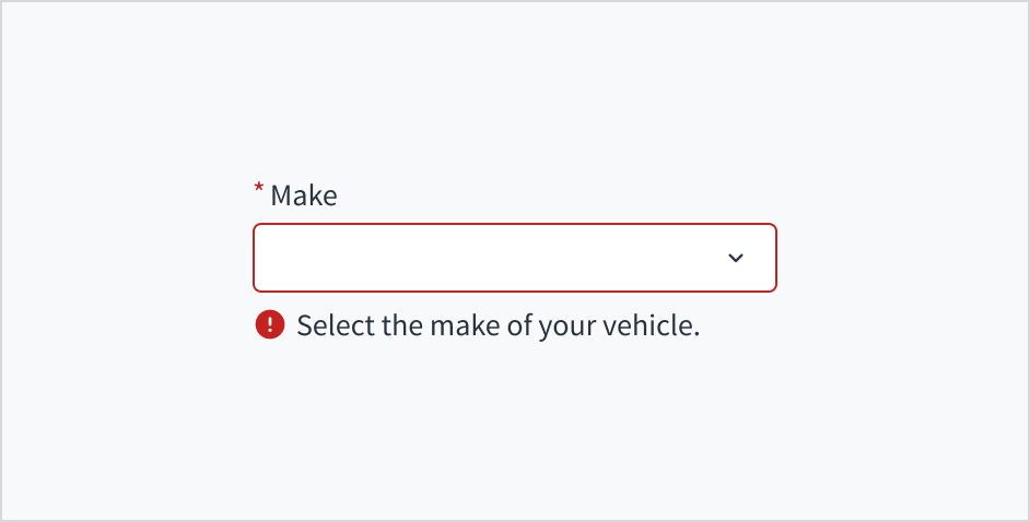
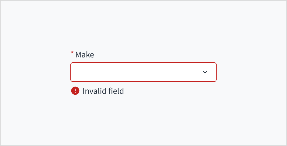
Ensure error messages are as helpful as possible so users can quickly address mistakes. If a user has completed a lengthy form and there are multiple error messages that just say “this field contains an error”, this is unhelpful. Instead, it is much more helpful to have error messages such as:
- “The email address is missing an '@' symbol.”
- “You haven't entered anything.”
Alternative text
Alternative text is essential for ensuring images can be interpreted by people with various disabilities. For example, screen reading software announces alternative text, helping people with visual impairments understand what an image conveys.
A decision must be made whether an image is purely decorative (to be ignored) or requires alternative text. The Web Accessibility Initiative (WAI) provides a helpful decision tree for alt text.
Some Jutro components contain icons and we have added appropriate default alternative text for these using an aria-label. For example:
<svg class="jut__Icon__icon jut__Icon__iconSizeLarge" viewBox="0 0 24 24" role="img" data-testid="icon-gw-check-circle" aria-label="Success icon">
…
</svg>
If you would like to add alternative text to a standalone icon component, you can do this by passing an aria-label prop to the component.