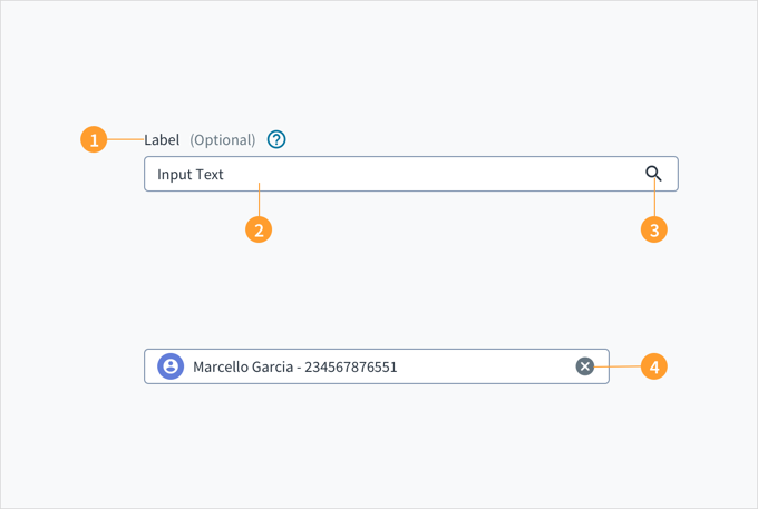
A look-up field consists of a text field connected to a collection of values that a user uses to search for specific values. For a basic look-up field, you set the valid values using the availableValues property, along with an optionTypes property to distinguish the type of the value. In the example below, you can look up the "John Doe" account or the "Marine" policy. You can click the search box to see the valid options or you can type to limit to options that contain the typed characters.
If you type an option that does not exist, the look-up field will tell you there are no options and nothing will be selected.
The LookupField component allows users to select a value from among the available values using keywords. It can be a primary source for discovering or filtering content.
If used as a search bar, the placement of the search bar determines the range of the search and its results.
Search bars placed on a header will search across the entire application for results.
Search bars placed within an element will only search within the element for results.
Pressing the Tab key moves keyboard focus to the input field. Pressing the Spacebar or the down arrow keys opens the popup menu with a list of values. The list is refined by typing the first few characters of the name you require.
The input field and label are associated through the aria-labelledby WAI-ARIA attribute. The field also includes the value of aria-autocomplete="list" to indicate that it contains a list popup with autocomplete function. As you type, the input field pre-populates a dropdown list of values that mostly closely matches what is entered in the field. The option that matches the information typed is automatically focused upon and is voiced by a screen reader.
When writing for empty states (for example, searches that return no results), avoid telling users what there isn't. Instead, use the opportunity to communicate what there is.
Do NOT use terms like system, queries, or values. For example, "No results were found for the values entered," or "The query produced no results."
Empty states for search results should direct users to the next step and keep them moving through the product flow.
Explain the situation. Let users know that you haven't found what they were looking for. Your tone should be empathetic.
Suggest alternative ways to progress forward that are relevant to your type of content, for example:
There are usually multiple ways to search for the same thing. This includes searching by category, searching for a more general or specific term, trying to use synonyms, and checking spelling.
Are there things that are similar to what the user searched for? You can suggest items or links that are as close as possible. For example:
Items by the same manufacturer (for example, other Ford vehicles).
Items with similar specifications from different manufacturers (for example, 2010 vehicles).
Items that are of a similar type, style, or feature (for example, midsize sedans).
Can your search engine find similar terms? If so, consider offering these results to users to save them the hassle of performing another search.
It's critical to understand what users are trying to accomplish with their search. Offer users something that gets them closer to their goal.
Aim for language that is friendly and conversational, for example, "We couldn't find any results. Did you mean [link to similar term]? Try searching for something else or broadening your search."
Use placeholder text to help scaffold the experience. For instance, you can reduce the range of choices by defining categories within the search field. This enables users to focus on the possibilities and guides them as they perform their search.
Alternatively, consider asking users a direct question (preferably in the second person "you") in fields that are particularly important. This will motivate users to find answers and dive into the site.
The contrast ratio of textual elements against their background is above 4.5:1 as per WCAG 2.1 AA requirements. Non-textual content that needs to convey meaning (such as icons and keyboard focus visibility) has a contrast ratio of at least 3:1 with its adjacent colors. All content is visible and functional up to and including 400% without requiring scrolling in two dimensions.
This component has been validated to meet the WCAG 2.1 AA accessibility guidelines. However, changes made by the content author can affect accessibility conformance.
Make sure to understand the Design System components API surface, and the implications and trade-offs. Learn more in our introduction to the component API.
If set to true, this field is required. If used with @jutro/validation, this prop can also be used to set the custom message overwrite. This can be done by using a tuple with the first value as true and the second value as the custom message. For example: required: [true, "a custom message"].
Shows an indicator that informs the user whether the current input value is valid. Whether the input is valid depends on the object entered in the validator prop.
An object which should contain a regex pattern as string and a validation message as string. If a user's input matches the regex pattern, the value will be valid, otherwise the message will be shown.