Typography
Usage
Overview
The typography component is a foundational element of the design system that ensures consistent and semantically correct text rendering. It separates the visual appearance (defined by variant) from the semantic meaning (defined by tag), which provides flexibility while maintaining accessibility.
Key properties:
variant: Controls the visual styling of the text, such as font size, weight, line height, color. Examples includeheading-1,heading-2,body-large, andlabel-medium.tag: Overrides the underlying HTML semantic element to ensure proper document structure and accessibility. Examples includeh1,h2,p, andspan.
By default, each variant is associated with a specific HTML tag. However, the tag property allows you to override this default. This gives you the flexibility to adjust the visual prominence of text while maintaining a logical semantic structure. For example, you can make a heading visually subtle without changing its structural importance.
For a complete list of default tags, see the Variant options tables. For more examples of this technique, see the section on Separating style from semantics.
When to use
Use the typography component for all text elements within the application, including:
- Headings: For titles and section headings.
- Example: Use a heading variant, such as
heading-1.
- Example: Use a heading variant, such as
- Body: For paragraphs and other long-form content.
- Example: Use a body variant, such as
body-medium.
- Example: Use a body variant, such as
- Labels: For shorter, descriptive text, such as form field labels.
- Example: Use a label variant, such as
label-small.
- Example: Use a label variant, such as
- Eyebrow: For introductory text that sits above a main heading to provide context.
- Example: Use an eyebrow variant, such as
eyebrow-1.
- Example: Use an eyebrow variant, such as
- Hero: For large, high-impact text in hero sections or marketing headlines.
- Example: Use a hero variant, such as
hero-1.
- Example: Use a hero variant, such as
- Block quotes: For styling text that is quoted from an external source.
- Example: Use a blockquote variant, such as
blockquote-medium.
- Example: Use a blockquote variant, such as
- Captions: For descriptive text accompanying images or figures.
- Example: Use a figcaption variant, such as
figcaption-medium.
- Example: Use a figcaption variant, such as
- Code: For displaying inline or block-level code snippets.
- Example: Use a code variant, such as
code-medium.
- Example: Use a code variant, such as
- Any text requiring consistent styling and semantic meaning.
When not to use
Avoid using the typography component for standalone elements whose primary role is to be a button or a link. Instead, use the dedicated Button or Link components, which are built to handle interactive states, focus management, and accessibility roles correctly.
Example usage
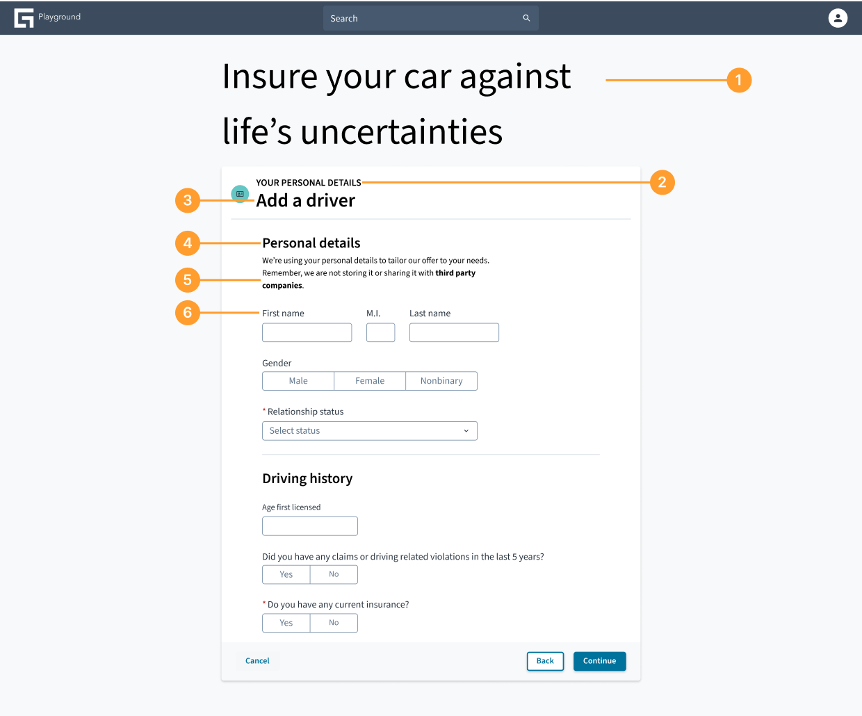
- Hero variant: This is the main headline of the page.
- Eyebrow variant: This text provides context for the heading below it.
- Heading variant (section title): This
heading-2serves as the primary heading for the "Add a driver" section. - Heading variant (sub-section title): This is a case of separating visual style from semantic meaning. The text is visually smaller than the main section heading (using a
heading-4variant), but it is marked up as anh3to create a correct nested structure for screen readers (h2→h3). - Body variant: This is a standard paragraph providing instructional text.
- Label variant: This text describes a form input.
Separating style from semantics
The following examples show how to use the variant and tag properties to create a visual appearance that is different from the underlying semantic structure of the text.
Example: Subtle section heading
This is useful when a heading is semantically necessary for the document outline but needs to be visually understated.
- Variant:
body-medium - Tag:
h2 - Justification: This heading is semantically important for screen readers navigating the page structure, but the
body-mediumvariant makes it visually blend in with paragraph text, avoiding unnecessary prominence.
The following example demonstrates this principle in practice:
Example: Visually prominent quote
This is for text that needs high visual impact but is not a structural heading.
- Variant:
heading-3 - Tag:
blockquote - Justification: Here, a blockquote is given the visual weight of a
heading-3to make it stand out. Using theblockquotetag ensures it is read correctly by assistive technology as a quote, rather than incorrectly as a structural section heading.
The following example demonstrates this principle in practice:
General guidelines
- Maintain hierarchy: Always use headings (
h1throughh6) in a logical, nested order. Anh2must follow anh1, and anh3must follow anh2, even if the visual variant is different. Don't skip heading levels (for example,h1directly followed byh4). - Semantic correctness: Prioritize the tag property for semantic accuracy. The variant is for visual presentation; the tag is for meaning.
- Consistency: Use the predefined variant values consistently throughout the application to maintain a cohesive visual language.
Content
General writing guidelines
- Clarity and conciseness: Write clearly and get straight to the point. Avoid jargon and overly complex sentences.
- Active voice: Prefer active voice over passive voice for stronger, more direct communication.
- Plain language: Use language that is easy for your target audience to understand.
- Consistency in terminology: Use consistent terms for features, actions, and concepts throughout the application.
- Tone of voice: Maintain a consistent and appropriate tone of voice that aligns with our brand. For more information, see Voice and tone.
- Proofread: Always proofread text for grammatical errors, spelling mistakes, and typos.
- Microcopy: Pay attention to small pieces of text like button labels, error messages, and tooltips. They are crucial for user experience.
Accessibility
Component compliance
The contrast ratio of textual elements against their background is above 4.5:1 as per WCAG 2.1 AA requirements. Non-textual content that needs to convey meaning (such as icons and keyboard focus visibility) has a contrast ratio of at least 3:1 with its adjacent colors. All content is visible and functional up to and including 400% without requiring scrolling in two dimensions.
This component has been validated to meet the WCAG 2.1 AA accessibility guidelines. However, changes made by the content author can affect accessibility conformance.
Authoring guidelines
Semantic HTML (tag property): This is the most critical aspect for accessibility. Screen readers and other assistive technologies rely on semantic HTML tags (for example, h1-h6, p, and blockquote) to understand the structure and meaning of the content. Always choose the most appropriate tag for the content's role.
Heading hierarchy: Ensure a logical heading structure (for example, h1 followed by h2, not h4). This allows screen reader users to navigate content efficiently. For more detailed guidance, refer to the W3C's tutorial on headings.
Theming
The typography component inherits its styles from the application's theme by default. However, you can customize typographic elements like color, font families, and the scale of sizes and weights to meet specific branding needs.