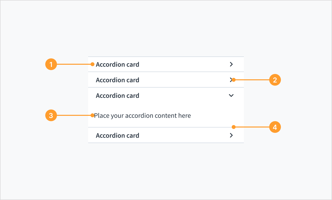
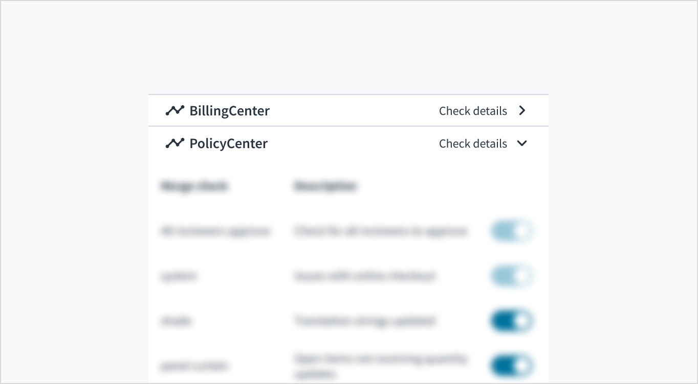
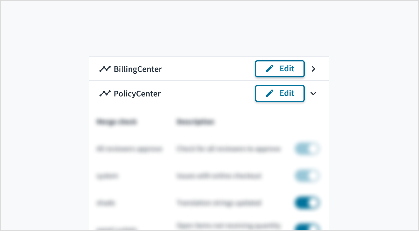
The Accordion and AccordionCard components are available from the @jutro/components package. Only AccordionCard can be placed inside Accordion. AccordionCard always has to have set either a title or dangerouslyRenderHeader prop but the usage of the latter is not recommended.
Using the hideDivider property allows you to hide all of the separators. Chevron placement is limited to right and left options. Both are set on the Accordion level.
The accordion is a component that allows for progressive display of information. Accordions are useful when you need to deliver large amounts of content within a small space (for example, mobile interface or side panel). They consist of vertically stacked headers, which expand to reveal their associated content. Accordions give users control over how much information they see on the screen at any given time. You might encounter accordions in wizard flows and in mobile solutions, where space is at a premium.
By default, the chevron icon is placed on the right side (at the end) of the header. This allows for the accordion title to align with other content on the page. Icon placement (left or right) must be consistent across all pages within one app.
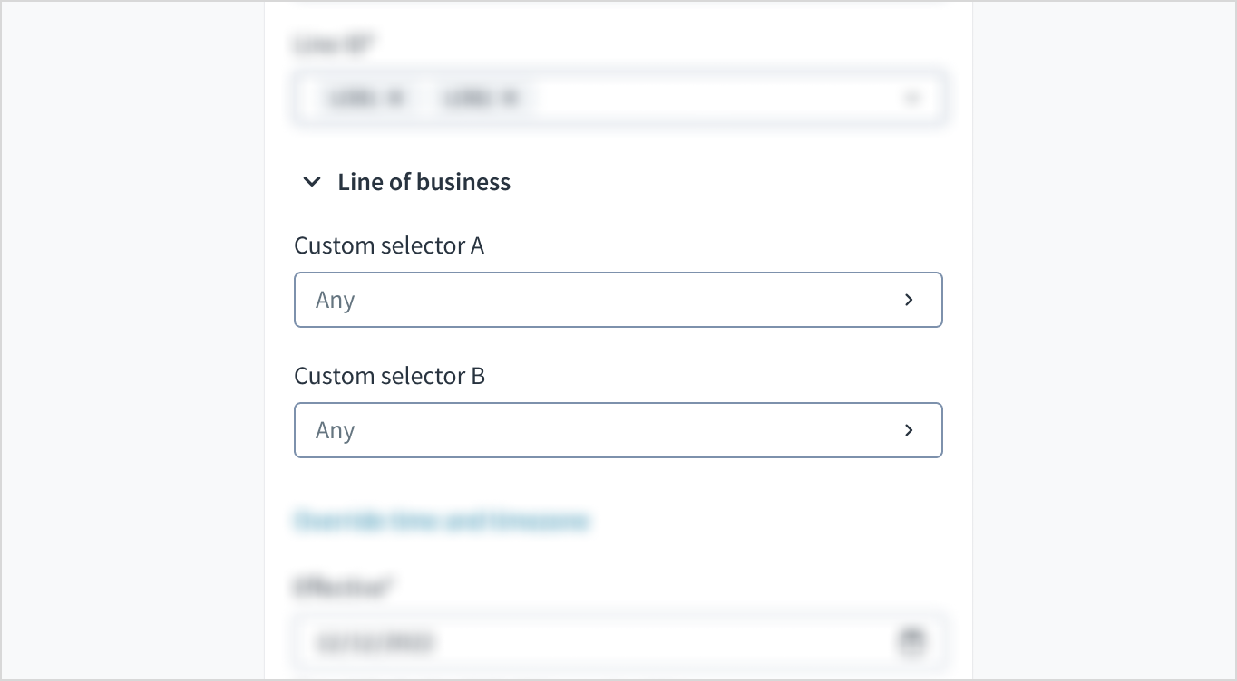
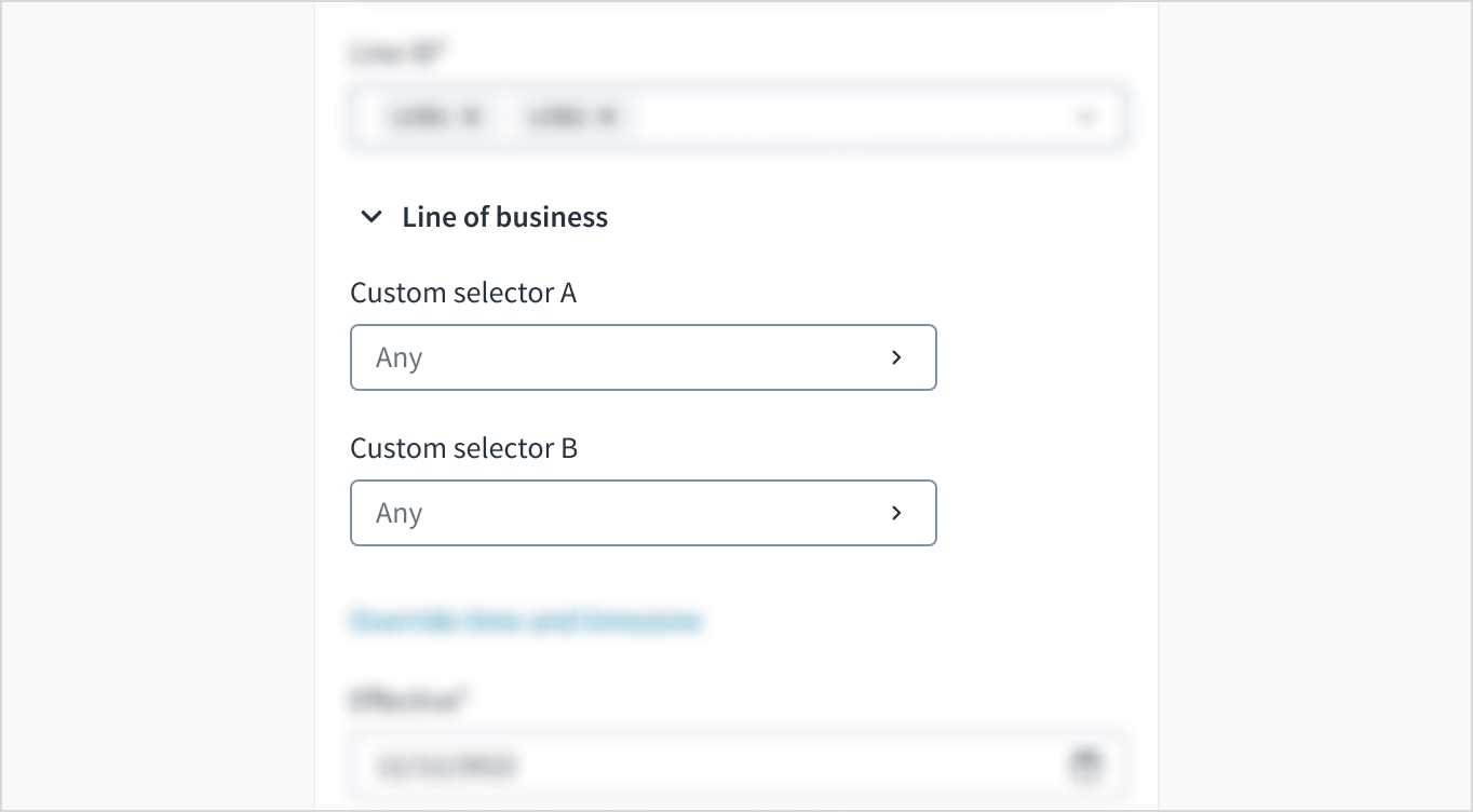
The accordion must fit the whole width of the parent container. To change the width of the accordion, change the container width.
Do match the width of the accordion to the width of the parent container.
Don't make the width of the accordion less than the width of the parent container.
Icon (When the chevron is on the right side, you can place an icon before the header title. If the chevron is on the left side, place the icon at the end of the accordion header).
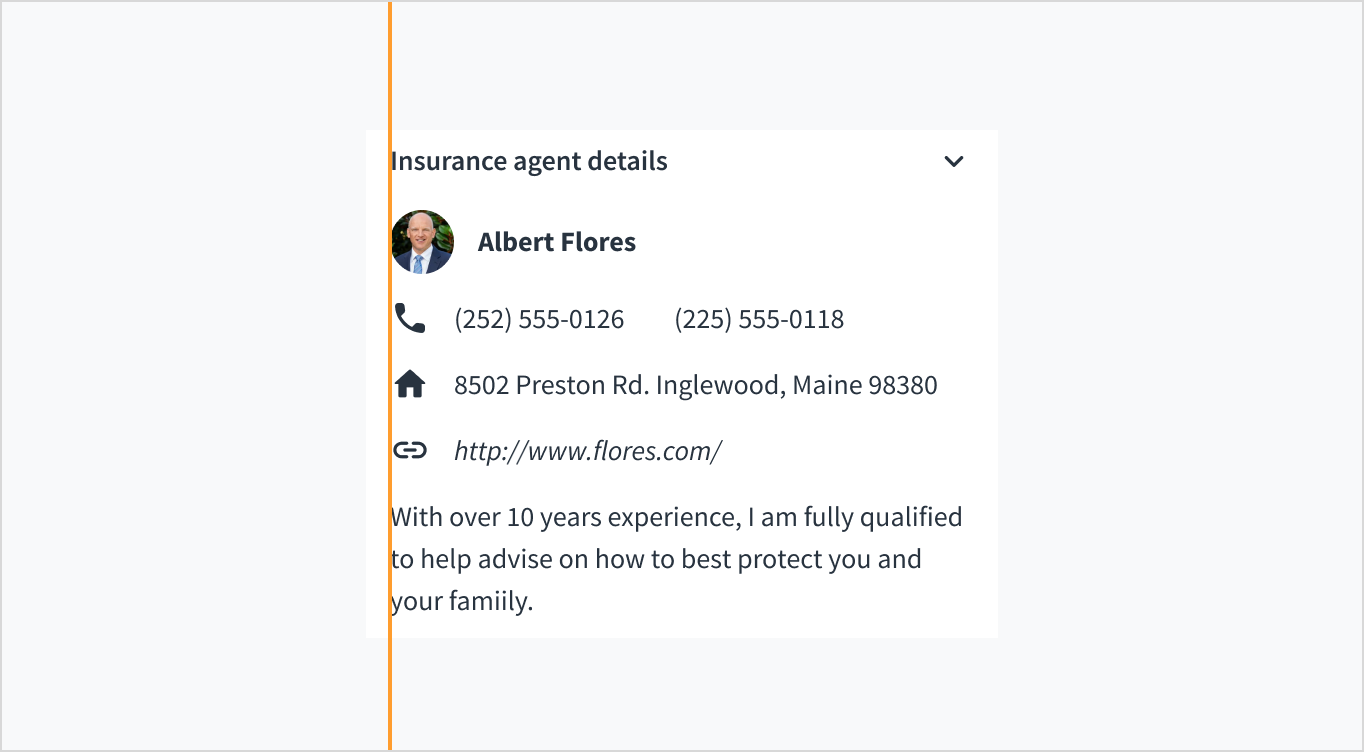
The accordion header can include text, icons, and other non-interactive elements.
Don't add interactive elements, such as buttons, to the accordion header. This violates accessibility.
Each accordion header must have a unique title that clearly and succinctly describes the associated body content. Headers appear in sentence case, except when using proper nouns.
The accordion component has 2 main states: collapsed and expanded.
Collapsed: Default state when the accordion is collapsed and not selected. Closed accordions appear without highlighting and display only the header title.
Expanded: Indicates that the user has selected the accordion and expanded it to display content. The chevron icon points downwards to indicate that the accordion has been expanded.
In addition to the collapsed and expanded states, accordions also have interactive states for enabled, disabled, hover, focus, and active.
State
Description
Enabled
Default state.
Disabled
Indicates that the accordion is not interactive but might be at some point. Disabled state is not meant to be accessible so it should not be focused.
Hover
Indicates a change of styling when the user hovers over the accordion header using a mouse.
Focus
Indicates that the user has selected (but not expanded) the accordion. The borders of the component are highlighted with our brand color.
Active
Indicates that the user is clicking or tapping the element.
When a user clicks to open a new accordion item, the items that are already opened remain so. Each interaction requires a user click to prevent disorientation in the UI. Users can collapse and expand the accordion by clicking on the chevron or by clicking anywhere in the header region.
The accordion header functions as a button. Enter and Space expand and collapse each accordion panel. Navigate through the focusable accordion elements using Tab and Shift+Tab.
When collapsed, accordion panel content is hidden. The WAI-ARIA state aria-expanded="false" advises users that the panel isn't visible. When expanded, the ARIA attribute changes to 'true' to convey that the content is visible.
The contrast ratio of textual elements against their background is above 4.5:1.
Non-textual content that needs to convey meaning (like icons and focus indicators) has a contrast ratio of at least 3:1 with its adjacent colors.
The item is operable using a keyboard, as well as using a mouse.
Content is accessible using screen readers, such as JAWS and VoiceOver.
Accessibility conformance ultimately depends on how this component is implemented and customized. Changes made by the content author can affect accessibility. For details on our shared responsibility model, please review our full Jutro accessibility statement.
Each accordion header must have a unique title that describes the accordion panel content. This assists blind users, in particular, in that they can navigate through each header and understand the content, without having to expand each panel.
Ensure that there are no keyboard traps when adding content to the accordion panel. Users should be able to move to each focusable element within each panel and then move to the next accordion card header.
Note: There are deprecated versions of this component. For documentation, see the Accordion (deprecated) page.
Make sure to understand the Design System components API surface, and the implications and trade-offs. Learn more in our introduction to the component API.
Message rendered as the title for the AccordionCard. If the dangerouslySetHeader property is provided, it becomes optional and won't be rendered by default.
If set to true, the AccordionCard will be expanded on initial load.
Passing HTML properties to the AccordionCard component
Under the hood, AccordionCard renders a native HTML Button element. If there is any HTML property from the standard HTML Button that is not already part of the AccordionCard component, you can pass it to the component. It will be assigned to the internal HTML Button component.
<AccordionCard
  title="Card title"
  id="accordion-card-1"
/>
The result of passing this id property is that it will be part of the HTML button that is created in the HTML DOM.
useAccordionCardState - Provides props from the AccordionCard context that you can use to create custom AccordionCard headers. The hook returns a value, which is an object that contains:
The Accordion and AccordionCard components are available from the @jutro/components package. Only AccordionCard can be placed inside Accordion. AccordionCard always has to have set either a title or dangerouslyRenderHeader prop but the usage of the latter is not recommended.
Using the hideDivider property allows you to hide all of the separators. Chevron placement is limited to right and left options. Both are set on the Accordion level.
New @jutro/components/Accordion component introduced replacing the previous one.
The previous accordion-related components were deprecated and moved to the @jutro/legacy package. To view their documentation, go to the deprecated components category.