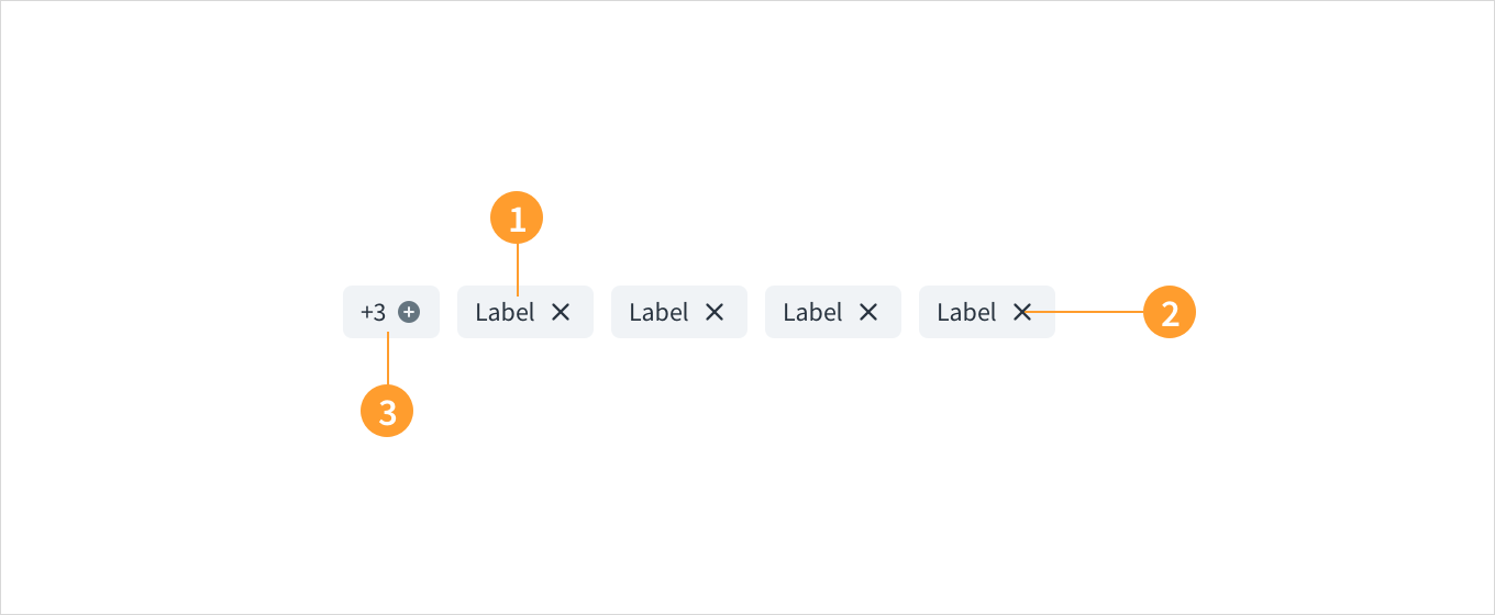
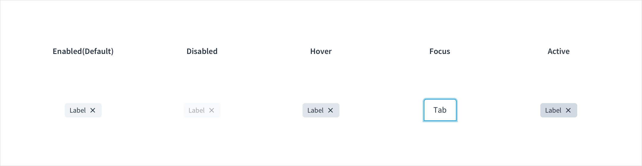
Tags have enabled, disabled, hover, focus, and active states:
Enabled: Communicates to the user that the element is enabled for interaction (default). Enabled tags have a background color with HEX # F0F3F6.
Disabled: Communicates to the user that the element is not interactive. Disabled tags have a background color with HEX # F9FAFB.
Hover: Provides feedback indicating that the user has placed a cursor over the element. (desktop only). On hover, the background color of tags is HEX # E1E6EC.
Focus: Provides feedback indicating that the user has highlighted the element, typically using an input method such as a keyboard or mouse. On focus, the background color of tags is HEX # F0F3F6, and the tag is surrounded by a stroke with HEX # A5D7EC.
Active: Provides feedback indicating that the user is clicking or tapping the element. Active tabs have a background color with HEX # D1D9E2.
The contrast ratio of textual elements against their background is above 4.5:1.
Non-textual content that needs to convey meaning (like icons and focus indicators) has a contrast ratio of at least 3:1 with its adjacent colors.
The item is operable using a keyboard, as well as using a mouse.
Content is accessible using screen readers, such as JAWS and VoiceOver.
Accessibility conformance ultimately depends on how this component is implemented and customized. Changes made by the content author can affect accessibility. For details on our shared responsibility model, please review our full Jutro accessibility statement.
When using the tag component within your application:
Be sure the tag text is clear and concise.
Do not use color alone to differentiate tag categories.
When using custom colors ensure that the minimum contrast requirements are met.
Make sure to understand the Design System components API surface, and the implications and trade-offs. Learn more in our introduction to the component API.