Theming overview
Understanding Jutro theming
Jutro theming is a mechanism that enables designers and developers to apply a customer's branding to the user interface of a Jutro app. Jutro theming uses design tokens to define the specific theming decisions. The design tokens are then transformed into variables that the application can use.
There are many types of design decisions that designers need to consider. Some of the most important ones include:
- Colors
- Fonts/Typography
- Spacing
- Shadows
- Border-radius
An example of a global change would be to replace Jutro's default font-family Source Sans Pro with Google's Roboto. This is as simple as changing the value of the design token associated with the font family:
{
  jds:
    {
      "font-family":
        { "heading": { "type": "fontFamilies", "value": "'Roboto'", "description": "Global font-family for headings" },
          "label": { "type": "fontFamilies", "value": "'Roboto'", "description": "Global font-family for label text" },
          "body": { "type": "fontFamilies", "value": "'Roboto'", "description": "Global font-family for body text" },
          "monospace": { "type": "fontFamilies", "value": "'Roboto'", "description": "Global font-family for monospace text" }
        },
      }
    }
Once the change in the design token value is transformed into the corresponding CSS variable, it will change the font across the entire application. A component-level change, on the other hand, would involve changing the font-size across a certain type of button, without affecting the global tokens.
Analyzing a design
When theming with Jutro, it's usually the case that a Guidewire customer is involved. UX designers will contribute in some capacity, whether they are internal or external to Guidewire. Depending on that customer's design needs, these are some of the scenarios that you may encounter:
- They have a design and want to Jutrify it
- They have old designs that they want to upgrade
- They have a brand guide/design system that they would like us to work from
- They're starting from scratch and want Guidewire to drive the design work (Rare)
In most of these cases, you would be required to analyze the customer's designs and extract the brand and style from these multiple sources.
Some of the key items to look out for while analyzing a design are:
Global options
- Colors
- Fonts/Typography
- Spacing
- Shadows
- Border-radius
Style details
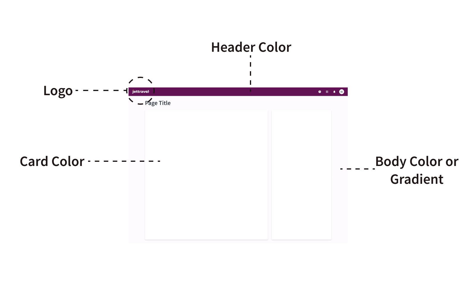
- Header - color, logo, padding, size
- Body background color
- Card background color (if applicable)
- Fonts - color variables Text-1 & Text-2, sizes
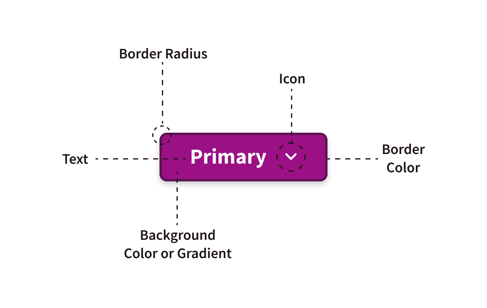
- Buttons - background color, text color, padding on all 3 button types
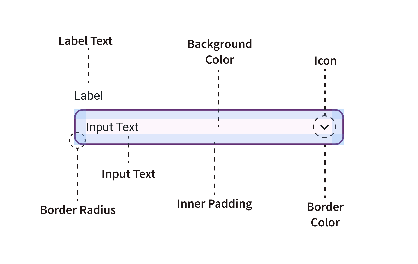
- Inputs - background color, border, text size, weight & color, space between label and input, padding and size of input field
- Link - color (if different from Brand-1)
These are the key style elements in a design. If you can extract these styles from your customer's design sources and replicate them in your designs, you will have done most of the work.

Reviewing a brand document
Reviewing a brand document, style guide, or design system follows a similar process to the one described above. However, instead of analyzing a fully designed page, you would examine the patterns and components that are used to create that page.
This means looking at each option as part of a designed component. The benefit of working with a design system or style guide is that you will have access to detailed information on how to use these styles correctly.
Designing with Jutro
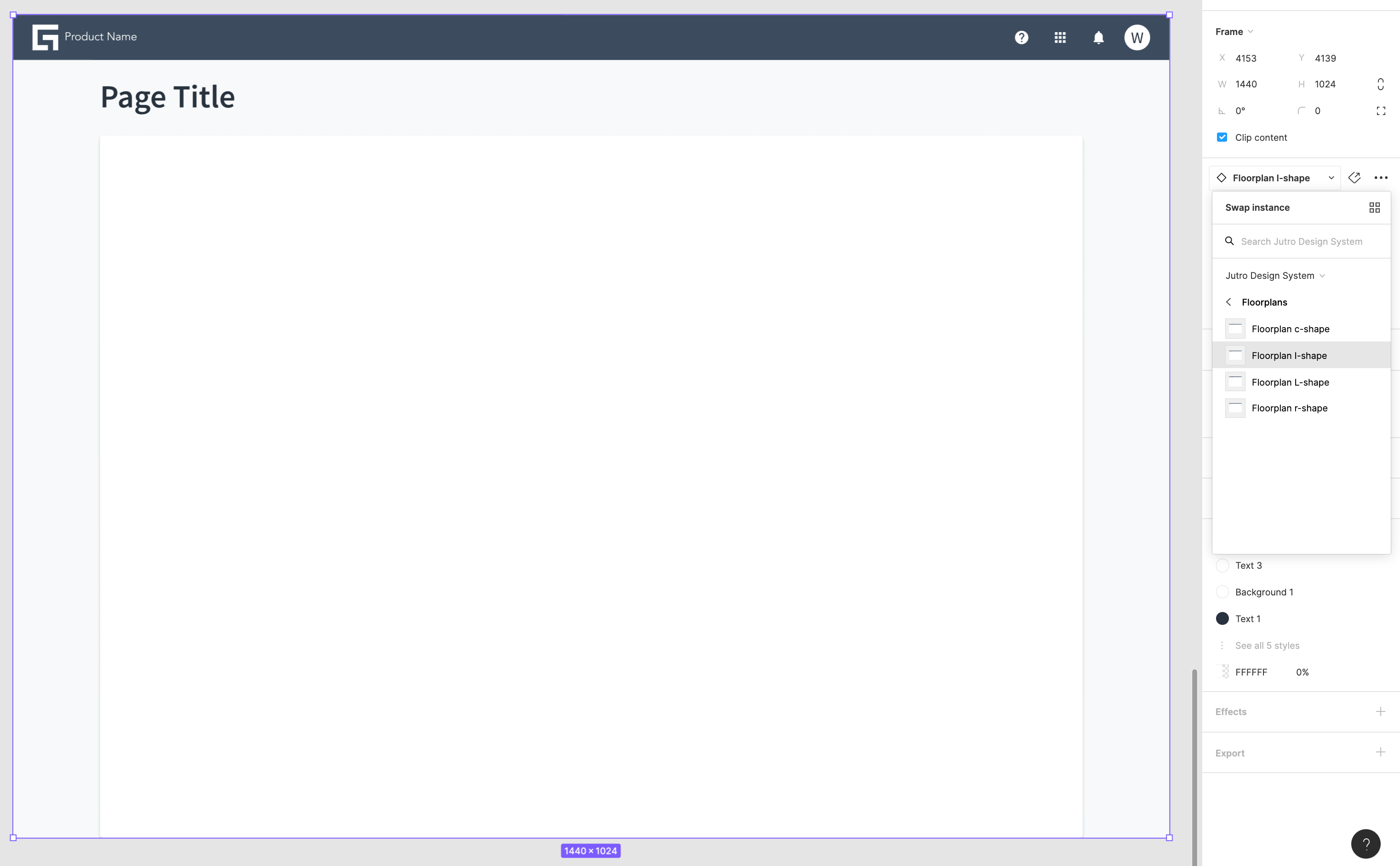
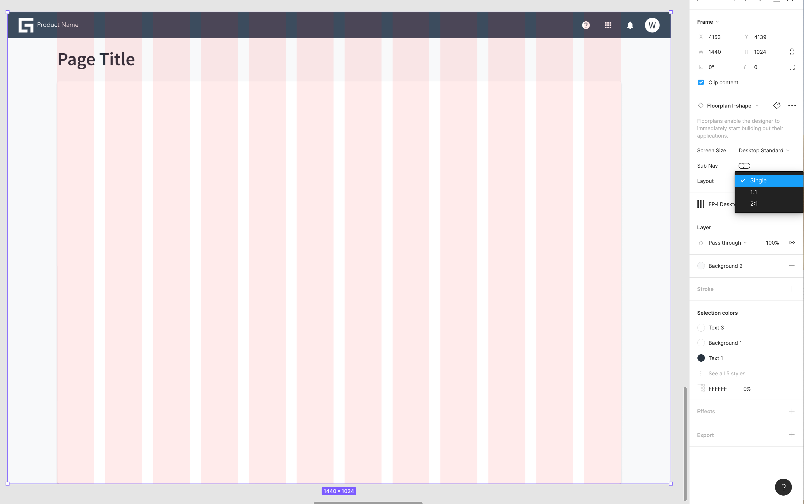
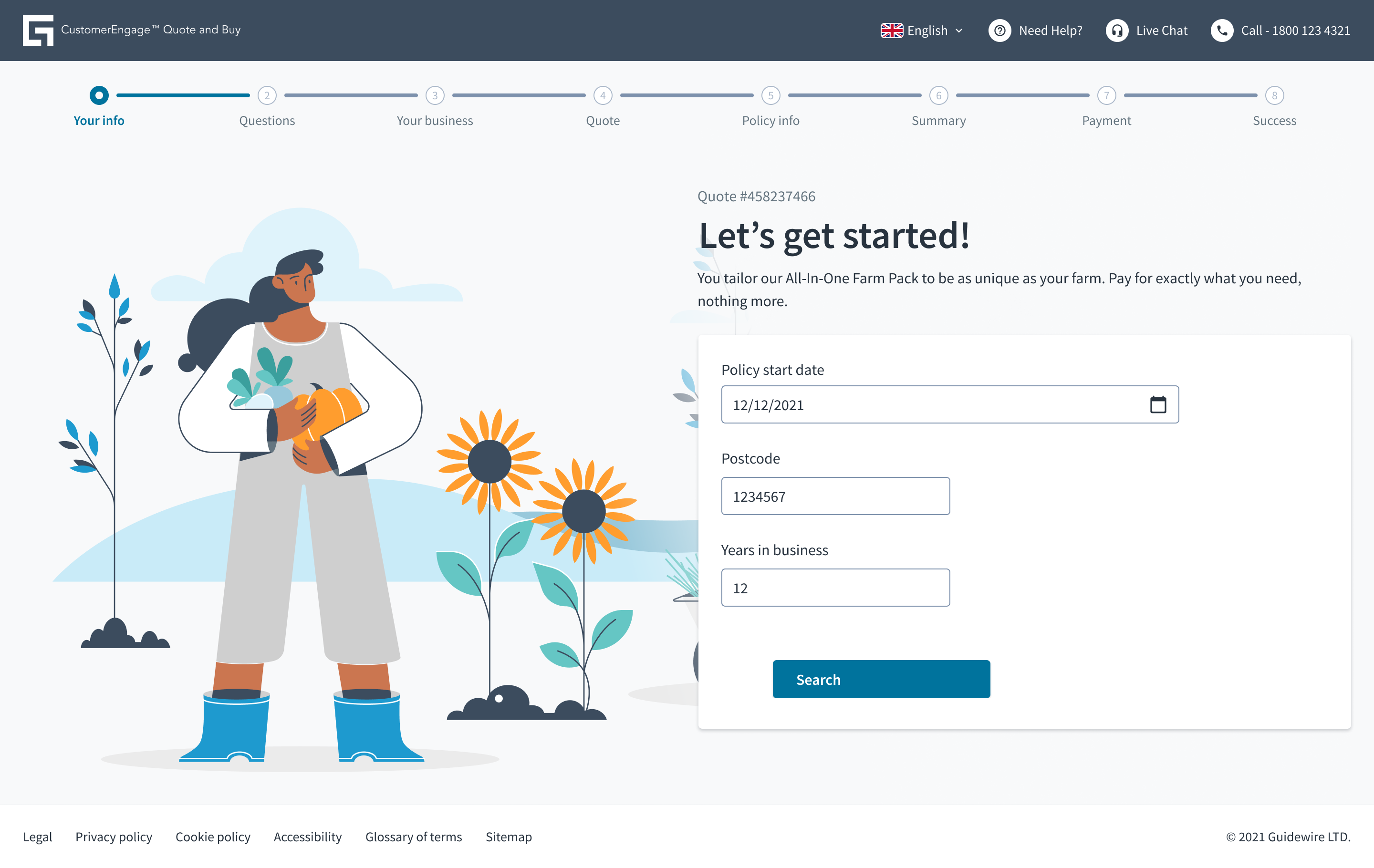
Designing with Jutro consists of the following high-level steps:
- Choose your floorplan
- Choose your layout
- Design using Jutro components
- Get the design tokens list from the UX designer and apply styles by getting the theme files through the design tokens to CSS variables transformation process.
