Components overview
What are Jutro components?
Components are the basic building blocks of the Jutro Design System. Each component is designed and implemented to address a specific interaction or UI need. You can assemble components piece by piece to create patterns and intuitive user experiences. All components follow the guidelines and requirements of the Jutro Design System, which promotes a consistent look and feel across Guidewire apps and ensures that product teams adhere to best practices.
Components meet non-functional needs such as accessibility (a11y), testability, and security.
In addition, components are compatible/integrated with the recommended approaches for internationalization (i18n), theming, metadata, and handling forms.
Component examples
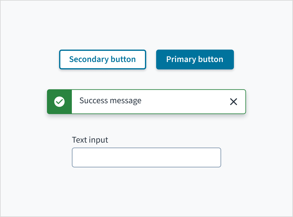
Buttons, notifications, and input text fields are all examples of components.

Characteristics
- Building blocks of the Jutro Design System
- Generic, reusable, configurable
- Responsive, but with specific min/max values
- Equipped with productization features: i18n, a11y, themeable, documented, tested, following non-breaking changes (NBC) policy
- Upgradable
How can developers use components?
Components are installable in apps as typical NPM packages (in the form of versioned dependencies) and then available for consumption in appropriate places as React components — with JSX/Metadata (configured through props).
Presentation metadata has been deprecated in Jutro 10.0. JSX is the recommended mechanism for UI implementation. If you need documentation about metadata, switch to a version of the documentation older than 10.0.
How can designers use components?
Components are available via the Jutro Figma library. These pre-designed elements can be dragged and dropped into new designs.