Badge
Examples
Check out the Usage section for details about how to design a badge properly, and the different configuration options we provide.
Basic Example
You can display a number to a user in a red circle.
<Badge value={5} />
Badge Types
Each option for the type property changes the badge's flavor.
<Badge
    type="neutral"
    value={5}
/>
<Badge
    type="notification"
    value={5}
/>
<Badge
    type="primary"
    value={5}
/>
<Badge
    type="inverse"
    value={5}
/>
Value larger than max
If the value is larger than maxValue it displays as {maxValue}+.
<JutroWrapper>
  <Badge
    value={15}
    maxValue={9}
  />
</JutroWrapper>
Usage
Overview
Badges serve as a discrete way to provide information about new or updated content. They show numeric values and tallies, such as the number of updates available or the number of unread messages. The numeric value inside the badge dynamically changes in real time as more notifications occur.
When to use
- To display information about new or updated content as a numeric value.
- In systems with complex workflows that require collaboration. This practice can help users keep up with important activity.
- To inform users about important software updates, such as bug fixes or added functionality.
When not to use
- For non-numeric status information. Use the info label component instead.
- To categorize items and filter data. Use tags instead.
Formatting
Anatomy

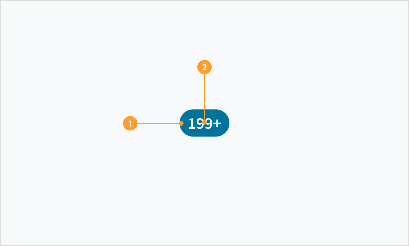
The badge component consists of the following elements:
- Container with specific color fill depending on the use case.
- Label that displays a number. For information on handling large numeric values, refer to Best practices.
Types

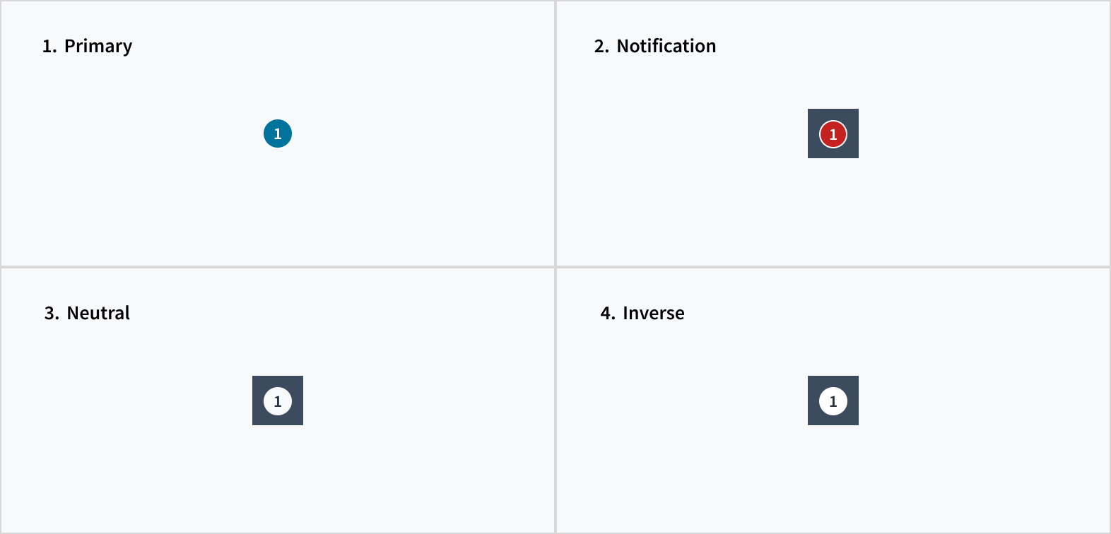
Badges come in a variety of colors that denote specific meanings:
- Primary: Use the primary badge when tracking items related to a workflow.
- Notification: Use the notification badge to overlay icons and communicate new and updated content, such as the number of unread messages.
- Neutral: Use the neutral badge for information that isn't crucial.
- Inverse: Use the inverse badge to preserve color contrast against a dark background.
Best practices
- Use consistent placement of badge overlays throughout a product or experience.
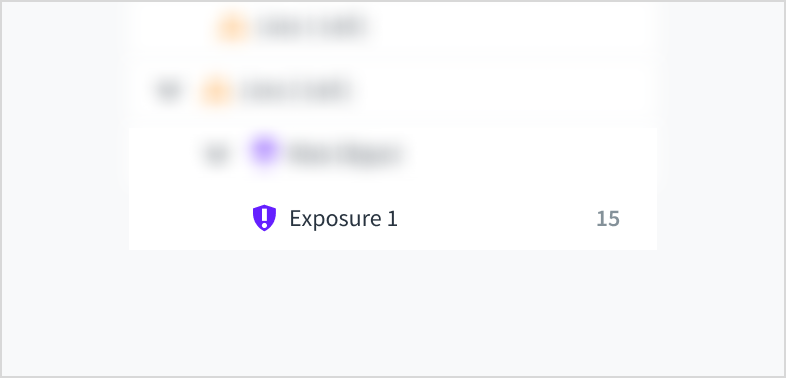
- Use badges as a standalone component (left) or as an overlay (right).
- Jutro has a
maxValueprop by which you can set the maximum value for the badge. If thevalueprop is greater thanmaxValue, then the Badge will display 'maxValue+'. If there is a use case where there are thousands of threads, instances, or errors, the recommendation is to set a value for themaxValueprop.
| Badge as a standalone component | Badge as an overlay |
|---|---|
 |
Interactions
Mouse
- Clicking on a badge that overlays an icon produces a list with more information about the specific notifications.
- A link may appear within a list that is associated with a badge. Users can trigger actions by clicking these links. For example, "See all notifications" or "Go to new messages".
- Badges disappear after users have clicked them.
Screen reader
The badge component includes the aria-live="polite" and aria-atomic="true" attributes. Screen reader users are notified when content updates. The liveRegionContext knob in Storybook allows developers to provide context to the meaning of the badge.
Accessibility
The badge displays numeric values, indicating the number of items that need to acknowledged.
- Screen reader interaction: The badge component includes the
aria-live="polite"andaria-atomic="true"attributes. Screen reader users are notified when content updates. - Keyboard interaction: Not applicable
- Color: The contrast ratio of the numeric value against each of its respective backgrounds is above 4.5:1, as per WCAG 2.0 AA requirements.
- Zoom: All content is visible and functional up to and including a zoom factor of 200%.
This component has been validated to meet the WCAG 2.0 AA accessibility guidelines. However, changes made by the content author can affect accessibility conformance. If applying custom color themes to the badge background, be sure to check that the contrast ratios meet the accepted threshold of 4.5:1.
Code
<Badge value={5} />
Import statement
import { Badge } from '@jutro/components';
Component contract
Make sure to understand the Design System components API surface, and the implications and trade-offs. Learn more in our introduction to the component API.
Properties
className- Type
stringDescriptionCSS class passed to root element of the component
id- Type
stringDescriptionComponent unique identifier
liveRegionContext- Type
stringDescriptionUsed to describe the live region for assistive technologies (e.g., Unread Emails)
maxValue- Type
numberDescriptionThe maximum value for the badge if value prop is greater than
maxValue, then the Badge will display 'maxValue+' type- Type
'neutral' 'notification' 'primary' 'inverse'DescriptionPhrase allowing to set custom flavor (success, general, neutral, etc.)
value- Type
numberDescriptionThe value of the Badge
Hooks
No hooks are available for Badge.
Translation keys
There are no translations for Badge.
For information on how to manage translations, see our section about Internationalization.
Escape Hatches
For more information, see our documentation about escape hatches.
Changelog
10.3.2
The following issues were resolved in patch 10.3.2:
ID | Description |
|---|---|
| JUT-19938 | The type property flags the neutral option as deprecated. |
10.1.0
Deprecations
idproptypeprop has deprecated variants:successerrorwarninginfo
Known Issues
ID | Description |
|---|---|
| JUT-19938 | The type property flags the neutral option as deprecated. |