Stepper
Examples
Check out the Usage section for details about how to design a stepper properly, and the different configuration options we provide.
Enter a number
You can allow the user to enter a number using the Stepper component. Then use the handler to get the selected number.
import { Stepper } from '@jutro/components/new';

// ...

<Stepper
  label="Enter Number"
  name="Number picker"
/>;
Enter a number with restrictions
You can limit the range of numbers to select using the min and max properties. These are inclusive limits.
import { Stepper } from '@jutro/components/new';

// ...

<Stepper
  label="Enter Number"
  secondaryLabel="From 1 to 10 inclusive"
  min={1}
  max={10}
/>;
Custom Validation Message
Stepper does not provide a specific validation logic but it provides the way to include the developer validation and use the stateMessages property to display any required error message.
This is an example of handling validation when onChange event is triggered. Enter a value below 0 or above 10 without using the buttons to test it.
export function StepperValidation() {
  const [validationMessages, setValidationMessages] = useState({});
  const max = 10;
  const min = 0;

  const onChange = useCallback((e, newValue) => {
    setValidationMessages({});

    if (newValue && (newValue > max || newValue < min)) {
      setValidationMessages({
        error: ['Value must be between 0 and 10'],
      });
    }
  }, []);

  return (
    <JutroWrapper>
      <div style={{ padding: '2rem 1rem' }}>
        <Stepper
          label="Enter Number"
          secondaryLabel="From 1 to 10 inclusive"
          onChange={handleChange}
          stateMessages={validationMessages}
          min={min}
          max={max}
        />
      </div>
    </JutroWrapper>
  );
}
Usage
Overview
The stepper component enables users to incrementally increase or decrease a numeric value. Users can also type numeric values directly into the input field.
When to use
- For numerical parameters with a clear default that most users are likely to select.
- To adjust numeric fields by a small discrete amount, with no more than 10 increments or decrements. For example, you could use the stepper to change the number of passengers in a vehicle or the number of copies to be made.
When not to use
- If frequent, large deviations from the default are expected.
- To select a single value from a wide range of numeric options or to specify minimum and maximum values within a range. Use the slider instead.
- For continuous variables, such as age, height, price, or distance. Use the number input to specify the exact value within a wide range.
Source: Nielsen Norman Group
Formatting
Anatomy
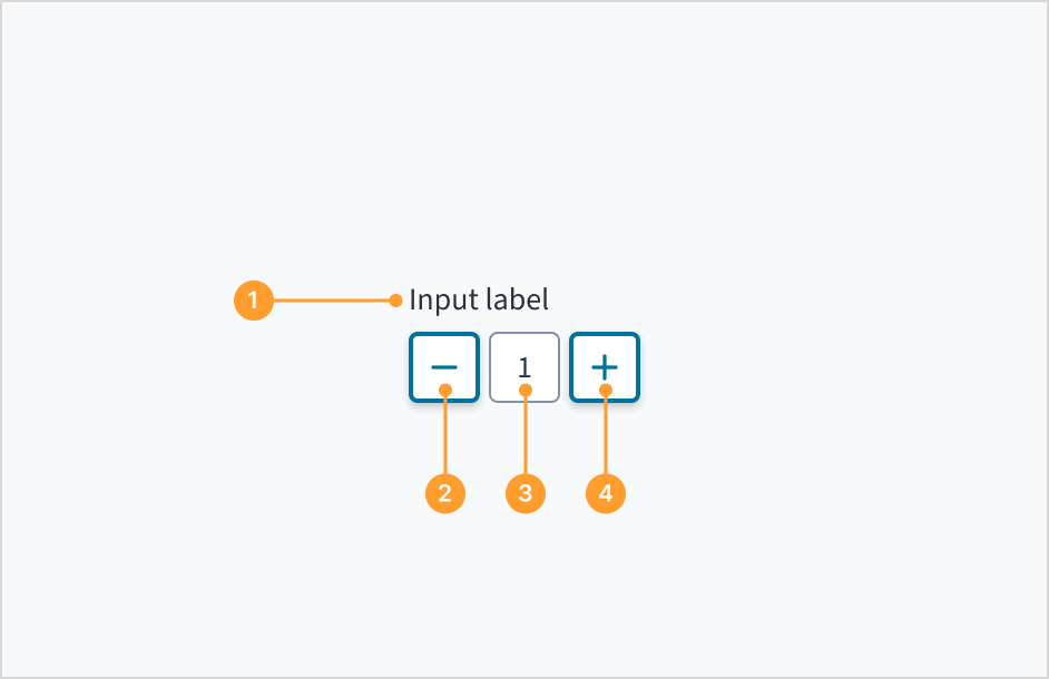
The stepper consists of the following elements:
- Label: Indicates what value the stepper changes, such as number of passengers.
- Decrease button: The decrease button reduces the value. The value reduces by 1 when a user clicks the button.
- Value: The current value that has been selected or predetermined. Users have the option to manually enter a numeric value by clicking in the text input field.
- Increase button: The increase button increases the value. The value increases by 1 when a user clicks the button.
Content
General writing guidelines
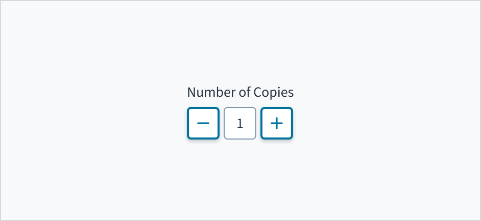
- Use sentence case for all aspects of designing Guidewire product interfaces. Don't use title case.
- Use present tense verbs and active voice in most situations.
- Use common contractions to lend your copy a more natural and informal tone.
- Use plain language. Avoid unnecessary jargon and complex language.
- Keep words and sentences short.
Include a label
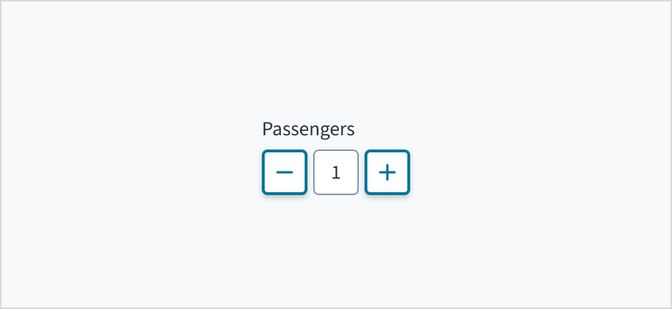
Place a clear, visible label outside the stepper input field. Label text explains the purpose of the stepper and provides context for the user. An input field without a label is ambiguous and not accessible.
The label prop is mandatory for the Stepper component. If you do not want the label to be visible, you can pass hideLabel = true underneath the label prop.

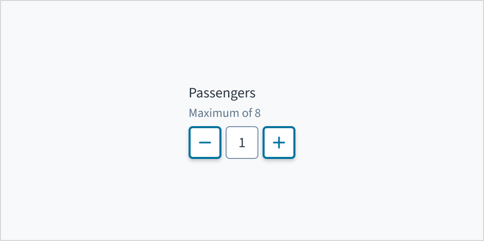
Add help text if it's meaningful
Use help text to communicate pertinent information, such as the maximum or minimum input value.
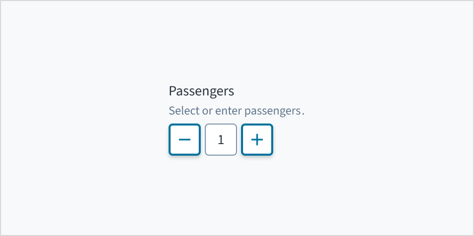
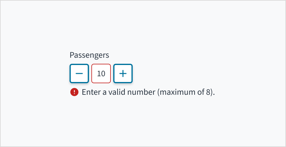
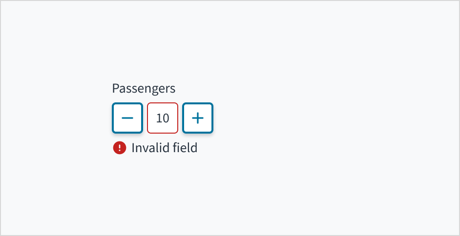
Use error text to guide users
Error message text tells a user how to fix the error. In the case of the stepper, errors are often related to data that is invalid or a required field that is left empty.
Use sentence case for error text. Write 1-2 short, complete sentences that end with a period.
Mark required fields
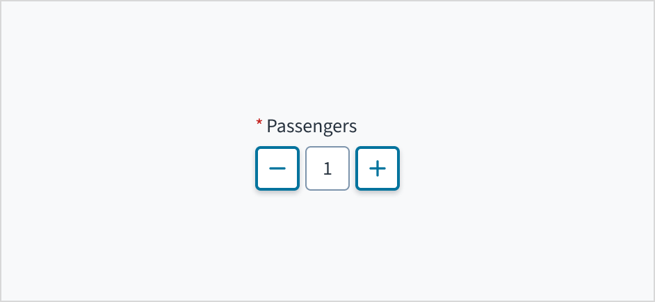
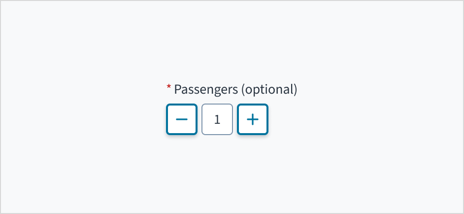
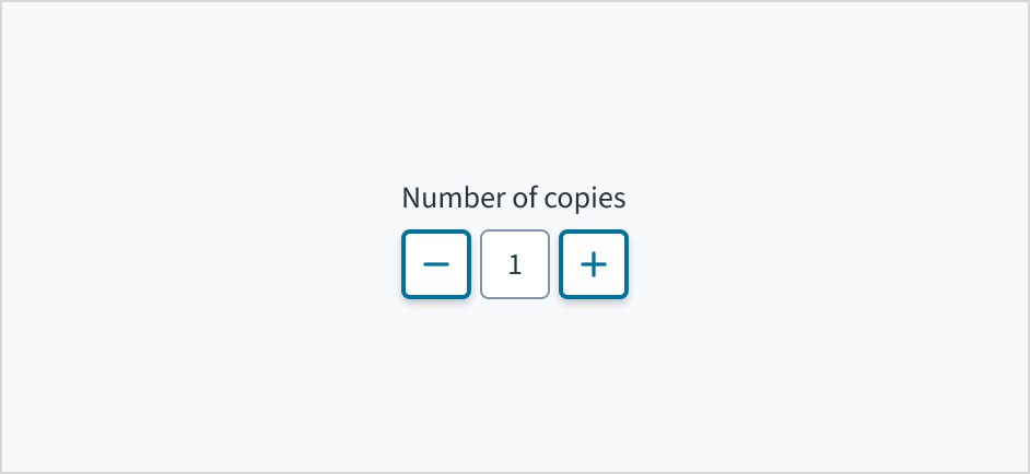
Use an asterisk (*) to indicate required fields. The asterisk precedes the field label. This helps users to easily locate which fields are required by scanning just the left-most character of the label.
Use sentence case
Field labels appear in sentence case.
Refer to the UI text style guide for more information on how to implement sentence case.
Behaviors
States
The stepper field has states for enabled, disabled, focus, error, read-only, and display-only.
Stepper control elements use icon buttons. For information about icon button states, refer to the documentation on button states.
| State | Description | |
|---|---|---|
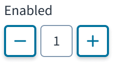 | Enabled (default) | Communicates to the user that the element is enabled for interaction. |
| Disabled | Indicates to the user that the input value can't be changed because of local factors. For example, a checkbox above the input field must be checked to access this input field. The user can take action to enable it by interacting with the page. | |
 | Focus | Provides feedback indicating the user has highlighted the element, typically using an input method such as a keyboard or voice. |
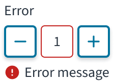 | Error | Indicates that the user has made a validation error. A validation label provides corrective feedback to users. |
| Read-only | Indicates to the user that the input value can't be changed because of outside factors. For example, lack of write access. The user can take action to enable it by, for example, contacting an administrator. | |
| Display-only | The display-only state is used for two cases:
read-only before. |
Interactions
Mouse
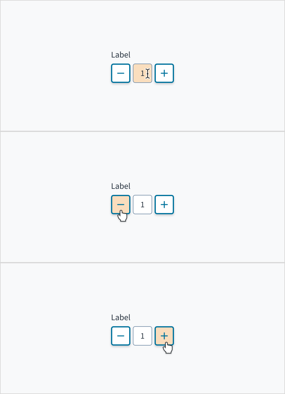
Users can manually enter a numeric value by clicking in the text input field. They can also incrementally increase or decrease the value by clicking the add icon or subtract icon.
Keyboard
Each element in the Jutro stepper component is tab-indexed and, as such, can be accessed via the TAB key. Values can be increased or decreased with the SPACEBAR and ENTER keys. The value within the input field can also be explicitly set with the cursor arrow keys or by entering the value manually.
Screenreader
The plus and minus value buttons include an aria-label attribute of "Increase Value" and "Decrease Value" respectively. These can be changed in Storybook in the messageProps fields. The input field utilizes aria-live="polite" in order to convey its value to people who are blind, and it is associated with the component label text via aria-labelledby.
Default values
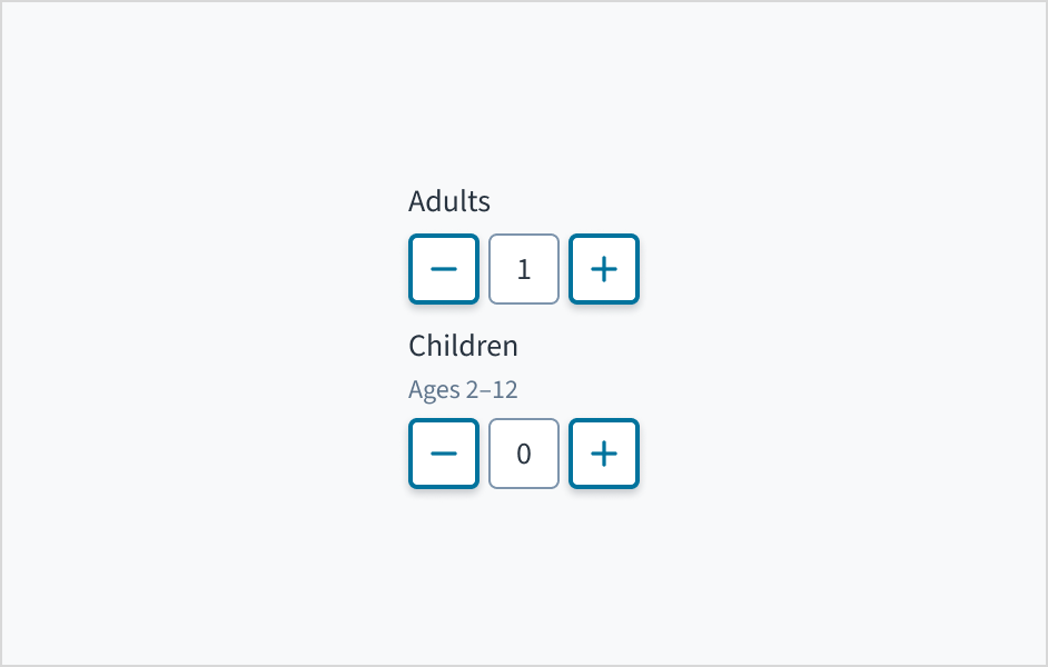
Set the most frequently selected value as a stepper default. For example, 1 is usually the default number of adults for booking a hotel room, whereas 0 may be the default number of children in a hotel reservation.
Source: Nielsen Norman Group
Accessibility
The Jutro stepper component adheres to the following criteria for color and zoom accessibility:
- Color: The contrast ratio of textual elements against their background is above 4.5:1 as per WCAG 2.0 AA requirements.
- Zoom: All content is visible and functional up to and including a zoom factor of 200%.
This component has been validated to meet the WCAG 2.0 AA accessibility guidelines. However, changes made by the content author can affect accessibility conformance.
Code
<Stepper label="Enter Number" />
Import statement
import { Stepper } from '@jutro/components/new';
Component contract
Make sure to understand the Design System components API surface, and the implications and trade-offs. Learn more in our introduction to the component API.
Properties
className- Type
stringDescriptionCSS class passed to root element of the component
disabled- Type
boolDescriptionIf true, component is rendered in disabled state
displayOnly- Type
boolDescriptionIf true, displays the component value as a plain text. Consider using readonly instead, if possible, because plain text has much worse accessibility than readonly inputs.
hideLabel- Type
boolDescriptionIf true, the label is not visible.
initialValue- Type
numberDescriptionInitial value of input. If value prop is specified along with this prop, this prop's value is discarded.
label- Type
intlMessageShape.isRequiredDescriptionLabel associated with input field, also passed as a default value to 'aria-label'
labelPosition- Type
top | leftDescriptionAllows to select label position
max- Type
numberDescriptionMaximum value of input. If this prop is passed, component does not allow to enter values, higher than specified one by using arrow up key/button.
min- Type
numberDescriptionMinimum value of input. If this prop is passed, component does not allow to enter values, lower than specified one by using arrow down key/button.
onChange- Type
funcDescriptionCallback fired when input value is changed
readOnly- Type
boolDescriptionIf true, component is rendered in read-only state, for value as a plain text consider using displayOnly
required- Type
boolDescriptionIf true, component is rendered as required and label has asterisk
secondaryLabel- Type
intlMessageShapeDescriptionSecondary label text to display
stateMessages- Type
objectDescriptionObject with input state and messages that should be shown for current state
step- Type
numberDescriptionStep value for value change. If this prop is passed, component will increase/decrease it's value on step when user press arrow key or button.
tooltip- Type
fieldsTooltipShapeDescriptionTooltip props object: text - to show tooltip content, trigger - to set tooltip trigger
value- Type
numberDescriptionValue of input. Takes precedence over initialValue. If this prop is passed, component works in controlled mode and its value will change only if this prop changes.
Hooks
No hooks are available for Stepper.
Translation keys
There are no translations for Stepper.
For information on how to manage translations, see our section about Internationalization.
Escape Hatches
For more information, see our documentation about escape hatches.
- Design tokens
classNameprop- Passing native HTML attributes
- Ref with imperative handlers
- Native event property
Custom Behaviors
Overriding min and max settings
Although min and max properties can be used to restrict the values that can be set in the component though the (+) and (-) buttons, there are 3 different ways in which the Stepper component can set a value out of these limits:
initialValueorvalueproperties: these properties can accept any number and the one provided is out of the defined limits it will be anyway used.- User manual input: the user is allowed to type any number, even if it is out of the defined limits
In case of having an initialValue value or a manually entered value out of the limits, Stepper component will:
- Disable (+) button if the value is above the
maxproperty value - Disable (-) button if the value is below the
minproperty value - Set the value to the
minor max values defined when the corresponding button is clicked
Disabled, displayOnly and readOnly precedence
If two or more of the properties disabled, displayOnly, and readOnly are set to true at the same time, the precedence is as follows:
displayOnly>readOnly>disabled
User input validation
Although some Jutro components might provide complementary features or a helper function to facilitate the validation process, it is your responsibility as a developer to handle the validation of any user input (using or not using the complementary helpers) and to decide what error messages to show.
Jutro components behave based on the developer implementation.
When are error messages displayed?
Error messages are only displayed when you pass them to the component through the stateMessages property. This property receives an object with the following content:
{
  error: ['error message 1', 'error message 2', 'error message N'];
}
The component displays every error message provided in the same order as in the array.
When does validation occur?
This is your decision as a developer. As components do not determine when the validation is performed or when the error must be displayed, you need to implement the logic to handle it according to the project requirements, for example while the user is editing the content, when the component loses focus, and on form submission.
Legacy information
Are you using the legacy stepper?
- To view docs for the old component, switch to a version of the docs older than 10.3.0.
- The legacy component is also available in Storybook: