Error boundary
Overview
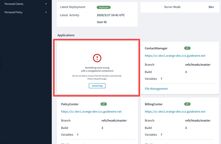
The ErrorBoundary component is a wrapper component that accepts children components and some optional customizations. When a child component renders normally, the ErrorBoundary component doesn't do anything. However, if a child component throws an error during rendering, the ErrorBoundary component kicks in and replaces this component with a predefined error UI.

Under the hood, the ErrorBoundary component catches JavaScript errors thrown by React components and reports them to Jutro events by default. (You can change this behavior if needed.) It also presents a recovery action and prevents the whole application from crashing.
The error UI consists of an icon, an error text and a detailed error text, and an action button. You can customize all of them, and you can use the component anywhere in your application. By default, it is used around the template Jutro application and wraps all micro frontends as well. All the parameters for the ErrorBoundary component and examples of the different styles, such as card or full height, are available in Storybook.
Use cases
You can wrap any component in an ErrorBoundary component. However, we recommend that you use it mainly for components that rely on network calls, interact with APIs or databases, as these are more likely to fail.
Wrap a component with ErrorBoundary
You wrap a component with an ErrorBoundary component like this:
const MyComponentWithBoundary = (props) => (
  <ErrorBoundary noticeStyle="card">
    <MyComponent {...props} />
  </ErrorBoundary>
);
Customization
You can customize all parts of the ErrorBoundary component using either metadata or JSX, and you can also decide whether to show the technical error that a child component has thrown.
For example, you can configure the metadata so that the technical error represented by the showErrorMessage property is visible like this:
{
  "id": "generated-f620b8f5-44fd-43a4-b828-1a88a51c80f5",
  "type": "container",
  "component": "ErrorBoundary",
  "content": [
    {
      "id": "generated-fb18c51a-a30e-4488-a66a-8d99d948c24f",
      "type": "element",
      "component": "BadComponent"
    }
  ],
  "componentProps": {
    "showErrorMessage": true
  }
}
You can do the same in JSX by passing an additional prop, showErrorMessage, like this:
const BasicTemplate: ErrorBoundaryStory = (args) => (
  <ErrorBoundary
    showErrorMessage
    {...args}>
    <BadComponent />
  </ErrorBoundary>
);
You can pass and customize other props such as noticeStyle, mainMessage, detailedMessage, and actions with their respective callback functions the same way.
You can also replace the default error UI component with a custom component. Check out Storybook for more customization examples.