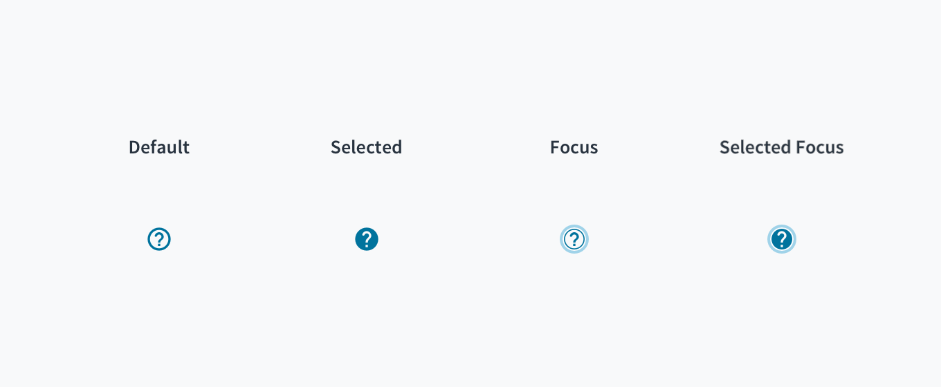
Tooltip
Overview
Tooltips provide an unobtrusive way to answer questions about the UI or to add a bit of information or instruction to an interface. They offer point-of-need help and contextual help and can communicate the value of features. Tooltips appear either when users click, hover, or focus on an element.
When to use
- Use tooltips to clarify the purpose of actions or icons using brief and informative text.
- Use tooltips to show the full text of messages or strings that have been truncated.
- Use tooltips to provide contextual help and prevent drop-off at friction points.
SQL Editor
Text size
3
When not to use
- Tooltips are not appropriate for conveying information or instructions that are critical to task completion.
- Tooltips should be used strategically. Resist the temptation to clutter your UI with tooltips that don't address a clear user need.
Use tooltips to provide additional information, such as why a field is listed.
Formatting
Anatomy
Tooltips have a dark background with white overlaying text that clearly displays the information. A caret indicates where the tooltip came from.
Tooltips consist of three variations that fulfill different design needs:
- Base tooltip: The base tooltip is used for general information. Text is descriptive and related to the field. The base tooltip may also accommodate interactive elements like buttons or links.
- Icon tooltip: The icon tooltip helps to clarify the name of the interactive icon button and describe its function.
- Definition tooltip: The definition tooltip defines a predefined portion of text.
Alignment and placement
- Position tooltips so that they don't block related content.
- When multiple elements are nearby, use a caret to indicate where the tooltip came from.
Interactions

- Tooltips display upon hover and focus. They continue to appear for as long as the user hovers over the element.
- Though tooltips can accommodate links and buttons, it's best not to hide interactive content in tooltips.
Content
General writing guidelines
- Use sentence case for all aspects of designing Guidewire product interfaces. Don't use title case.
- Use present tense verbs and active voice wherever possible.
- Use common contractions to lend your copy a more natural and informal tone.
- Use plain language. Avoid unnecessary jargon and complex language.
- Keep words and sentences short.
Writing tooltips
- Be concise. Tooltip explanations should be as short and simple as possible.
- Limit tooltip text to a max of 2 lines and take care that, when translating, the text doesn't exceed 2 lines.
- Tooltips that describe the function of an icon-only action button or tab should only contain 1 or 2 words.
- Body text should include information that's meaningful to users for the task at hand.
- Include a period at the end of full sentences. If the tooltip is a short phrase, don't use a period.
- Don't truncate text in a tooltip.
Accessibility
The Jutro tooltip component displays additional supplemental information upon click, hover, or focus. Although there are three options upon which to trigger a tooltip, from a pure accessibility standpoint, we advise using either click or focus. This is due to the fact that only allowing a tooltip to display on hover means that the information it contains will not be available to keyboard-only users and screen reader users.
- Screen reader interaction: The tooltip component has the WAI-ARIA role of 'tooltip', and inherits the
aria-liveattribute automatically. As such, the content within the tooltip is voiced by screen readers. - Keyboard interaction: The tooltip becomes visible when the tooltip is set to display on focus. It also becomes visible when the tooltip is set to display on click, as the keyboard event is programmatically tied to the click event.
- Color: The contrast ratio of textual elements against their background is above 4.5:1, as per WCAG 2.0 AA requirements.
- Zoom: All content is visible and functional up to and including a zoom factor of 200%.
This component has been validated to meet the WCAG 2.0 AA accessibility guidelines. However, changes made by the content author can affect accessibility conformance. Be sure to review and follow guidance here and also in the WAI-ARIA Authoring Practices for Tooltips.
- When the tooltip is dismissed/closed, ensure that focus is maintained on the element that invoked it.
- Check color contrast thresholds between the text and its background if applying custom colors to the element.
Troubleshooting
tippyjs issue
If your Tooltip doesn't work, you may be running into a known issue with @tippyjs/react. The child component needs a forwardRef for the tooltip to work.
The workaround for components which don't have forwardRef is to wrap them in a <span>.
<Tooltip
  id="statusTooltip"
  content="This badge does not have a forward ref yet but it really needs a tooltip">
  <span>
    <Badge value={7} />
  </span>
</Tooltip>
aria-expanded="true" issue
If you put a non-focusable element inside a Tooltip, the element will be given the aria-expanded="true" label. This is incorrect HTML. To avoid this issue, ensure you only put focusable elements inside the Tooltip.