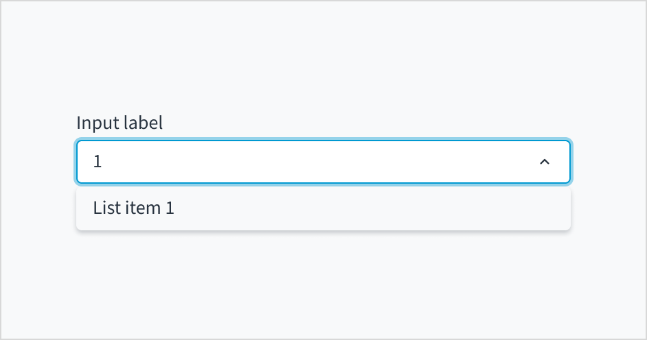
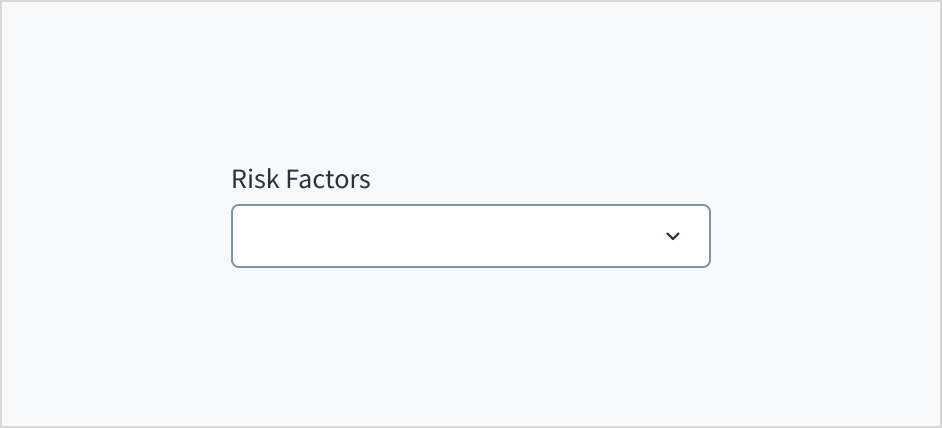
The dropdown component presents users with a set of options from which they select. Dropdowns progressively disclose options, preventing users from seeing too much information at one time. They can also be used to group information. Dropdowns are always supported by a field label or title that is positioned before the control.
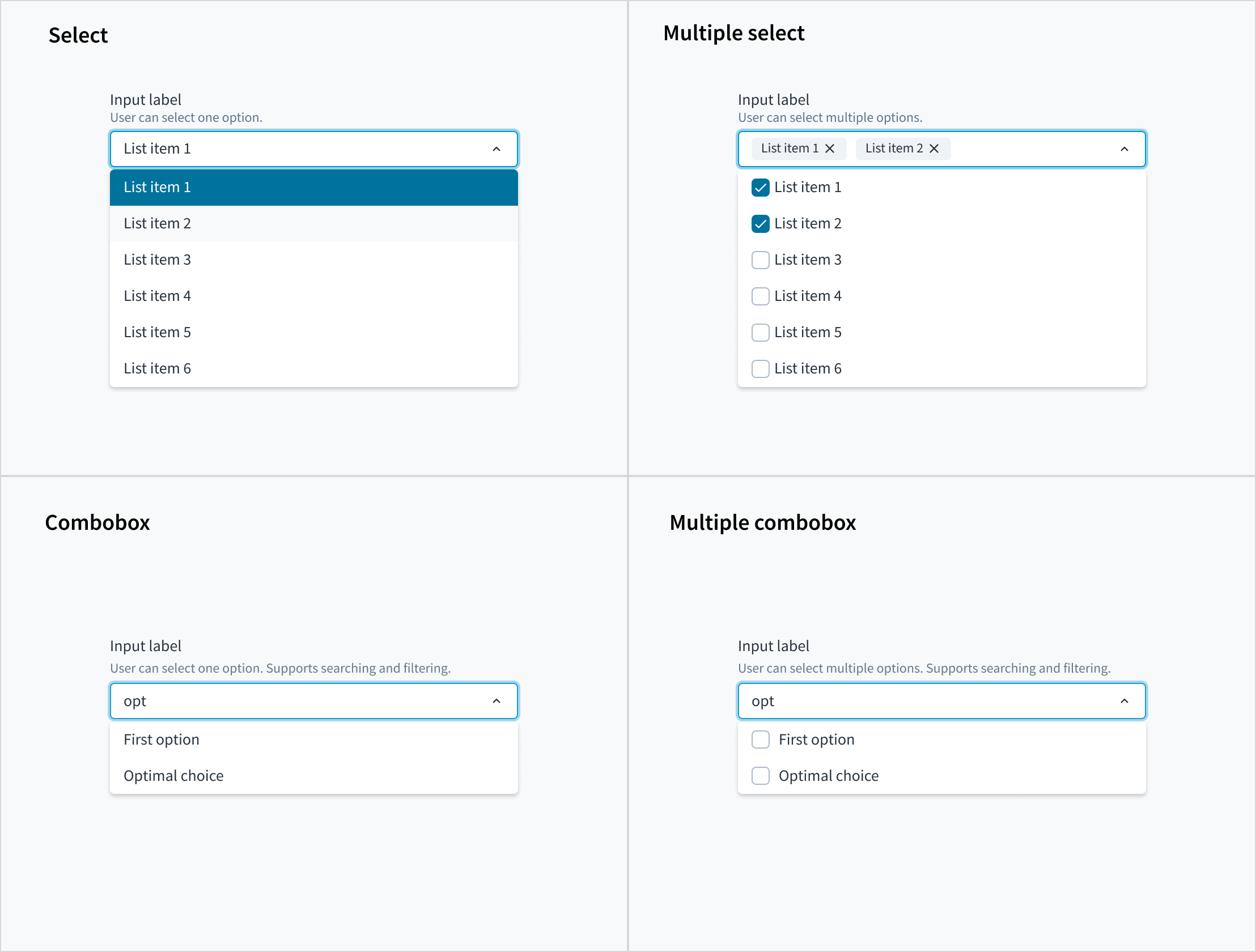
This component comes in four variants: select, multiple select, combobox, and multiple combobox.
The multiple combobox variant of the dropdown enables users to filter longer lists to only the selections matching a query. The user can select multiple options from the list.
Jutro accommodates dropdown menus with typeahead input fields. Users can manually enter text to filter the dropdown items. This feature is useful for helping users select from a long list.
Dropdowns with typeahead enabled provide suggestions as users begin typing. Selections appear based on the characters that users have entered. The more characters that users input into the field, the more refined the list becomes.
When using the dropdown for sorting purposes, consider arranging options in order. For example:
From most common to least common option
From simplest to most complex operation
From least to most risky option
The first option would appear at the top of the list.
Avoid arranging the list of options alphabetically unless it makes sense for your use case. Lists of countries and other known-item problems are often fine to alphabetize. However, you do need to ensure that users will know unambiguously the name of their selection.
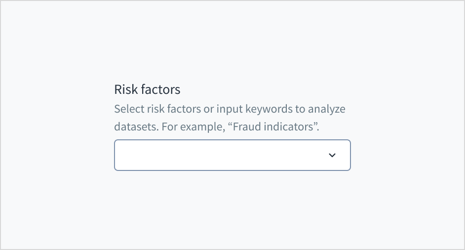
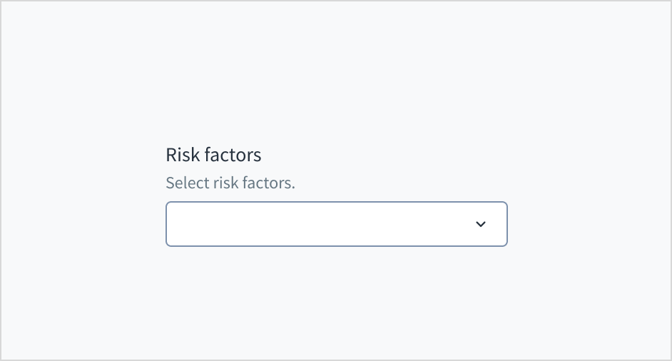
Use help text to show context and communicate what to select or how to select an option. Here are some examples of what you might include in help text:
An overall description of the dropdown options
Hints that assist the user in choosing the right selection
More context for why a user needs to make a selection
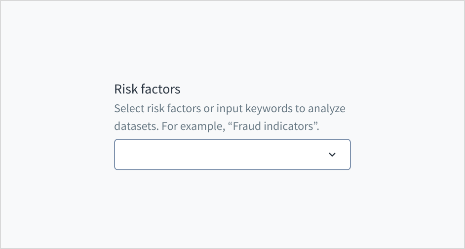
Only use help text for pertinent information. Avoid using help text that simply restates the same information that appears in the label.
Use sentence case for help text. Write 1-2 short, complete sentences that end with a period.
Do use help text to show context.
Don't use help text to simply restate the same information that appears in the label.
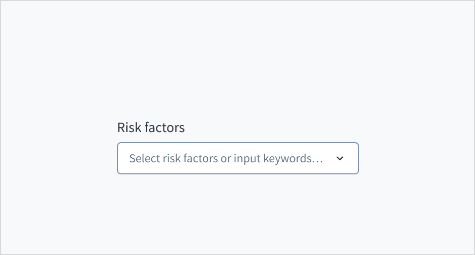
Don't put placeholder text in the text entry field. Placeholder text strains users' short-term memory because it disappears once a value is entered. It also poses additional burdens for users with visual and cognitive impairments.
Instead, place hints and instructions outside of the field.
The input field for multiple combobox follows the content guidelines for text fields.
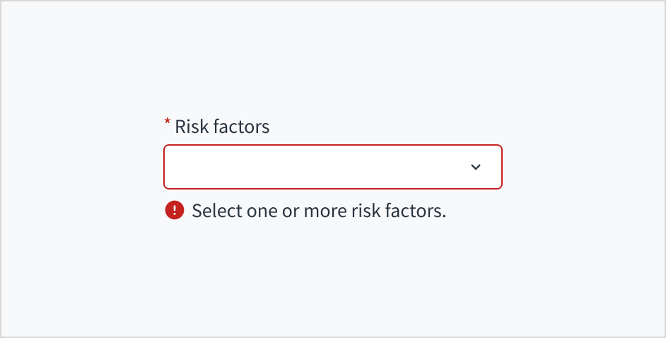
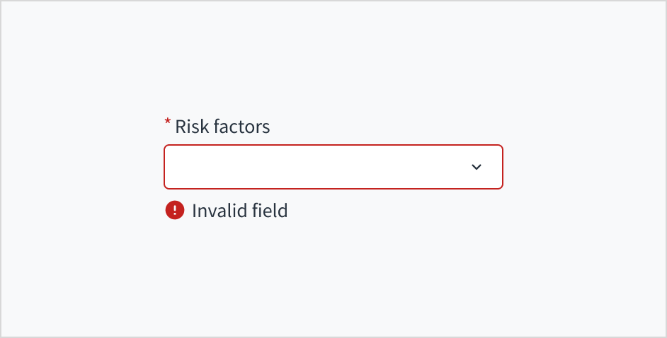
Error message text tells a user how to fix the error. In the case of the dropdown, errors are often related to something that must be fixed for in-line validation. For example, if someone doesn't select a risk factor and this is a required field, you can use error text to guide the user to a solution: “Select one or more risk factors.”
Use sentence case for error text. Write 1-2 short, complete sentences that end with a period.
Do use error text to guide the user and show them a solution.
Don't write ambiguous error messages or leave users guessing as to how to resolve a problem.
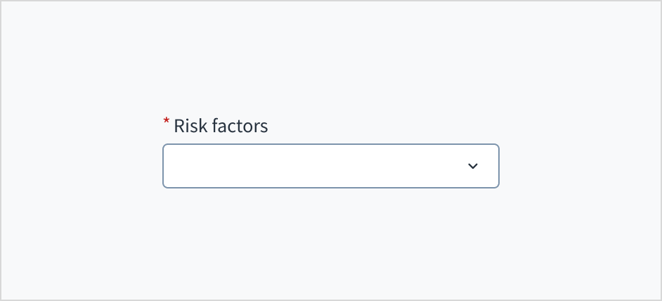
Use an asterisk (*) to indicate required fields. The asterisk precedes the field label. This helps users to easily locate which fields are required by scanning just the left-most character of the label.
In addition to marking required fields with an asterisk, it is recommended to include clear instructions at the top of the form, such as "All fields marked with an asterisk are mandatory," to ensure users understand the meaning of the asterisk.
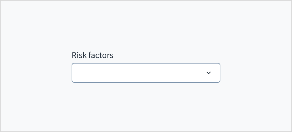
Do use an asterisk to indicate that a field is required.
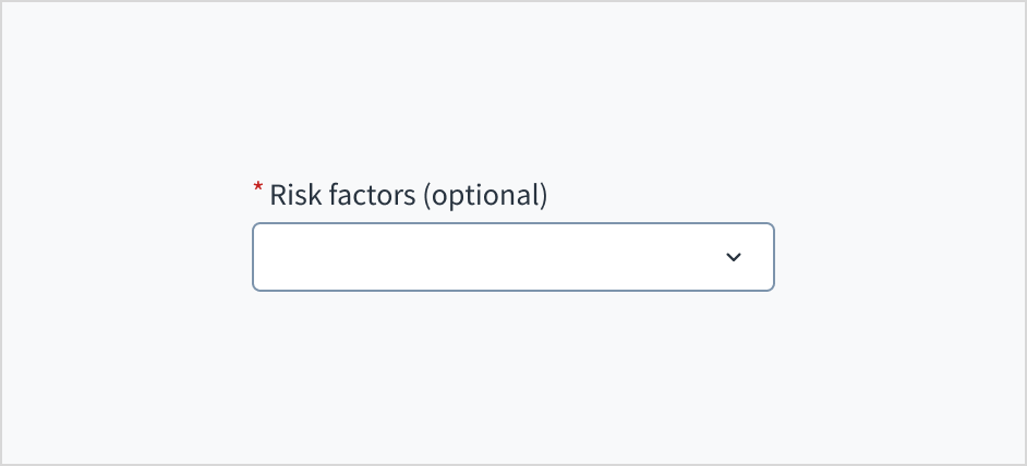
Don't use an asterisk to denote anything that is optional.
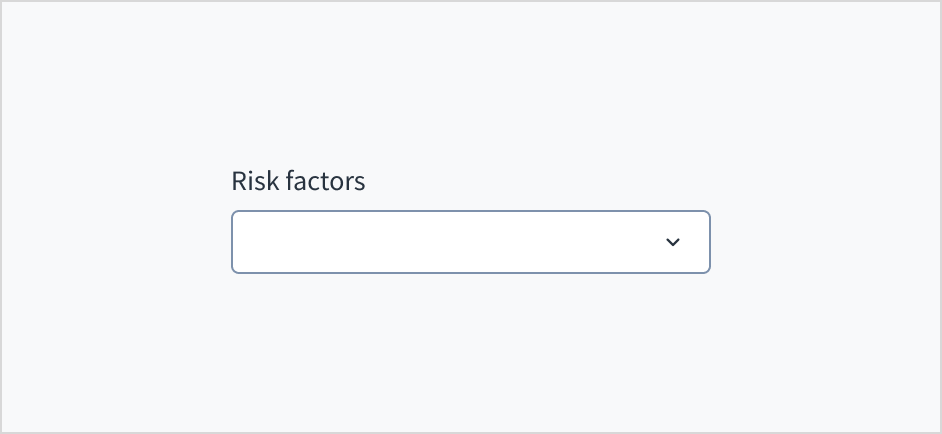
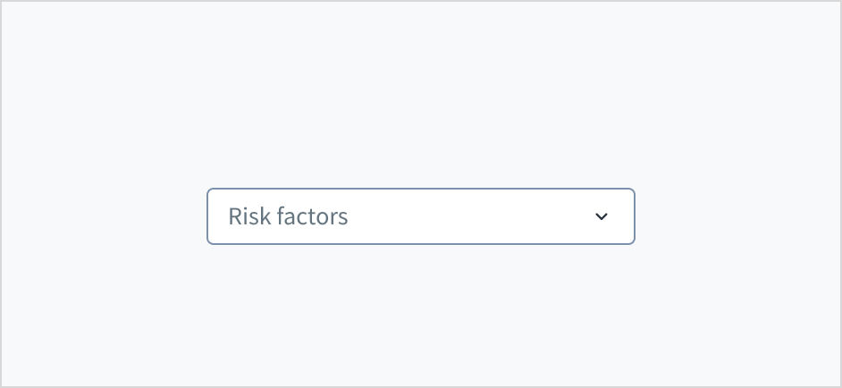
The multiple combobox variant appears with no value (default), placeholder text, or a filled input.
Visual
State
Description
No value (default)
Indicates to the user that no value has been selected and there is no placeholder.
Placeholder
Indicates to the user that no value has been selected. The placeholder is grayed out.
Filled input
Indicates to the user that the input is filled with data.
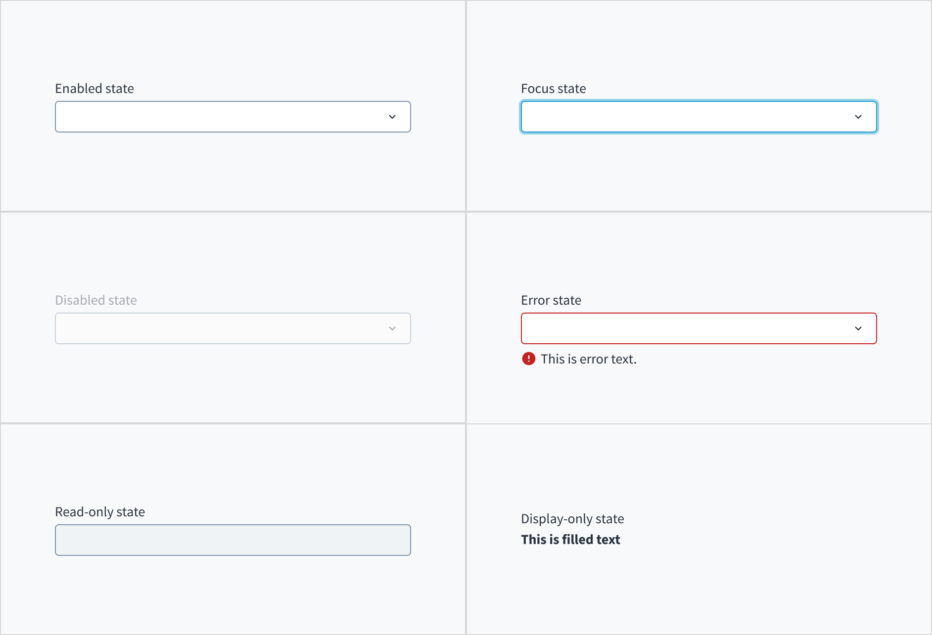
Multiple combobox also has interactive states for enabled, focus, disabled, error, read-only, and display-only.
State
Description
Enabled
Indicates to the user that the element is enabled for interaction.
Focus
Indicates to the user which UI element in the system is focused.
Disabled
Indicates to the user that the input value can't be changed because of local factors. For example, a checkbox above the input field must be checked to access this input field. The user can take action to enable it by interacting with the page.
Error
Indicates that the user has made a validation error. Error text provides corrective feedback to users.
Read-only
Indicates to the user that the input value can't be changed because of outside factors. For example, lack of write access. The user can take action to enable it by, for example, contacting an administrator.
Display-only
The display-only state is used for two cases:
A UI element is used in display mode.
A UI element is displayed in edit mode, but is never editable.
This state was called “read-only” before.
The following image illustrates multiple combobox interactive states.
The dropdown is expanded and collapsed using the Spacebar. Users navigate through the options using the arrow keys and select by means of the Spacebar or Enter key.
The aria-labelledby establishes a programmatic association between the input field and its label. The WAI-ARIA attribute of aria-autocomplete='list' communicates that a list of choices will appear from which the user can choose, but the edit box retains focus. Selecting the 'required' option in Storybook adds both the 'required' and 'aria-required="true"' attributes to the input field.
The contrast ratio of textual elements against their background is above 4.5:1.
Non-textual content that needs to convey meaning (like icons and focus indicators) has a contrast ratio of at least 3:1 with its adjacent colors.
The item is operable using a keyboard, as well as using a mouse.
Content is accessible using screen readers, such as JAWS and VoiceOver.
Accessibility conformance ultimately depends on how this component is implemented and customized. Changes made by the content author can affect accessibility. For details on our shared responsibility model, please review our full Jutro accessibility statement.
When using this component within your application:
Assist users in understanding the content by avoiding very long option names.
Avoid using implicitly focusable elements such as buttons, checkboxes and links, or implicitly semantic content such as headings within your dropdown components.
Note: There are deprecated versions of this component. For documentation, see the Dropdown (deprecated) page.
Make sure to understand the Design System components API surface, and the implications and trade-offs. Learn more in our introduction to the component API.
Warning: Passing child options to the MultipleSelect component other than SelectOption is not supported. Although it might work, it might result in unexpected behaviors or be affected by changes introduced in future releases.
If set to true, adds an icon button that appears when at least one option is selected, or any text is typed. It allows the user to unselect all selected options and delete the typed text at once.
If set to true, the tags are displayed permanently in expanded view. This overrides the default behavior where excess tags collapse into a tag containing aggregated options.
Value of the component, in the form of an array of currently selected options. Takes precedence over initialValue. If this prop is passed, component works in controlled mode and its value will change only if this prop changes.
The useFilteredOptions hook provides the mechanisms to handle the options displayed based on user input.
Parameters received:
initialOptions: TValue[]. Initial list of options in the component without any filter applied
Output:
An object with:
filteredOptions: TValue[]. Array with the options resulting from applying the filter
onSearch: function. Function that takes the onSearch input event and filters the options based on it. This can be assigned to the onSearch event of the component.
resetFilter: function. Used to reset the options filtering, setting filteredOptions array to its initial value
When the tags of the selected options exceed the component space, some of them collapse into a single tag that indicates the number of selected options not being displayed. Clicking this tag expands the component vertically to display all the tags of selected options. Once expanded, the option tags cannot be collapsed.
To override this behavior and display all option tags permanently in an expanded view, set the tagsAlwaysExpanded property to true. To compare the two behaviors, see examples.
All dropdown related components define the list of available options through the children property of ReactNode type. You can use only the following subcomponents as children:
SelectOption used by Select and MultipleSelect
ComboboxOption used by Combobox and MultipleCombobox
Warning:
SelectOption and ComboboxOption must only be used in the context of their respective 'parent' component. Although they might work in isolation, this is not a supported feature.
Select and MultipleSelect components are only intended to accept SelectOption components as children. Although they might be able to display or handle other types or HTML elements, this is not a supported feature.
Combobox and MultipleCombobox components are only intended to accept ComboboxOption components as children. Although they might be able to display or handle other types or HTML elements, that is not a supported feature.
Any usage of these components outside of their supported scope falls outside of the non-breaking changes commitment, as such usage is not considered a part of the components contract. These usages might result in unexpected behaviors or be affected by changes introduced in future releases.
Jutro inputs have implemented imperative handlers as a mechanism to provide access to some common native features that might be useful for you. The following features are available:
Set focus to allow you to set the user focus into a specific component
Blur to remove the focus from the component
Scroll to the component so that you can take the user to a specific area of the page.
These features are provided through the ref property, which exposes them as follows:
Although some Jutro components might provide complementary features or a helper function to facilitate the validation process, it is your responsibility as a developer to handle the validation of any user input (using or not using the complementary helpers) and to decide what error messages to show.
Jutro components behave based on the developer implementation.
When are error messages displayed?
Error messages are only displayed when you pass them to the component through the stateMessages property. This property receives an object with the following content:
The component displays every error message provided in the same order as in the array.
When does validation occur?
This is your decision as a developer. As components do not determine when the validation is performed or when the error must be displayed, you need to implement the logic to handle it according to the project requirements, for example while the user is editing the content, when the component loses focus, and on form submission.
Check out the Usage section for details about how and when to use MultipleCombobox and the specific tabs for details on the features that the component provides.
The useFilteredOptions hook is used to implement the filter mechanism based on user input. However, for clarity and simplicity it is not included in some examples. You can find more detailed information about the hook here.
Note: Most of the features and properties of the four provided Dropdown components do not have usage differences. Some examples from other components might be relevant for MultipleCombobox too.
You can disable completely any of the dropdown components by setting the disabled property to true. You can also disable only the specific options using the disabled property of the SelectOption and ComboboxOption components. In case that the whole component is disabled, the disabled property of the options does not have any effect.
This is a common behavior for all of the dropdown components: when the value property is set, the user cannot directly modify the component, it will be managed entirely by the developer implementation.
This example is applicable to all dropdown components:
exportfunctionMultiComboControlled(){
const[updatedValue, setNewValue]=useState([]);
constonChange=(e, newValue)=>{
setNewValue(newValue);
};
const options =[
<ComboboxOption
value={{
id:'1',
label:'Option 1',
}}
/>,
<ComboboxOption
value={{
id:'2',
label:'Option 2',
}}
/>,
<ComboboxOption
value={{
id:'3',
label:'Option 3',
}}
/>,
<ComboboxOption
value={{
id:'4',
label:'Option 4',
}}
/>,
<ComboboxOption
value={{
id:'5',
label:'Option 5',
}}
/>,
];
return(
<div>
<MultipleCombobox
label="Choose values"
secondaryLabel="This value will be passed to the list of options below"
Using the ref property and the imperative handlers provided ('focus', 'blur' and 'scrollIntoView') it is possible to perform different native actions. An example is to set the focus on the component.
This is an example using MultipleCombobox component:
The dropdown components do not handle the validation process, but you can handle the error status and the messages to be displayed using the stateMessages property.
The state messages logic works for all dropdown components, below is an example of MultipleSelect:
Example implementation with asynchronous API calls
Asynchronous API calls are not handled inside the basic useFilteredOptions hook. For this purpose you might need to create your own implementation catered to your specific needs. This is an example of a custom hook for the MultipleCombobox component:
The MultipleCombobox component's default behavior is to collapse option tags when they cannot fit in a single line. The component expands to a multiline view when you click on the tag containing aggregated options. This behavior is controlled by the tagsAlwaysExpanded property, and by default it's set to false.
To enable clearing the input with a single click on the icon button, set the clearable property to true. The button appears when at least one option is selected, or any text is typed. It allows the user to unselect the selected options and delete the typed text at once.
Added the tagsAlwaysExpanded property, which, when set to true, overrides the Collapsed option tags default behavior.
Added the clearable property, which, when set to true, allows the user to clear the selected options or delete the typed text with a single click on the icon button.
New @jutro/components/MultipleCombobox component introduced.
The previous TypeaheadMultiSelectField component was deprecated and moved to the @jutro/legacy package. To view its documentation, switch to a version of the documentation older than 10.0.
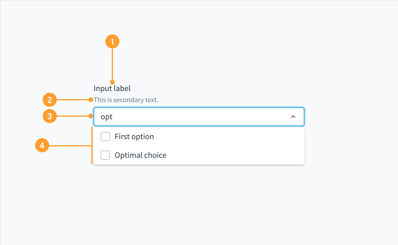 Anatomy of the dropdown component, multiple combobox variant.