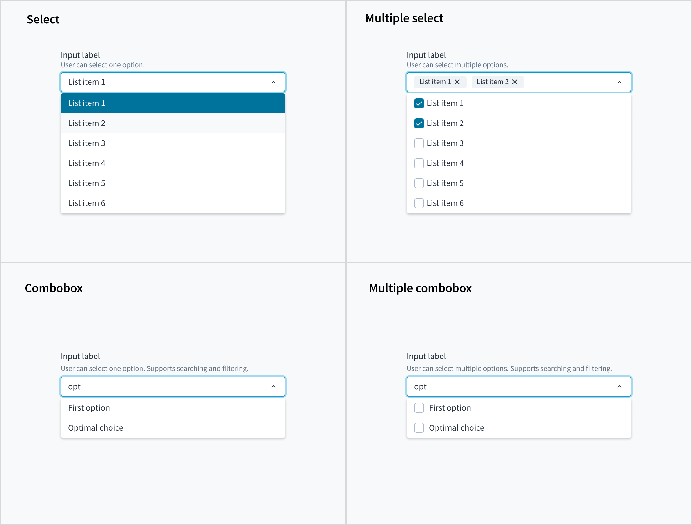
Combobox
Examples
Check out the Usage section for details about how and when to use Combobox and the specific tabs for details on the features that the component provides.
The useFilteredOptions hook is used to implement the filter mechanism based on user input. However, for clarity and simplicity it is not included in some examples. You can find more detailed information about the hook here.
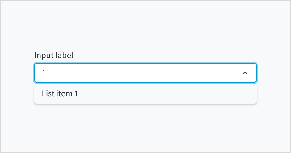
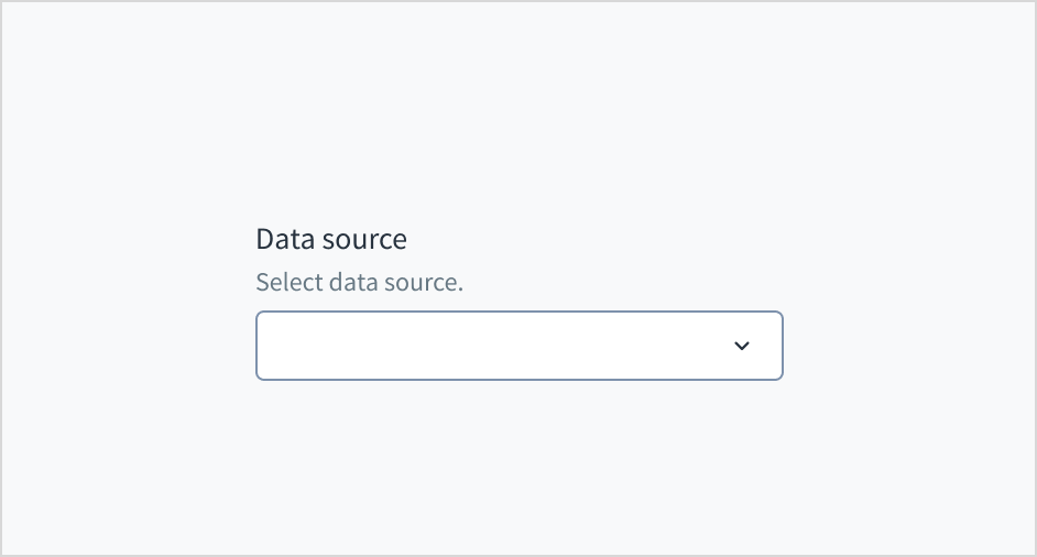
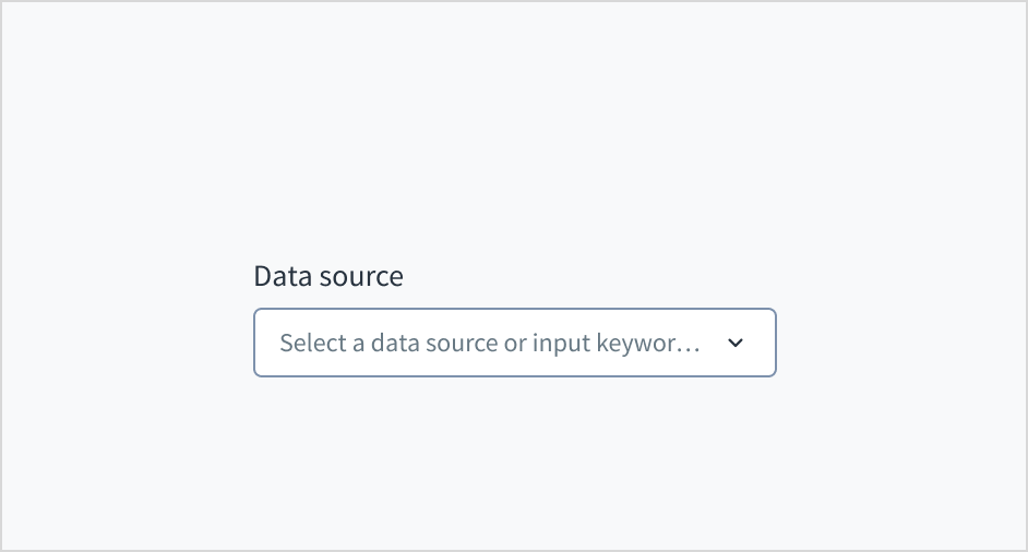
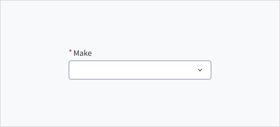
Combobox too.Combobox filtered by user input
export function ComboWithFilter() {
  const CHARACTERS = [
    { id: '1', label: 'Anakin Skywalker' },
    { id: '2', label: 'Luke Skywalker' },
    { id: '3', label: 'Master Yoda' },
    { id: '4', label: 'Han Solo' },
  ];

  const { filteredOptions, onSearch, resetFilter } =
    useFilteredOptions(CHARACTERS);

  return (
    <Combobox
      label="Select 1 option"
      secondaryLabel="Options filtered by user input"
      onSearch={onSearch}
      onBlur={resetFilter}>
      {filteredOptions.map(({ id, label }) => (
        <ComboboxOption
          key={id}
          value={{ id, label }}
        />
      ))}
    </Combobox>
  );
}
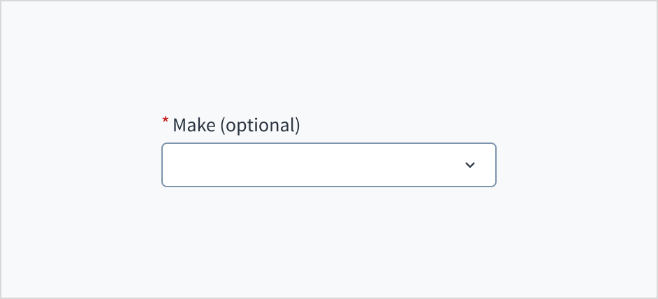
Combobox with initial value
Define an initial value for the Combobox:
export function ComboWithInitial() {
  const CHARACTERS = [
    { id: '1', label: 'Anakin Skywalker' },
    { id: '2', label: 'Luke Skywalker' },
    { id: '3', label: 'Master Yoda' },
    { id: '4', label: 'Han Solo' },
  ];

  const { filteredOptions, onSearch, resetFilter } =
    useFilteredOptions(CHARACTERS);

  return (
    <Combobox
      label="Select 1 option"
      secondaryLabel="Options filtered by user input"
      initialValue={CHARACTERS[2]}
      onSearch={onSearch}
      onBlur={resetFilter}>
      {filteredOptions.map(({ id, label }) => (
        <ComboboxOption
          key={id}
          value={{ id, label }}
        />
      ))}
    </Combobox>
  );
}
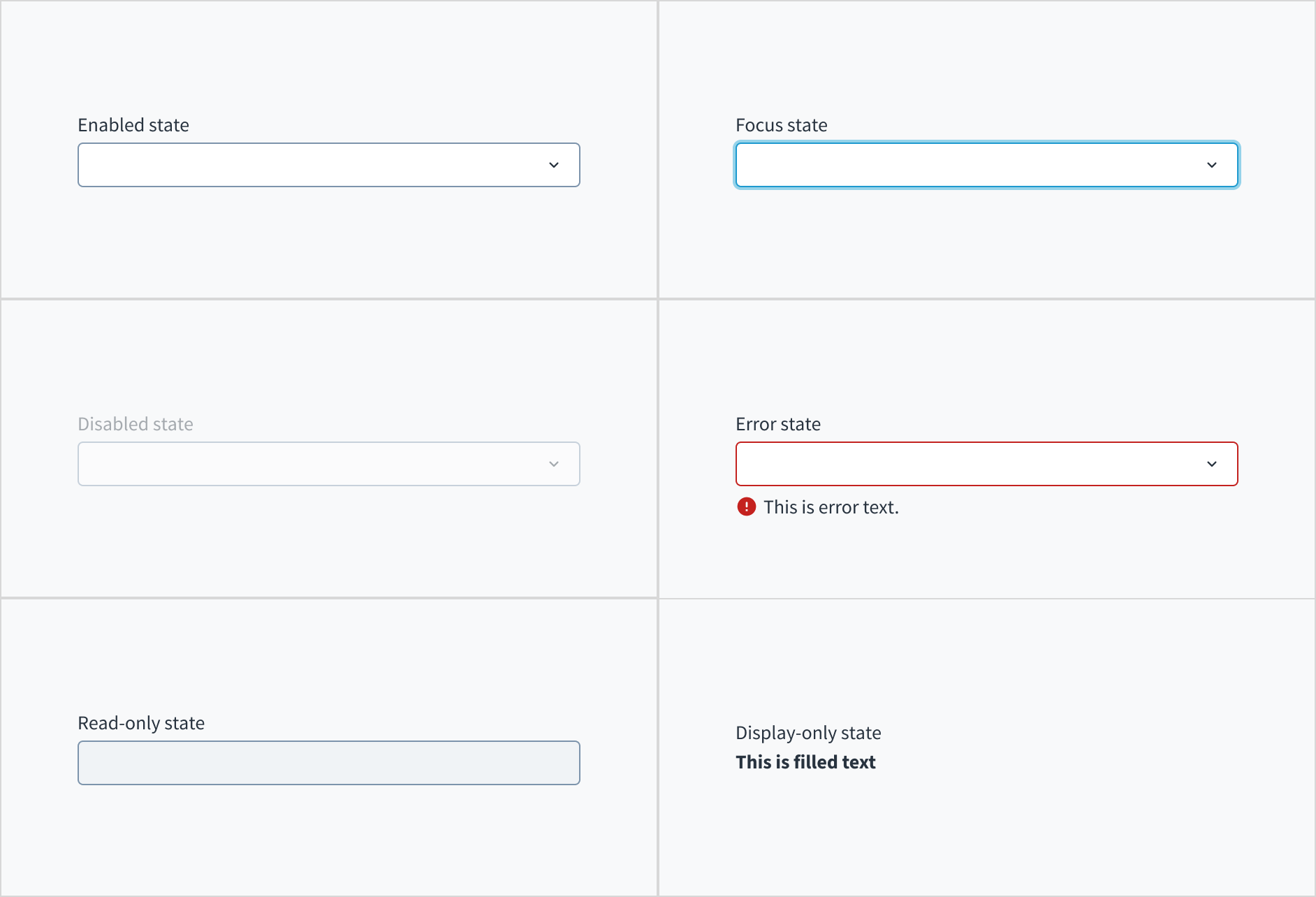
Disabled dropdown or options
You can disable completely any of the dropdown components by setting the disabled property to true. You can also disable only the specific options using the disabled property of the SelectOption and ComboboxOption components. In case that the whole component is disabled, the disabled property of the options does not have any effect.
Disabled dropdown
Example of a disabled dropdown component using the Combobox component.
<Combobox
  label="Your favorite character"
  initialValue={{ id: '1', label: 'Anakin' }}
  disabled={true}>
  <ComboboxOption
    value={{
      id: '1',
      label: 'Anakin',
    }}
  />
  <ComboboxOption
    value={{
      id: '2',
      label: 'Luke',
    }}
  />
</Combobox>
Disabled options
Example of how to disable some dropdown options using the Combobox component.
export function ComboWithDisabled() {
  const CHARACTERS = [
    { id: '1', label: 'Anakin Skywalker' },
    { id: '2', label: 'Luke Skywalker', disabled: true },
    { id: '3', label: 'Master Yoda' },
    { id: '4', label: 'Han Solo', disabled: true },
  ];

  const { filteredOptions, onSearch, resetFilter } =
    useFilteredOptions(CHARACTERS);

  return (
    <Combobox
      label="Select 1 option"
      secondaryLabel="Options filtered by user input"
      onSearch={onSearch}
      onBlur={resetFilter}>
      {filteredOptions.map(({ id, label, disabled }) => (
        <ComboboxOption
          key={id}
          value={{ id, label }}
          disabled={disabled}
        />
      ))}
    </Combobox>
  );
}
DisplayOnly dropdown
By setting the displayOnly property to true, the component value will be displayed as plain text.
An example is shown below:
<Combobox
  label="Your favorite characters (Combobox component)"
  initialValue={{ id: '1', label: 'Anakin' }}
  displayOnly={true}>
  <ComboboxOption
    value={{
      id: '1',
      label: 'Anakin',
    }}
  />
</Combobox>
Controlled component
This is a common behavior for all of the dropdown components: when the value property is set, the user cannot directly modify the component, it will be managed entirely by the developer implementation.
This example is applicable to all dropdown components:
export function ComboControlled() {
  const [updatedValue, setNewValue] = useState(null);

  const onChange = (e, newValue) => {
    setNewValue(newValue);
  };

  const options = [
    <ComboboxOption
      value={{
        id: '1',
        label: 'Option 1',
      }}
    />,
    <ComboboxOption
      value={{
        id: '2',
        label: 'Option 2',
      }}
    />,
    <ComboboxOption
      value={{
        id: '3',
        label: 'Option 3',
      }}
    />,
    <ComboboxOption
      value={{
        id: '4',
        label: 'Option 4',
      }}
    />,
    <ComboboxOption
      value={{
        id: '5',
        label: 'Option 5',
      }}
    />,
  ];

  return (
    <div>
      <Combobox
        label="Choose values"
        secondaryLabel="This value will be passed to the list of options below"
        onChange={onChange}>
        {options}
      </Combobox>
      <br />
      <Combobox
        label="Changes with the above"
        value={updatedValue}>
        {options}
      </Combobox>
    </div>
  );
}
Clear previously selected options
The user can always remove the options they have selected in a MultipleSelect or MultipleCombobox component. The Select and Combobox components, however, by default do not allow the user to clear a selected value. You can enable this feature using the placeholder and showPlaceholderAsOption properties - the provided placeholder will be available as the first option of the dropdown and, if the user selects it, it will clear the previous value they have selected.
You need to set these two properties as follows:
placeholdercannot be emptyshowPlaceholderAsOptionmust be set totrue.
See the example with the Combobox component:
<Combobox
  label="Your favorite character"
  initialValue={{ id: '1', label: 'Anakin' }}
  placeholder="Choose a character"
  showPlaceholderAsOption>
  <ComboboxOption
    value={{
      id: '1',
      label: 'Anakin',
    }}
  />
  <ComboboxOption
    value={{
      id: '2',
      label: 'Luke',
    }}
  />
</Combobox>
Set focus on the dropdown
Using the ref property and the imperative handlers provided ('focus', 'blur' and 'scrollIntoView') it is possible to perform different native actions. An example is to set the focus on the component.
This is an example using Combobox component:
export function ComboRef() {
  const selectRef = useRef(null);

  const setFocus = (e) => {
    selectRef?.current?.focus();
  };

  return (
    <div>
      <Button
        label="Set focus on Combobox"
        onClick={setFocus}></Button>
      <Combobox
        label="Get the focus from the button"
        ref={selectRef}>
        <ComboboxOption
          value={{
            id: '1',
            label: 'Option 1',
          }}
        />
        <ComboboxOption
          value={{
            id: '2',
            label: 'Option 2',
          }}
        />
      </Combobox>
    </div>
  );
}
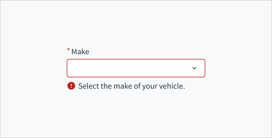
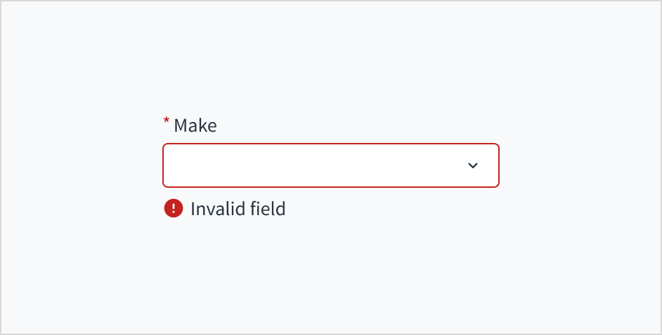
Component validation
The dropdown components do not handle the validation process, but you can handle the error status and the messages to be displayed using the stateMessages property.
The state messages logic works for all dropdown components, below is an example of MultipleSelect:
export function ComboValidation() {
  const [validationMessages, setValidationMessages] = useState({});

  const onChange = useCallback((e, newValue) => {
    setValidationMessages({});

    if (newValue && newValue.label !== 'Option 2') {
      setValidationMessages({
        error: ['You must select option number 2'],
      });
    }
  }, []);

  return (
    <Combobox
      label="Select option 2"
      stateMessages={validationMessages}
      onChange={onChange}>
      <ComboboxOption
        value={{
          id: '1',
          label: 'Option 1',
        }}
      />
      <ComboboxOption
        value={{
          id: '2',
          label: 'Option 2',
        }}
      />
      <ComboboxOption
        value={{
          id: '3',
          label: 'Option 3',
        }}
      />
      <ComboboxOption
        value={{
          id: '4',
          label: 'Option 4',
        }}
      />
      <ComboboxOption
        value={{
          id: '5',
          label: 'Option 5',
        }}
      />
    </Combobox>
  );
}
useFilteredOptions hook
Example implementation
useFilteredOptions hook provides basic data handling for filtering.
import React, { useState } from 'react';
import { IntlMessageShape } from '@jutro/prop-types';
import { useTranslator } from '@jutro/locale';

type SelectValue = {
    id: string;
    label: IntlMessageShape;
    [index: PropertyKey]: unknown;
};

/**
 * @typedef {Object} FilterHookReturnObject
 * @property {TValue[]} filteredOptions - array of filtered options
 * @property {function} onSearch - function that takes the onSearch input event
 * and filters the options based on it
 * @property {function} resetFilter - used to reset the filtering for options,
 * after using filteredOptions array resets to initial one
 * @property {function} onAddNew - function that adds new value to the internal
 * options array inside the hook and calls appendToSelection that is responsible
 * for selecting this new value inside the dropdown
 */

/**
 * Helper hook for filtering options based on user input.
 *
 * @param {TValue[]} initialOptions - initial list of options in component
 * @param {function} createNewValue - function for constructing value object
 * from string
 * @param {function} appendToSelection - callback that is responsible for
 * appending value to the controlled list of selected values
 *
 * @returns {FilterHookReturnObject} - helpers for filtering purposes:
 * filtered options array, onAddNew and onSearch function to be supplied
 * to component and resetFilter function
 */
export const useFilteredOptions = <TValue extends SelectValue = SelectValue>(
    initialOptions: TValue[],
    createNewValue?: (value: string) => TValue,
    appendToSelection?: (value: TValue) => void
): {
    filteredOptions: TValue[];
    onSearch: (event: React.ChangeEvent<HTMLInputElement>) => void;
    resetFilter: () => void;
    onAddNew: (newValue: string) => void;
} => {
    const translator = useTranslator();
    const [query, setQuery] = useState('');
    const [options, setOptions] = useState(initialOptions);

    // Basic filtering. This part should be changed to cover your needs.
    const filteredOptions = options.filter(val =>
        translator(val.label)
            .trim()
            .toLowerCase()
            .includes(query.trim().toLowerCase())
    );

    // Function that should be passed to the Combobox onSearch prop.
    // It gets the value of the search term inside Combobox.
    const onSearch = (event: React.ChangeEvent<HTMLInputElement>) => {
        setQuery(event.target.value);
    };

    // Function that is responsible for clearing the query
    // only when the Combobox is on active browser tab.
    // Typically connected to Combobox onBlur.
    const resetFilter = () => {
        if (document.visibilityState === 'visible' && document.hasFocus()) {
            setQuery('');
        }
    };

    // Function responsible on adding new values to both
    // internal state of filtered items and external
    // controlled state value
    const onAddNew = (newValue: string) => {
        const valueTransformed = createNewValue?.(newValue);

        setQuery('');

        if (valueTransformed) {
            // adds the value to the internal state
            setOptions(prevOptions => [...prevOptions, valueTransformed]);
            // adds the value to the controlled state
            appendToSelection?.(valueTransformed);
        }
    };

    return { filteredOptions, onSearch, resetFilter, onAddNew };
};
Example implementation with asynchronous API calls
Asynchronous API calls are not handled inside the basic useFilteredOptions hook. For this purpose you might need to create your own implementation catered to your specific needs. This is an example of a custom hook for the Combobox component:
import React, { useEffect, useState } from 'react';

import { Combobox, ComboboxOption } from '@jutro/components';
import { useTranslator } from '@jutro/locale';
import { IntlMessageShape } from '@jutro/prop-types';

type SelectValue = {
    id: string;
    label: IntlMessageShape;
    [index: PropertyKey]: unknown;
};

const someAPICallback = async query => {
    console.log('calling the API');

    const CHARACTERS = [
        { id: '1', label: 'Anakin Skywalker' },
        { id: '2', label: 'Luke Skywalker' },
        { id: '3', label: 'Master Yoda' },
        { id: '4', label: 'Han Solo' },
    ];

    const result = new Promise(resolve => {
        setTimeout(
            () =>
                resolve(
                    CHARACTERS.filter(val =>
                        val.label
                            .trim()
                            .toLowerCase()
                            .includes(query.trim().toLowerCase())
                    )
                ),
            3000
        );
    });

    return result;
};

const useFilteredOptions = <TValue extends SelectValue = SelectValue>(): {
    filteredOptions: TValue[];
    onSearch: (event: React.ChangeEvent<HTMLInputElement>) => void;
    resetFilter: () => void;
    loading: boolean;
} => {
    const [query, setQuery] = useState('');
    const [filteredOptions, setFilteredOptions] = useState([]);
    const [loading, setLoading] = useState(true);

    useEffect(() => {
        setLoading(true);

        // This is a simple example only, API callback should be debounced
        // to ensure the async operation does not overlap with the query change.
        someAPICallback(query).then((opts: TValue[]) => {
            setFilteredOptions(opts);
            setLoading(false);
        });
    }, [query]);

    // Function that should be passed to the Combobox onSearch prop.
    // It gets the value of the search term inside Combobox.
    const onSearch = (event: React.ChangeEvent<HTMLInputElement>) => {
        setQuery(event.target.value);
    };

    // Function that is responsible for clearing the query
    // only when the Combobox is on active browser tab.
    // Typically connected to Combobox onBlur.
    const resetFilter = () => {
        if (document.visibilityState === 'visible' && document.hasFocus()) {
            setQuery('');
        }
    };

    return { filteredOptions, onSearch, resetFilter, loading };
};

export const Welcome: React.FC = () => {
    const translator = useTranslator();
    const { filteredOptions, onSearch, resetFilter, loading } =
        useFilteredOptions();

    return (
        <Combobox
            label="Select 1 option"
            secondaryLabel="Options filtered by user input"
            onSearch={onSearch}
            onBlur={resetFilter}
        >
            {loading ? (
                <span>{translator('Loading...')}</span>
            ) : (
                filteredOptions.map(({ id, label }) => (
                    <ComboboxOption key={id} value={{ id, label }} />
                ))
            )}
        </Combobox>
    );
};
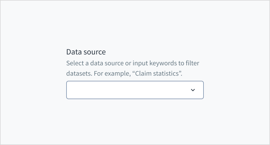
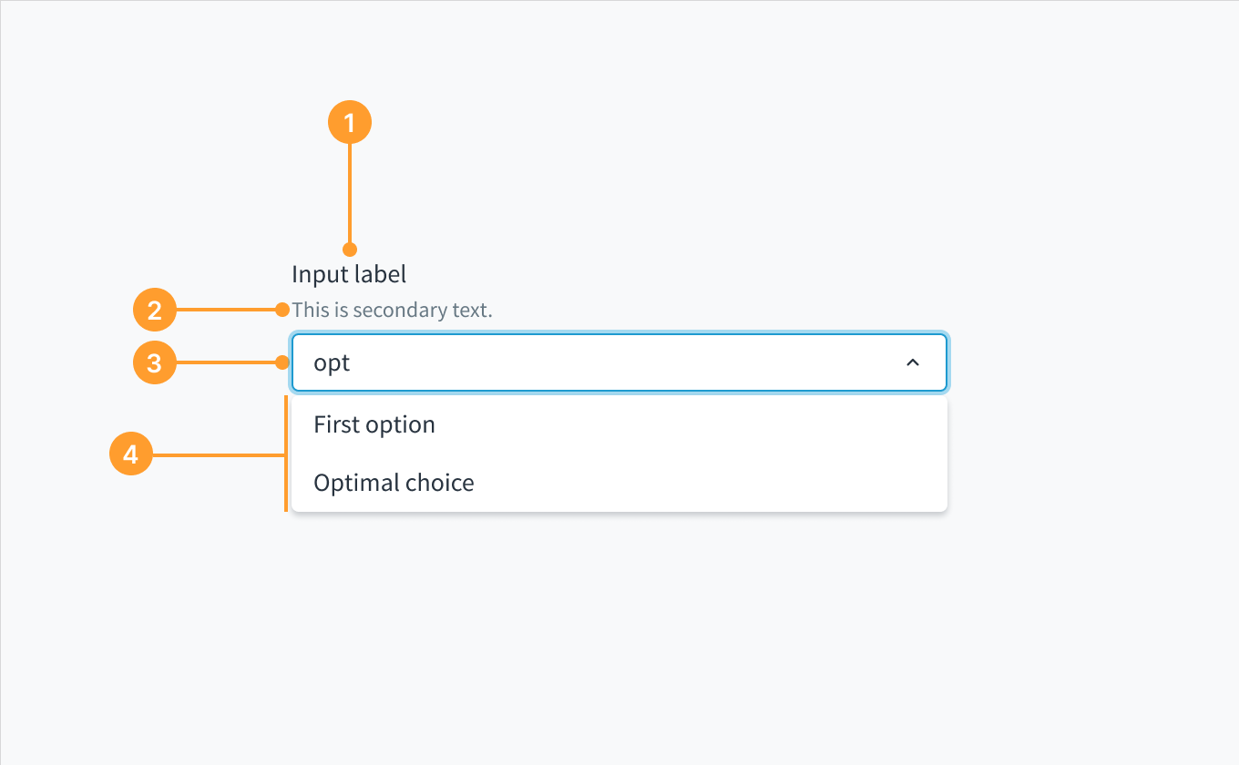 Anatomy of the dropdown component, combobox variant.