Overflow menu
Examples
Overflow menus are rendered using the DropdownMenu component. The renderTrigger property determines the component the DropdownMenu is rendered as.
When the user activates the component, it renders a tree of any of the following:
DropdownMenuLinkDropdownMenuSeparatorDropdownMenuHeader
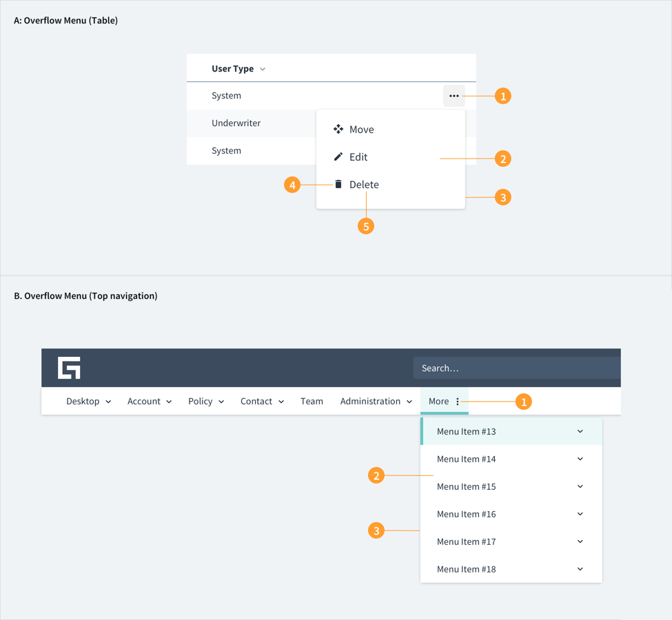
Check out the Usage section for details about how to design an overflow menu properly, and the different configuration options we provide.
Basic Example
The following example demonstrates how to create a simple DropdownMenu component. The renderTrigger property defines a button which opens the menu when clicked.
<DropdownMenu
  id="dropdown-menu"
  renderTrigger={(
    {
      id,
      menuId,
      ref,
      'aria-haspopup': ariaHasPopup,
      'aria-expanded': ariaExpanded,
      title = 'Menu',
      onKeyDown,
    },
    toggleMenu
  ) => {
    return (
      <Button
        id={id}
        ref={ref}
        aria-expanded={ariaExpanded}
        aria-controls={menuId}
        aria-haspopup={ariaHasPopup}
        onClick={() => toggleMenu()}
        onKeyDown={onKeyDown}
        label={title}
      />
    );
  }}>
  <DropdownMenuLink>First menu item</DropdownMenuLink>
  <DropdownMenuLink>Second menu item</DropdownMenuLink>
  <DropdownMenuLink>Third menu item</DropdownMenuLink>
</DropdownMenu>
Headers and separator example
You can use headers and separators to create separation between groups of options.
<DropdownMenu
  id="dropdown-menu"
  renderTrigger={(
    {
      id,
      menuId,
      ref,
      'aria-haspopup': ariaHasPopup,
      'aria-expanded': ariaExpanded,
      title = 'Menu',
      onKeyDown,
    },
    toggleMenu
  ) => {
    return (
      <Button
        id={id}
        ref={ref}
        aria-expanded={ariaExpanded}
        aria-controls={menuId}
        aria-haspopup={ariaHasPopup}
        onClick={() => toggleMenu()}
        onKeyDown={onKeyDown}
        label={title}
      />
    );
  }}>
  <DropdownMenuLink>First menu item</DropdownMenuLink>
  <DropdownMenuLink>Second menu item</DropdownMenuLink>
  <DropdownMenuSeparator />
  <DropdownMenuLink>Separated menu item</DropdownMenuLink>
  <DropdownMenuSeparator />
  <DropdownMenuHeader title="Header text">
    <DropdownMenuLink>First header menu item</DropdownMenuLink>
    <DropdownMenuLink>Second header menu item</DropdownMenuLink>
  </DropdownMenuHeader>
</DropdownMenu>
Drop up example
You can use the dropUp property to render the menu above the button when clicked.
<DropdownMenu
  id="dropdown-menu"
  dropUp={true}
  renderTrigger={(
    {
      id,
      menuId,
      ref,
      'aria-haspopup': ariaHasPopup,
      'aria-expanded': ariaExpanded,
      title = 'Menu',
      onKeyDown,
    },
    toggleMenu
  ) => {
    return (
      <Button
        id={id}
        ref={ref}
        aria-expanded={ariaExpanded}
        aria-controls={menuId}
        aria-haspopup={ariaHasPopup}
        onClick={() => toggleMenu()}
        onKeyDown={onKeyDown}
        label={title}
      />
    );
  }}>
  <DropdownMenuLink>First menu item</DropdownMenuLink>
  <DropdownMenuLink>Second menu item</DropdownMenuLink>
  <DropdownMenuLink>Third menu item</DropdownMenuLink>
</DropdownMenu>