Examples
Check out the Usage section for details about how and when to use the Toast component.
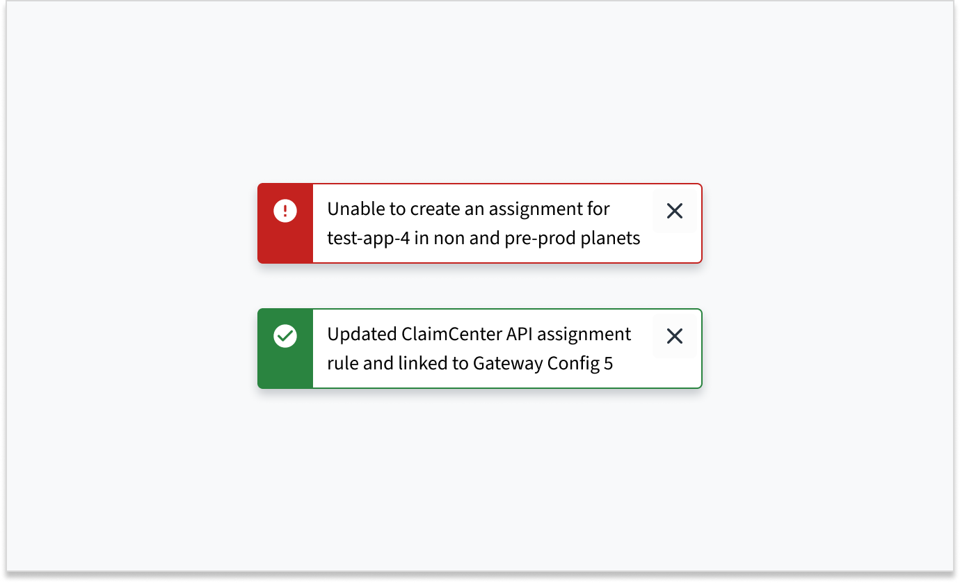
Basic toast
The toast appears when you click the button and stays on the screen for 5 seconds.
You can set this duration in milliseconds. There is no upper limit to how long the toast can stay on the screen. However, the autoClose timer pauses when you hover over the toast or when the page loses focus.
import React from 'react';
import { Button, ToastProvider } from '@jutro/components/';

export const BasicToast = () => {

  const handleClick = () => {
    ToastProvider.toast({
      message: 'This is a toast message!',
      autoClose: 5000,
    });
  };

  return (
    <div>
      <ToastProvider />
      <Button
        label="Show toast"
        onClick={handleClick}
      />
    </div>
  );
};
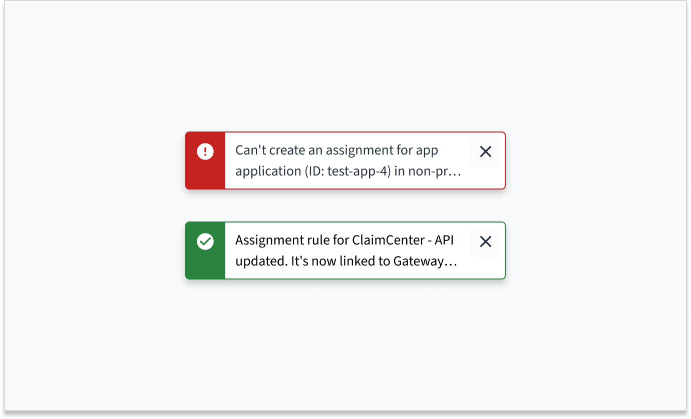
Toast link
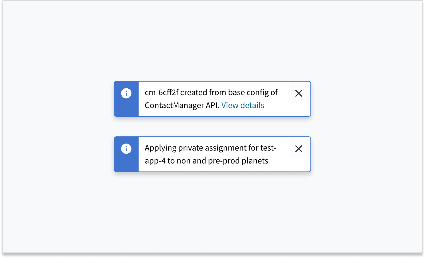
You can add a link inside a toast using the prop linkProps. It accepts all the Link component props.
Visit the Link component section to learn more about its usage.
import React from 'react';
import { Button, ToastProvider } from '@jutro/components/';

export const ToastLink = () => {

  const handleClick = () => {
    ToastProvider.toast({
      message: 'This is a toast message',
      linkProps: {
        children: 'This is a link inside a toast',
        href: 'https://docs.guidewire.com/jutro/documentation/latest/',
        target: '_blank'
    },
    });
  };

  return (
    <div>
      <Button
        label="Show toast with a link"
        onClick={handleClick}
      />
    </div>
  );
};
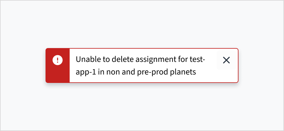
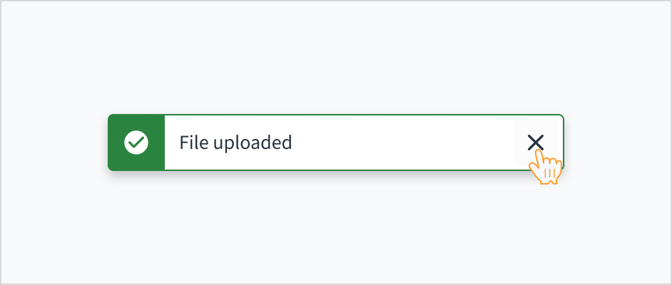
Toast types
The type prop determines the visual style and importance of the toast notification. You can use it to specify the category of the toast message. It accepts the following values:
infosuccesswarningerror
import React from 'react';
import { Button, ToastProvider } from '@jutro/components/';

export const ToastTypes = () => {

  const showToast = (type, message) => {
    ToastProvider.toast({
      message,
      autoClose: 5000,
      type
    });
  };

  return (
    <div style={{ display: 'flex', gap: '1.5rem', flexWrap: 'wrap'}}>
      <Button
        label="Info toast"
        onClick={() => showToast('info', 'This is an info toast message!')}
      />
      <Button
        label="Success toast"
        onClick={() => showToast('success', 'This is a success toast message!')}
      />
      <Button
        label="Warning toast"
        onClick={() => showToast('warning', 'This is a warning toast message!')}
      />
      <Button
        label="Error toast"
        onClick={() => showToast('error', 'This is an error toast message!')}
      />
    </div>
  );
};
Actions after closing toast
The onClosed prop allows you to add a function that is called upon closing the toast. In this example, it changes the text of the button.
Additionally, it uses the autoFocus prop to change automatically the focus to the toast close button.
import React, { useState } from 'react';
import { Button, ToastProvider } from '@jutro/components/';
export const CloseToast = () => {
const [buttonLabel, setButtonLabel] = useState('Show toast');
const handleClick = () => {
ToastProvider.toast({
message: 'Close this toast to change the button text',
autoFocus: true,
autoClose: false,
toastId: 'errorToast',
onClosed: () => {
setButtonLabel('Toast closed');
setTimeout(() => {
setButtonLabel('Show toast');
}, 5000);
}
});
};
return (
<div>
<Button
label={buttonLabel}
onClick={handleClick}
/>
</div>
);
};
Usage
Overview
A toast notification communicates system-generated information in response to user activity. This may include information about an update, confirmation, or a completed action. Toasts overlay content in the upper-right corner of the screen. They appear for a predefined time of 5 seconds and can be dismissed by the user.
When to use
- To display process related information, such as confirmation that a message was sent or that an update was completed.
- For brief, non-disruptive messages that don't require the immediate attention of users.
When not to use
- When displaying field-specific information. In this case, consider using an inline notification, popover, or field-status message.
- For critical information that requires the user's attention and resolution. In this case, consider using a popover, field-status message, or modal.
- When you know that your message will exceed the character limit for toasts (approximately 75 characters). In this case, consider using a different message type that is appropriate to your use case, such as banner.
Types
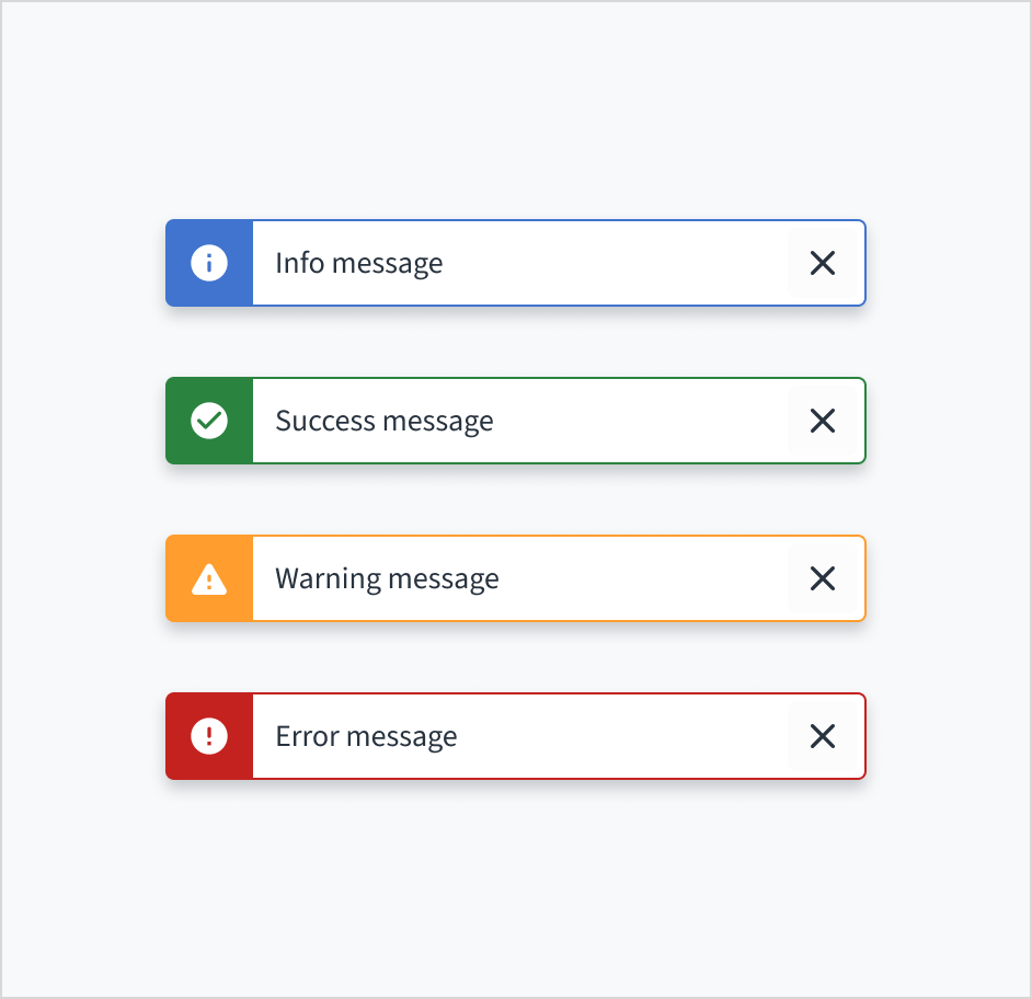
Toast notifications are based on the severity of the message. They include the following types:
| Type | Purpose |
|---|
| Info | Provides information regarding an operation |
| Success | Indicates a successful operation |
| Warning | Indicates potential issues with an operation |
| Error | Indicates that an operation has encountered errors |
Anatomy
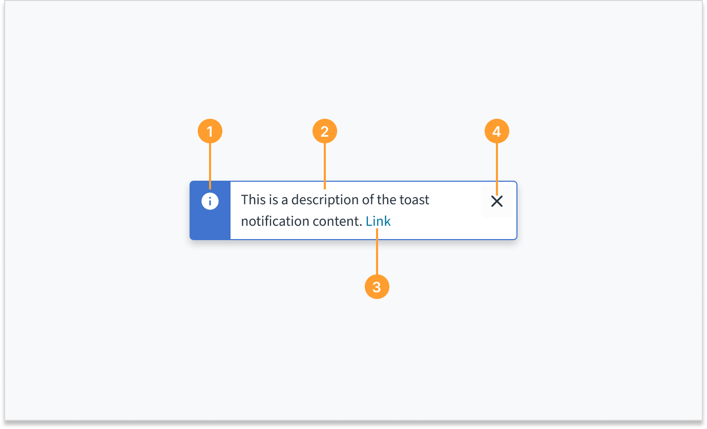
Toast notifications consist of the following elements:
- Icon: Provides a visual indication of the message severity.
- Description: Briefly describes the action taken, the current status, or provides additional context. The toast description can contain up to 2 lines of wrapped text.
- Link (optional): Provides a means to view details or direct users to another object. Links are standalone when they are used in toast notifications. They cannot appear inline with other text.
- Close button: Dismisses the notification. Toast notifications are always dismissible. If the user doesn't dismiss the toast, it automatically disappears after 5 seconds.
Sizing and placement
Toast notifications have a fixed width. The height of toasts grows with content up to 2 lines of wrapped text.
Toast notifications slide in and out from the upper-right corner of the screen.
Multiple toasts may be displayed at once. When this happens, the toasts appear stacked in the upper-right corner of the screen, with the most recent appearing at the top.
Content
General writing guidelines
- Use sentence case for all aspects of designing Guidewire product interfaces. Don't use title case.
- Use present tense verbs and active voice in most situations.
- Use common contractions to lend your copy a more natural and informal tone.
- Use plain language. Avoid unnecessary jargon and complex language.
- Keep words and sentences short.
Toast notification description
The toast notification description summarizes the action taken, current status, or additional context, and may contain up to 2 lines of text.
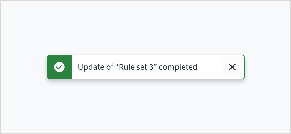
If the toast's description is a single sentence fragment (for example, "Item archived"), don't add a period to the end.
Writing for toast notifications
Use concise language
Toast notifications provide a limited amount of space for content. Use concise language so that users can quickly scan the text and understand the notification. The ideal length for toasts is two lines or less.
To create clear, concise, and useful toast notifications, ensure that the content:
- Focuses on a single idea or subject
- Remains minimal and direct
- Provides sufficient context for clarity
- Is limited to 2 lines of wrapped text (approximately 61 to 75 characters, including spaces and punctuation)
Do keep the information concise and clear.
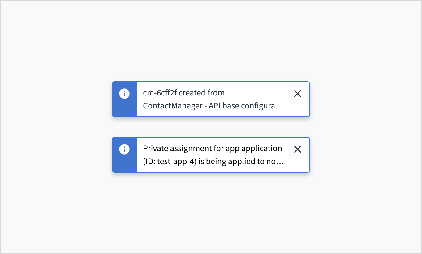
Don't exceed the limit of 2 lines of wrapped text. This results in truncation and breaks accessibility.
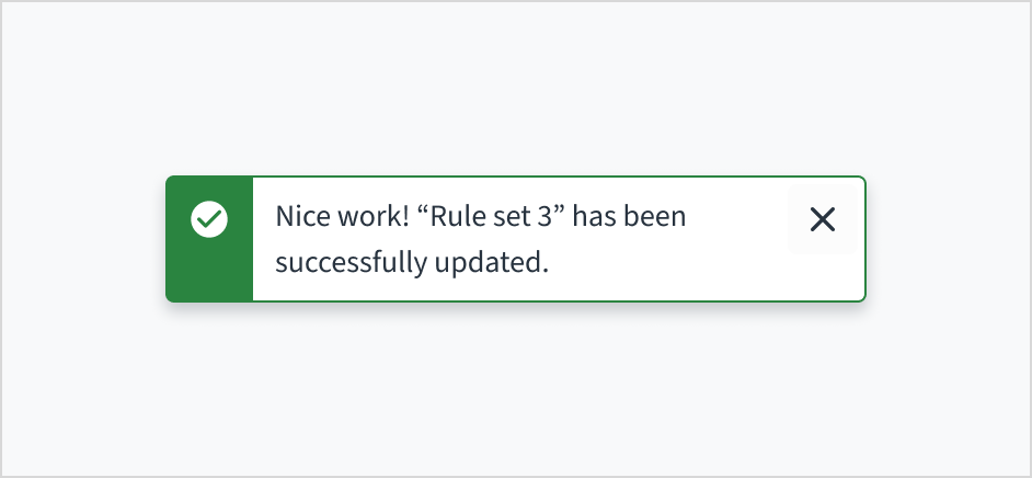
Use an instructive tone that is neutral and direct
Toasts are brief, temporary notifications. They're meant to provide quick reference or context without interrupting the user's experience. Use an instructive tone that presents the information in a neutral and direct way.
Do use an instructive tone that presents the message in a concise and neutral way.
Don't use language that is overly playful, encouraging, or celebratory.
Use sentence case
Like all in-product content at Guidewire, toasts are written in sentence case.
For more information on how to implement sentence case, see the section on Capitalization in the UI text style guide.
Behaviors
Dismissal
Toast notifications are always dismissible. If not manually closed, toasts automatically disappear after 5 seconds.
To make toast notifications persistent, set the autoClose prop to false. These toasts will remain visible until manually closed by the user.
Consider using persistent toasts when:
- There's a link within the toast
- The content requires more time to read or process
Interactions
Mouse
Toast notifications are system generated. By default, toasts automatically disappear after 5 seconds. A user can also dismiss a toast by clicking the close button.
Keyboard
For toasts with a link, the link gets focus first. A user can move between the link and the close button using Tab. To close the toast notification, a user can press Enter or Space while the close button has focus.
Screenreader
Screen readers must announce toast notifications as they appear on screen. To accomplish this, the toast should have an appropriate ARIA live region attribute, typically aria-live="polite". The "polite" attribute allows for users to finish what they are doing before announcing a live region change.
Accessibility
This component has been validated to meet the WCAG 2.0 AA accessibility guidelines. However, changes made by the content author can affect accessibility conformance. Follow the guidance below when using this component in your applications:
- Try not to exceed 75 characters, including spaces and punctuation. This limit helps maintain readability and prevents truncation.
- Don't use toast notifications for critical alerts or long messages. By default, toasts are timed and will disappear automatically after 5 seconds. This makes it difficult for people to get the entire message.
Do try to adhere to the 2 line limit for toasts because longer messages result in truncation.
Don't truncate text within a toast. Truncation breaks accessibility.