Content layout
In Floorplans, when applying padding layout for a main content container, you can use you can use the contentLayout prop.
This has three options:
centerproviding max width and centered horizontallycanvaswith no paddingdefaultwith standard Guidewire padding
contentLayout sets the default layout for all pages in your app. If you want to change the layout for any sub-pages to be different from the default, you will need to define the desired settings in the sub-page's file as follows:
 "floorplan.settings": {
    "type": "floorplan",
    "contentLayout": "center",
    "matches": [
      "/settings"
    ]
  }
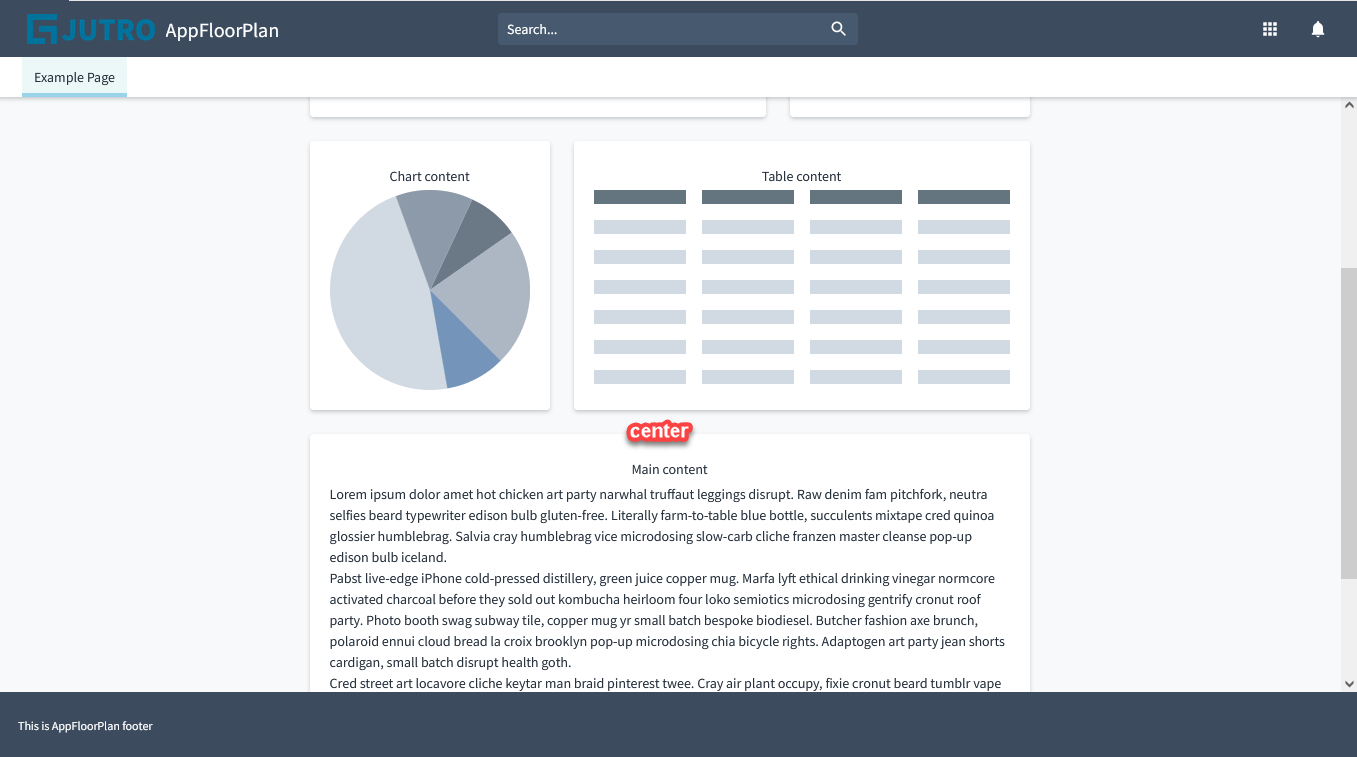
Center content layout
The following example is using the contentLayout: 'center' prop:

<AppFloorPlan

  floorPlans={[
    {
      contentLayout: 'center',
      footer: {
        content: [
          {
            id: "footer-text",
            type: "element",
            component: "div",
            componentProps: {
              className: 'footerText',
            },
            content: {
              id: "jutro.app.footer.legalNotice",
              defaultMessage: "Sample legal notice. Lorem ipsum dolor sit amet, consectetur adipiscing elit. Sed eget massa varius, suscipit risus et, facilisis lectus. Donec eget lacus massa."
            }
          },
        ]
      },
      header: {
        ...
      },
      noContentPadding: false
      rightSide: {
        ...
      },
      ...
    }
  ]}
/>
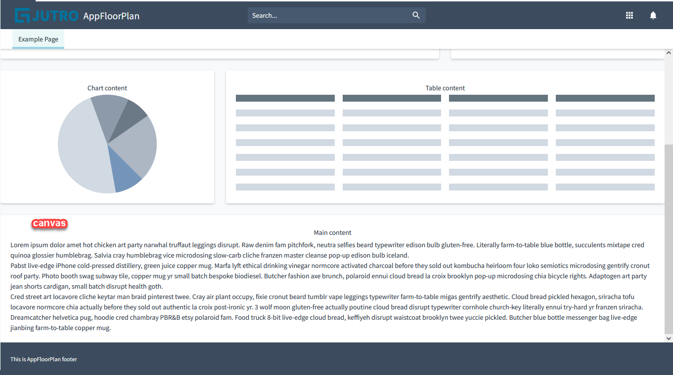
Canvas content layout
As you can see in Storybook, the canvas option is without padding:

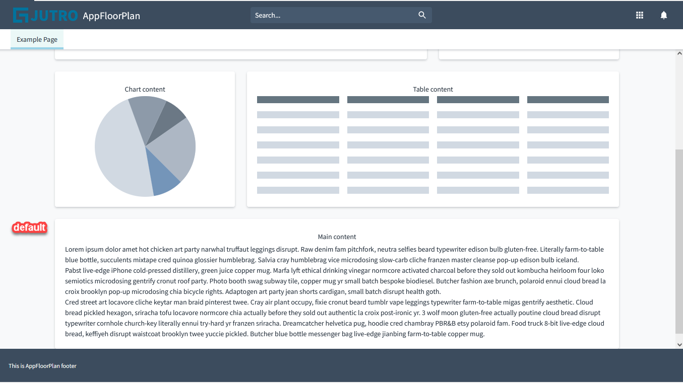
Default content layout
The 'default' configuration on the other hand, provides Guidewire default padding: 
'default' is the default value when contentLayout is not specified.
contentClassName prop
You can also use a contentClassName prop to allow for custom css to be placed on the main content container to modify backgrounds.