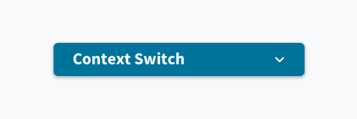
Context switcher
note
This component is to be used only under the scope of the Header UX patterns and not to be used in isolation or custom scenarios.
Overview
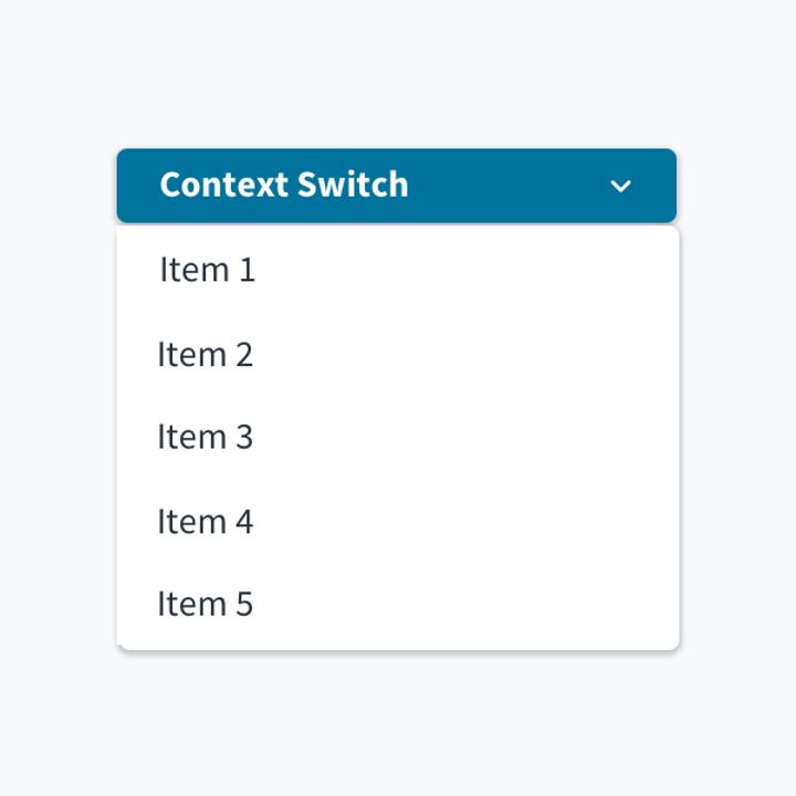
The context switcher component is in essence a dropdown containing a list of objects from the parent page. It acts on the navigation level and hence will appear as a prominent component either on the left navigation panel or the horizontal nav bar.

Best practices
- The context switcher should only be used in scenarios where frequent/fast switching of objects is required. In Advanced Product Designer, for instance, you can switch between insurance products.
- If either is not required or possible, then other appropriate means to change the object should be used (for example, back to previous page, tertiary action to 'change object,' etc.)
- The context switcher may be used as a navigational element on the left panel or as part of the top navigation, depending on the use case.
- Since all objects are at the sibling level, the menu elements should remain the same for all objects and not change as objects are switched.
- To access the full list of objects, navigate back to the parent page rather than displaying a long list of objects.
- If there is a long list of objects, consider displaying only the most frequently accessed items, or the more important items on the context switcher list.
- Use a left nav panel in conjunction with the horizontal nav bar to display sub-menu items.
Interactions
Selecting/focusing on the context switcher enables the dropdown displaying the list of the contexts available.

Navigation
Selecting any one of the items in the dropdown list reloads the current page to accommodate the changed context.