Date picker
note
This component is being reworked. There will be a new version aligned with the latest guidelines in upcoming releases.
Usage
The date picker enables users to select a date. It consists of a text entry field with a dropdown calendar entry screen.
Anatomy
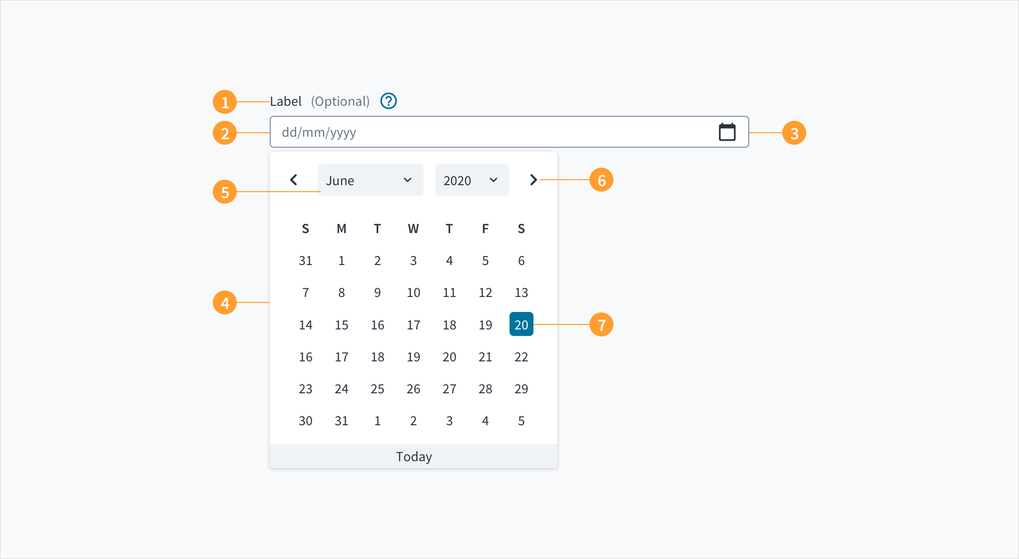
Date pickers consist of the following elements:
- Field label: provides the title for the date picker. Labels should be clear and concise, and should specify the purpose of the selection.
- Input field: text input field where users can type in the date. This field includes placeholder text that models the correct date format.
- Calendar icon: indicates to users that this is a date field. Users click on the icon to display a calendar dropdown menu and select a date.
- Dropdown calendar: the menu where users select a date.
- Month and year selection: enables users to navigate dates in the past or future.
- Month pagination: enables users to move forward or backward, one month at a time.
- Selected day: the day that the user has clicked on.
Best practices
- Date pickers must include labels that describe the purpose of the selection.
- Date format by default appears as month/day/year. Adjust the date format depending on location. Some countries, for example, use the format day/month/year.
- Field labels should include the date format in the form of help text. This text can either appear inline or below the label. Including only the date format as placeholder text increases cognitive burden.
- Date format is automated when a user selects from the calendar menu.
- Calendar menus are not ideal for picking dates in the distant past or future, such as birthdates. In these cases, use the text field instead.
Responsiveness/Adaptiveness
- The date picker is responsive for all devices.
- On tablet and mobile, the text input field shrinks to accommodate reduced screen real estate.
Interactions
Text input field
Users can enter dates into the text input field using their keyboards. When users begin typing in the text input field, the placeholder text disappears. This response underscores the need to include permanent help text.
Calendar menu
- Clicking on the calendar icon opens the calendar dropdown menu.
- When users click on a date from the calendar dropdown menu, the date appears highlighted.
- The month pagination controls enable users to move through past and future months.
- In the calendar menu, users can also select month and year by clicking on the chevrons.
Error conditions
Clearly mark invalid fields. When there is more than one field, indicate which field is triggering the error.
UX writing considerations
- Text input fields should not rely solely upon placeholder text.
- When using the text input field, include the date format as permanent help text. Date format can appear inline in parentheses with the label, or below the label.
- Labels for text input fields should be clear and concise, and should specify the use case (for example, "date of birth").
- Keep in mind that not all regions use the same format for dates. Europe, for instance, follows the model of day/month/year. Ensure that placeholder text accurately reflects locale.
Accessibility
Jutro's Date picker component is built on the React datepicker library. It comprises an input field and a calendar widget.
- Screen reader interaction: Users are informed of the pre-populated date value when they tab to the datepicker input field, and that this value is currently selected. The date can be entered manually from this input field. While focus remains on the pre-populated date, a calendar widget is also available. Users can also move focus into the widget by pressing the down arrow key. Navigation through the calendar portion of the widget is accomplished via the arrow keys, and the value currently in focus is voiced by screen readers via a WAI-ARIA
aria-labelattribute. The 'Previous', 'Month', 'Year' and 'Next' buttons are focusable via the TAB key when the widget is open. React datepicker does not currently enable keyboard navigation to the 'Today' link. - Keyboard interaction: A calendar widget appears when the user tabs to the datepicker input field. The current date is highlighted and keyboard-only users can enter the date manually here. Users can also place keyboard focus on the widget by pressing the down arrow key when it is expanded. Navigate through the calendar with the arrow keys. 'Previous', 'Month', 'Year' and 'Next' buttons are focusable via the TAB key when the widget is open.
- Color: The contrast ratio of textual elements against their background is at or above 4.5:1, as per WCAG 2.0 AA requirements.
- Zoom: All content is visible and functional up to and including a zoom factor of 200%.