Date range
This component is being reworked. There will be a new version aligned with the latest guidelines in upcoming releases.
Usage
Overview
The date range component is used to input a range of date elements into a form, typically consisting of a start date and an end date.
Anatomy

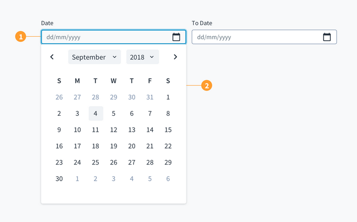
The date range component consists of the following elements:
- Start date: used to specify the start date.
- End date: used to specify the end date.
Both elements include a field where users can manually input a date. There is also a calendar icon that, when clicked, triggers a dropdown menu and enables date selection.
Best practices
-
Use the date range picker only when there is a need to display a start and end date.
-
Use the standard date picker when users only need to specify a single date.
-
The date labels can be customized depending on the use case.
Interactions
The individual date pickers have their own interaction states as shown below.

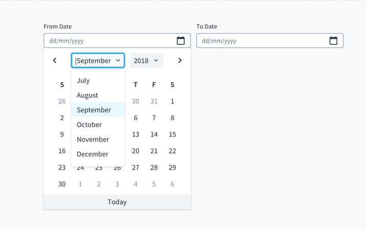
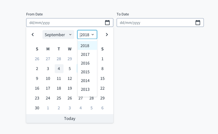
On selecting the date input field, the following interactions are enabled:
-
Text entry in the date field - the users may type in the date using the specified format.
a. Only numeric text is accepted in the field.
b. The separators, as dictated by the required date format, will be added automatically.
-
The calendar is displayed with the current date highlighted.
a. On selecting the month control, a dropdown appears with the current month highlighted. The user may choose the required month from the list.

b. On selecting the year control, a dropdown appears with the current year highlighted. The user may choose the required year from the list.

-
Dates selected via the calendar picker will override dates that have been manually typed.
-
All standard interaction patterns for dropdowns will apply here.
UX writing considerations
-
Labels for the date range component should be clear, concise, and specify the use case (for example, "policy start date").
- Labels appear above the date input field and are left-aligned.
- Use sentence case for field labels.
-
When representing the date as a numeric value or label, best practice is to use ISO Standard 8601: YYYY-MM-DD.