Avatar
Usage
Overview
The avatar is an object that appears in the global header and represents a user's identity. It provides access to the user's profile and generic settings, as applicable. Avatars strengthen the connection between users and products. They also give users a degree of personalization.
Anatomy
Avatar image
Avatar dropdown
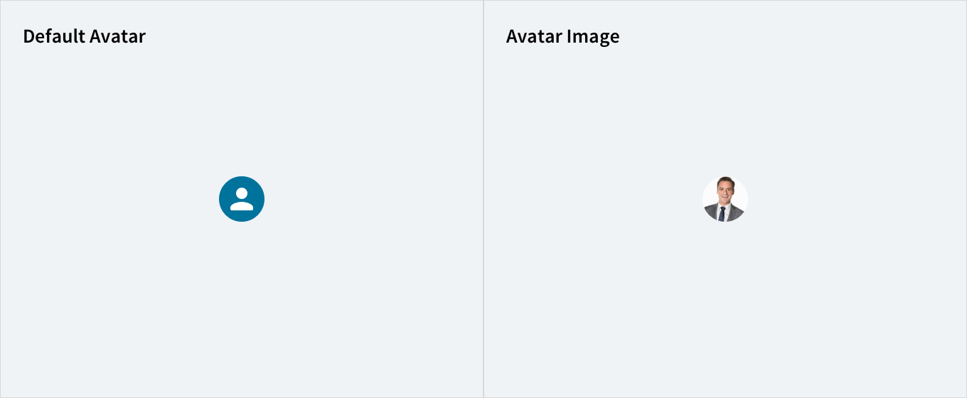
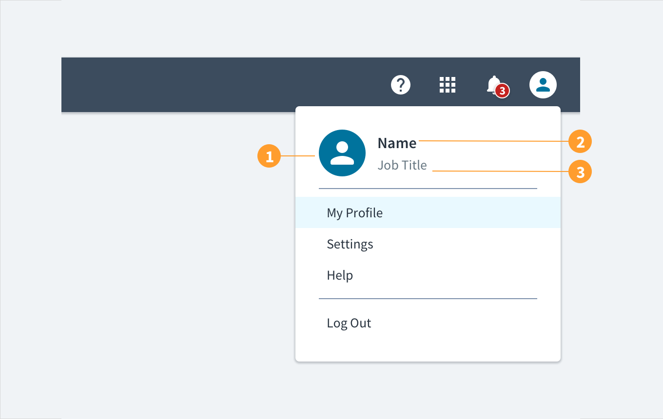
Avatars appear as circular graphics in the top right-hand corner of a header and its associated dropdown menu. Users can upload an image to display. By default (if no image is uploaded), the avatar displays the user's first and last initials. Avatar dropdown menus also provide the user's name and title as text labels.
Avatar with uploaded image (contained)
Avatars consist of the following elements:
- Default or uploaded image: users may upload an image, which appears as a circular graphic, as their avatar.
- Name label: under the avatar dropdown menu, the user's name appears as an anchored text label.
- Role title: under the avatar dropdown menu, the user's role or title appears under their name.
Best practices
- Use avatars to indicate where users can access their profile and generic settings.
- Use avatars consistently in an experience or set of interrelated products.
- Use avatars to strengthen the connection between a product and its users.
- Use avatars to provide users with a degree of personalization.
Responsiveness/Adaptiveness
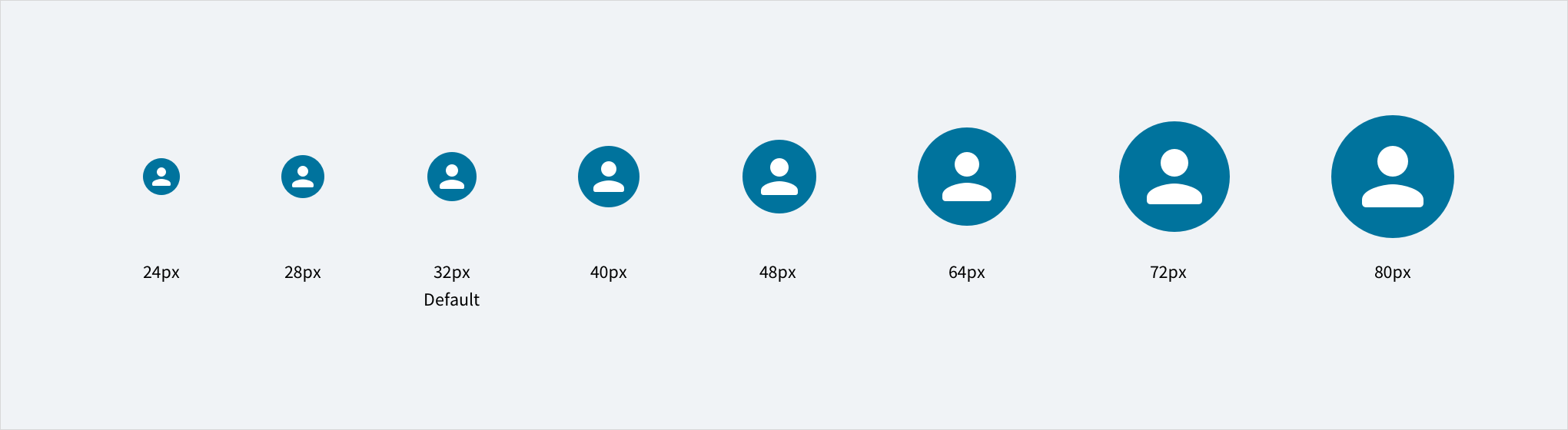
- Jutro avatars come in a variety of sizes to accommodate different form factors.
- Like most components, avatars can be distributed, sized, and arranged by our
<Grid>and<Flex>components as part of Jutro's commitment to responsive design.
(Replace this image with a new one that also shows the relative header size to be used with each and also indicates what sizes are used on desktop, tablet and mobile phone)
Interactions
Mouse
- Hovering over the avatar's circular graphic displays a tooltip with the user's name.
- Clicking the avatar's circular graphic displays a dropdown menu.
- Moving the mouse cursor over the text labels within the dropdown menu highlights them.
Keyboard
The avatar header functions as a button. SPACEBAR & ENTER expand & collapse the panel content within it.
Screen reader
Alternative text can be set in the username field. With no value specified, the value defaults to 'User Avatar'. The WAI-ARIA attribute of aria-haspopup="true" alerts screen reader users to the presence of content within the avatar. The aria-expanded attribute toggles between 'tr
Error conditions
When no image is available for the avatar, the user's initials appear instead. If the user's initials can't be rendered (for example, names that don't use Latin characters), a default icon displays instead.
Accessibility
The contrast ratio of textual elements against their background is above 4.5:1 as per WCAG 2.1 AA requirements. Non-textual content that needs to convey meaning (such as icons and keyboard focus visibility) has a contrast ratio of at least 3:1 with its adjacent colors. All content is visible and functional up to and including 400% without requiring scrolling in two dimensions.
This component has been validated to meet the WCAG 2.1 AA accessibility guidelines. However, changes made by the content author can affect accessibility conformance.
Within your application, ensure that if alternative text is specified, it is meaningful.
The @jutro/auth dependency is now optional for
@jutro/router and @jutro/components packages.
However, the Avatar component requires
@jutro/auth to be added to your app dependencies to be used.