Cards
Usage
Overview
A card is a UI element that groups related information in a container. Cards consist of content blocks that, as a whole, relate to a single subject, topic, or destination. These interactive and self-contained content objects sit within an application page layout. Card-based designs provide simple, intuitive, and aesthetically pleasing solutions for web apps. Cards are designed to address specific content needs. The layout of cards varies depending on their content. As such, a card-based layout can be a powerful tool for responsive design.
When to use
- To group several pieces of related information into digestible units.
- To make information easily scannable and actionable.
- As a linked entry point to additional information.
When not to use
- For unrelated information that doesn't benefit from being grouped together.
- For information that is too complex to be broken down into a card format.
- When the content or layout can't be kept consistent within a series.
Formatting
Anatomy
Grid layouts and break points for responsive web design apps
Cards are rectangular with radiuses corners and drop shadows. The layout of cards is flexible and depends on their content. Cards may include a variety of elements, including media, supporting text, and actions. The card container is the only required element. Card elements, like text and images, are arranged in a hierarchy to assist with scanning.
Cards consist of the following elements:
Card basics
- Card container: the card container houses all card elements. The size of card containers depends on their content. Basic cards are white with a drop shadow and light stroke and sit against a lightly tinted background.
- Media: images are placed at the top of the card and can run full width.
- Header text: header text is styled according to the Jutro typography guidelines.
- Body text: body text is styled according to the Jutro typography guidelines. Body text includes things like summary material and descriptions.
- Icons and labels: Icons and labels are placed at the bottom of cards and are styled according to the Jutro iconography guidelines. Icons may be used for supplemental actions.
- Buttons: Interactions such as buttons can be placed directly onto cards.
Grid layouts and break points for responsive web design apps
- Wide layout (desktop)
- Medium layout (desktop)
- Mobile layout (single column)
Best practices
- Cards must resemble physical cards and have a tactile feel (for touch screens, haptic interactions can be applied).
- Use shadows dynamically (at differing depths) to help with card interaction. For example, you may support a pick up and move gesture by creating the illusion of elevating the card. To do this, use a deeper outer shadow during the interaction.
- The hierarchy of card elements must be well designed and kept consistent in a card series.
- Gestures must be implemented with consistency within a card series. Frequently used gestures on cards include swipe, pick up and move, and scrolling.
- Cards must contain a limited number of actions and use links to draw users into deeper areas of the content experience.
- Cards are coplanar and multiple cards on a page must be grouped as a series.
- Ensure card layouts are easy to use. Cards must be easily scannable and placed in consistent patterns.
- Use a dashboard card layout for subjects that aren't related but should, however, be grouped as one section.
Content
General writing guidelines
- Use sentence case for all aspects of designing Guidewire product interfaces. Don't use title case.
- Use present tense verbs and active voice in most situations.
- Use common contractions to lend your copy a more natural and informal tone.
- Use plain language. Avoid unnecessary jargon and complex language.
- Keep words and sentences short.
Card-specific writing guidelines
- Be selective about the content that you include in cards. They are intended to serve as an entry point to more detailed information. Extraneous content can overload cards and create friction.
- Place content hierarchically within cards to facilitate scanning.
- Use different levels of emphasis for content to communicate hierarchical position.
- If a card includes more than two supplemental actions, use an overflow menu.
- Limit the number of actions on a card to only what is essential.
- Use sentence case in cards, even for headings and titles. Capitalize proper names.
Responsiveness
Grid layouts and break points for responsive web design apps include:
- Wide layout: a wide layout is the widest allowable page width, accommodating 3 to 4 cards horizontally.
- Medium layout: a medium layout is suitable for smaller screens, multi-browser use cases and tablet browsers, accommodating 3 cards horizontally.
- Mobile layout: a mobile layout uses a single column to compensate for the drastically reduced screen real estate compared with desktop screens and tablets.
Interactions
Keyboard
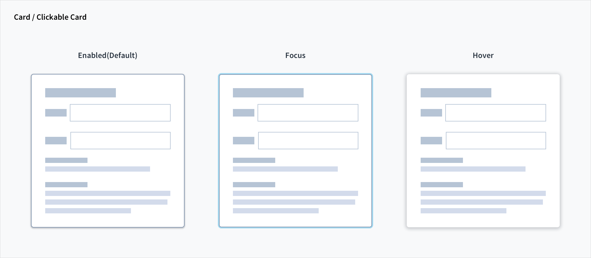
Focusable content within the card component (that is, the tooltip) is reachable and actionable using the keyboard.
The clickable card is also both keyboard-focusable and actionable using the Spacebar and Enter keys.
Screen reader
By default, the header field within the card implements <h2> content and as such is reachable through the screen reader heading shortcut. The tooltip includes an aria-label attribute of 'Show tooltip'. Tooltip utilizes aria-live='polite', enabling the screen reader to voice its content automatically.
The clickable card uses the HTML5 <button> element, and as such the text within the tags acts as the card's accessible name.
Accessibility
The contrast ratio of textual elements against their background is above 4.5:1 as per WCAG 2.1 AA requirements. Non-textual content that needs to convey meaning (such as icons and keyboard focus visibility) has a contrast ratio of at least 3:1 with its adjacent colors. All content is visible and functional up to and including 400% without requiring scrolling in two dimensions.
This component has been validated to meet the WCAG 2.1 AA accessibility guidelines. However, changes made by the content author can affect accessibility conformance.
When adding content to the card, be sure to follow accessibility guidelines, including, for example, color contrast requirements, the use of appropriate headings if necessary, and alternative text on informative images.