Usage
Overview
Modals focus a user's attention on one task using a window that sits on top of the page. They present critical information, which may or may not require user input, before continuing the workflow.
By design, modals interrupt a user's workflow. Modals disable the main content area and prevent users from returning to their previous workflow until they complete the modal task or dismiss the modal.
Modals are mostly used for noting errors (original purpose) but they can be used for alerts, confirmations and custom requirements.
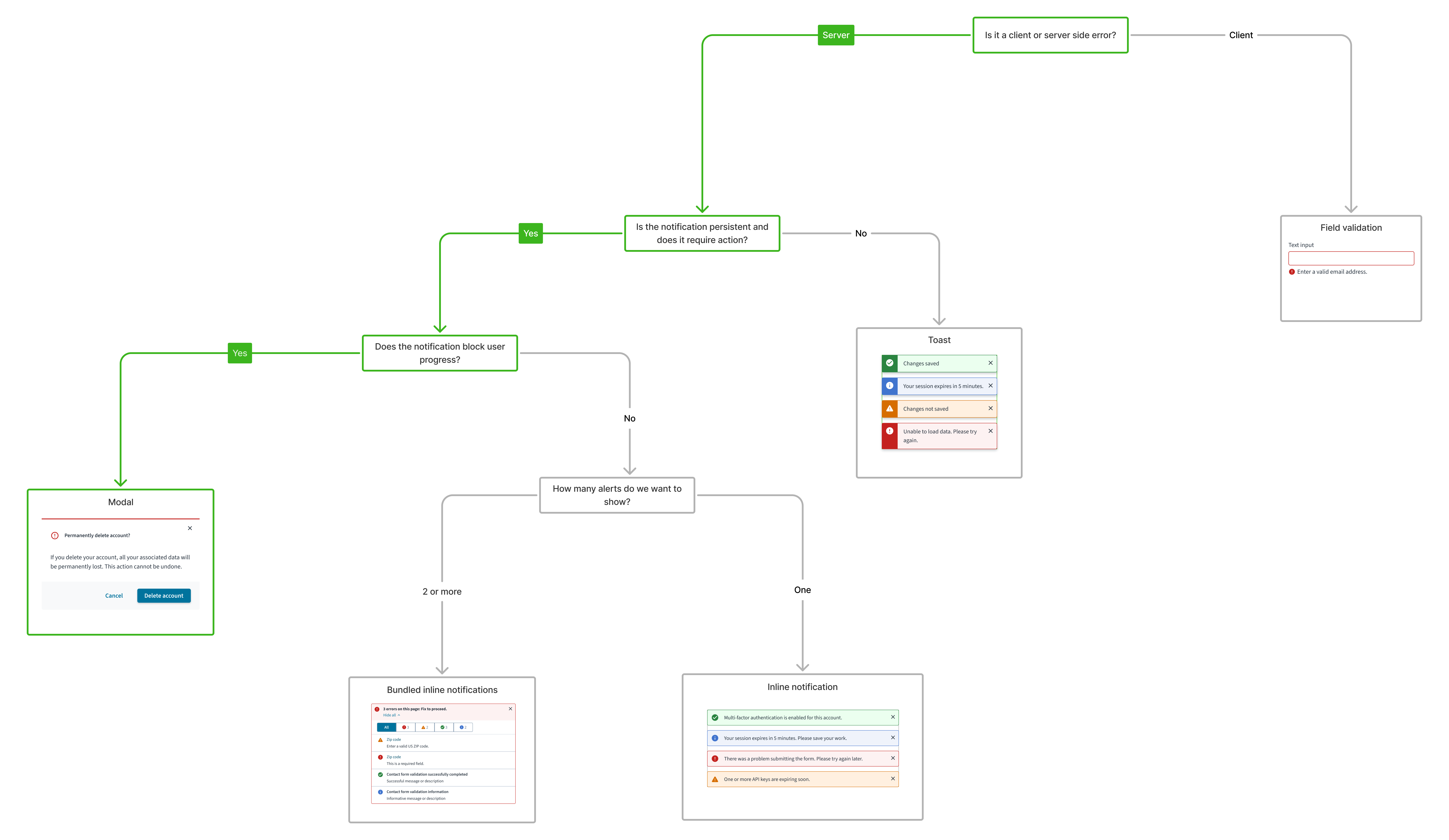
For a detailed guide on when to use the modal component, explore the following UI component decision tree.
When to use
- To request essential input or decisions that are blocking the user from continuing a process or task.
- To deliver urgent information, critical errors, or important warnings that require immediate user attention and acknowledgement.
- To confirm significant user actions, especially those with important consequences (for example, deleting data).
When not to use
- For non-critical messages, status updates, or information that does not require immediate user action or workflow interruption.
- To interrupt high-stakes or fluid user tasks (like a checkout process or complex data entry) unless absolutely necessary to prevent a critical error.
- If the decision or task within the modal requires users to access other information on the page or elsewhere in the application.
Anatomy
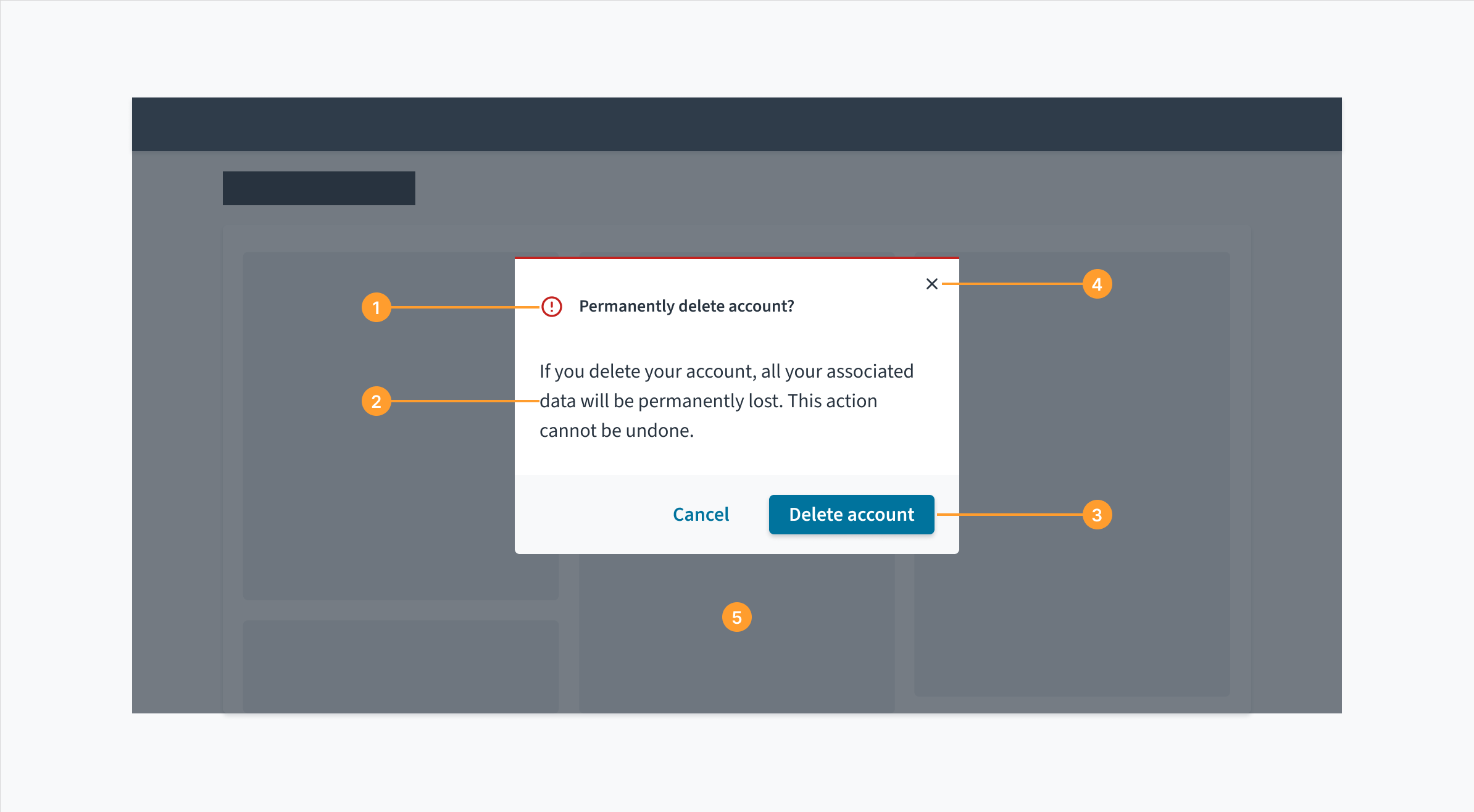
Modals have a header, body, and a footer.
- Header: The header contains the title of the modal window and communicates its purpose.
- Body: Contains supportive text that is necessary for users to complete the modal's task. Modals can also accommodate other components within the body.
- Buttons: The main actions that the user needs to complete or cancel the modal's task.
- Close icon: Closes the dialog without submitting any data.
- Overlay: Covers the main page content and renders it inactive until the modal's task is completed or dismissed.
Errors
Error messages must follow error messaging guidelines. For more information, see the following:
Content
General writing guidelines
- Use sentence case for all aspects of designing Guidewire product interfaces. Don't use title case.
- Use present tense verbs and active voice in most situations.
- Use common contractions to lend your copy a more natural and informal tone.
- Use plain language. Avoid unnecessary jargon and complex language.
- Keep words and sentences short.
- Headers must ask a single, clear question or communicate a single concise message. If the modal is informational or educational with no decision required, then the title can be a statement.
- Avoid using "Are you sure" as a modal title. It's vague and users might not know what you're really asking. Instead, ask users the question you want them to answer using the specific action; for example, "Send payment?"
Body
- Body text must clarify any consequences and explain options in simple terms.
- Ensure the modal has all the information that is needed for a single decision.
- Avoid including information that is unrelated to the decision or complicated descriptions of rare situations.
- For informational modals, use the correct tone to match the nature of the message. For example, when seeking to prevent an error, UX text must be clear and straightforward.
- Primary button text must state an unambiguous action that answers the question posed in the header.
- Make sure the question and the actions use the same words. Avoid using disjointed language. For example, if you ask, "Delete portfolio?" in the header, the primary call-to-action button (CTA) must also read "Delete".
- Primary actions go on the right, dismissive or secondary actions on the left.
- For modals that require a decision, use words that describe the literal action rather than something vague like Yes, OK, or Sure.
- Reserve "OK" for situations like acknowledgment modals, where you're simply asking the user to acknowledge the presented information.
This modal clearly asks about the specific action, informs the user of a key potential consequence, and offers unambiguous, action-oriented buttons.
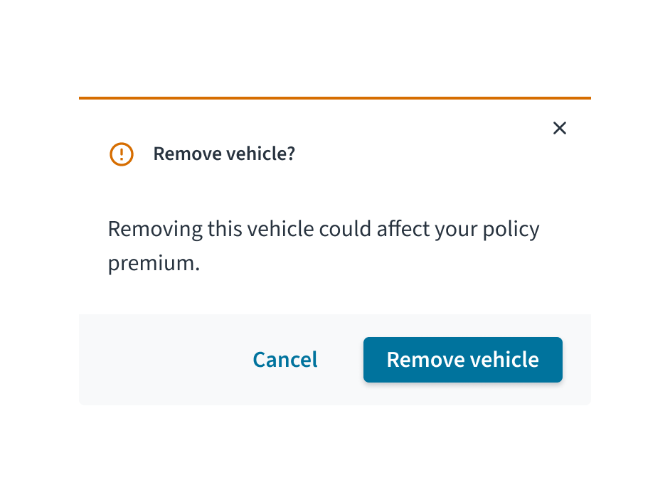
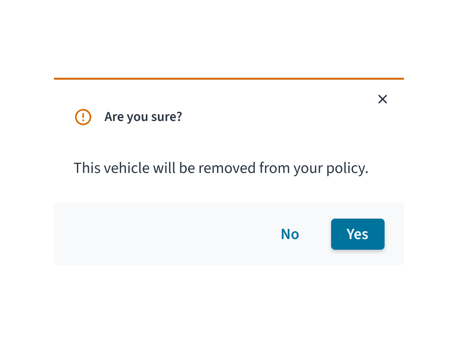
This modal uses a vague question, fails to mention important consequences, and provides unclear 'Yes/No' button options.
Behaviors
States
When a modal is triggered, certain elements such as buttons have an active, focus, and hover state.
- Focus: Provides feedback indicating that the element is highlighted using a keyboard or mouse.
- Active: Provides feedback indicating that the user is clicking or tapping the element.
- Hover: Provides feedback indicating that the user has placed a cursor over the element (desktop only).
When the modal is closed, the user is returned to the on-page content and their previous workflow.
Interactions
Mouse
Clicking the close icon in the upper right will close the modal without submitting user data.
Clicking the primary action button completes the task and closes the modal.
The secondary action offers a way for the user to back out and take no action. Clicking the secondary button closes the modal and returns the user to their previous context.
Keyboard
When triggered, the tab sequence is contained and keyboard focus is trapped within the modal. The primary window is inert and cannot be interacted with until the modal is dismissed.
Screen reader
The modal components include a WAI-ARIA role="dialog" and aria-modal="true" to indicate to assistive technologies that the window beneath is currently inert. Focus order, accessible names and programmatic relationships are dependent on the individual content within each modal. The element with ARIA role="dialog" includes both an aria-labelledby and an aria-describedby reference, which refer to the primary modal title and modal content respectively.
Accessibility
The contrast ratio of textual elements against their background is above 4.5:1 as per WCAG 2.1 AA requirements. Non-textual content that needs to convey meaning (such as icons and keyboard focus visibility) has a contrast ratio of at least 3:1 with its adjacent colors. All content is visible and functional up to and including 400% without requiring scrolling in two dimensions.
This component has been validated to meet the WCAG 2.1 AA accessibility guidelines. However, changes made by the content author can affect accessibility conformance.
Refer to the WAI-ARIA Authoring Practices for Modals, and within your application, be sure to check that:
- Upon triggering, keyboard focus is placed on the first focusable item within the modal dialog.
- Upon dismissal, keyboard focus returns to the same component which triggered the modal dialog.
- Focus should not move outside the modal until it is closed.
Code
Warning: Micro frontendsIf you are using the Modal component in a micro frontend, use ModalNextContext. showModal does not work in embedded applications due to limitations around passing custom React elements.
ModalNext renders children in front of an overlay. It offers the following:
- Blocks interaction below the modal
- Disables scrolling while open
- Manages focus according to accessibility best practices (see accessibility)
Basic implementation
import React, { useState } from 'react';
import {
  Button,
  ModalBody,
  ModalFooter,
  ModalHeader,
  ModalNext,
} from '@jutro/components';

const MyModal = ({ isOpen, onResolve }) =>
  isOpen ? (
    <ModalNext isOpen>
      <ModalHeader onClose={() => onResolve()} />
      <ModalBody>
        <p>You can put anything you want here!</p>
      </ModalBody>
      <ModalFooter>
        <Button onClick={() => onResolve('Cancel')}>Cancel</Button>
        <Button onClick={() => onResolve('OK')}>OK</Button>
        <Button onClick={() => onResolve('More')}>More options</Button>
      </ModalFooter>
    </ModalNext>
  ) : null;

export const MyComponent = () => {
  const [isOpen, setIsOpen] = useState(false);

  const handleOpen = () => setIsOpen(true);

  const handleModalResult = (result) => {
    switch (result) {
      case 'Cancel':
        alert('Cancelled');
        break;
      case 'OK':
        alert("So you're okay with this?");
        break;
      case 'More':
        alert('Your other options');
        break;

      default:
        alert('The default thing happened.');
        break;
    }
    setIsOpen(false);
  };

  const handleClose = () => {
    alert('Closed with the X button');
  };

  return (
    <div>
      <MyModal
        isOpen={isOpen}
        onResolve={handleModalResult}
      />
      <Button onClick={handleOpen}>Show Modal</Button>
    </div>
  );
};
The simplest way to display a modal is to import <ModalNext> and its child components and display it using state in the parent component.
To implement business logic, set up a handler and pass it as onResolve. In the example above, we trigger different actions using with each button. You can run several operations in the callback function, and close the modal when you are ready.
Notice that <ModalHeader> takes a onClose callback which runs when the use clicks the X (close) button.
Props
ModalNext
| Prop | Type | Description |
|---|
contentLayout | {component: string, componentProps: object}, LayoutShape | defines the layout to be used with a 'component' property set to either Flex or Grid and componentProperties to set properties for that layout component |
isOpen | bool | Optional flag indicating whether the Modal is currently open |
onAfterOpen | func | Callback function that, if provided, is called when the Modal dialog has been opened and is visible to the user |
onAfterClose | func | Callback function that, if provided, is called when the Modal dialog has been close and is hidden from the user |
onRequestClose | func | Callback function that, if provided, is called when the Modal dialog has been requested to be closed (either by clicking on overlay or pressing ESC) |
closeTimeoutMS | number | Number indicating the milliseconds to wait before closing the modal. |
contentLabel | IntlMessageShape | String indicating how the content container should be announced to screen readers |
overlayClassName | string | The optional CSS class for the overlay for the Modal dialog |
className | string | The optional CSS class for the the Modal dialog |
shouldFocusAfterRender | bool | Optional flag indicating whether the Modal will autofocus to itself on open |
shouldCloseOnOverlayClick | bool | When false will not close the dialog when the overlay is clicked. |
shouldCloseOnEsc | bool | Optional flag indicating whether keyboard support for closing the Modal is available (using the ESC key) |
shouldReturnFocusAfterClose | bool | Optional flag indicating if the Modal should restore focus to the element that had focus prior to its display. |
parentSelector | func | Function that will be called to get the parent element that the Modal will be attached to. |
The ModalNext component is the base component that should wrap the below components, and determines some of the overarching behaviors of the modal.
| Prop | Type | Description |
|---|
contentLayout | {component: string, componentProps: object}, LayoutShape | defines the content layout to be used with a 'component' property set to either Flex or Grid and componentProps to set properties for that layout component |
titleLayout | {component: string, componentProps: object}, LayoutShape | defines the header layout to be used with a 'component' property set to either Flex or Grid and componentProps to set properties for that layout component |
status | success, info, warning, error | The status of this modal. Either a 'success', 'info', 'warning', error'. Default to no status |
icon | string | See Icon |
title | IntlMessageShape | Text to display for the title |
subtitle | IntlMessageShape | Text to display for the subtitle |
onClose | func | The function to be called when the close button is clicked. If you do not set this function, the modal will not have a close (x) button in the corner. |
The ModalHeader component should be used to display the top portion of the modal - the status color bar, the optional icon to the left of the title, and the title itself.
ModalBody
| Prop | Type | Description |
|---|
id | string | Used to identify modal body component. |
contentLayout | {component: string, componentProps: object}, LayoutShape | Defines the layout to be used with a 'component' property set to either Flex or Grid and componentProps property to set properties for that layout component. |
autoFocus | bool | Causes focus to be drawn to the body of the modal on mount. Defaults to true. |
The ModalBody component is a simple component that serves to wrap the content of the modal and should be placed after the ModalHeader
| Prop | Type | Description |
|---|
contentLayout | {component: string, componentProps: object}, LayoutShape | defines the layout to be used with a 'component' property set to either Flex or Grid (otherwise, will default to a div) and componentProperties to set properties for that layout component |
The ModalFooter component is a simple component that serves to wrap the footer content of the modal and should be placed as the last component wrapped by ModalNext. You will usually wrap buttons within this component, but it does not restrict you if other components are necessary for the implementation.
Async example
const MyModal = ({ isOpen, onResolve }) =>
  isOpen ? (
    <ModalNext isOpen>
      <ModalHeader onClose={() => onResolve()} />
      <ModalBody>
        <p>You can put anything you want here!</p>
      </ModalBody>
      <ModalFooter>
        <Button onClick={() => onResolve('Cancel')}>Cancel</Button>
        <Button onClick={() => onResolve('Process request')}>
          Process request
        </Button>
      </ModalFooter>
    </ModalNext>
  ) : null;

export const MyComponent = () => {
  const [isOpen, setIsOpen] = useState(false);
  const [processing, setProcessing] = useState(false);

  const handleOpen = () => setIsOpen(true);

  const processRequest = async () => {
    return new Promise((resolve) => {
      setTimeout(() => {
        alert('Request successful');
        resolve();
      }, [3000]);
    });
  };

  const handleModalResult = async (result) => {
    if (result === 'Process request') {
      if (!processing) {
        setProcessing(true);
        await processRequest();
        setProcessing(false);
        setIsOpen(false);
      }
    } else {
      setIsOpen(false);
    }
  };

  return (
    <div>
      <MyModal
        isOpen={isOpen}
        onResolve={handleModalResult}
      />
      <Button onClick={handleOpen}>Show Modal</Button>
    </div>
  );
};
ModalNextContext
ModalNextContext (modal provider) is the only way to create a modal in a micro frontend.
import React, { useContext } from 'react';
import { ModalNextContext } from '@jutro/components';
const { showAlert } = useContext(ModalNextContext);
const showSomething = (msg) => {
showAlert({
status: 'success',
title: messages.genericSuccessMessage,
message: msg,
});
};
<button onClick={() => showSomething('Surprise!')}>
Click here to get a surprise
</button>;
Generic modals
Alert
The Alert modal is a generic modal that will display a modal with a status color, optional icon, title, message and a confirm button. The results of the Alert modal can be captured as well (confirm or close (as a reject)).
import React, { useState, useContext } from 'react';
import { ModalNextContext } from '@jutro/components';
const AlertModalExample = () => {
const [result, setResult] = useState(null);
const { showAlert } = useContext(ModalNextContext);
async function triggerAlert() {
const results = await showAlert({
status: 'info' ,
icon: 'gw-error-outline' ,
title:
'Test Alert' ,
message:
'Just testing an Alert!' ,
confirmButtonText:
'OK' ,
});
setResult(`modal result was: ${results}`);
}
return (
<div>
<button onClick={triggerAlert}>Show Alert Modal</button>
<div>{result}</div>
</div>
);
};
Confirmation
The Confirmation modal is a generic modal that will display a modal with a status color, optional icon, title, message and a confirm and cancel button. The results of the Confirmation modal can be captured as well (confirm, cancel or close (as a reject)).
import React, { useState, useContext } from 'react';
import { ModalNextContext } from '@jutro/components';
const ConfirmationModalExample = () => {
const [result, setResult] = useState(null);
const { showConfirm } = useContext(ModalNextContext);
async function triggerConfirmation() {
const results = await showConfirm({
status: 'info' ,
icon: 'gw-error-outline' ,
title:
'Test Confirm Modal' ,
message:
'Just testing a Confirmation Modal!' ,
confirmButtonText:
'OK' ,
cancelButtonText:
'Cancel' ,
});
setResult(`modal result was: ${results}`);
}
return (
<div>
<button onClick={triggerConfirmation}>Show Confirmation Modal</button>
<div>{result}</div>
</div>
);
};
Custom modals
Custom modals can be implemented with the ModalNext, ModalHeader, ModalBody and ModalFooter components, and displayed using showModal from ModalNextContext similar to the usage above for the generic modals.