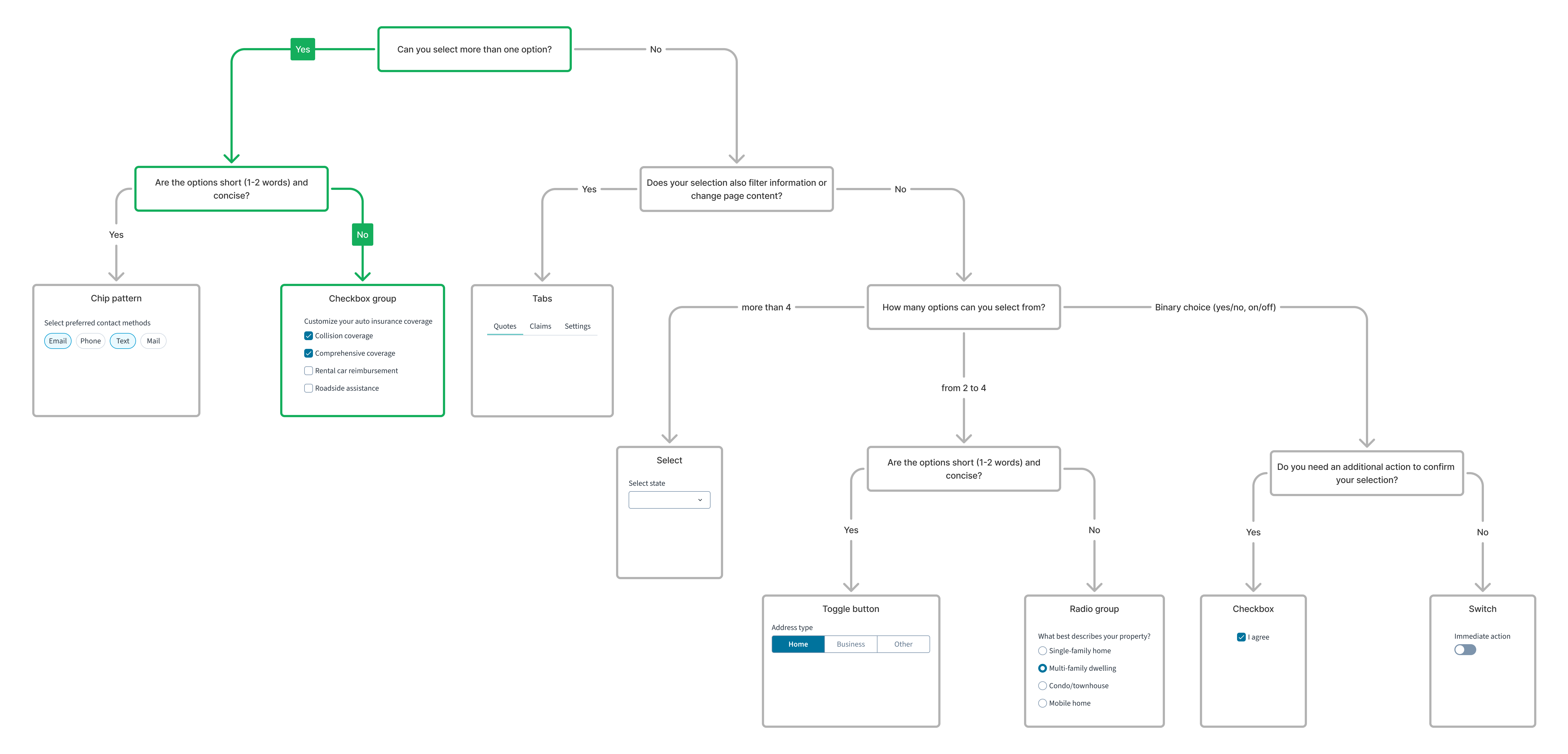
Checkboxes enable users to select from a list of items. They often appear in forms, where there is a need to collect user information. When using checkboxes, users can select one or more items from a set.
For a detailed guide on when to use this component, explore the following UI component decision tree.
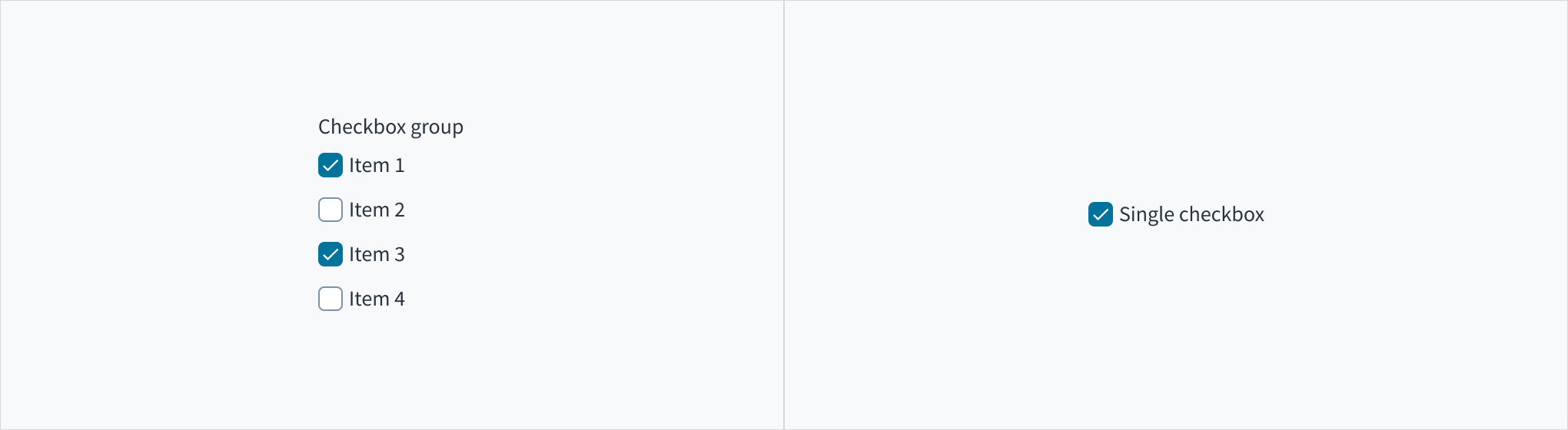
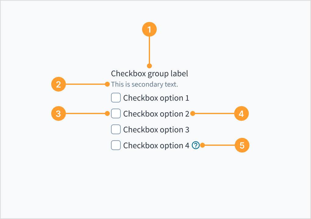
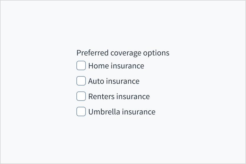
A checkbox group is a list of checkbox items under one group label. Users can select all items that are relevant under the group label. This format is useful when there are multiple valid options for a single instance.
Jutro also accommodates checkboxes with a single item. Note that checkboxes can be used to turn an option on or off (for example, when enabling or disabling a setting).
Checkbox group (left) and single checkbox (right).
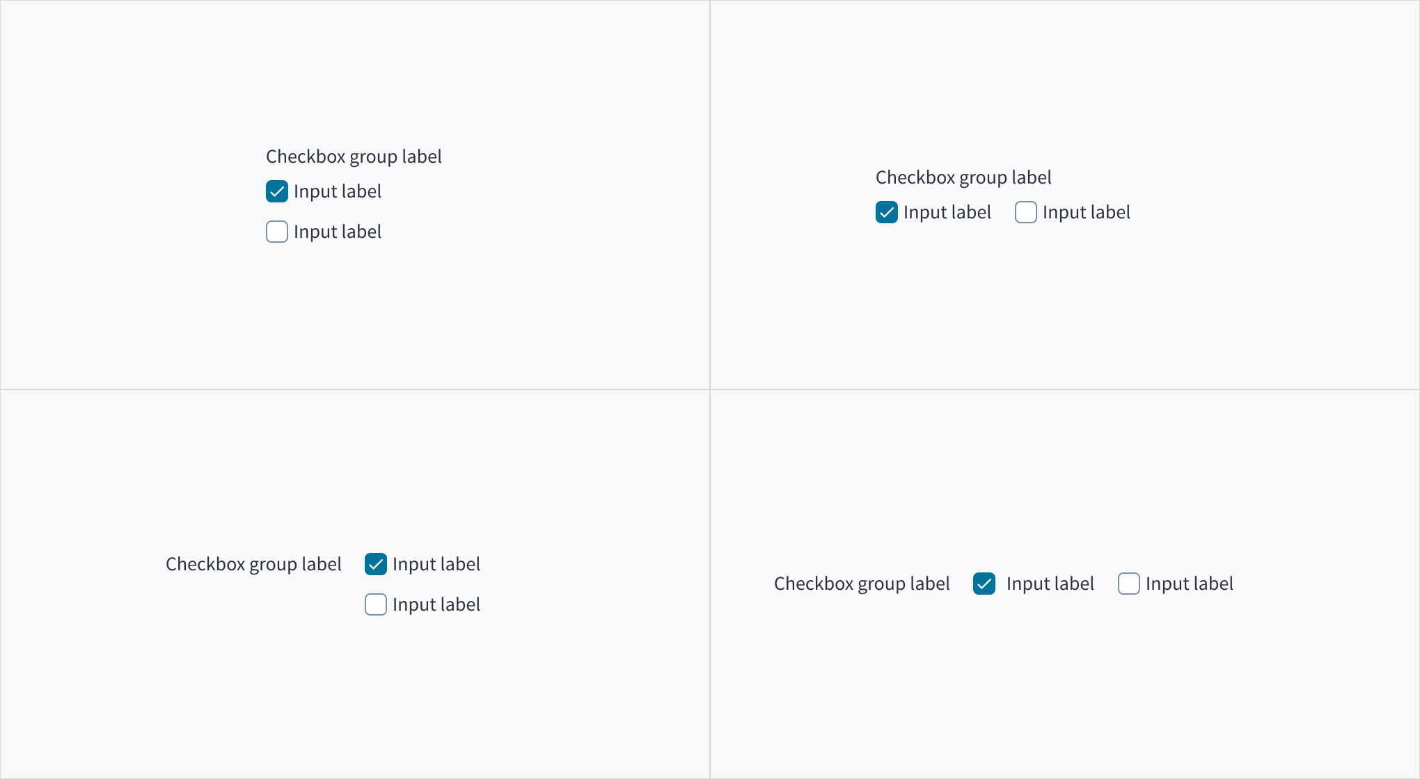
A checkbox group can be arranged vertically or horizontally depending on the page structure. By default, checkboxes are arranged vertically for easier reading.
As is the case with all input components, the label for the checkbox group can appear at the top (default) or on the left of the input itself.
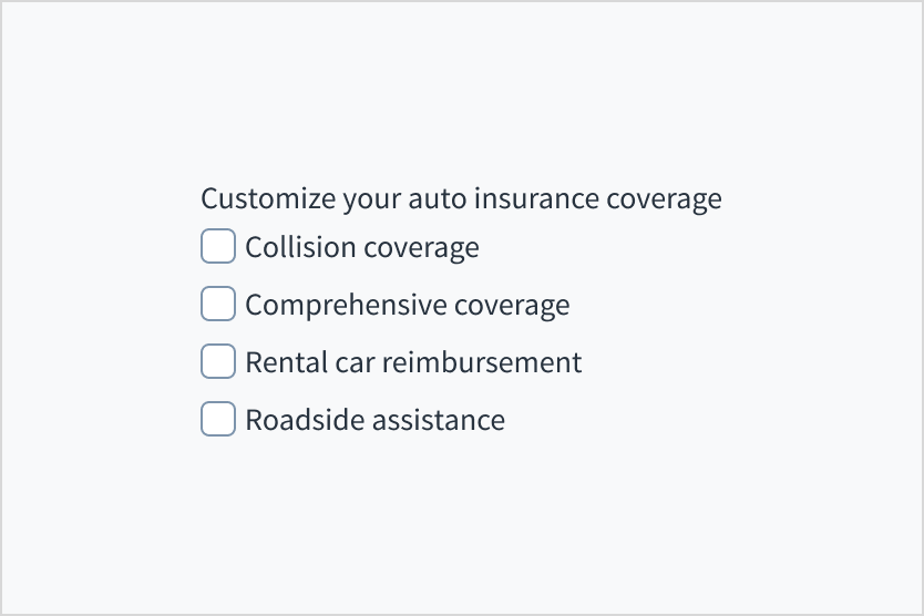
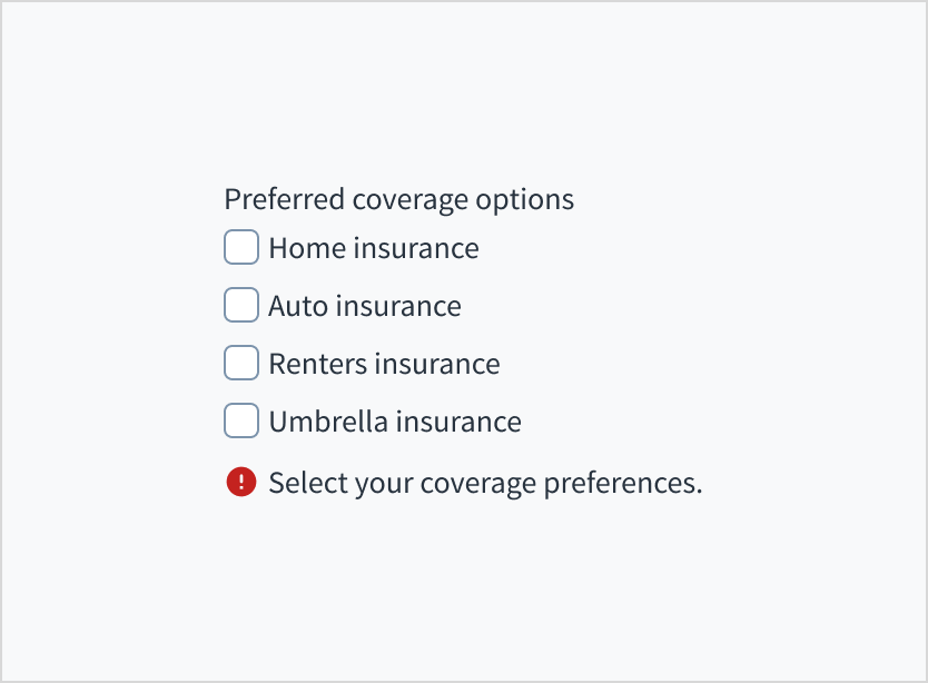
Checkbox groups must have a label that describes what the list of options represents. A checkbox group without a label is ambiguous and not accessible.
Use the group label to state the category of the grouping or describe what actions to take below.
Do include a label that clearly describes what the list of options represents.
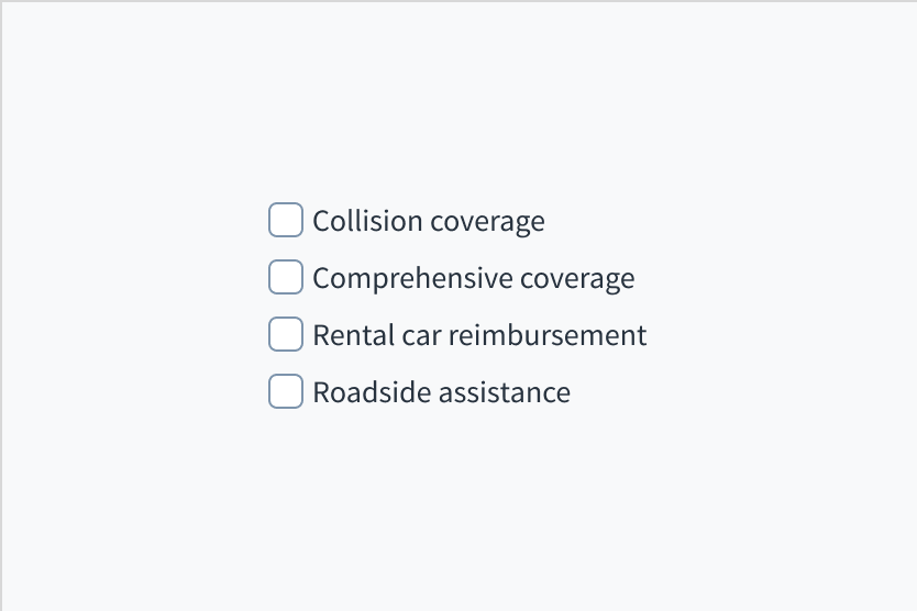
Don't assume that the options are self-explanatory without a label.
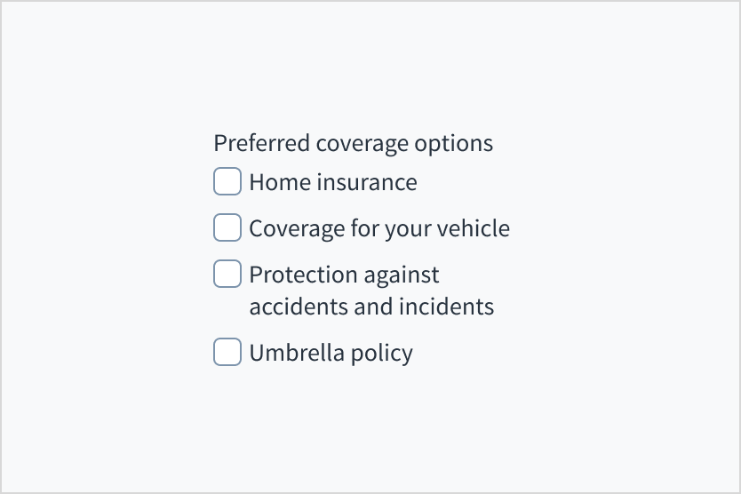
Try to make all labels in a checkbox group as parallel as possible. They should follow the same format and be approximately the same length.
Use labels that are clear, concise, and unambiguous. Labels should describe options that are easy for average users to understand.
Use positive and active wording for checkbox labels. Make it clear what will happen if the user checks a particular box, and what will happen if they leave it unchecked.
Avoid negations such as "Don't send me email notifications". This would mean that the user would have to check the box in order for something not to happen.
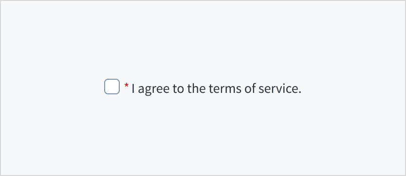
When asking the user for their consent, use the first person. For example, “I agree to the terms of service”.
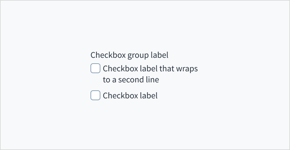
Limit the checkbox text label to a single line. We recommend using one to three words for checkbox labels.
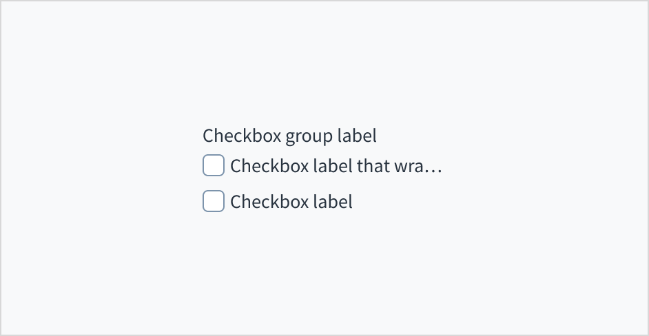
Don't truncate checkbox labels with an ellipsis (...). If the label is too long for the horizontal space available, consider rewording it. You can also wrap long checkbox labels to a second line. This is preferable to truncation.
Do keep checkbox label text concise. If necessary, wrap to a second line.
Don't truncate checkbox label text with an ellipsis.
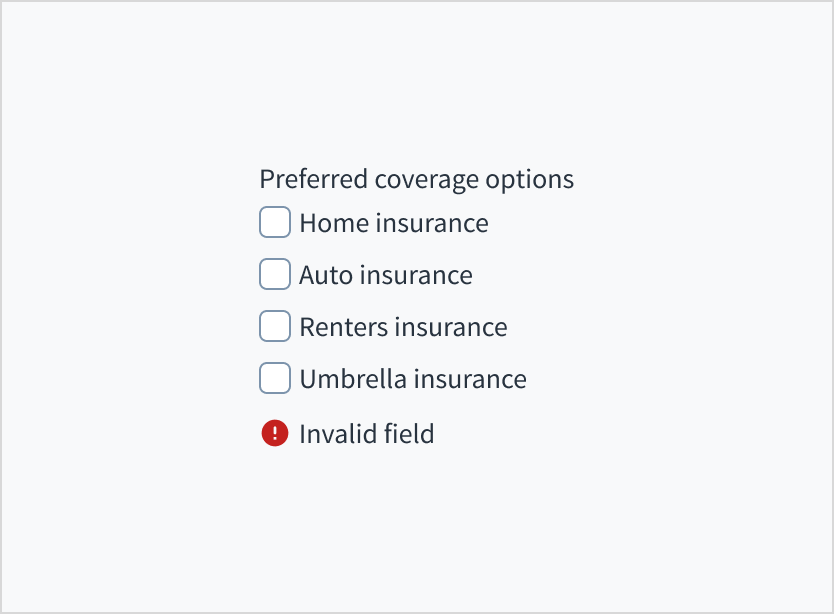
Checkbox groups and checkboxes can include error messages to show that a selection is required to move forward, or that a selection that was made is invalid.
Use sentence case for error text. Write 1-2 short, complete sentences that end with a period.
Do use error text to guide the user and show them a solution.
Don't write ambiguous error messages or leave users guessing as to how to resolve a problem.
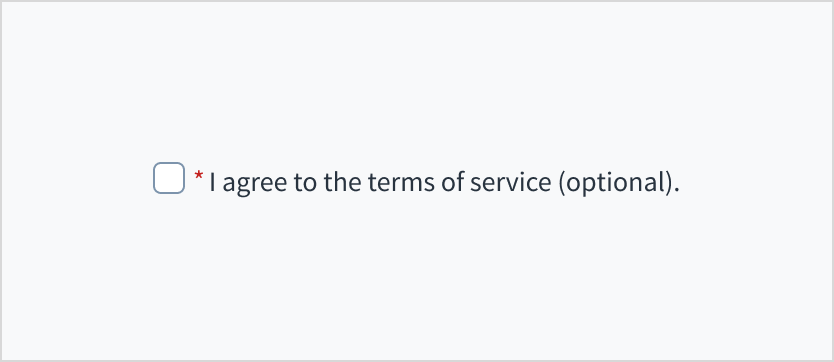
Use an asterisk (*) to indicate required fields. The asterisk precedes the field label. This helps users to easily locate which fields are required by scanning just the left-most character of the label.
In addition to marking required fields with an asterisk, it is recommended to include clear instructions at the top of the form, such as "All fields marked with an asterisk are mandatory," to ensure users understand the meaning of the asterisk.
Do use an asterisk to indicate that a field is required.
Don't use an asterisk to denote anything that is optional.
When the checkbox has focus, pressing the Space key changes the state of the checkbox. This follows the standards established by the World Wide Web Consortium (W3C).
For the checkbox group: The checkbox group implements <input type='checkbox'>. The group derives its accessible name from the group label. This can be changed using the label field in Storybook. A 'for/id' association is implemented to associate each individual checkbox with its label, while the 'checked/unchecked' state of the element is communicated through the aria-checked attribute.
For the single checkbox: The checkbox element is programmatically associated with its label. This means that users can use the TAB key to navigate through elements, and their respective labels will be voiced by screen readers. The 'checked/unchecked' state is communicated through the aria-checked attribute.
The contrast ratio of textual elements against their background is above 4.5:1 as per WCAG 2.1 AA requirements. Non-textual content that needs to convey meaning (such as icons and keyboard focus visibility) has a contrast ratio of at least 3:1 with its adjacent colors. All content is visible and functional up to and including 400% without requiring scrolling in two dimensions.
This component has been validated to meet the WCAG 2.1 AA accessibility guidelines. However, changes made by the content author can affect accessibility conformance.
Make sure to understand the Design System components API surface, and the implications and trade-offs. Learn more in our introduction to the component API.
State of the checkbox. If set to true, the checkbox is checked. Takes precedence over initialChecked. If this prop is passed, the component works in controlled mode and its value will change only if this prop changes.
If set to true, the component is rendered in disabled state. Note that when checkbox group is disabled all checkboxes inside group are disabled as well.
You can use HTML input attributes, except any that are overridden by Jutro. These attributes are assigned to the HTML input element.
<CheckboxGrouplabel="This is a group"> <Checkbox label="This is the first one" id="firstOption" /> <Checkbox label="This is the second one" id="secondOption" /> <Checkbox label="This is the third one" id="thirdOption" /> </CheckboxGroup>
The result of passing the id property is that it becomes a part of the HTML input that is created in the HTML DOM.
Jutro inputs have implemented imperative handlers as a mechanism to provide access to some common native features that might be useful for you. The following features are available:
Set focus to allow you to set the user focus into a specific component
Blur to remove the focus from the component
Scroll to the component so that you can take the user to a specific area of the page.
These features are provided through the ref property, which exposes them as follows:
Although some Jutro components might provide complementary features or a helper function to facilitate the validation process, it is your responsibility as a developer to handle the validation of any user input (using or not using the complementary helpers) and to decide what error messages to show.
Jutro components behave based on the developer implementation.
When are error messages displayed?
Error messages are only displayed when you pass them to the component through the stateMessages property. This property receives an object with the following content:
The component displays every error message provided in the same order as in the array.
When does validation occur?
This is your decision as a developer. As components do not determine when the validation is performed or when the error must be displayed, you need to implement the logic to handle it according to the project requirements, for example while the user is editing the content, when the component loses focus, and on form submission.
The CheckboxGroup component acts as container for a set of Checkbox elements. You can choose to display or hide the label, but it is mandatory for the component's accessibility.
<CheckboxGrouplabel="This is a group"> <Checkboxlabel="option 1"/> <Checkboxlabel="option 2"/> </CheckboxGroup>
You can hide the CheckboxGroup label by setting the hideLabel property to true. This does not affect any of the other behaviors of the CheckboxGroup element.
<CheckboxGroup label="This is only for aria-label" hideLabel={true}> <Checkboxlabel="option 1"/> <Checkboxlabel="option 2"/> </CheckboxGroup>
Both components allow developers to show error messages. When set at the CheckboxGroup level, errors are displayed below all options. However, when set at the Checkbox level inside a CheckboxGroup, the message is ignored and has no effect.
exportfunctionCheckboxMessages(){ const[validationMessages, setValidationMessages]=useState({}); const[groupValidationMessages, setGroupValidationMessages]=useState({}); const onChange =useCallback((e, newChecked)=>{ setValidationMessages({}); setGroupValidationMessages({}); if(newChecked){ setValidationMessages({error:['This is ignored']}); setGroupValidationMessages({error:['Only second checkbox can be marked']}); } },[]); return( <CheckboxGroup label="Do not select the forbidden option" stateMessages={groupValidationMessages} > <Checkbox label="Forbidden option" onChange={onChange} stateMessages={validationMessages} /> <Checkboxlabel="You can select this one"/> </CheckboxGroup> ); } }
Although this is not implemented as part of the Checkbox component, the native behavior of an HTML input element is available. In this case, the indeterminate state can be set programmatically through JavaScript. A checkbox in the indeterminate state has a horizontal line in the box, instead of a check or tick. In the example below, the style is modified to make the option visible.
exportfunctionSetIndeterminateState(){ const onChange =useCallback((e, newCheck)=>{ (document.getElementById('checkbox2')asHTMLInputElement).indeterminate= newCheck; },[]); const style ={ opacity:100}; return( <CheckboxGrouplabel="Group of checkboxes"> <Checkbox label="Set the next checkbox as 'indeterminate'" onChange={onChange} /> <Checkbox label="This is another checkbox" id="checkbox2" checked={false} style={style} /> </CheckboxGroup> ); }
New @jutro/components/Checkbox and @jutro/components/CheckboxGroup components introduced that replace CheckboxField and CheckboxGroupField.
The previous checkbox-related components were deprecated and moved to the @jutro/legacy package. To view their documentation switch to an older version.