Usage
Overview
Tabs allow users to navigate similar content on the same page. For example, you might have a series of tabs labeled "Get a quote," "Account log in," and "Claims." They help organize content into multiple categories, reducing cognitive load for the user.
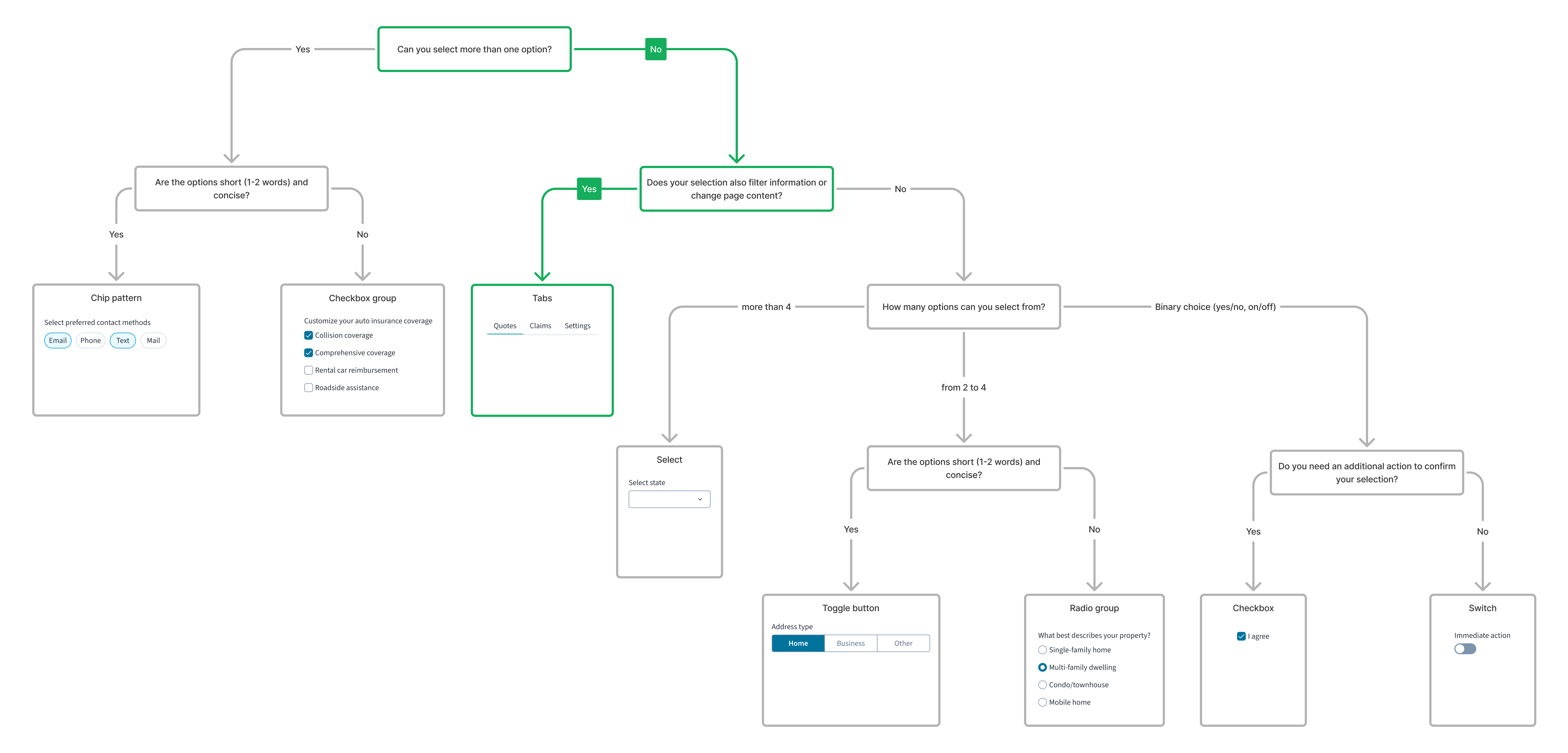
For a detailed guide on when to use this component, explore the following UI component decision tree.
Anatomy
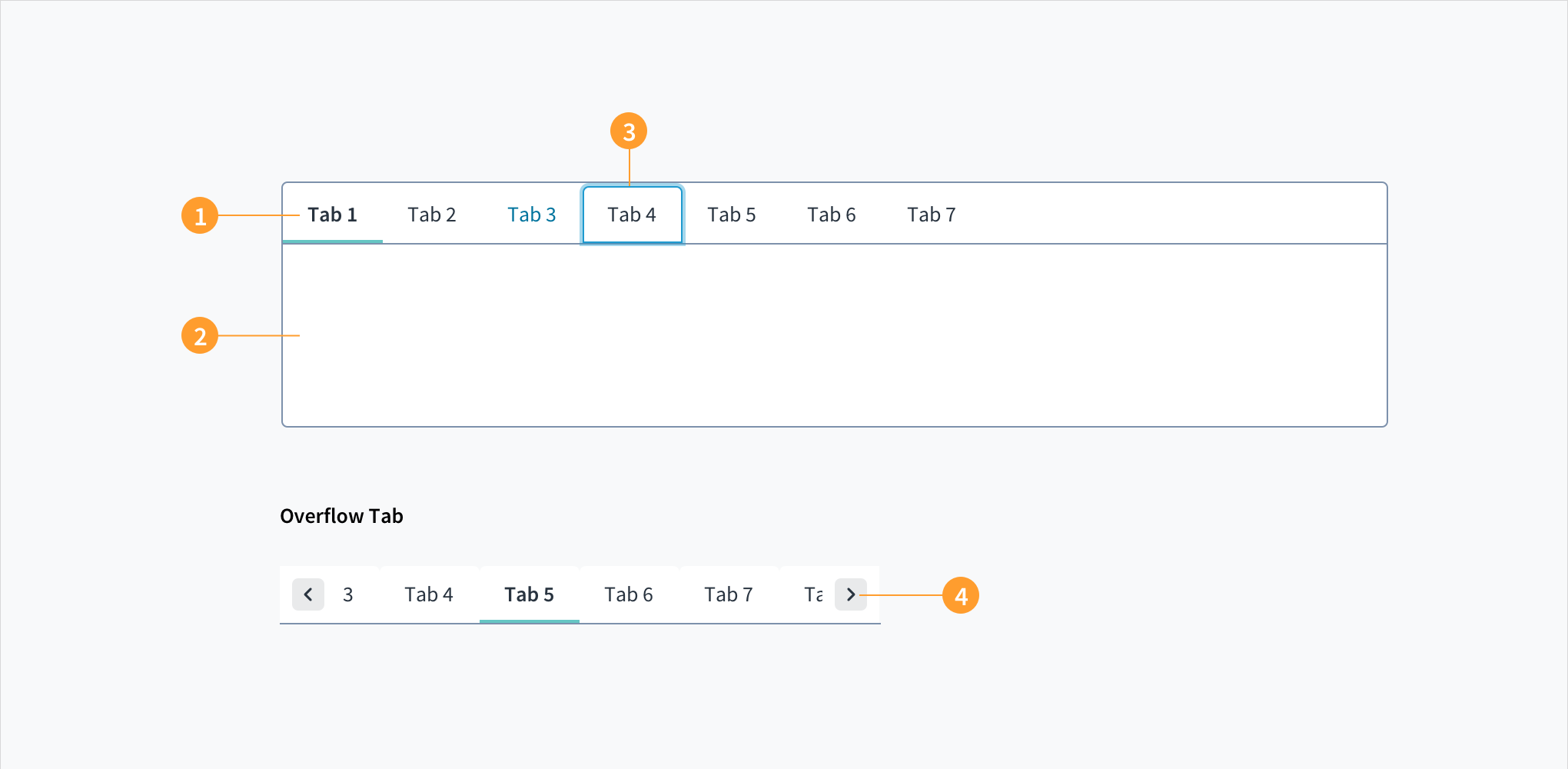
Tabs appear in a set; each tab has a label and a content section.
Tabs consist of:
- Label: describes the content of the tab. Each tab has a label that provides the user with context.
- Content area: contains content related to that category. The content within tabs should consist of a cohesive set of items with a common theme.
- Active tab indicator: appears beneath an active tab. Only one tab can be active at a time.
- Chevron icon: allows users to bring overflow tabs within view.
Content
UX writing considerations
- The content that lives within each tab should be cohesive and should have a common set of characteristics.
- Use labels to clearly and succinctly describe the content that lives within each tab.
- Tabs should be parallel in nature, without twisting the language to make them parallel.
- Tab labels should be short (1 to 2 words) and should use plain language.
- Tab labels use sentence case: capitalize the first word of a phrase and proper nouns.
Best practices
- Use tabs to alternate views within the same context. Users should not have to navigate to different areas. Tabs allow them to alternate views while staying in place.
- Logically chunk content so each user can easily predict what they will find within each tab.
- Arrange tabs logically but don't use tabs for sequential content that needs to be read in a particular order.
- By default, set the first tab in a set to be active.
- Avoid the temptation to use more than one row of tabs. We generally recommend no more than six tabs in a set.
- Only use tabs when users do not need to compare content across multiple tabs.
- Highlight the currently selected tab.
- Ensure that unselected tabs are clearly visible and readable.
- Display tabs on the top of the tab panel, rather than on the sides or bottom.
Behaviors
States
Tabs have hover, focus, and active states:
- Hover: Provides feedback indicating that the user has placed a cursor over the element (desktop only). Tab labels change font color upon hover.
- Focus: Provides feedback indicating that the user has highlighted the element, typically using an input method such as a keyboard or mouse.
- Active: Provides feedback indicating that the user is clicking or tapping the element. Tabs that are active appear underlined.
Interactions
Keyboard
The TAB key moves focus to the first tab element in the sequence. Use the arrow keys to move between tab panels. If the tab panel contains focusable elements (such as a link or button) pressing the TAB key moves focus to the focusable element. If there are no focusable elements, the TAB key will move focus away from the tab panel to the next focusable element after the component.
Screen reader
WAI-ARIA roles of 'tablist', 'tab' and 'tabpanel' are included to provide meaning to assistive technologies. When a tab panel is active the aria-selected value is set to 'true' to provide contextual information.
Navigation
- When interacting with tabs, users do not navigate to different areas. Instead, they alternate views within the same context.
Accessibility
The contrast ratio of textual elements against their background is above 4.5:1 as per WCAG 2.1 AA requirements. Non-textual content that needs to convey meaning (such as icons and keyboard focus visibility) has a contrast ratio of at least 3:1 with its adjacent colors. All content is visible and functional up to and including 400% without requiring scrolling in two dimensions.
This component has been validated to meet the WCAG 2.1 AA accessibility guidelines. However, changes made by the content author can affect accessibility conformance.
Be sure to follow guidance in this section and also in the WAI-ARIA Authoring Practices for Tabs.
When using this component in your applications:
- Provide meaningful and descriptive titles for each tab. This assists users to understand the content within each tab panel, and provides for efficient navigation.
- Ensure that the content within each tab panel is accessible by, for example, using semantic heading components, paying attention to color contrasts, & applying alternative text to images.
Code
Import statement
import { TabSet, Tab } from '@jutro/components/';
Component contract
Make sure to understand the Design System components API surface, and the implications and trade-offs. Learn more in our introduction to the component API.
Properties
TabSet
activeTab
DescriptionThe tabId of the active tab. It must be used in conjunction with onTabChange.
children
TypeComponentPropTypes.childOfComponentType(Tab)
DescriptionA set of <Tab> children for this component.
className
DescriptionCSS class name for this component.
defaultActiveTab
DescriptionSets which tab is active by default.
label
DescriptionAn optional label describing the purpose of the tab list.
onTabChange
Type(tab?: string) => unknown
DescriptionThe callback to call when the tab is changed; if provided, activeTab must also be provided.
iddeprecated
DescriptionUnique identifier for the component.
showFramedeprecated
DescriptionDisplays a frame surrounding TabSet when set to true.
Tab
idrequired
DescriptionUnique identifier for the component.
children
DescriptionThe content of this tab, child components to display.
className
DescriptionCSS class name for this component.
disabled
DescriptionIf set to true, the tab is disabled.
heading
DescriptionThe heading for the tab. This prop is not rendered by the Tab component directly, but rather is extracted out by the TabSet component and rendered by it instead. Can be either a simple string or a renderer function which must accept rendering props object as an argument.
noContainerFocus
DescriptionIf set to true, makes the tab contain nested focusable elements and pressing the Tab key does not focus on the tabpanel.
visible
DescriptionIf set to true, the tab is visible.
Hooks
No hooks are available for Tabset.
Translation keys
There are no translation keys associated with the Tabset and Tab components.
Escape hatches
For more information, see our documentation about escape hatches.
Custom behaviors
Tab overflow
When the tabs width exceeds the container width, hides the extra tabs and displays an arrow for scrolling to these tabs.
Examples
Basic tabs
The TabSet and Tab components are available from the @jutro/components package. The Tab component can only be placed inside a TabSet component. Tab requires to have an id set.
import React from 'react';
import { TabSet, Tab } from '@jutro/components/';

export const BasicTabs = () => {
  return (
    <TabSet activeTab="tab-1">
      <Tab
        heading="Tab heading 1"
        id="tab-1"
      >
        Tab 1 content
      </Tab>
      <Tab
        heading="Tab heading 2"
        id="tab-2"
      >
        Tab 2 content
      </Tab>
      <Tab
        heading="Tab heading 3"
        id="tab-3"
      >
        Tab 3 content
      </Tab>
      <Tab
        heading="Tab heading 4"
        id="tab-4"
      >
        Tab 4 content
      </Tab>
    </TabSet>
  );
};
Tabs status examples
You can make a tab visible or not using the visible prop. In this example, the third tab is not visible, but when you click on the first tab, the onTabChange prop calls the function handleTabChange and makes the third tab visible.
Additionally, the second tab is disabled using the disabled prop.
import React, { useState } from 'react';
import { TabSet, Tab } from '@jutro/components/';

export const StatusTabs = () => {
  const [isTab3Visible, setIsTab3Visible] = useState(false);
  const [activeTab, setActiveTab] = useState('tab-4');
  const handleTabChange = (tabId) => {
    setActiveTab(tabId);
    setIsTab3Visible(tabId === 'tab-1' || tabId === 'tab-3');
  };

  return (
    <TabSet
      defaultActiveTab="tab-4"
      activeTab={activeTab}
      onTabChange={handleTabChange}
    >
      <Tab
        heading="Tab heading 1"
        id="tab-1"
      >
        Tab 1 content
      </Tab>
      <Tab
        heading="Disabled tab"
        id="tab-2"
        disabled
      >
        Tab 2 content
      </Tab>
      <Tab
        heading="Hidden tab"
        id="tab-3"
        visible={isTab3Visible}
      >
        This tab is only visible after clicking on the fist tab.
      </Tab>
      <Tab
        heading="Tab heading 4"
        id="tab-4"
      >
        Click on the first tab to enable the hidden tab.
      </Tab>
    </TabSet>
  );
};
Nested tabs and overflow
You can include a TabSet component inside a Tab to nest a new set of tabs.
When the width of the tabs is greater that the container, the tabs overflow automatically.
import React from 'react';
import { TabSet, Tab } from '@jutro/components/';

export const NestedOverflowTabs = () => {
  return (
    <div style={{ width: '600px' }}>
      <TabSet activeTab="tab-1">
        <Tab
          heading="Tab heading 1"
          id="tab-1"
        >
          <p>Here are some nested tabs:</p>
          <TabSet activeTab="ntab-1">
            <Tab
              heading="Nested Tab heading 1"
              id="ntab-1"
            >
              Nested Tab 1 content
            </Tab>
            <Tab
              heading="Nested Tab heading 2"
              id="ntab-2"
            >
              Nested Tab 2 content
            </Tab>
          </TabSet>
        </Tab>
        <Tab
          heading="Tab heading 2"
          id="tab-2"
        >
          Tab 2 content
        </Tab>
        <Tab
          heading="Tab heading 3"
          id="tab-3"
        >
          Tab 3 content
        </Tab>
        <Tab
          heading="Tab heading 4"
          id="tab-4"
        >
          Tab 4 content
        </Tab>
        <Tab
          heading="Tab heading 5"
          id="tab-5"
        >
          Tab 5 content
        </Tab>
        <Tab
          heading="Tab heading 6"
          id="tab-6"
        >
          Tab 6 content
        </Tab>
        <Tab
          heading="Tab heading 7"
          id="tab-7"
        >
          Tab 7 content
        </Tab>
      </TabSet>
    </div>
  );
};