Tooltips provide an unobtrusive way to answer questions about the UI or to add a bit of information or instruction to an interface. They offer point-of-need help and contextual help and can communicate the value of features. Tooltips appear either when users click, hover, or focus on an element.
Tooltips have a dark background with white overlaying text that clearly displays the information. A caret indicates where the tooltip came from.
Tooltips consist of three variations that fulfill different design needs:
Base tooltip: The base tooltip is used for general information. Text is descriptive and related to the field. The base tooltip may also accommodate interactive elements like buttons or links.
Icon tooltip: The icon tooltip helps to clarify the name of the interactive icon button and describe its function.
Definition tooltip: The definition tooltip defines a predefined portion of text.
The Jutro tooltip component displays additional supplemental information upon click, hover, or focus. Although there are three options upon which to trigger a tooltip, from a pure accessibility standpoint, we advise using either click or focus. This is due to the fact that only allowing a tooltip to display on hover means that the information it contains will not be available to keyboard-only users and screen reader users.
Screen reader interaction: The tooltip component has the WAI-ARIA role of 'tooltip', and inherits the aria-live attribute automatically. As such, the content within the tooltip is voiced by screen readers.
Keyboard interaction: The tooltip becomes visible when the tooltip is set to display on focus. It also becomes visible when the tooltip is set to display on click, as the keyboard event is programmatically tied to the click event.
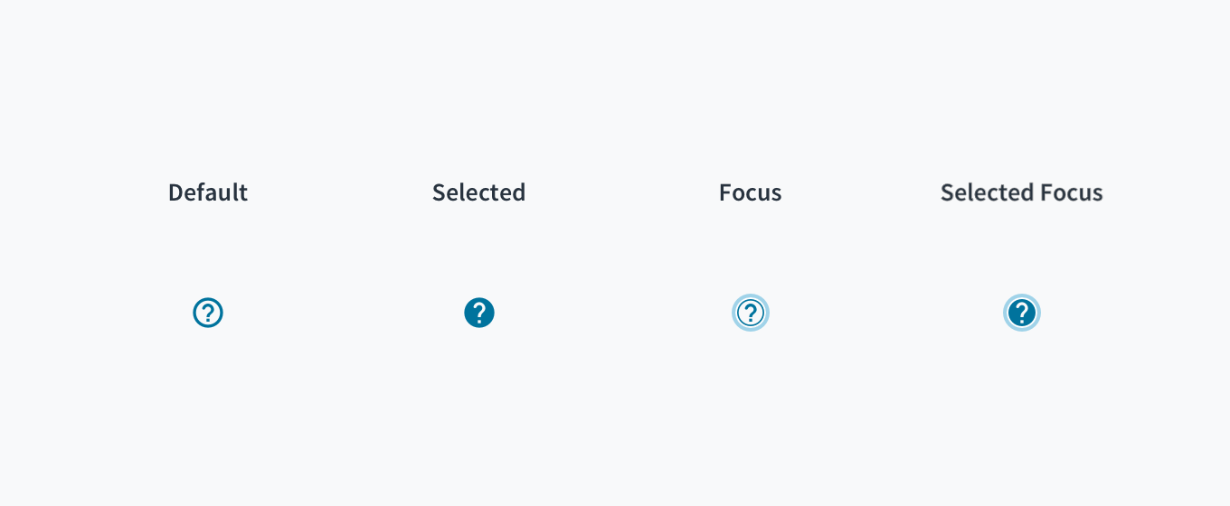
The contrast ratio of textual elements against their background is above 4.5:1 as per WCAG 2.1 AA requirements. Non-textual content that needs to convey meaning (such as icons and keyboard focus visibility) has a contrast ratio of at least 3:1 with its adjacent colors. All content is visible and functional up to and including 400% without requiring scrolling in two dimensions.
This component has been validated to meet the WCAG 2.1 AA accessibility guidelines. However, changes made by the content author can affect accessibility conformance.
When the tooltip is dismissed/closed, ensure that focus is maintained on the element that invoked it.
Check color contrast thresholds between the text and its background if applying custom colors to the element.
Note: Some configurations of the Tooltip component are not accessibility compliant.
The 'Mouseenter' trigger is only available to mouse users. Tabbing to the component and then trying to trigger it does not display the tooltip. This means the tooltip is inaccessible for users who rely on using a keyboard.
Setting 'Hide On Click' to false would fail the WCAG 2.1 requirement 'Content on Hover or Focus' because it is not possible to remove the tooltip. The tooltip may obscure content which a user needs to read.
There are two different components implementing the 'Tooltip' specifications. While Tooltip component is able to support all the scenarios, TooltipIcon component is only considered when the tooltip is associated with an icon. See the Examples section for use cases.
Tooltip
importReactfrom'react'; import{Tooltip,Button}from'@jutro/components'; exportconstBasicTooltip=()=>{ return( <Tooltipcontent="This is a tooltip"> <Buttonlabel="Move the cursor here"/> </Tooltip> ); };
TooltipIcon
import{TooltipIcon}from'@jutro/components'; importReactfrom'react'; exportconstTooltipIconBasic=()=>{ return<TooltipIcontext="This is a tooltip"/>; };
Make sure to understand the Design System components API surface, and the implications and trade-offs. Learn more in our introduction to the component API.
Warning: Any Tooltip property not included in the list below is considered an internal implementation detail and not subject to the non breaking changes policy.
If set to true, the tooltip disappears if a mousedown event is fired outside of it. If set to false, it is not possible to close the tooltip. If 'toggle' option is used, the tooltip will be closed when clicking on the element again. In all cases, trigger property needs to be set to 'click'.
Note: It is required that an icon with the same name as the one passed in the icon property but with the '-outlined' suffix exists in order to set an specific icon. If it does not exist, the default icon will be always displayed.
Information from Field Component to link tooltip with related field. This property is not to be used out of the context of the @legacy input components.
Information from Field Component to the Tooltip Icon about the position of the label. This property is not to be used out of the context of the @legacy input components.
Information from Field Component. If set to true, the label is displayed inline. This property is not to be used out of the context of the @legacy input components.
Known issue: child component requires a forwardRef
If your Tooltip doesn't work, you may be running into a known issue: The child component needs a forwardRef for the tooltip to work.
The workaround for components which don't have forwardRef is to wrap them in a <span>.
import{Badge,Tooltip}from'@jutro/components'; importReactfrom'react'; exportconstTooltipNoRef=()=>{ return( <Tooltip content="This badge does not have a forward ref but it really needs a tooltip" showOnInit > <span> <Badge value={7} type="primary" /> </span> </Tooltip> ); };
If you put a non-focusable element inside a Tooltip, the element will be given the aria-expanded="true" label. This is incorrect HTML. To avoid this issue, ensure you only put focusable elements inside the Tooltip.
A basic tooltip added to a Button component. The tooltip is displayed when the cursor is moved over the button.
importReactfrom'react'; import{Tooltip,Button}from'@jutro/components'; exportconstBasicTooltip=()=>{ return( <Tooltipcontent="This is a tooltip"> <Buttonlabel="Move the cursor here"/> </Tooltip> ); };
It is possible to have multiple lines in a tooltip in 2 different ways:
Option 1: by interpolating the message with a new line character.
import{Button,Tooltip}from'@jutro/components'; importReactfrom'react'; exportconstTooltipNewlineInterpolate=()=>{ return( <Tooltip content={{ defaultMessage:'This is a tooltip {br} this is a new line', args:{br:<br/>}, }} placement="top" trigger="click" > <Buttonlabel="Click to open"/> </Tooltip> ); };
Option 2: by passing a JSX element as the content.
import{Button,Tooltip}from'@jutro/components'; importReactfrom'react'; exportconstTooltipNewlineJsx=()=>{ return( <Tooltip content={ <p> This is a tooltip <br/> this is a new line </p> } placement="top" trigger="click" > <Buttonlabel="Click to open"/> </Tooltip> ); };