Slider
Usage
Overview
Slider is a control element where the user selects a single value or a range of values from a fixed set of options. It provides a visual representation of an adjustable range of values or content. Users can pick a specific value by moving a handle horizontally along a track.
When to use
- To select a single value or a range of values from a fixed set of options.
- When the precise value won't matter to the user, but rather only the approximate range.
When not to use
- To adjust numeric fields by a small discrete amount. Instead, use the stepper.
- To select a precise value. Instead, use the number input.
Source: Nielsen Norman
Formatting
Anatomy
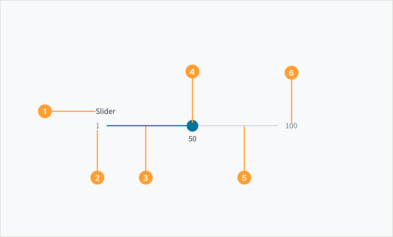
The slider consists of the following elements:
- Slider label: Text that describes the purpose of the selection control
- Minimum value: The lowest value in the range that the user is required to select from.
- Filled track: A visual indicator that highlights the selected range or progress along the slider from the starting point to the current position.
- Handle: Element that the user can move to the desired point in the range of values. The selected values display beneath the slider handle.
- Track: Horizontal line representing a range of values that users can select from.
- Maximum value: The highest value in the range that the user is required to select from.
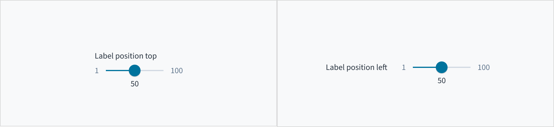
Label placement
Display any slider labels above or beside the slider, rather than below it, so that they remain visible while the user is selecting a value.
Layout and orientation
For left-to-right languages (for example, languages written in Latin, Cyrillic, Modern Greek, Indic and Southeast Asian scripts), the minimum value appears on the left end of the track, and the maximum value is on the far right.
For right-to-left languages (for example, languages written in Arabic and Hebrew scripts), the orientation of values is reversed.
Content
General writing guidelines
- Use sentence case for all aspects of designing Guidewire product interfaces. Don't use title case.
- Use present tense verbs and active voice in most situations.
- Use common contractions to lend your copy a more natural and informal tone.
- Use plain language. Avoid unnecessary jargon and complex language.
- Keep words and sentences short.
Include a label
Use the slider label to indicate what value the user is changing. The label should be short and concise. Limit it to a single line of text.
Use sentence case
Slider labels appear in sentence case and without punctuation.
For more information on how to implement sentence case, refer to the UI text style guide.


Behaviors
States
The slider has five visual states, which serve to communicate the status: enabled, hover, active, focus, and disabled.
| Visual | State | Description |
|---|---|---|
 | Enabled | Indicates to the user that the element is enabled for interaction. |
 | Hover | Indicates that the user has placed a cursor over the slider handle. |
 | Focus | Indicates that the user is clicking the slider handle. |
 | Active | Indicates that the slider handle is focused and that the keyboard can be used to select a value. The focus state can be used with all other states (including Disabled). |
 | Disabled | Communicates to the user that the element is not interactive. |
Interactions
Mouse
Users can select a numeric value by moving the slider handle with their mouse. By default, the value changes by increments of one.
You can use the step prop to control the increments by which the value changes as the user moves the slider handle. When the step prop is set, the slider's value will only change to values that are multiples of the specified step value.For example, if you have a slider with a range from 0 to 100, and you set the step prop to 5, the slider will only allow the user to select values that are multiples of 5 (0, 5, 10, 15, ..., 100). This means that the slider handle will snap to these specific values as the user drags it.
Keyboard
The slider handle is keyboard focusable. Values can be increased and decreased using the arrow keys.
Screenreader
This component includes the WAI-ARIA role of "slider" and the aria-orientation attribute of 'horizontal' to communicate its purpose and orientation. The slider handle and its label are associated through aria-labelledby. Similarly, the attributes of aria-valuemin, aria-valuemax and aria-valuenow are included to provide meaning to screen reader users. Changes in value are communicated by means of role='alert'.
Accessibility
The contrast ratio of textual elements against their background is above 4.5:1 as per WCAG 2.1 AA requirements. Non-textual content that needs to convey meaning (such as icons and keyboard focus visibility) has a contrast ratio of at least 3:1 with its adjacent colors. All content is visible and functional up to and including 400% without requiring scrolling in two dimensions.
This component has been validated to meet the WCAG 2.1 AA accessibility guidelines. However, changes made by the content author can affect accessibility conformance.
Be sure to review the guidance as referenced in the WAI-ARIA Authoring Practices for Sliders.