Simple progress bar
Usage
Overview
The simple progress bar shows the current progress of a system operation, such as loading, uploading, or submitting. It also shows the progress of a particular task before completion.
When to use
Use a progress bar to show the current progress of a system operation, such as loading, uploading, or submitting, especially when:
- The task has measurable progress (for example, percentage complete).
- The task is complex or has a long wait time and users need feedback on its status.
- You want to reduce user uncertainty by providing visual feedback during long-running operations.
When not to use
Don’t use a progress bar in these scenarios:
- For very short tasks that don’t require detailed feedback—use simpler indicators like loaders.
- To show progress through a series of discrete steps (for example, filling out a multi-step form). Instead, use step progress bar.
- To show steps and sub-steps for a particular task or use custom icons. Instead, use phase progress bar.
Formatting
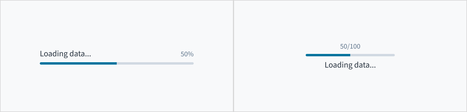
Anatomy

The progress bar consists of the following elements:
- Label: Describes the task or operation the progress bar is tracking.
- Numeric value: Represents the progress of a system operation or task within the progress bar's range. The numeric value is shown as a fraction or percentage.
- Bar: Represents the progress of a system operation or task by displaying a filled line.
Alignment and placement
The label can appear at the top or at the bottom of the progress bar.
Content
General writing guidelines
- Use sentence case for all aspects of designing Guidewire product interfaces. Don't use title case.
- Use present tense verbs and active voice in most situations.
- Use common contractions to lend your copy a more natural and informal tone.
- Use plain language. Avoid unnecessary jargon and complex language.
- Keep words and sentences short.
Progress bar label
- Include a progress bar label to give context about the operation or task being performed. In rare cases where context is sufficient, the label can be hidden. These progress bars must still include an
aria-labelattribute so that they are accessible. - Keep the progress bar label short and concise. Limit the label to a few words or a single line of text.
- Use sentence case for labels. Capitalize the first word of a phrase and any proper nouns. For additional guidance on how to implement sentence case, see Capitalization.
Accessibility
The simple progress bar includes the WAI-ARIA role of 'progressbar'. It also includes the WAI-ARIA attributes, aria-valuetext, aria-valuenow, aria-valuemin and aria-valuemax to assist in providing additional meaning to assistive technologies.
The contrast ratio of textual elements against their background is above 4.5:1 as per WCAG 2.1 AA requirements. Non-textual content that needs to convey meaning (such as icons and keyboard focus visibility) has a contrast ratio of at least 3:1 with its adjacent colors. All content is visible and functional up to and including 400% without requiring scrolling in two dimensions.
This component has been validated to meet the WCAG 2.1 AA accessibility guidelines. However, changes made by the content author can affect accessibility conformance.
When using this component within your application, ensure that the progress bar label is meaningful and concise. If you need to hide the label, provide a label prop and set hideLabel to True. This action sets the aria-label attribute to the label.