Usage
Overview
The date input combines three distinct input fields - day, month, and year - into a single date component. Users enter dates unrelated to the current date, such as birth dates, using this component.
When to use
- When the date is well-known to the user, such as a birth date or credit card expiration.
- When precise date entry is required and calendar selection might be cumbersome. For example, if the user needs to enter a date that's in the distant past or future, it can be faster and more efficient to manually type the date.
When not to use
- For dates that are close to the current time (for example, within the next few weeks or months). Instead, use the date picker.
- If the user is unlikely to have the date committed to memory (for example, scheduling an appointment several months in the future). Instead, use the date picker.
Types
The date input component offers three variants to accommodate different date-related input needs.
| Visual | Type | Purpose |
|---|
 | Date | Users enter a full date (day, month, and year). |
 | Month | Users enter a specific month and year, without a day. |
 | Year | Users enter a year only. |
Anatomy
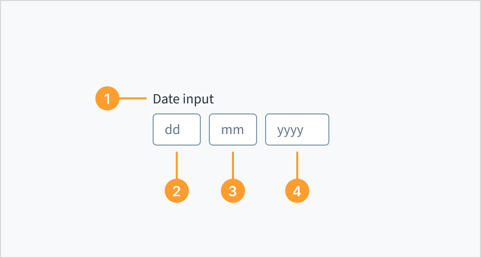
The date input consists of the following elements:
- Label: A clear and concise description that provides the purpose and context of the date input field. The label helps users understand the date they are expected to enter.
- Day field: An input field where the user can manually type in the day.
- Month field: An input field where the user can manually type in the month.
- Year field: An input field where the user can manually type in the year.
The date input component adapts to the user's locale settings, presenting the day, month, and year fields in the order most familiar to them. For example:
- United States: MM/DD/YYYY
- United Kingdom: DD/MM/YYYY
- Japan: YYYY/MM/DD
The component automatically adjusts the field order and labels to match the appropriate date format for the user's region.
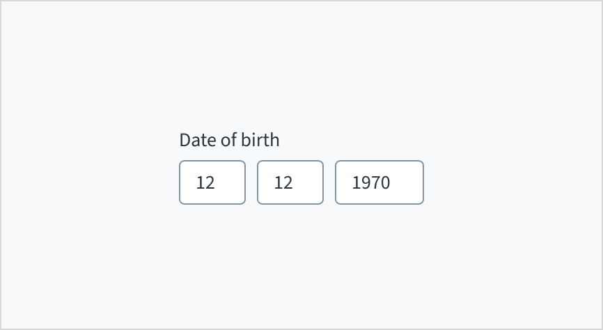
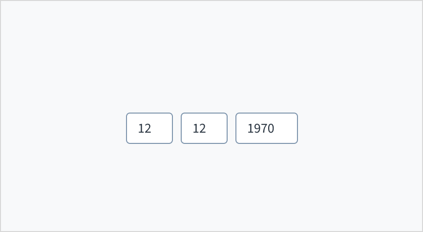
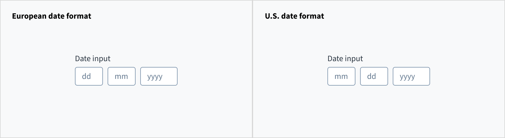 The order of the inputs changes depending on the locale. Examples for Europe (left) and U.S. (right).
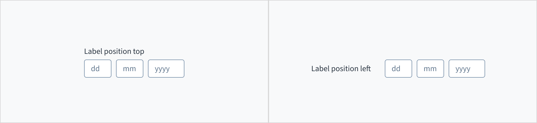
Label placement
The label for the date input can appear at the top (default and recommended) or on the left of the input itself.
Content
General writing guidelines
- Use sentence case for all aspects of designing Guidewire product interfaces. Don't use title case.
- Use present tense verbs and active voice in most situations.
- Use common contractions to lend your copy a more natural and informal tone.
- Use plain language. Avoid unnecessary jargon and complex language.
- Keep words and sentences short.
Include a label
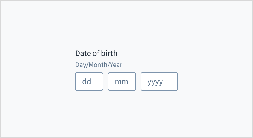
Place a clear, visible label outside the date input field. An input field without a label is ambiguous and not accessible.
Do position a permanent label outside the field.
Don't assume that the field is self-explanatory without a label.
Use help text
When using a date input, include the date format as help text. Relying solely on placeholder text to communicate the date format is problematic because placeholder text disappears once the user starts typing. This can leave users unsure of the expected format.
Source: Nielsen Norman Group
Do include the date format as help text.
Don't rely solely on placeholder text to communicate the date format.
Behaviors
States
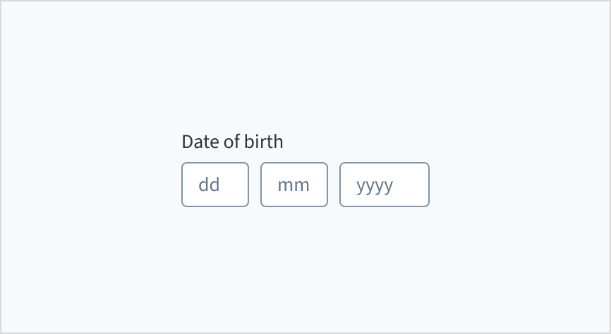
The date input field appears with no value (default), placeholder text, or a filled input.
| Visual | State | Description |
|---|
 | No value (default) | Indicates to the user that no value has been entered and there is no placeholder. |
 | Placeholder | Indicates to the user that no value has been entered. The placeholder is greyed out. |
 | Filled input | Indicates to the user that the input is filled with data. |
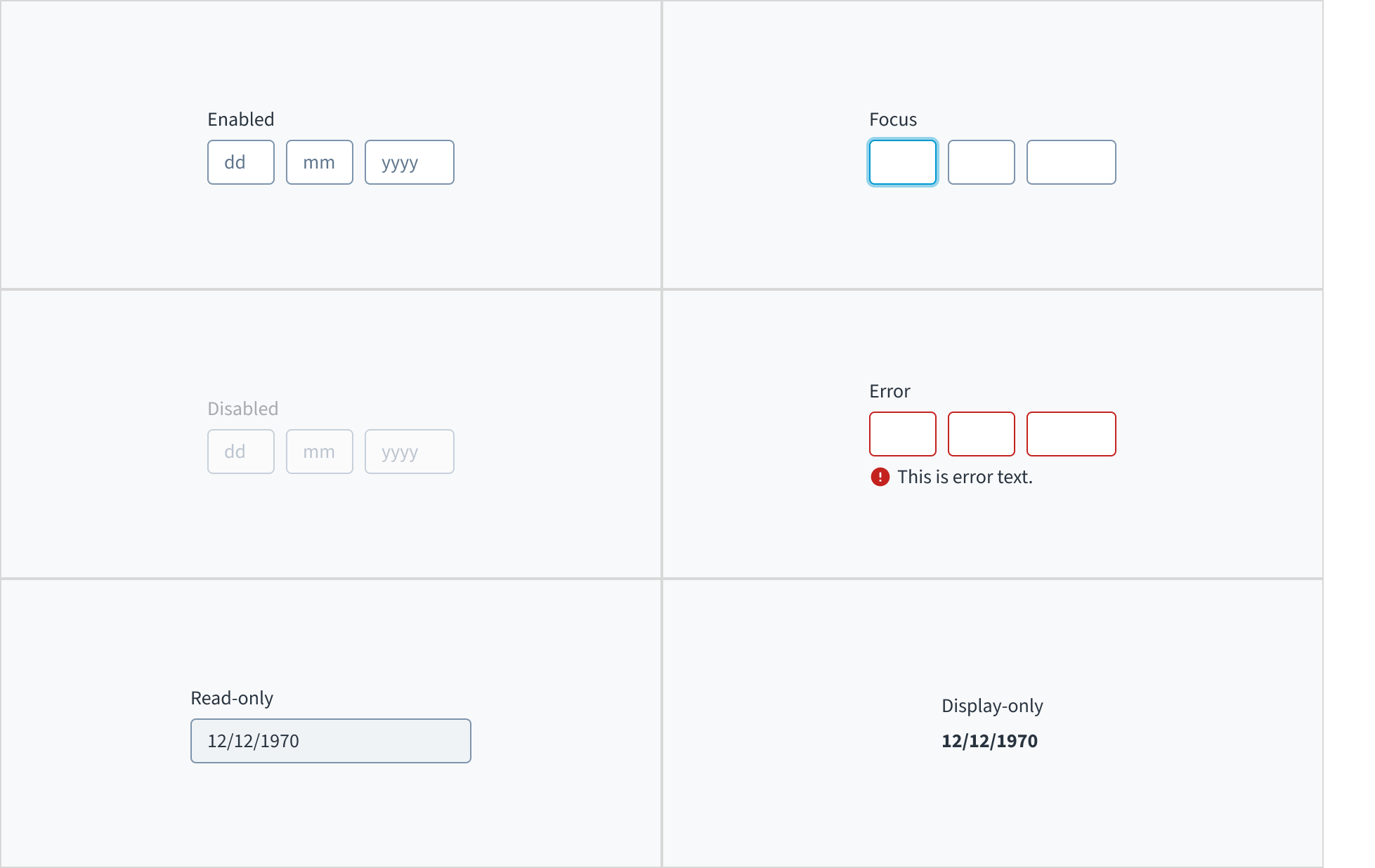
Date input fields also have interactive states for enabled, focus, disabled, error, read-only, and display-only.
Interactions
Mouse
Users can interact with this element by clicking in the area inside border.

Keyboard
The input element is keyboard accessible. Users can navigate into and out of the component using the TAB key.
Screen reader
The number input component derives its accessible name using an aria-label attribute. Changing the text value of the label element also changes the value of the accessible name. The default aria-required='true' attribute toggles to 'false' when the required checkbox is checked in Storybook.
Accessibility
The contrast ratio of textual elements against their background is above 4.5:1 as per WCAG 2.1 AA requirements. Non-textual content that needs to convey meaning (such as icons and keyboard focus visibility) has a contrast ratio of at least 3:1 with its adjacent colors. All content is visible and functional up to and including 400% without requiring scrolling in two dimensions.
This component has been validated to meet the WCAG 2.1 AA accessibility guidelines. However, changes made by the content author can affect accessibility conformance.
When using this component, ensure the label clearly communicates which date the user needs to input.
Code
Import statement
import { DateInput } from '@jutro/components/new';
Component contract
Make sure to understand the Design System components API surface, and the implications and trade-offs. Learn more in our introduction to the component API.
Properties
labelrequired
DescriptionLabel associated with the input field, also passed as a default value to 'aria-label'.
autoFocus
DescriptionDetermines whether to switch the focus between fields automatically. If true, the focus is set on the next field after typing the exact amount of characters as set in the max length attribute.
className
DescriptionCSS class name for this component.
disabled
DescriptionIf true, the component is rendered in a disabled state.
Type'vshort' | 'short' | 'long' | 'abbreviated' | 'full'
DescriptionSets the date format. This prop can only be used along with readOnly and displayOnly props.
displayOnly
DescriptionIf set to true, displays the component value in plain text. Consider using readonly instead, if possible, because plain text is worse for accessibility than readonly inputs.
hideLabel
DescriptionIf true, the label is not visible.
initialValue
Type{ day: number, month: number, year: number }
DescriptionInitial value of the input. The value must be an object with day, month, and year properties, where month is indexed from 1. If the value prop is specified along with this prop, this prop's value is discarded.
labelPosition
maxDate
Type{ day: number, month: number, year: number }
DescriptionMaximum allowed day value.
maxMonth
Type{ month: number, year: number }
DescriptionMaximum allowed month value.
maxYear
DescriptionMaximum allowed year value.
minDate
Type{ day: number, month: number, year: number }
DescriptionMinimum allowed day value.
minMonth
Type{ month: number, year: number }
DescriptionMinimum allowed month value.
minYear
DescriptionMinimum allowed year value.
onBlur
Typefunction (FocusEvent<HTMLInputElement>)
DescriptionA callback called after the component is focused.
onChange
Typefunction (React.ChangeEvent<HTMLInputElement>, { day: number, month: number, year: number })
DescriptionCallback invoked when component value is changed.
onFocus
Typefunction (FocusEvent<HTMLInputElement>)
DescriptionA callback called after the component is focused.
readOnly
DescriptionIf set to true, component is rendered in a read-only state. For values in plain text, consider using displayOnly.
required
DescriptionIf true, the component is rendered as required and the label will display an asterisk.
secondaryLabel
DescriptionSecondary label text to display.
stateMessages
DescriptionAn object with a list of error messages for the current state.
Type{ text: intlMessageShape, trigger: string } | intlMessageShapetext
DescriptionText to show tooltip content.
trigger
DescriptionThe trigger to show the tooltip.
DescriptionText to be displayed in the tooltip or tooltip object that includes: text - to show tooltip content, trigger - to set tooltip trigger.
value
Type{ day: number, month: number, year: number }
DescriptionValue of the input. Takes precedence over initialValue. The value must be in object format with day, month, and year property where month is indexed from 1. If this prop is passed, the component works in controlled mode and its value changes only if this prop changes.
variant
Type'date' | 'month' | 'year'
DescriptionVariant of the date input.
Hooks
No hooks are available for DateInput.
Translation keys
The date input component inherits the following translations:
| Key | Used for |
|---|
| jutro-components.fields.DatePicker.insertDay | The aria-label for the day selection field. |
| jutro-components.fields.DatePicker.insertMonth | The aria-label for the month selection field. |
| jutro-components.fields.DatePicker.insertYear | The aria-label for the year selection field. |
| jutro-components.fields.DatePicker.placeholderDay | The day part of the placeholder. Must be two repeated characters. |
| jutro-components.fields.DatePicker.placeholderMonth | The month part of the placeholder. Must be two repeated characters. |
| jutro-components.fields.DatePicker.placeholderYear | The year part of the placeholder. Must be four repeated characters. |
Depending on the locale, the input fields are rearranged to match the regional date format. This also affects the format for the displayOnly and readOnly props.
The DateInput component provides a validation mechanism using the onChange prop. This prop accepts the event, value, and errorCode parameters. The errorCode values can be:
INVALID_DATE: The date format is incorrect, for example, entering a month value greater than 12.MIN_EXCEEDED: The input value is lower than the minimum value defined by the minDate, minMonth, or minYear props.MAX_EXCEEDED: The input value is greater than the maximum value defined by the maxDate, maxMonth, or maxYear props.
You can check the Min/Max example to see how the validation works.
You can use the displayFormat prop to modify the format of the dates when using the readOnly or displayOnly props. There are five different alternatives:
vshort: 6/20/2024short: Jun 20, 2024long: June 20, 2024abbreviated: Thu, Jun 20, 2024full: Thursday, June 20, 2024
Escape hatches
For more information, see our documentation about escape hatches.
Are you using the legacy date input fields?
- To view docs for the old components, switch to a version of the documentation older than 10.7.0.
- These legacy components are also available in Storybook:
Examples
Check out the Usage section for details about how and when to use the DateInput component.
You can use the variant prop to create an input component with different fields:
import React from 'react';
import { DateInput } from '@jutro/components/new';

export const BasicDateInput = () => {
  return (
    <div style={{ display: 'flex', gap: '2rem', flexWrap: 'wrap'}}>
        <DateInput label="This is a simple date input" />
        <DateInput label="This is a month and year input" variant='month' />
        <DateInput label="This is a year input" variant='year' />
    </div>
  );
};
Error example
You can use the stateMessages property to display an error on the DateInput component.
import React from 'react';
import { DateInput } from '@jutro/components/new';

export const ErrorDateInput = () => {

  return (
    <div>
      <DateInput
        label="This is a date input"
        stateMessages= {{
            error: ['This is an error message'],
        }}
      />
    </div>
  );
};
Min/Max example
You can set a minimum and maximum date for the DateInput component with the minDate and maxDate props. Alternatively, you can set independent values, for months and years using the minMonth, minYear, maxMonth, and maxYear. The following example checks when it loses focus if the year value is between 2000 and 2024 and in case it is not between these values, shows an error.
import React, { useState } from 'react';
import { DateInput } from '@jutro/components/new';

export const MinMaxDateInput = () => {
  const [stateMessages, setStateMessages] = useState({});

  const handleChange = (event, value, errorObject) => {
    const errorCode = errorObject?.errorCode;

    if (errorCode === 'INVALID_DATE') {
      setStateMessages({
        error: ['Please enter a valid date.'],
      });
      return;
    }

    if (errorCode === 'MIN_EXCEEDED' || errorCode === 'MAX_EXCEEDED') {
      setStateMessages({
        error: [`The year must be between 2000 and 2024.`],
      });
    } else {
      setStateMessages({});
    }
  };

  return (
    <div>
      <DateInput
        label="Enter a date between year 2000 and year 2024"
        minDate={{ day: 1, month: 1, year: 2000 }}
        maxDate={{ day: 31, month: 12, year: 2024 }}
        onChange={handleChange}
        stateMessages={stateMessages}
      />
    </div>
  );
};
When using the readOnly or displayOnly props, you can use the displayFormat prop to modify the format of the dates.
import React from 'react';
import { DateInput } from '@jutro/components/new';

export const DisplayOptionsDateInput = () => {
  return (
    <div>
    <div style={{ display: 'flex', gap: '1.5rem', flexWrap: 'wrap'}}>
        <DateInput label="Vshort" readOnly displayFormat="vshort" initialValue={{ day: 20, month: 6, year: 2024  }} />
        <DateInput label="Short" readOnly displayFormat="short" initialValue={{ day: 20, month: 6, year: 2024  }} />
        <DateInput label="Long" readOnly displayFormat="long" initialValue={{ day: 20, month: 6, year: 2024  }} />
    </div><br />
    <div style={{ display: 'flex', gap: '1.5rem', flexWrap: 'wrap', justifyContent: 'center', alignItems: 'center'}}>
        <DateInput label="Abbreviated" readOnly displayFormat="abbreviated" initialValue={{ day: 20, month: 6, year: 2024  }} />
        <DateInput label="Full" readOnly displayFormat="full" initialValue={{ day: 20, month: 6, year: 2024  }} />
    </div>
    </div>
  );
};