Usage
Overview
The date range picker enables users to specify start and end dates. Users can select these dates from a calendar or enter them manually. This component is used in insurance applications to specify a range of dates for tasks such as:
- Selecting an insurance policy's coverage period
- Filtering claims data
When to use
For selecting a period with a distinct start and end date.
When not to use
For selecting a single date. In this case, use the date picker component.
Anatomy
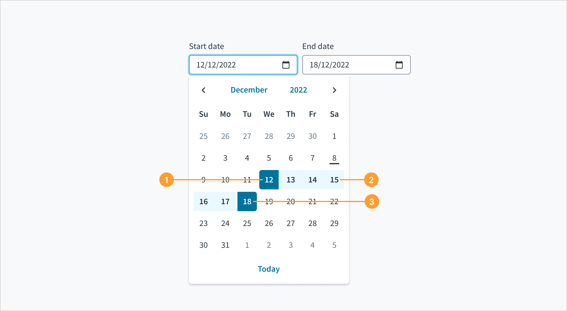
The date range component consists of the following elements:
- Start date
- All intervening dates
- End date
Both the start date and the end date include a field where users can manually input a date. There is also a calendar icon that, when clicked, triggers a dropdown menu for date selection.
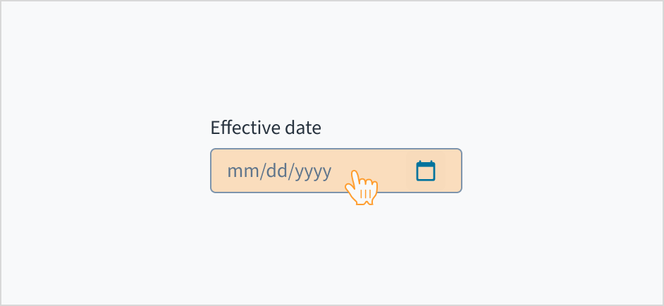
The format of the date displayed in the date picker depends on the user's locale. This means that the date format will vary based on the user's location and language settings.
For example, in the United States, the date format is typically MM/DD/YYYY, while in many European countries, the format is DD/MM/YYYY.
The date format is shown as a placeholder within the date picker to assist the user as they enter the date. This ensures that the format remains visible throughout the input process.
Content
General writing guidelines
- Use sentence case for all aspects of designing Guidewire product interfaces. Don't use title case.
- Use present tense verbs and active voice in most situations.
- Use common contractions to lend your copy a more natural and informal tone.
- Use plain language. Avoid unnecessary jargon and complex language.
- Keep words and sentences short.
Include a label
Label the date range picker with clear, descriptive text. This label must communicate its purpose and the specific type of year being selected.
Labels appear above the date input field, are left-aligned, and use sentence case.
Do position a permanent label outside the field.
Don't use placeholder text as replacement for label.
Behaviors
States
The date range picker component behaves like an input field, with the same interactive states.
Interactions
Mouse
Users can interact with this element by clicking in the area inside border.
Keyboard
The date picker is expanded and collapsed with Spacebar. Users navigate through the options using the arrow keys and select by means of the Spacebar or Enter key.
A calendar widget appears when the user tabs to the date picker input field. The current date is highlighted and keyboard-only users can enter the date manually here. Users can also place keyboard focus on the widget by pressing the down arrow key when it is expanded. Navigate through the calendar with the arrow keys. 'Previous', 'Month', 'Year', and 'Next' buttons are focusable using the Tab key when the widget is open.
Screen reader
Users are informed of the pre-populated date value when they tab to the date picker input field, and that this value is currently selected. The date can be entered manually from this input field. While focus remains on the pre-populated date, a calendar widget is also available. Users can also move focus into the widget by pressing the down arrow key. Navigation through the calendar portion of the widget is accomplished using the arrow keys, and the value currently in focus is voiced by screen readers through a WAI-ARIA aria-label attribute. The 'Previous', 'Month', 'Year', and 'Next' buttons are focusable using the Tab key when the widget is open. React date picker does not currently enable keyboard navigation to the 'Today' link.
Accessibility
The contrast ratio of textual elements against their background is above 4.5:1 as per WCAG 2.1 AA requirements. Non-textual content that needs to convey meaning (such as icons and keyboard focus visibility) has a contrast ratio of at least 3:1 with its adjacent colors. All content is visible and functional up to and including 400% without requiring scrolling in two dimensions.
This component has been validated to meet the WCAG 2.1 AA accessibility guidelines. However, changes made by the content author can affect accessibility conformance.
When using this component, ensure the labels clearly communicate which dates the user needs to input or select.
<DateRangePicker
  label={{ start: 'Choose start date', end: 'Choose end date' }}
  onChange={(event, value) =>
    console.log('The dates chosen are', value.start, value.end)
  }
/>
Import statement
import { DateRangePicker } from '@jutro/components/new';
Component contract
Make sure to understand the Design System components API surface, and the implications and trade-offs. Learn more in our introduction to the component API.
Properties
labelrequired
Type{ start: IntlMessageShape, end: IntlMessageShape }
DescriptionLabels associated with the input fields, also passed as a default value to ,aria-label'. Must be in object format: start - an IntlMessageShape label for the start date picker, end - an IntlMessageShape label for the end date picker.
className
DescriptionCSS class name for this component.
disabled
DescriptionIf set to true, the component is rendered in disabled state.
Type'vshort' | 'short' | 'long' | 'abbreviated' | 'full'
DescriptionThe date format. This value along with locale will determine how the date is displayed to the user.
displayOnly
DescriptionIf set to true, displays the component value in plain text. Consider using readonly instead, if possible, because plain text is worse for accessibility than readonly inputs.
hideLabel
Type{ start: boolean, end: boolean }
DescriptionIf set to true, the label is not visible. Must be in object format: start - Boolean value for the start date picker, end - Boolean value for the end date picker.
DescriptionIf set to true, hides the Today button in the calendar.
initialValue
Type{start: { day: number, month: number, year: number }, end: { day: number, month: number, year: number }}
DescriptionInitial value of the input. Must be in object format: start - initial value for the start date picker, end - initial value for the end date picker. The start and end initial values must be in object format with day, month and year property where the month is indexed from 1. If the value prop is specified along with this prop, this prop's value is discarded.
labelPosition
DescriptionAllows selection of label position.
maxDate
Type{ day: number, month: number, year: number }
DescriptionMaximum allowed date value.
minDate
Type{ day: number, month: number, year: number }
DescriptionMinimum allowed date value.
onBlur
Typefunction (FocusEvent<HTMLInputElement>)
DescriptionA callback called after the component is focused.
onChange
Typefunction (React.ChangeEvent<HTMLInputElement>, {start: { day: number, month: number, year: number }, end: { day: number, month: number, year: number }})
DescriptionCallback invoked when component value is changed.
onFocus
Typefunction (FocusEvent<HTMLInputElement>)
DescriptionA callback called after the component is focused.
placeholder
DescriptionPlaceholder to display on an empty component. Must be in object format: start - an IntlMessageShape placeholder for the start date picker, end - an an IntlMessageShape placeholder for the end date picker. If the value prop is specified along with this prop, this prop's value is discarded.
readOnly
DescriptionIf set to true, component is rendered in a read-only state. For values in plain text, consider using displayOnly.
required
DescriptionIf set to true, the component is rendered as required and the label will display an asterisk.
secondaryLabel
Type{ start: IntlMessageShape, end: IntlMessageShape }
DescriptionSecondary label text to display. Must be in object format: start - an IntlMessageShape secondary label for the start date picker, end - an IntlMessageShape secondary label for the end date picker.
stateMessages
DescriptionAn object with a list of error messages for the current state.
Type{ text: intlMessageShape, trigger: string } | intlMessageShapetext
DescriptionText to show tooltip content.
trigger
DescriptionThe trigger to show the tooltip.
DescriptionText to be displayed in the tooltip or tooltip object that includes: text - to show tooltip content, trigger - to set tooltip trigger.
value
Type{start: { day: number, month: number, year: number }, end: { day: number, month: number, year: number }}
DescriptionValue of the input. Takes precedence over initialValue. Must be in object format: start - the value for the start date picker, end - the value for the end date picker. Value must be in object format with day, month and year property where the month is indexed from 1. If this prop is passed, the component works in controlled mode and its value will change only if this prop changes.
Custom behaviors
The DateRangePicker component provides a validation mechanism using the onChange prop. This prop accepts the event, value, and errorCode parameters. These contain seperate start and end properties to distinguish which input is being referred to. The errorCode values can be:
INVALID_DATE: The date format is incorrect, for example, entering a month value greater than 12.MIN_EXCEEDED: The input value is lower than the minimum value defined by the minDate prop.MAX_EXCEEDED: The input value is greater than the maximum value defined by the maxDate prop.
You can check the Validation example to see how the validation works.
You can use the displayFormat prop to modify the format of the dates when using the readOnly or displayOnly props. There are five different alternatives:
vshort: 6/20/2024short: Jun 20, 2024long: June 20, 2024abbreviated: Thu, Jun 20, 2024full: Thursday, June 20, 2024
Hooks
No hooks are available for DateRangePicker.
Translation keys
DateRangePicker component defines two translation keys for the aria-label:
| Key | Used for |
|---|
| jutro-components.fields.DatePicker.chooseStartDate | Start date aria-label |
| jutro-components.fields.DatePicker.chooseEndDate | End date aria-label |
DateRangePicker also inherits the following translations:
| Key | Used for |
|---|
| jutro-components.DateCalendar.previousMonth | The label text for the Previous month button. |
| jutro-components.DateCalendar.nextMonth | The label text for the next month button. |
| jutro-components.DateCalendar.currentDay | The label text for go to the current date button. |
| jutro-components.DateCalendar.currentDayAriaLabel | The label text for the button to select the current date as the value. |
| jutro-components.MonthSkeleton.previousYear | The label text for the previous year button. |
| jutro-components.MonthSkeleton.nextYear | The label text to go to the next year button. |
| jutro-components.MonthSkeleton.currentMonth | The label text to go to the current month button. |
| jutro-components.MonthSkeleton.currentMonthAriaLabel | The label text for the button to select the current month as the value. |
| jutro-components.YearCalendar.previousYears | The label text for the previous year range button. |
| jutro-components.YearCalendar.currentYear | The label text for the go to current year button. |
| jutro-components.YearCalendar.currentYearAriaLabel | The label text for the button to select the current year as the value. |
Escape hatches
For more information, see our documentation about escape hatches.
Are you using the legacy version of this component?
- To view docs for the old component, switch to a version of the docs older than 10.5.x.
- the legacy component is also available in Storybook:
Examples
Check out the Usage section for details about how to design a DateRangePicker properly, and the different configuration options we provide.
Basic date range example
You can add an input that allows a user to enter a date range either manually or through calendar modals.
<DateRangePicker
  label={{ start: 'Choose start date', end: 'Choose end date' }}
  onChange={(event, value) =>
    console.log('The dates chosen are', value.start, value.end)
  }
/>
Min/Max example
You can limit the range of dates a user can select.
Note: This does not include validation, it only limits the options in the calendar modal. A user can type any date into the input.
<DateRangePicker
  label={{ start: 'Choose start date', end: 'Choose end date' }}
  minDate={{ day: 1, month: 1, year: 2024 }}
  maxDate={{ day: 31, month: 12, year: 2024 }}
/>
Validation Example
You can use the onChange property to call a function that updates stateMessages to display errors to the user. The following example displays errors for invalid dates or dates that are not in 2024.
Note: As mentioned in the previous example, a user can type any date into the input regardless of the minDate and maxDate properties.
import React, { useState } from 'react';
import { DateRangePicker } from '@jutro/components/new';
export function DateRangePickerError() {
const [stateMessages, setStateMessages] = useState({});
const parseErrorCode = (sideErrorObject) => {
let errorCode = sideErrorObject.errorCode;
if (errorCode === 'INVALID_DATE') {
return { error: ['Please enter a valid date.'] };
}
if (errorCode === 'MIN_EXCEEDED' || errorCode === 'MAX_EXCEEDED') {
return { error: ['Please enter a valid date.'] };
}
};
const handleChange = (event, value, errorObject) => {
let parsedMessages: {
start?: { error: string[] };
end?: { error: string[] };
} = {};
let start_error = errorObject?.start;
if (start_error) {
parsedMessages.start = parseErrorCode(start_error);
}
let end_error = errorObject?.end;
if (end_error) {
parsedMessages.end = parseErrorCode(end_error);
}
console.log(parsedMessages);
setStateMessages(parsedMessages);
};
return (
<DateRangePicker
label={{ start: 'Choose start date', end: 'Choose end date' }}
minDate={{ day: 1, month: 1, year: 2024 }}
maxDate={{ day: 31, month: 12, year: 2024 }}
onChange={handleChange}
stateMessages={stateMessages}
/>
);
}

