Page layouts
Overview
Page layouts provide a solid foundation for building applications efficiently. They ensure consistency and responsiveness across different application types, enabling seamless UI composition. Designers and developers can choose from our available page layouts and other content layout components and adapt them to meet specific application needs.
Just like architectural drawings that illustrate the shape, size, and arrangement of a room, page layouts define the structure and organization of an interface, ensuring clarity and usability.
Anatomy
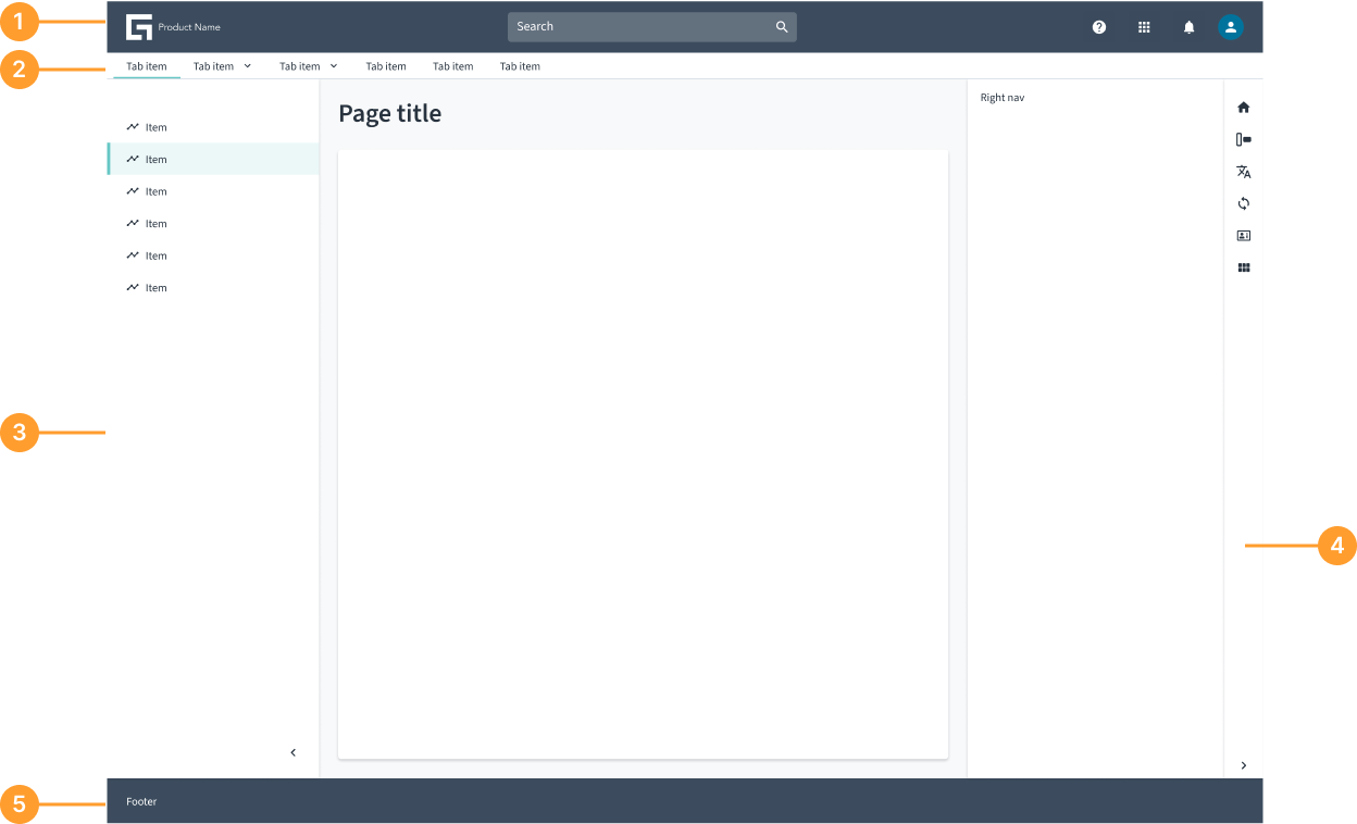
- Header: The header enables consistent navigation across application experiences. It defines the uppermost part of any given page. Headers are container components. In other words, they contain other components to fulfill a specific use case.
- Subheader: Positioned below the header, the subheader provides additional context or actions related to the page’s primary content.
- Side panel: The side panel organizes the content structure and provides context to orient users. It occupies the left side of the screen and spans vertically from the header to the bottom of the page.
- Tools side panel: Used for additional actions, comparison, or contrasting information. It functions as a workspace overlay or as a push panel for toggling settings and details.
- Footer: A persistent section at the bottom of the page, typically containing legal links, secondary navigation, or supporting actions.
Jutro Design System solutions
Jutro Design System provides multiple components for handling the page and content layouts, facilitating the design and implementation tasks through a combination of generic and specific solutions.
Page layout components
Page layout components enable designers and developers to quickly start building their applications, ensuring consistent and responsive UI composition across different application types. Teams can choose from five available individual page layout components and adapt them to meet specific application requirements, or they can use the AppFloorPlan component that provides a predefined set of options.
AppFloorPlan component features.Using the page layout components requires the design and implementation of content for the different page sections, such as header, menus, and footer. These components also require the application to handle routing independently. However, these aspects are provided by the AppFloorPlan component.
Evaluate your project needs before making a decision.
What's the difference between individual layout components and AppFloorPlan?
| Feature | Individual page layout components | AppFloorPlan |
|---|---|---|
| Flexibility | Flexible, allowing customization | Rigid, predefined structures and options |
| Theming | Fully tokenized, ensuring consistency and easier theming | Not tokenized |
| Responsibilities separation | Only focused on UX aspects | UX and routing |
| Content | No predefined content | Predefined content with customization options: menus, header elements, and layout |
Individual page layout components
Page layouts are flexible and tokenized, allowing for customization and easier adaptation across different screens. Each page layout component is completely independent of the content displayed within it. The page layout components include:
AppFloorPlan component
The AppFloorPlan component features a more rigid structure with predefined rules and content, such as a header and navigation menu, and also integrates routing.
Content layout helpers
The content layout helper components facilitate the creation of various structures for content distribution. While the different page layout components control specific sections of the page, such as the header or footer, these helper components provide generic solutions for organizing content within the page, such as managing columns, rows, and their content. The content layout helpers include:
FlexandFlexItem: Flex containers implementation with predefined options.GridandGridItem: Grid container and child elements implementation.GridLayout: Simplification of theGridcomponent.ColumnLayout: Columns structure component.
Content layout helpers are mostly developer oriented components.
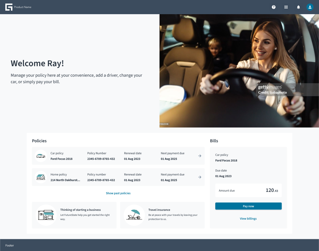
Examples of page layouts
Jutro includes several examples of page layouts. These examples serve as starter kits and references, demonstrating how you can use page layouts effectively. Think of them as page variants, such as a landing page or a details view. The purpose of these examples is to provide you with a visual representation of how a layout might look, helping you conceptualize and refine your design before beginning the actual work. Instead of starting from scratch, you can take inspiration from these examples and adapt them to fit your needs, making the entire process more efficient and seamless.