SidePanel
Usage
Overview
The side panel organizes content structure and provides context to orient users. It serves as secondary navigation, offering access to tools, settings, or additional sections. Positioned on the left side of the screen, it spans vertically from the header to the bottom of the page and pushes the content rather than overlaying it.
When to use
- The application has multiple sections that users need to switch between frequently.
- Users need a consistent menu that remains visible across pages.
- A hierarchical structure is required, with sections and subsections.
- The navigation should be accessible with minimal clicks.
- You want to allow users to collapse the navigation to save space while keeping it available.
Anatomy
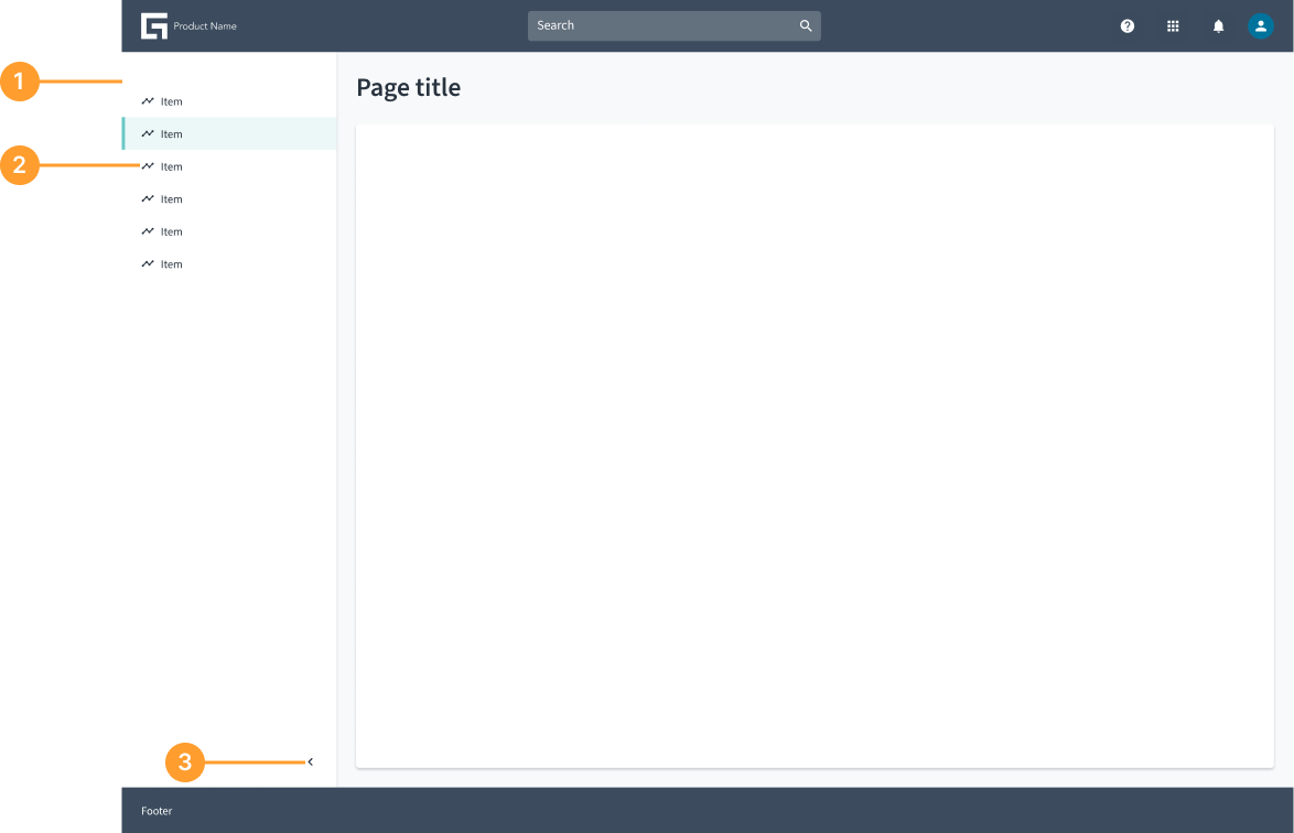
- Panel container: The main structure that contains all components of the side panel.
- Item list: A list of selectable items.
- Collapsible icon button: An arrow button that indicates whether the panel can be collapsed or expanded. Clicking it toggles the side panel state.
Not all elements are required. Only include what is necessary for your specific use case. The side panel is an open and flexible panel that can accommodate various elements based on specific use cases. Teams can customize it by adding different components and functionalities as needed while maintaining a streamlined experience.
Behavior
- Appears on the left side of the screen and spans from the header to the bottom of the page.
- Can be collapsible or persistent, depending on the application’s needs.
- Pushes the content rather than overlaying it, ensuring a clear and structured layout.
- Provides quick access to secondary navigation, tools, or contextual actions without disrupting the main workflow.
Usage examples
Examples of side panel usage, showcasing its open and flexible nature.
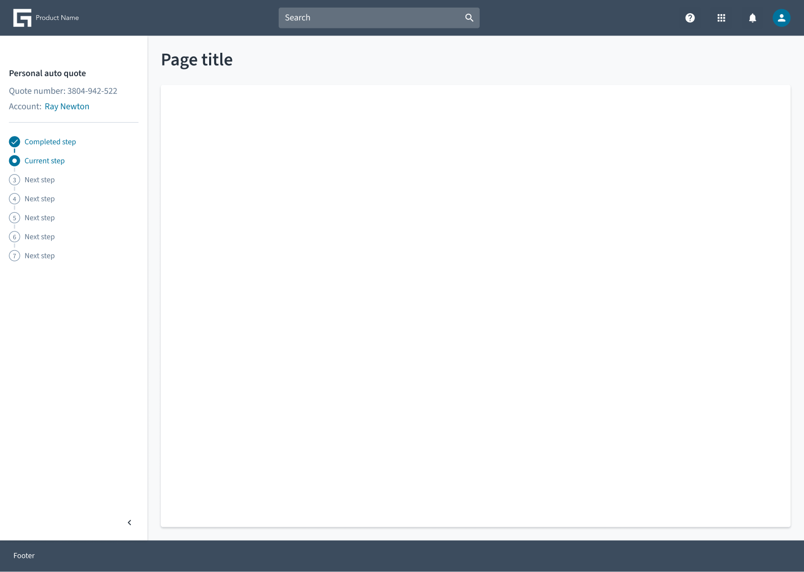 Side panel with a steps layout progress indicator
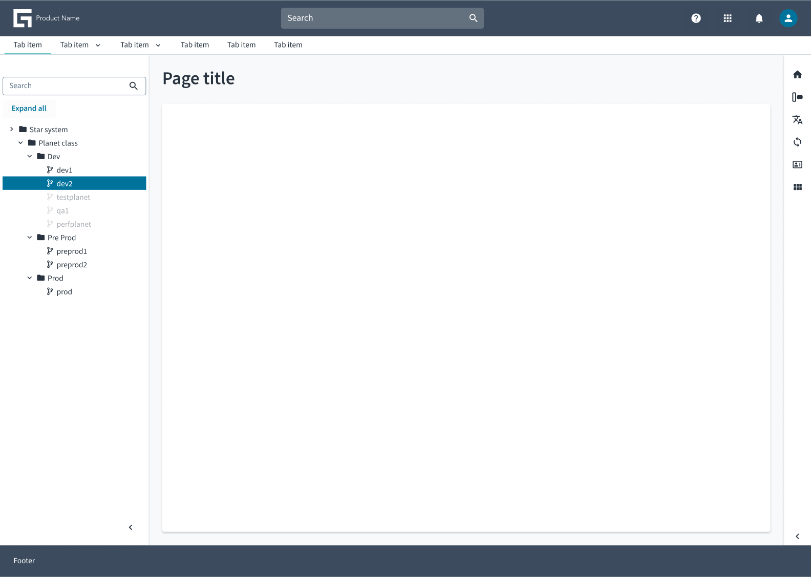 Side panel with a tree view component