ToolsSidePanel
Usage
Overview
The tools side panel is a collapsible panel located on the right side of the screen. It provides users with additional tools, settings, or contextual information without disrupting their primary workflow. This panel is designed to enhance productivity by offering quick access to key actions and resources.
When to use
- Users need quick access to controls without leaving the main content area.
- The panel contains adjustable settings that impact the current view.
- The panel serves as a contextual assistant, offering relevant options based on user selection.
When not to use
- The actions inside are primary and need to be part of the main UI.
- The panel contains too many complex options, making it overwhelming for users.
- Users need to complete multi-step actions that require full attention (consider using a modal instead).
- The panel conflicts with other UI elements, leading to poor usability.
Anatomy
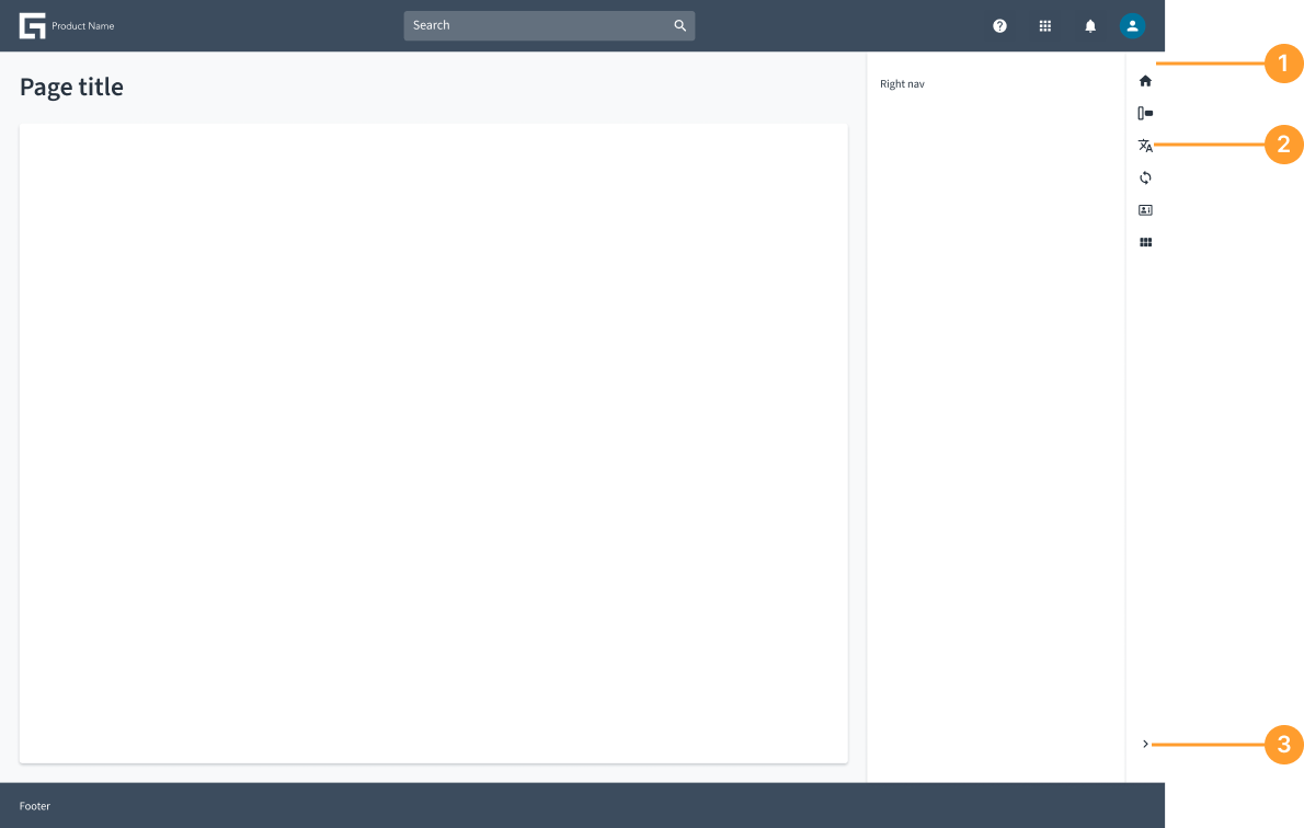
- Panel container: The main structure that contains all the components of the side panel.
- Tool items: The panel consists of icons without text labels.
- Collapsible icon button: An arrow button that allows users to expand or collapse the panel.
Not all elements are required. Include only what is necessary for your specific use case. The tools side panel is an open and flexible panel that can accommodate various elements based on specific use cases. Teams can customize it by adding different components, tools, and functionalities as needed while maintaining a streamlined experience.
Behavior
- Appears on the right side of the screen and spans from the header to the bottom of the page.
- Can be collapsible or persistent, depending on the application’s needs.
- Pushes the content rather than overlaying it, ensuring a clear and structured layout.
- Provides quick access to tools, or contextual actions without disrupting the main workflow.