AppFloorPlan
The AppFloorPlan component sets the overall layout for the entire application, including the content for each section. More specifically, it controls:
- The header
- The footer
- Where the navigation is displayed: left (side panel) or top (subheader)
- The right panel
Your overall application layout is managed by a AppFloorPlan. But for specific areas in the application, you can use Jutro layout content components like Grid or Flex or else custom components.
On a very high level:
- The
AppFloorPlansets the layout and routing for your application. It wraps each individual page. - Each page manages its own layout within the space created by the
AppFloorPlan. This is where you would insert one of the available layout content components.
AppFloorPlan component, it is possible to create different page layout structures, using the predefined content or providing custom components.Code
The @jutro/auth dependency is now optional for
@jutro/router and @jutro/components packages.
However, the AppFloorPlan component requires
@jutro/auth to be added to your app dependencies to be used.
Import statement
import { AppFloorPlan } from '@jutro/floorplan';
Component contract
Properties
className- Type
stringDescriptionCSS class name for this component.
contentAsSectionElement- Type
booleanDescriptionIf set to
true, content is rendered within<section>HTML tags, otherwise<main>is used. This is used when the page contains nested floorplans as only one element withmainrole is recommended. contentClassName- Type
stringDescriptionAdditional class name for the main component.
contentLayout- Type
'canvas' | 'default' | 'center'DescriptionLayout type of the main content.
excludeScrollToTopRoutes- TypeDescription
Routes to be excluded from automatic scroll to the top on a location change.
header- Description
Properties for the application's Header component.
leftSide- Type
objectclassName- Type
stringDescriptionCSS class name for this component.
collapsed- Type
booleanDescriptionIf set to
true, component is currently collapsed. collapsible- Type
booleanDescriptionIf set to
true, component can be collapsed. contextSwitcher- Description
Context switcher object.
renderContextSwitcher- Type
RenderContextSwitcherDescriptionCallback to render custom ContextSwitcher instead of default one.
DescriptionProps passed to SideNavigation component.
noContentPadding- Type
booleanDescriptionIf set to
true, padding of the page content will be removed. renderFooter- Type
({ className }: { className: string }) => ReactNodeDescriptionFunction to render a custom footer.
rightSide- Type
objectcollapsible- Type
booleanDescriptionIf set to
true, component can be collapsed. This prop isfalseby default for desktop andtruefor smaller devices. isInitiallyCollapsed- Type
booleanDescriptionIf set to
true, component will be collapsed on initial render. This prop isfalseby default for desktop andtruefor smaller devices. shouldFocusAfterRender- Type
booleanDescriptionIf set to
true, component will be in focus after render. This is useful for proper accessibility support because the content will be automatically read by a screen reader. sides- Type
SideContentShape[]componentrequired- Type
ReactComponentDescriptionComponent to render as content.
labelrequired- TypeDescription
The aria-label describing the content. This text is not rendered and is only used for accessibility.
componentProps- Type
objectDescriptionProps to pass to the component passed to the
componentproperty. The type depends on the value of thecomponentproperty. icon- Type
string | IconDescriptionAn Icon component to render on the component. The value must be an
Iconcomponent or the icon's name. For example,CheckIconor'gw-check'. id- Type
stringDescriptionUnique identifier for the component.
DescriptionList of pages to render in the panel.
DescriptionRight panel config.
routes- TypeDescription
App routes to be shown in the subheader or, if the screen is mall, the burger menu.
scrollContent- Type
booleanDescriptionIf set to
true, the height of the content is set to the height of the screen and the footer will be displayed at the bottom of the screen. showFooter- Type
booleanDescriptionIf set to
false, the footer will not be shown. showHeader- Type
booleanDescriptionIf set to
false, the header will not be shown. showLeftSide- Type
booleanDescriptionIf set to
trueand if a value has been passed tosideRoutes, then the left side panel will be shown. showRightSide- Type
booleanDescriptionIf set to
false, the right side panel will not be shown. showSubHeader- Type
booleanDescriptionIf set to
false, the subheader will not be shown. sideRoutes- TypeDescription
App routes to be shown in leftSide.
subHeader- Type
objectclassName- Type
stringDescriptionCSS class name for this component.
contextSwitcher- Description
Context switcher component that will be rendered in the left side of the header.
renderContextSwitcher- Type
RenderContextSwitcherDescriptionCallback to render custom ContextSwitcher instead of default one.
renderCustomComponent- Type
JSXElementConstructor<Record<string, never>>DescriptionCustom component placed on the right side of subheader or in burger menu.
DescriptionSub header config.
Header Properties
The header property in the AppFloorPlan component takes an object with the following properties:
appSwitcherCollapsibleGroupsThreshold- Type
numberDescriptionNumber of items from which the groups in AppSwitcher are collapsible and the search field is displayed.
appSwitcherFooterText- Type
IntlMessageShape | LinkPropTypesDescriptionText displayed on the footer link in AppSwitcher. See IntlMessageShape and Link for more detailed information on the accepted types.
appSwitcherFooterUrl- Type
Record<string, (...args: any[]) => void>DescriptionURL to which the footer link in the AppSwitcher leads.
appSwitcherHideFooter- Type
booleanDescriptionIf set to
true, the footer in the AppSwitcher is hidden. appSwitcherItems- TypeDescription
Array of items to be displayed in the App Switcher menu.
appSwitcherSearchEnabled- Type
booleanDescriptionIf set to
true, enables the search field in AppSwitcher if the number of items are equal to or above theappSwitcherCollapsibleGroupsThresholdvalue. avatarChildren- Type
React.ReactNodeDescriptionAvatar content to be rendered before routes links.
avatarProps- Type
AvatarPropTypesDescriptionAvatar props to be passed down if not using auth info (username, imageSource, title, subtitle).
burgerMenuRoutes- TypeDescription
Routes to be rendered in the burger menu, for breakpoints smaller than
desktop. callbackMap- Type
Record<string, (...args: any[]) => void>DescriptionMap to resolve callbacks on avatar links.
className- Type
stringDescriptionCSS class name for this component.
commonAvatarRoutes- Type
Array<DropdownMenuLinkShape>DescriptionArray of items to be displayed as common Avatar content.
contextSwitcher- Description
Context switcher object.
helpPopoverItems- Type
React.ReactNode[]DescriptionHelp popover items.
helpUrl- Description
The link path for the help page.
languageSelectorProps- Description
Props passed to Language Selector.
logoAlt- TypeDescription
Logo image's
altprop. logoSrc- Type
stringDescriptionDisplay a logo from source.
logoTitle- TypeDescription
The title for the logo.
logoUrl- Type
stringDescriptionLink path to a logo.
notificationChildren- Type
React.ReactNodeDescriptionNotification content to be rendered.
onAppSwitcherFooterClick- Type
(event: React.SyntheticEvent) => voidDescriptionCallback which will be triggered when the footer link in the AppSwitcher is clicked.
onLoadValues- Type
functionDescriptionFunction for asynchronous data loading in the search field.
onSearchValueChange- Type
functionDescriptionDisplay a search field. Callback for the search field value change.
renderBurgerMenuCustomItem- Type
JSXElementConstructor<Record<string, never>>DescriptionComponent to be rendered inside burger menu after navigation.
renderContextSwitcher- Type
RenderContextSwitcherDescriptionCallback to render custom ContextSwitcher instead of default one.
renderCustomComponent- Type
JSXElementConstructor<Record<string, never>>DescriptionCustom component to be rendered in the application header. It will be rendered on the left of actions menu.
renderHeader- Type
(props: RenderHeaderProps) => ReactNodeDescriptionFunction to render a custom header.
renderHelpPopoverItems- Type
() => ReactElementDescriptionRender custom help popover items.
searchAvailableValues- Type
LookupOptionShape[]DescriptionAn array of choice objects to display, works only if
onLoadValuesis not supplied. searchFieldPlaceholder- TypeDescription
Search field placeholder text.
searchOptionTypes- Type
LookupOptionType[]DescriptionArray of option types variants in the search lookup field.
showAppSwitcher- Type
booleanDescriptionIf set to
true, will show App Switcher. showAvatar- Type
booleanDescriptionDisplay the avatar.
showHelp- Type
booleanDescriptionIf set to
true, shows the Help dropdown. showLanguageSelector- Type
booleanDescriptionIf set to
true, shows the Language Selector. showNotifications- Type
booleanDescriptionDisplay the notification icon.
useAuthInfo- Type
booleanDescriptionIf set to
true,uses Okta auth information.
Enabling/disabling different parts of the AppFloorPlan
You can disable/enable each part of the AppFloorPlan by setting corresponding property to false/true. All of these are true by default:
showHeader- show/hide header, this takes precedence overheaderpropshowSubHeader- show/hide top navigation, in order to see it you need to have at least one route inrouteswithshowOnNavBar=trueshowFooter- show/hide footershowRightSide- show/hide right side, if set tofalse, the right panel is not displayed, even if you configurerightSideshowLeftSide- show/hide left navigation, in order to see it you need to have at least one route insideRouteswithshowOnNavBar=true
Routes, navigation, and pages
You can control routes using the routes or sideRoutes prop of the AppFloorPlan. To add new pages to your app, add them to one of these props.
Setting sideRoutes makes the navigation appear on the left side. Setting routes makes the navigation appear at the top of the SubHeader. If you want both top and left navigation, you can set both sideRoutes and routes.
These routes have the following shape:
export type Route = {
  // react-router-dom Route and Redirect props
  //URL path of the route
  path?: string,
  // If true, will only match if the path matches
  // the location.pathname exactly
  exact?: boolean,
  //If true, a path that has a trailing slash will
  // only match a location.pathname with a trailing slash
  strict?: boolean,
  // Match is case sensitive
  sensitive?: boolean,
  //Path to which redirect when entering the current page
  redirect?: string,
  //When true, redirecting will push a new entry onto
  // the history instead of replacing the current one
  push?: boolean,
  //The location to redirect to
  to?: IntlToShape,
  //A pathname to redirect from
  from?: string,
  // end of react-router-dom

  //Identifier for the route
  id?: string,
  // Component to be rendered as the destination page
  // for this route
  component?: ReactComponent,
  //Properties for the component to be rendered
  componentProps?: Record<string, unknown>,
  //Title to be displayed for the route
  title?: IntlMessageShape,
  //Defines whether the route should be shown in the navigation
  showOnNavBar?: boolean,
  //Nav link properties
  navLink?: NavLinkPropTypes,
  //Array of sub-routes
  routes?: Route[],
  //An external path
  href?: string,
};
For more details see the page about routing.
Floorplan overrides
You can use a different definition for individual pages of the application. Create a configuration (FloorplanOverride) with a matches prop with paths to pages.
 {
  ...
  matches: ["/welcome", "/contact"];
  ...
 }
If there are several override configs for the same path, the first one takes precedence.
If you have more than one configuration without the matches prop, the first one is considered default. If you do not provide an override for a page, it uses the default configuration.
The override configuration only needs to specify the differences with the default configuration, as it will be merged with it.
  export const example2PageDefinition = (): FloorPlanOverride {
    return {
        // Configuration override for the /example2 path only
        showRightSide: false,
        matches: '/example2'
    }
  }
  export const floorPlanDefinition = (): FloorPlan {
    return {
      // Default `AppFloorPlan` configuration definition
      contentLayout: 'canvas'
      showRightSide: true,
      rightSide: {
        ...
      }
    }
  }

  export function Jutro(): JSX.Element {
    return <AppFloorPlan
              floorPlans={[floorPlanDefinition(), example2PageDefinition()]} />;
}
Content layout
In AppFloorPlan, when applying padding layout for a main content container, you can use the contentLayout prop with one of its variants:
centerproviding max width and centered horizontallycanvaswith no paddingdefaultwith standard Guidewire padding (default value)
contentLayout sets the default layout for all pages in your app. If you want to change the layout for any sub-pages to be different from the default, you will need to define the desired settings through a FloorplanOverrides:
  export const example2PageDefinition = (): FloorPlanOverride {
    return {
        contentLayout: 'center',
        matches: '/example2'
    }
  }
  export const floorPlanDefinition = (): FloorPlan {
    return {
      // Default configuration
      contentLayout: 'canvas'
    }
  }

  export function Jutro(): JSX.Element {
    return <AppFloorPlan
              floorPlans={[floorPlanDefinition(), example2PageDefinition()]} />;
}
contentClassName prop
You can also use a contentClassName prop to allow for custom CSS to be placed on the main content container to modify backgrounds and other styles.
Examples
Check out the Usage and Code sections for further details and configuration options and examples.
Basic configuration
The example below shows how to use the various props of AppFloorPlan. A page with header and left and right panels is displayed, each of them with a couple of child elements.
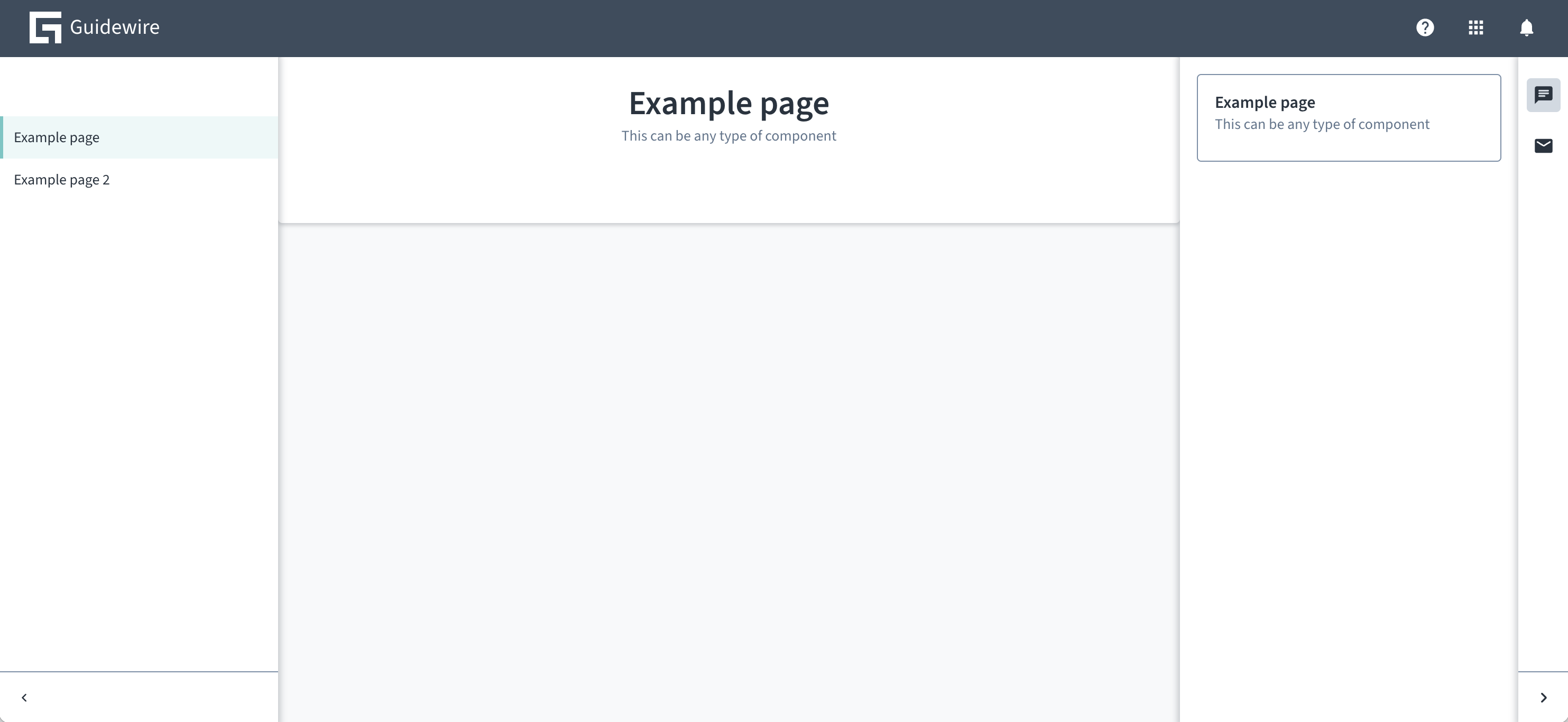
import React from 'react';
import { AppFloorPlan } from '@jutro/floorplan';
import { FloorPlan } from '@jutro/floorplan';
import { ChatIcon, MailIcon } from '@jutro/icons';
import { Card } from '@jutro/components';

export const floorPlanDefinition = (): FloorPlan {
    return {
        showHeader: true,
        header: {
            showNotifications: true,
            logoSrc: './images/guidewire-logo-dark.svg',
            logoTitle: 'Guidewire',
            showHelp: true,
            showAppSwitcher: true,
            showLanguageSelector: false,
        },
        showSubHeader: false,
        showLeftSide: true,
        leftSide: {
            collapsible: true,

        },
        sideRoutes: [
            {
                path: '/',
                exact: true,
                showOnNavBar: false,
                redirect: '/example',
            },
            {
                title: 'Example page',
                path: '/example',
                exact: true,
                component: PageExample,
            },
            {
                title: 'Example page 2',
                path: '/example2',
                exact: true,
                component: PageExample,
            },
        ],
        showRightSide: true,
        rightSide: {
            collapsible: true,
            isInitiallyCollapsed: true,
            sides: [
                {
                    label: "Open chat",
                    icon: ChatIcon,
                    component: RightSideExample,
                },
                {
                    label: "Email",
                    icon: MailIcon,
                    component: RightSideExample,
                }
            ],
        },
        showFooter: false,
    };
};

export function Jutro(): JSX.Element {
    return <AppFloorPlan floorPlans={[floorPlanDefinition()]} />;
}


const PageExample = (): JSX.Element {
    return <Card title="Example page"
              subTitle="This can be any type of component" isPanel></Card>
}

const RightSideExample = (): JSX.Element {
    return <Card title="Example page"
              subTitle="This can be any type of component"></Card>
}
Custom header
If your header design is significantly different than the base configuration header, and the available customization options are not sufficient, you can provide a custom header renderer function using the renderHeader attribute:
const floorplans = {
    'floorplan.default': {
        ...
        renderHeader() {
            // myCustomHeaderRenderer implementation
        }
    }
}

<AppFloorPlan floorPlans={floorplans} />;
The renderHeader function has following arguments:
navigationRoutes- visible routes (routes withshowOnNavBarnot set tofalse).header- theAppFloorPlan's header properties.subHeader- theAppFloorPlan's sub header properties.
With showSubHeader set to false you can also implement your own sub header as part of the custom header and the custom header height is not limited in any way.
Right side
The rightSide prop takes a configuration object which determines the contents of the right panel. Consider this example of right side:
{
  "showRightSide": true,
  "rightSide": {
    "collapsible": true,
    "sides": [
      {
        "label": {
          "id": "example1",
          "defaultMessage": "Example right side 1"
        },
        "icon": "gw-home",
        "component": "RightSideContent",
        "componentProps": {
          "foodItem": "banana"
        }
      },
      {
        "label": {
          "id": "example2",
          "defaultMessage": "Example right side 2"
        },
        "icon": "gw-star",
        "component": "RightSideContent",
        "componentProps": {
          "foodItem": "cup of coffee"
        }
      }
    ],
    "shouldFocusAfterRender": true,
    "isInitiallyCollapsed": false
  }
}
To make this example work, create a RightSideContent:
function RightSideContent({ foodItem }) {
  return <div>Enjoy this {foodItem}!</div>;
}
The configuration creates a right panel with two buttons. Clicking the buttons switches between two panels. One of them says "Enjoy this banana!", and other says "Enjoy this cup of coffee!".
The props that rightSide can take can be found in the properties table on the code tab.