Toggle button group
Usage
Overview
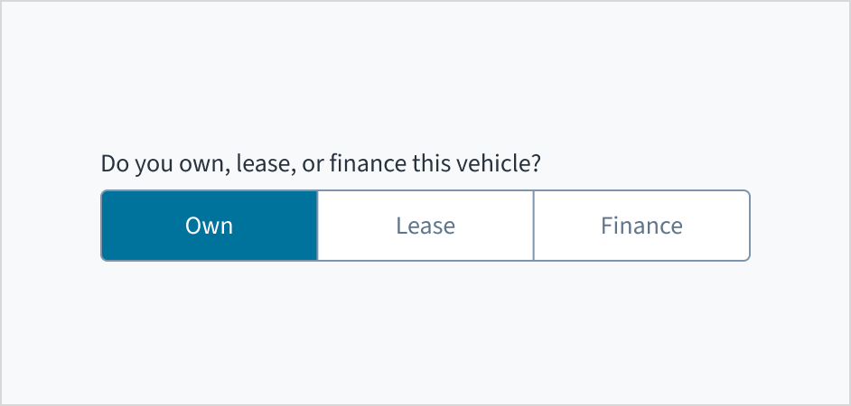
Toggle button group is a control element where the user selects a single option from a set of two to four mutually exclusive choices. This component consists of multiple toggle buttons, with only one button active or selected at any given time.
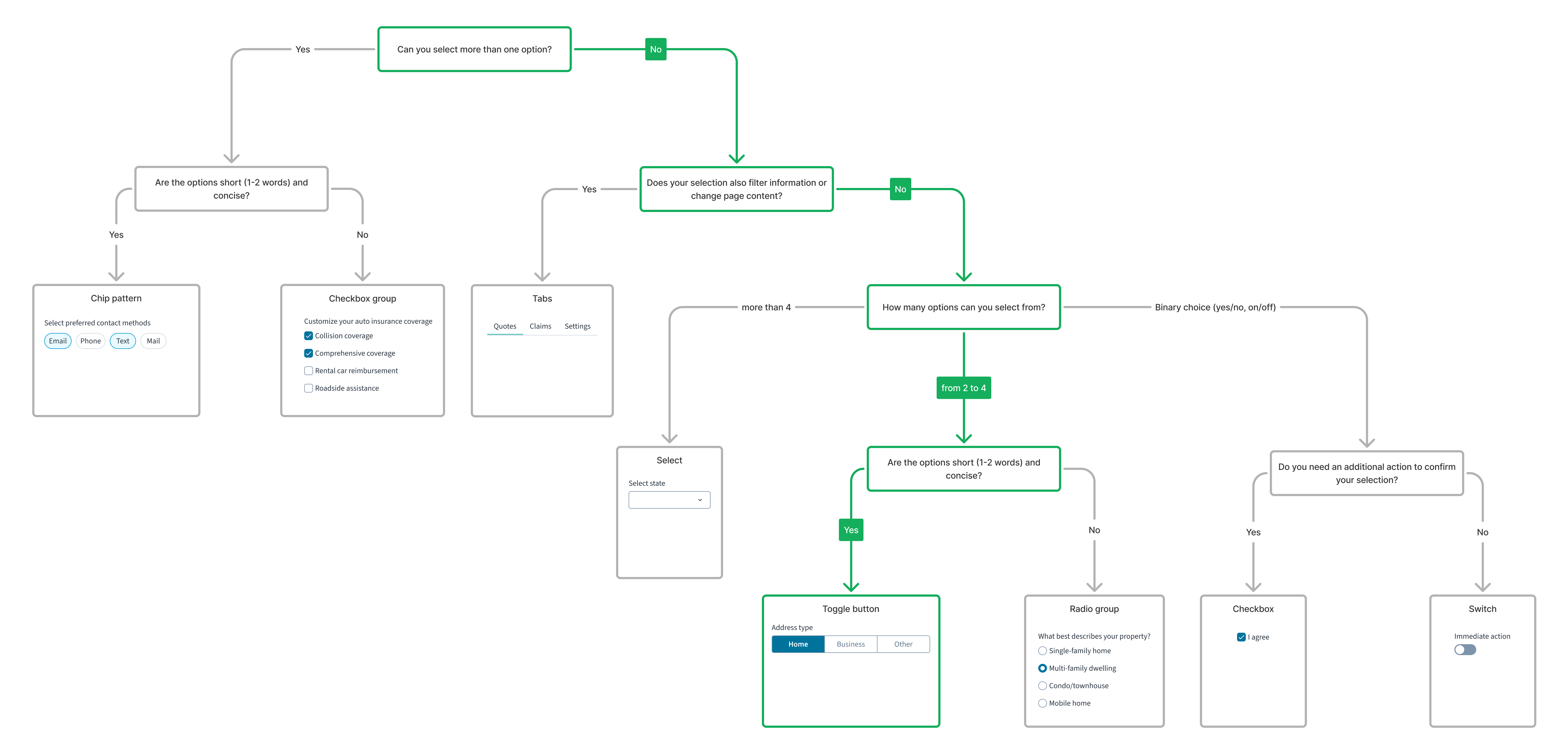
For a detailed guide on when to use this component, explore the following UI component decision tree.
When to use
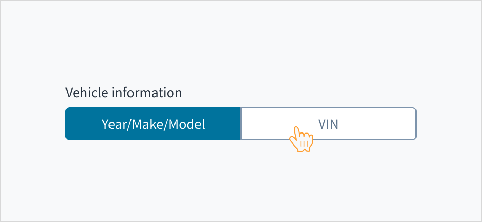
- When presenting users with 2 to 4 mutually exclusive options within a form.
- For toggling between views.
When not to use
- When there are more than 4 options for the user to choose from. In this case, use the dropdown select or combobox.
- When there are 3–4 options in mobile experiences. In this case, use the radio group.
- When there is only one selectable option. In this case, use a single checkbox.
Formatting
Anatomy
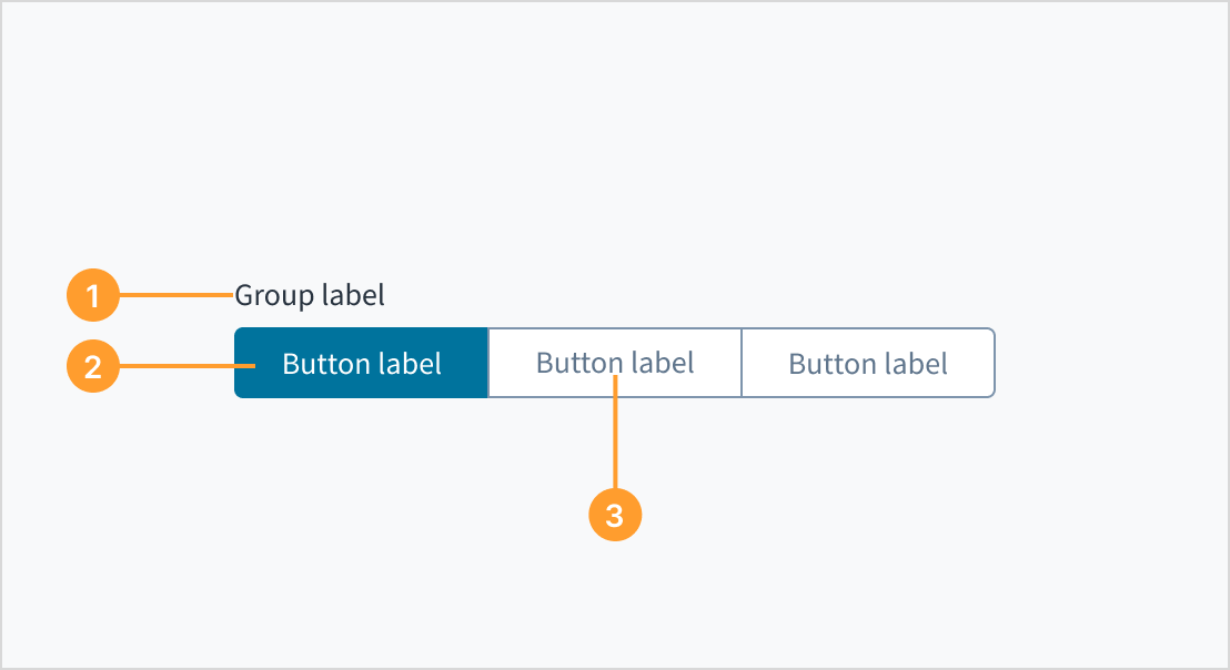
The toggle button group consists of the following elements:
- Group label: A label that describes the purpose of the toggle button group.
- Toggle button: An individual button within the toggle button group that represents a selectable option.
- Toggle button label: The text label that describes the option associated with the toggle button.
Layout and alignment
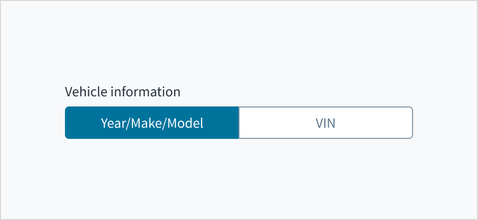
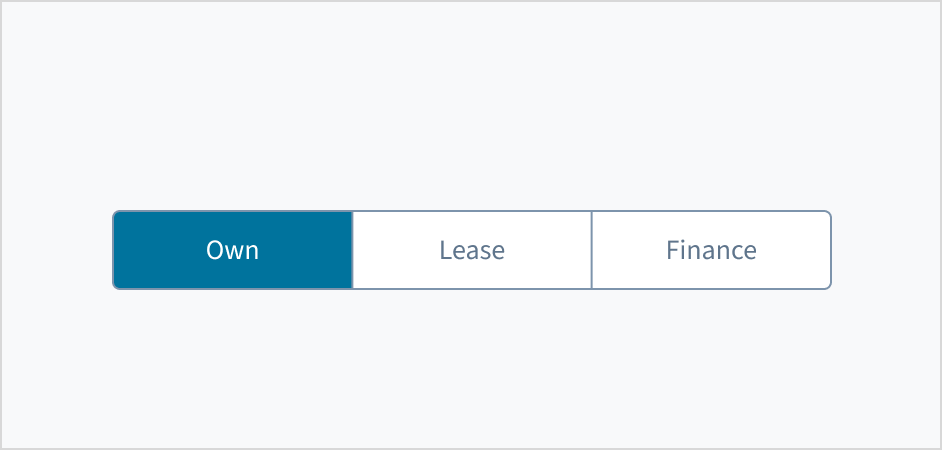
Ensure all toggle button items have the same width to maintain visual consistency and importance.
Best practices
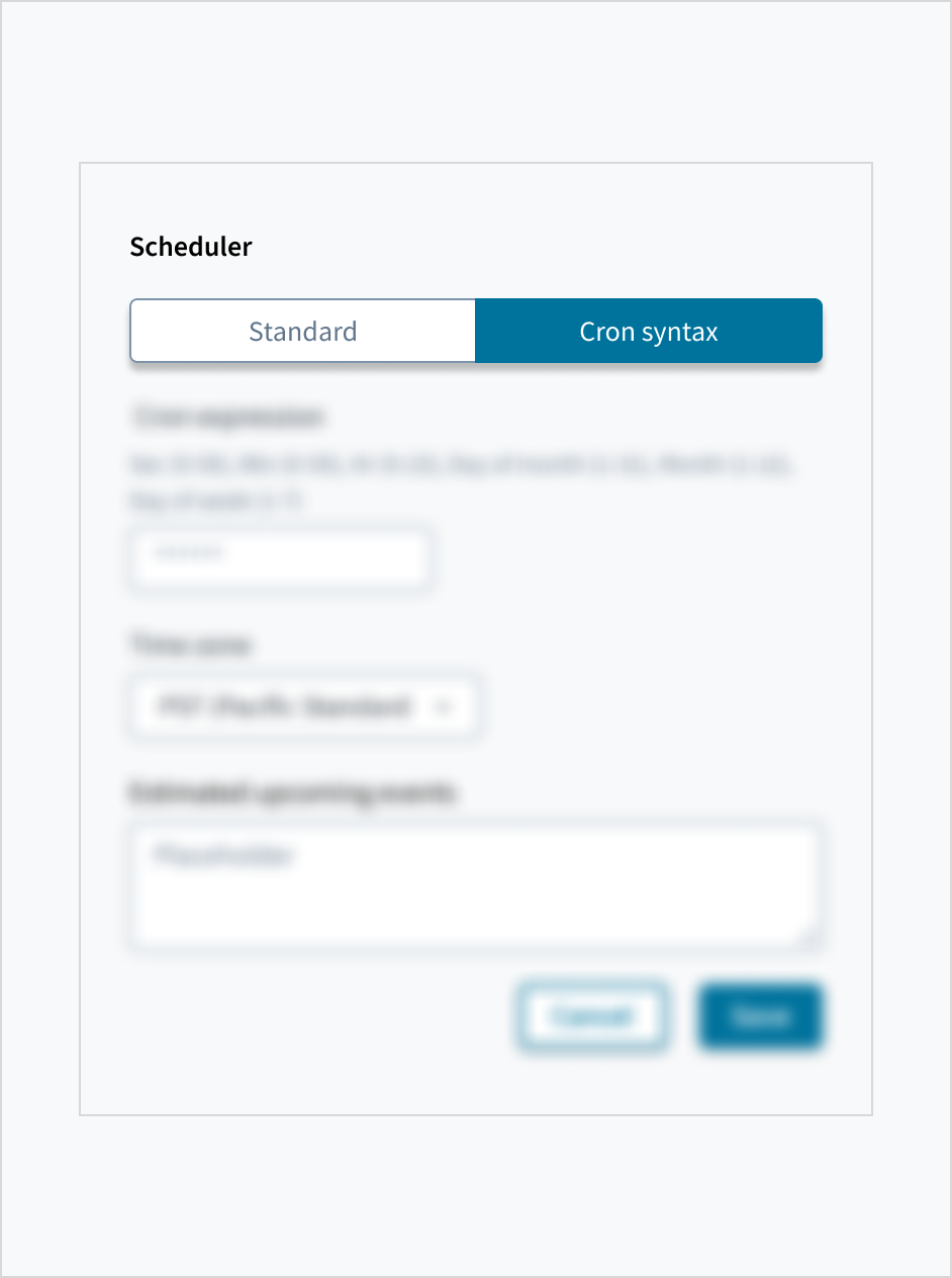
When using the toggle button group to switch between views, the toggle action should immediately effect the change without requiring additional action.
Content
General writing guidelines
- Use sentence case for all aspects of designing Guidewire product interfaces. Don't use title case.
- Use present tense verbs and active voice in most situations.
- Use common contractions to lend your copy a more natural and informal tone.
- Use plain language. Avoid unnecessary jargon and complex language.
- Keep words and sentences short.
Labels
Group label
While it is not strictly mandatory to include a parent group label, it is highly recommended. In cases where context is sufficient, the label could be undefined. A toggle button group without a visible label should still be given an aria-label with aria-label or aria-labelledby. This aria-label communicates the collective meaning of all toggles.
Toggle button labels
Toggle button labels are mandatory. Each button in the toggle group must have a clear, descriptive text label to ensure users understand the available options. Keep labels concise while ensuring clarity. Aim for short, descriptive labels that are easy to scan and understand at a glance.

Capitalization
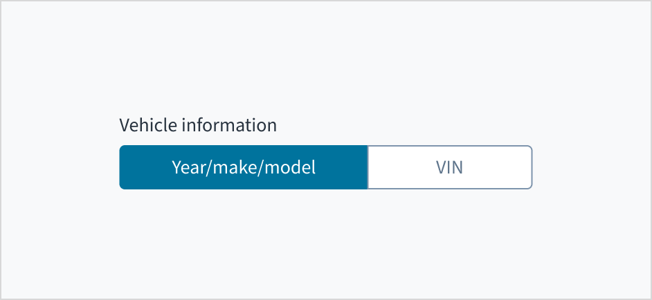
Label text appears in sentence case. Capitalize the first letter of the first word in a sentence or phrase and proper nouns.
For additional guidance on how to implement sentence case, see the Capitalization section of the UI text style guide.
Behaviors
States
Toggle buttons behave like buttons, with the same interactive states. For more information, refer to the button component documentation.
Interactions
Mouse
Users select a toggle button option by clicking on the desired button with the mouse.
Users can only select one toggle button at a time. When a user makes a new selection, the previous choice is automatically deselected.
Keyboard
Each button is keyboard focusable. Use Tab and Shift+Tab to navigate between values. Users can select each button with both the Spacebar and the Enter keys.
Screenreader
The toggle button group is associated with the group label by means of the WAI-ARIA attribute: aria-labelledby. The aria-pressed attribute toggles between 'true' and 'false' to indicate the state of each button. This facilitates blind and visually impaired users by communicating the purpose of the toggle button.
Accessibility
The contrast ratio of textual elements against their background is above 4.5:1 as per WCAG 2.1 AA requirements. Non-textual content that needs to convey meaning (such as icons and keyboard focus visibility) has a contrast ratio of at least 3:1 with its adjacent colors. All content is visible and functional up to and including 400% without requiring scrolling in two dimensions.
This component has been validated to meet the WCAG 2.1 AA accessibility guidelines. However, changes made by the content author can affect accessibility conformance.
When using the toggle button group component in your application:
- Ensure that each button has a clear and concise label.
- Warn users if selecting a toggle component will cause a change in context.