Info label
Usage
Overview
Info label is a non-interactive component that visually displays an item's status. The info label component often appears in the context of a card, table, or list view.
When to use
To show the status of an element in the UI. Use the info label for non-numeric status information.
When not to use
- To display information about new or updated content as a numeric value. Use the badge instead.
- To categorize items and filter data. Use tags instead.
Formatting
Anatomy
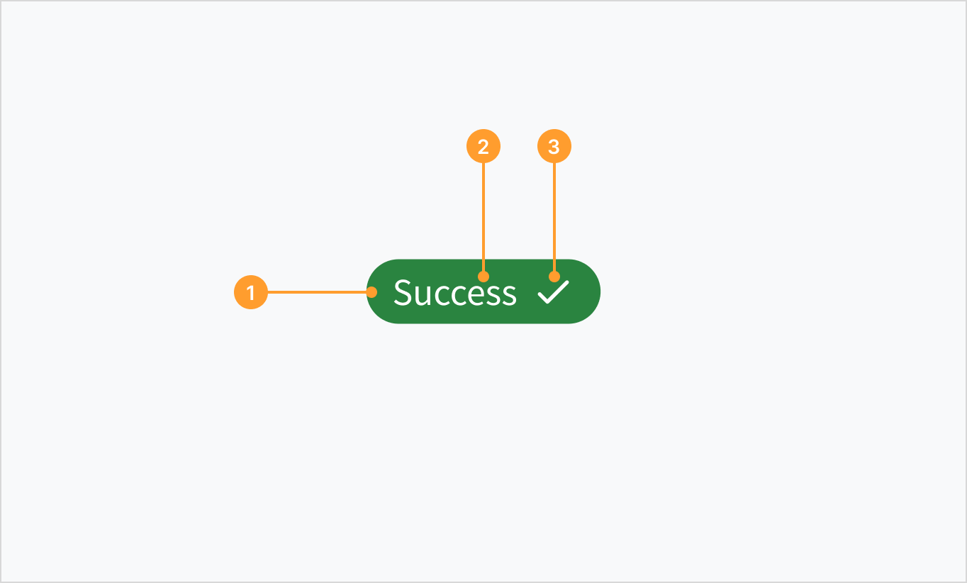
An info label consists of the following elements:
- Container with a specific color fill that depends on the use case.
- Text label that communicates status information.
- Optional icon to support the text label visually and give more context on the status type.
Types
 Info label status types
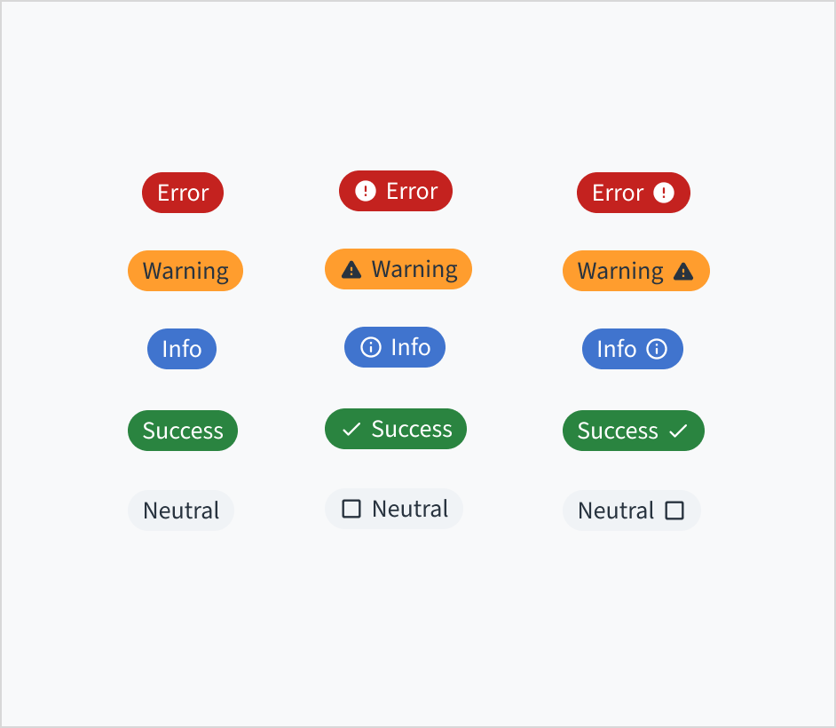
Info labels come in a variety of states and colors that denote specific meanings.
Success
Use the success label type to represent a constructive status. For example: "success", "active", "up", "available", "completed", "deployed", "approved", "resolved", or "added".

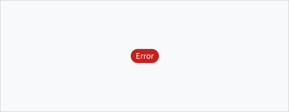
Error
Use the error label type to represent a critical status. For example: "error", "not deployed", "stopped," "failed", or "declined".

Warning
Use the warning label type to indicate potential issues with an operation. For example: "warning", "blocked", or "timeout".

Info
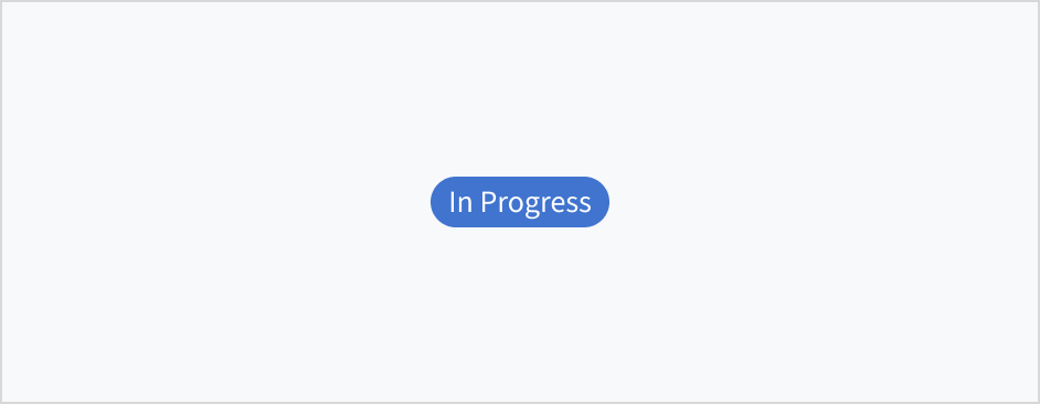
Use the info label type to represent an in progress or current status. For example: "in progress", "open", or "modified".

Neutral
Use the neutral label type to communicate general status or an inactive state. The neutral label type represents a default or passive state. This makes it suitable for scenarios where no specific action is needed. For example: "inactive," "empty," "to do", "unavailable", or "not started".

Icons and placement
Info labels can also contain icons to provide a clearer indication of the status of an element. The icon can be placed to the left or the right of the text label.

Best practices
- Use a clear label with short, scannable text.
- Use icons to distinguish info labels of the same color or to provide additional visual information.
- Don't overload the UI with info labels. This works against their purpose. An info label is meant to highlight an item's status for quick recognition.
Content
General writing guidelines
- Use sentence case for all aspects of designing Guidewire product interfaces. Don't use title case.
- Use present tense verbs and active voice in most situations.
- Use common contractions to lend your copy a more natural and informal tone.
- Use plain language. Avoid unnecessary jargon and complex language.
- Keep words and sentences short.
Include a label
The InfoLabel component must always include a text label.
Keep the label short and clear. Use either a one-word status label, such as "Error", or a two-word status label, such as "Permission error".
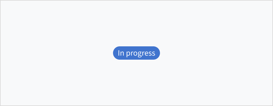
Use sentence case
Status labels appear in sentence case.
Refer to the UI text style guide for more information on how to implement sentence case.
Behaviors
Interactions
InfoLabel is a non-interactive component. It can't be clicked on or dismissed.
Accessibility
The contrast ratio of textual elements against their background is above 4.5:1 as per WCAG 2.1 AA requirements. Non-textual content that needs to convey meaning (such as icons and keyboard focus visibility) has a contrast ratio of at least 3:1 with its adjacent colors. All content is visible and functional up to and including 400% without requiring scrolling in two dimensions.
This component has been validated to meet the WCAG 2.1 AA accessibility guidelines. However, changes made by the content author can affect accessibility conformance.
When using this component within your application:
- Always include a text label to help users in understanding the state. Don't rely on color alone to communicate information.
- Don't use info labels for long text.