Note: There are deprecated versions of this component. Switch to a version of the docs older than 10.0.x to view their docs.
Usage
Overview
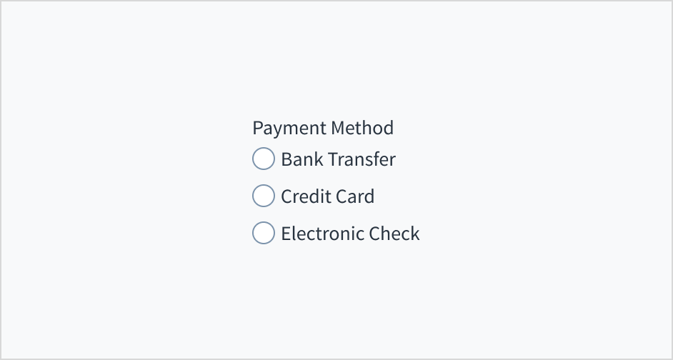
A radio group displays a set of mutually exclusive options from which a person may select exactly one.
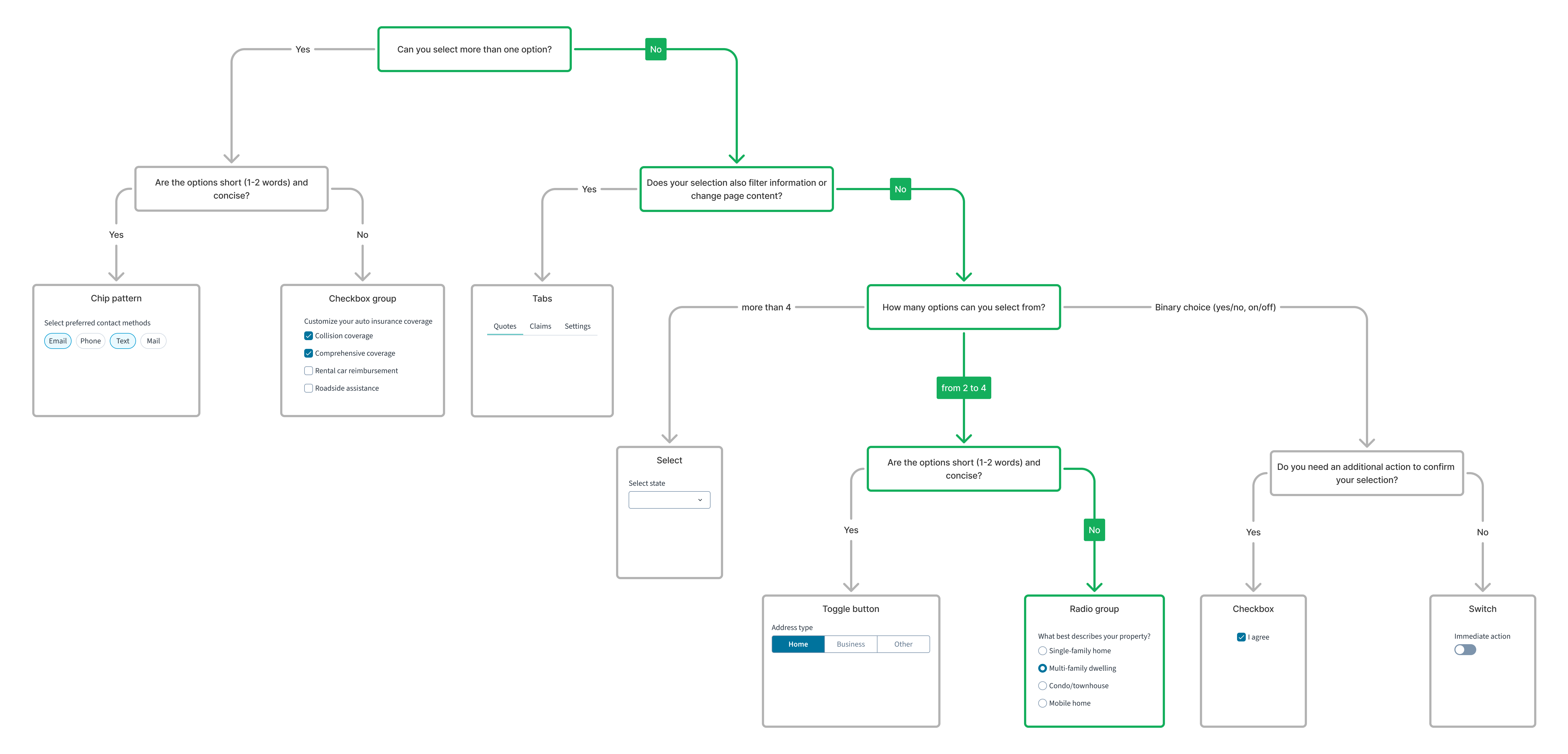
For a detailed guide on when to use this component, explore the following UI component decision tree.
When to use
When selecting a single option from a small set of mutually exclusive options (5 or fewer).
When not to use
- When there are multiple options to select independently of each other. Use the checkbox component instead.
- There's a large number of options (6 or more) from which users can choose. Use the dropdown component instead.
- The user may select zero of the options or change their mind and unselect an option. In cases like this, consider using the checkbox component. You can also choose to add a None of the above option to the radio button group instead.
Sources: Nielsen Norman Group, USWDS
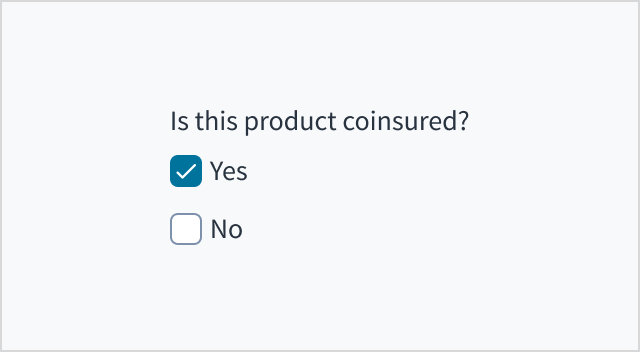
Note: To display a set of mutually exclusive options from which a person can select exactly one, use radio buttons instead of checkboxes.
Anatomy
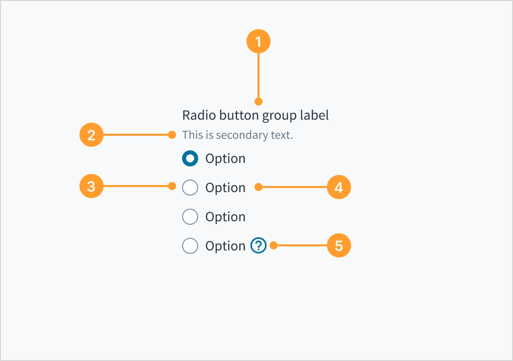
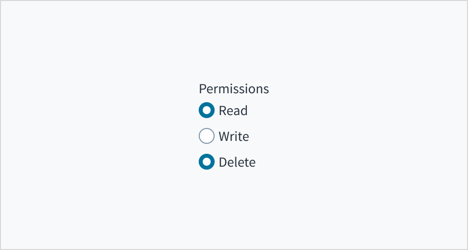
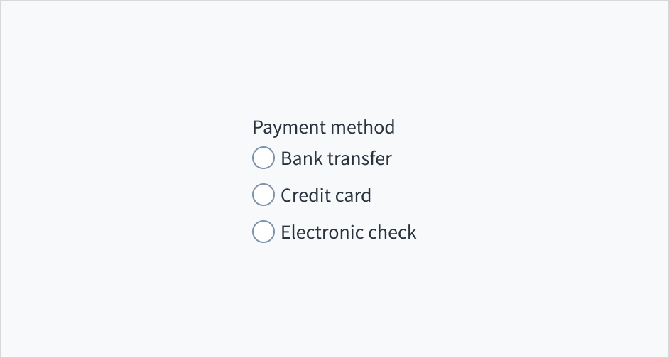
- Radio group label: Explains the purpose of the radio group.
- Helper text (optional): Gives additional context for the radio group.
- Radio button input: Indicates the appropriate state. By default an option is selected.
- Radio button label: Describes the information that is to be selected or unselected.
- Tooltip icon (optional): Serves to disambiguate the context for a given radio button. The tooltip appears when hovered.
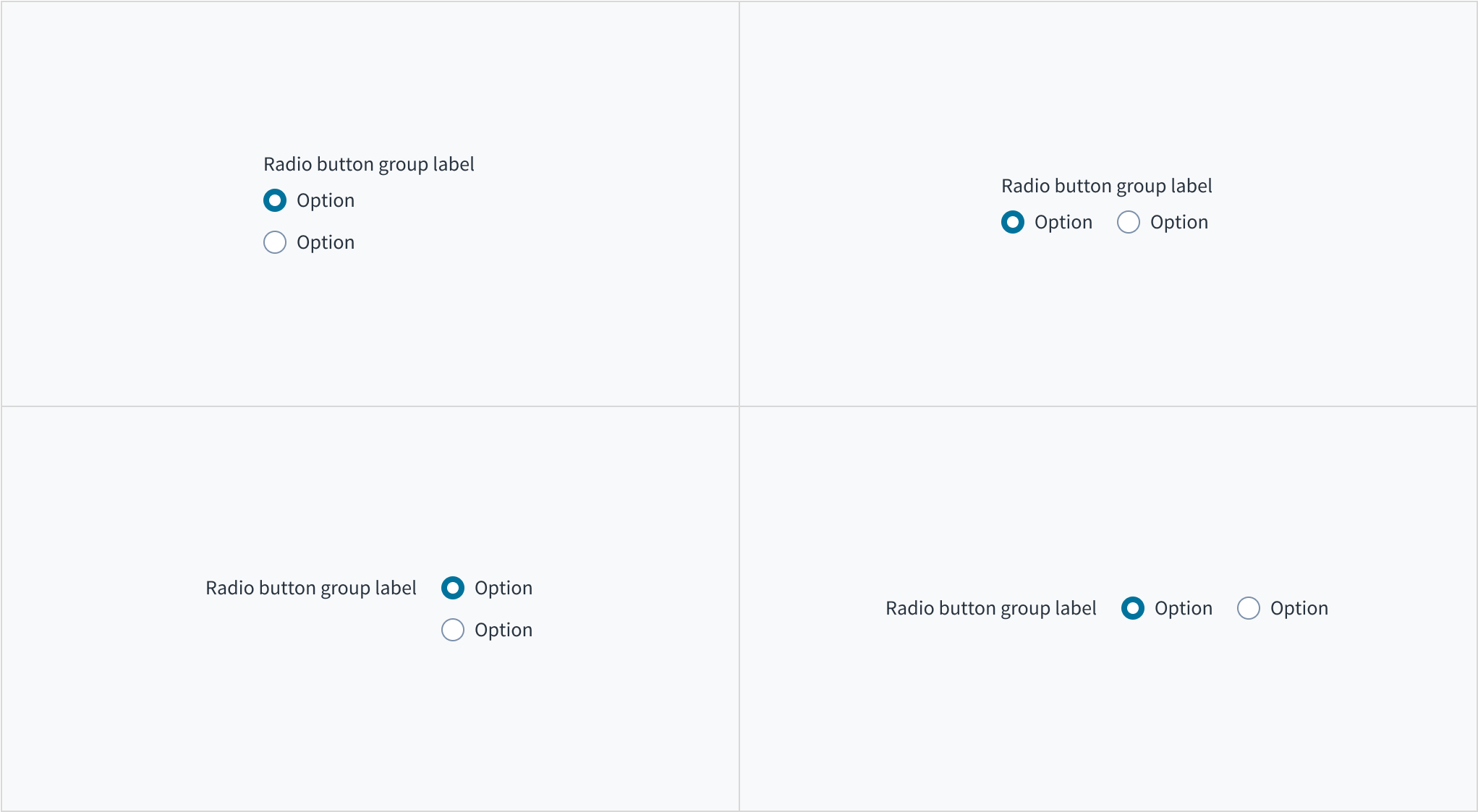
Alignment and placement
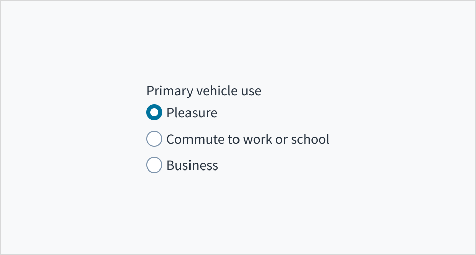
A radio group can be arranged vertically or horizontally depending on the page structure. By default, radio buttons are arranged vertically for easier reading.
As is the case with all input components, the label for the radio group can appear at the top (default) or on the left of the input itself.
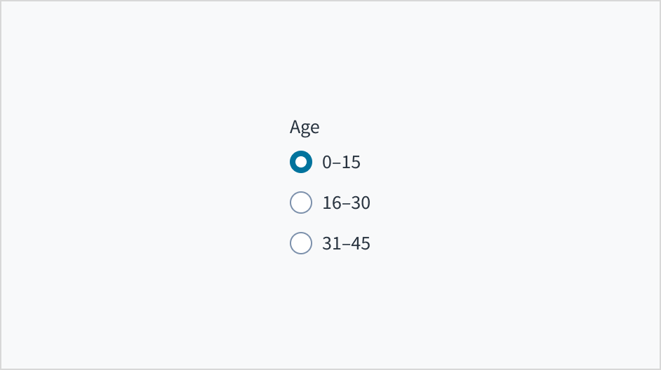
Default selection
Configure one of the radio buttons, usually the first, to be selected by default. This selection expedites the task by communicating to the user that they are required to choose an option in this set. Providing a default selection is recommended for most use cases.
There are some instances, however, when preselecting a default value is presumptuous and might result in an incorrect input. Consider the content and the default selection, how users will react to it, and the effect the selection will have on the user and the organization in both the short and long term. Avoid default selections that are presumptuous, pushy, offensive, or alienating.
Source: Nielsen Norman Group
Use a logical order to help users find the option they're looking for. For example:
- from most common to least common option
- from least to most risky option
- from simplest to most complex operation
Avoid putting selection options in alphabetical order. This is language dependent and doesn't localize well.
Content
General writing guidelines
- Use sentence case for all aspects of designing Guidewire product interfaces. Don't use title case.
- Use present tense verbs and active voice in most situations.
- Use common contractions to lend your copy a more natural and informal tone.
- Use plain language. Avoid unnecessary jargon and complex language.
- Keep words and sentences short.
Use for mutually exclusive options
Radio buttons and checkboxes are not interchangeable. Use radio buttons to select a single option from a small set of mutually exclusive options (5 or fewer). Use checkboxes when there are lists of options and the user may select any number of choices, including zero, one, or several.
Use radio buttons when only one item can be selected.
Don't use radio buttons when multiple items can be selected.
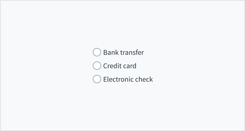
Radio groups must have a label that describes what the list of options represents. A radio group without a label is ambiguous and not accessible.
Use the group label to state the category of the grouping or describe what actions to take below.
Do include a label that clearly describes what the list of options represents.
Don't assume that the options are self-explanatory without a label.
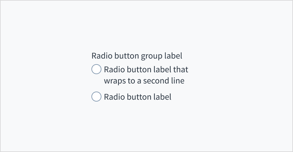
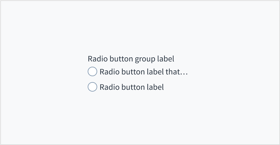
Limit the radio button's text label to a single line. We recommend using one to three words for radio button labels.
Don't truncate radio button label text with an ellipsis (...). If the label is too long for the horizontal space available, consider rewording it. You can also wrap long radio button labels to a second line. This is preferable to truncation.
Do keep radio button label text concise. If necessary, wrap to a second line.
Don't truncate radio button label text with an ellipsis.
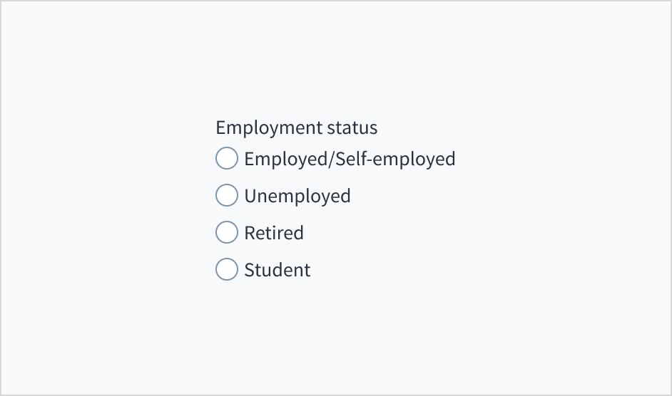
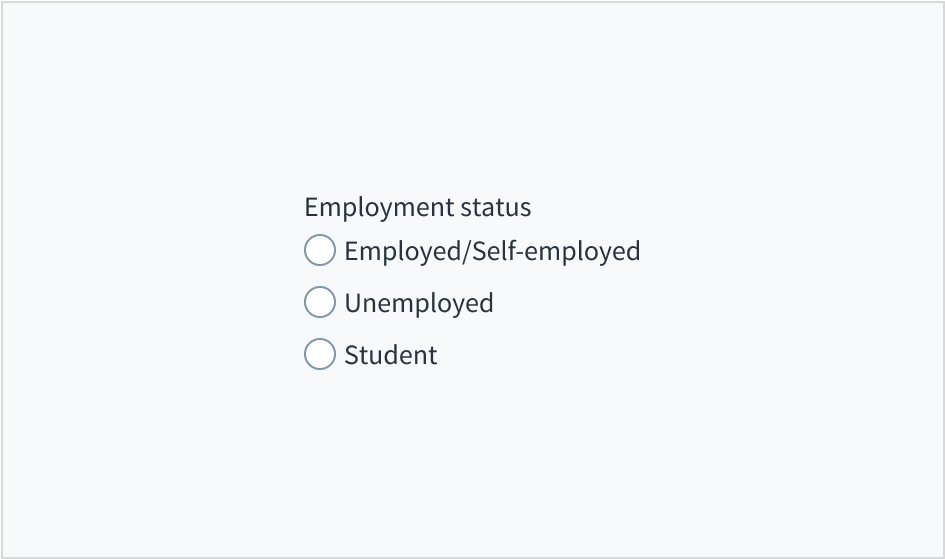
Give distinct, comprehensive options
Users can only make one selection from a radio group. This means that each choice must be clear and distinct. Avoid overlapping options.
Do make sure that options are clearly distinct.
Don't provide options that have overlapping values.
Make sure that the options you provide are comprehensive so that users can make a selection. If it's impossible to be comprehensive, offer a button labeled Other, supplemented by a type-in field.
Source: Nielsen Norman Group
Do make sure that options are comprehensive.
Don't provide an incomplete set of options.
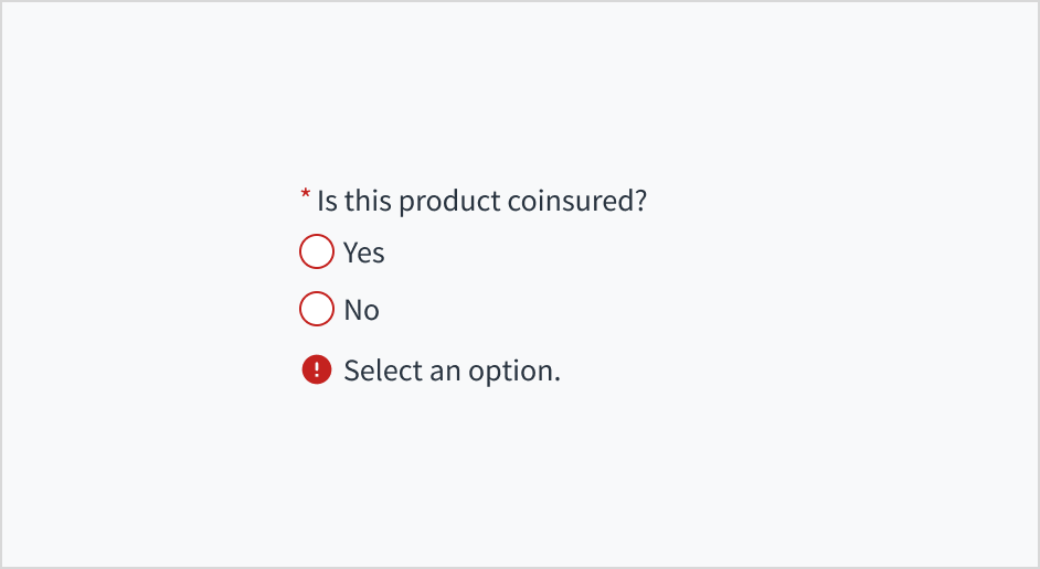
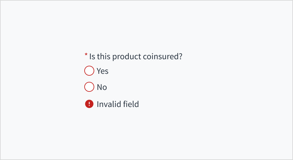
User error text to guide users
Radio groups can include error messages to show that a selection is required to move forward, or that a selection that was made is invalid.
Use sentence case for error text. Write 1-2 short, complete sentences that end with a period.
Do use error text to guide the user and show them a solution.
Don't write ambiguous error messages or leave users guessing as to how to resolve a problem.
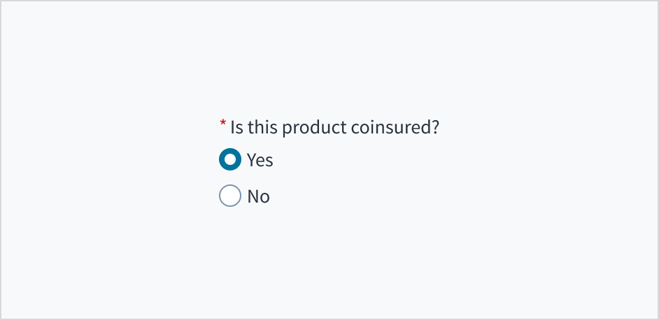
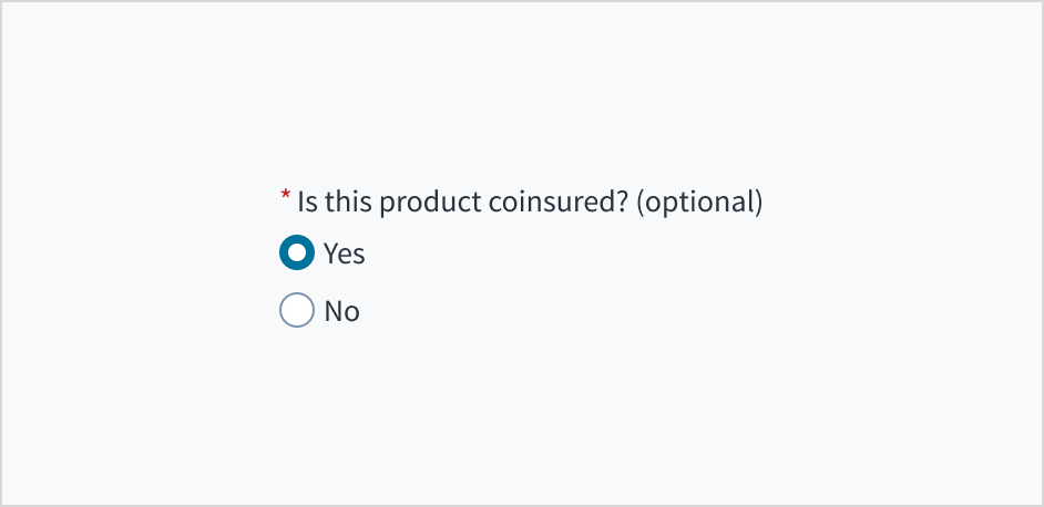
Mark required fields
Use an asterisk (*) to indicate required fields. The asterisk precedes the field label. This helps users to easily locate which fields are required by scanning just the left-most character of the label.
In addition to marking required fields with an asterisk, it is recommended to include clear instructions at the top of the form, such as "All fields marked with an asterisk are mandatory," to ensure users understand the meaning of the asterisk.
You can only add an asterisk to the radio group, not individual options.
Do use an asterisk to indicate that a field is required.
Don't use an asterisk to denote anything that is optional.
Use sentence case
Group labels and radio button labels appear in sentence case.
Refer to the UI text style guide for more information on how to implement sentence case.
Behaviors
States
The radio button component has 2 main states: selected and unselected. The default view of a radio button group is to preselect one of the radio buttons.
Users can only select one radio button at a time. When a user makes a new selection, the previous choice is automatically deselected.
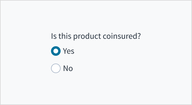
| Selected state | Unselected state |
|---|
 |  |
Radio buttons also have states for enabled, hover, focus, active, disabled, and error.
| Visual | State | Description |
|---|
 | Enabled | Indicates to the user that the element is enabled for interaction (default). |
 | Hover | Indicates that the user has placed a cursor over the element (desktop only). |
 | Focus | Indicates that the user has highlighted the element, typically using an input method such as a keyboard or voice. |
 | Active | Indicates that the user is clicking or tapping the element. |
 | Disabled | Communicates to the user that the element is not currently available for interaction. |
 | Error | Indicates that there has been an error related to this element. For example, a selection needs to be made in order to move forward, or a selection is invalid. |
Interactions
Mouse
To select or unselect radio buttons, users click either the radio button or the label.
Keyboard
Users navigate between radio buttons using the arrow keys. To select a radio button, users press ENTER or SPACE.
Screenreader
The radio button group implements the html <input type="radio">, supplemented with WAI ARIA to provide meaning for blind users. The group is designated as such with role='radiogroup', while aria-checked toggles between 'true' and 'false', depending on the state of the radio button. Labels and radio buttons are programmatically associated through a 'for/id' association. The default aria-required value of 'false' toggles to 'true' when the required checkbox is checked in Storybook.
Accessibility
The contrast ratio of textual elements against their background is above 4.5:1 as per WCAG 2.1 AA requirements. Non-textual content that needs to convey meaning (such as icons and keyboard focus visibility) has a contrast ratio of at least 3:1 with its adjacent colors. All content is visible and functional up to and including 400% without requiring scrolling in two dimensions.
This component has been validated to meet the WCAG 2.1 AA accessibility guidelines. However, changes made by the content author can affect accessibility conformance.
When using this component within your application, ensure that:
- If a radio group does not have a default selected, the focus moves to the first radio button in the group.
- Labels are presented after the radio button.
Note: There are deprecated versions of this component. Switch to a version of the docs older than 10.0.x to view their docs.
Code
<RadioGroup label="This is a group">
  <Radio
    label="option 1"
    value="1"
  />
  <Radio
    label="option 2"
    value="2"
  />
</RadioGroup>
Import statement
import { Radio, RadioGroup } from '@jutro/components';
Component contract
Make sure to understand the Design System components API surface, and the implications and trade-offs. Learn more in our introduction to the component API.
Properties
RadioGroup Properties
labelrequired
DescriptionLabel associated with radio group, also passed as a default value to aria-label.
children
DescriptionList of Radio components to be grouped together.
className
DescriptionCSS class name for this component.
disabled
DescriptionIf set to true, component is rendered in disabled state. Note that when radio group is disabled, all radio options inside group are disabled as well.
displayOnly
DescriptionIf set to true, displays the component value in plain text.
hideLabel
DescriptionIf set to true, the label is not visible.
horizontal
DescriptionIf set to true, radio options inside group are rendered horizontally.
initialValue
DescriptionInitially selected radio. If value prop is specified along with this prop, this prop's value is discarded.
labelPosition
DescriptionPosition of radio group label, relative to radio options. 'top' - label will be placed above the option. 'left' - label will be placed on the left side of the options.
onChange
Typefunction (React.ChangeEvent<HTMLInputElement>, string)
DescriptionCallback invoked when component value is changed.
required
DescriptionIf set to true, component is rendered as required and label has asterisk.
secondaryLabel
DescriptionAdditional label associated with radio group.
stateMessages
DescriptionAn object with a list of error messages for the current state.
Type{ text: intlMessageShape, trigger: string } | intlMessageShapetext
DescriptionText to show tooltip content.
trigger
DescriptionThe trigger to show the tooltip.
DescriptionText to be displayed in the tooltip or tooltip object that includes: text - to show tooltip content, trigger - to set tooltip trigger.
value
DescriptionValue of the component. Takes precedence over initialValue. If this prop is passed, component works in controlled mode and its value will change only if this prop changes.
Radio Properties
labelrequired
DescriptionLabel associated with radio field, also passed as a default value to aria-label.
valuerequired
className
DescriptionCSS class name for this component.
disabled
DescriptionIf set to true, radio input is rendered in disabled state. Note that when radio group is disabled all radios inside group are disabled as well.
Type{ text: intlMessageShape, trigger: string } | intlMessageShapetext
DescriptionText to show tooltip content.
trigger
DescriptionThe trigger to show the tooltip.
DescriptionText to be displayed in the tooltip or tooltip object that includes: text - to show tooltip content, trigger - to set tooltip trigger.
Hooks
No hooks are available for Radio or RadioGroup.
Translation keys
There are no translations for Radio or RadioGroup.
For information on how to manage translations, see our section about Internationalization.
Escape Hatches
For more information, see our documentation about escape hatches.
The following options are available:
- Design tokens
- A
className property
- The ability to pass native HTML attributes
- Ref with imperative handlers
- A native
event property
Passing HTML properties to the component
You can use HTML input attributes, except any that are overridden by Jutro. These attributes are assigned to the HTML input element.
<RadioGroup label="This is a group">
  <Radio
    label="This is the first one"
    value="1"
    id="firstOption"
  />
  <Radio
    label="This is the second one"
    value="2"
    id="secondOption"
  />
  <Radio
    label="This is the third one"
    value="3"
    id="thirdOption"
  />
</RadioGroup>
The result of passing the id property is that it becomes part of the HTML input that is created in the HTML DOM.
Ref with imperative handlers
Jutro inputs have implemented imperative handlers as a mechanism to provide access to some common native features that might be useful for you. The following features are available:
-
Set focus to allow you to set the user focus into a specific component
-
Blur to remove the focus from the component
-
Scroll to the component so that you can take the user to a specific area of the page.
These features are provided through the ref property, which exposes them as follows:
    const componentRef = useRef(null);

    const setFocus = () => {
        componentRef?.current.focus();
    }

    const removeFocus = () => {
        componentRef?.current.blur();
    }

    const scrollToComponent = () => {
        componentRef?.current.scrollIntoView();
    }

    <Component ref={componentRef}>
More options might be included in the future.
Custom behaviors
Radio component usage
The Radio component must not be used by itself, it is only to be used under the scope of the RadioGroup component. The RadioGroup component only accepts Radio elements as child elements.
Warning: Any usage different from the ones described above is not supported and might cause unexpected issues in future releases.
Precedence of disabled, displayOnly, and readOnly properties
If two or more of the properties disabled, displayOnly, and readOnly are set to true at the same time, the precedence is as follows:
displayOnly > readOnly > disabled
Although some Jutro components might provide complementary features or a helper function to facilitate the validation process, it is your responsibility as a developer to handle the validation of any user input (using or not using the complementary helpers) and to decide what error messages to show.
Jutro components behave based on the developer implementation.
When are error messages displayed?
Error messages are only displayed when you pass them to the component through the stateMessages property. This property receives an object with the following content:
{
  error: ['error message 1', 'error message 2', 'error message N'];
}
The component displays every error message provided in the same order as in the array.
When does validation occur?
This is your decision as a developer. As components do not determine when the validation is performed or when the error must be displayed, you need to implement the logic to handle it according to the project requirements, for example while the user is editing the content, when the component loses focus, and on form submission.
Are you using the legacy RadioButtonField, RadioButtonCardField, ImageRadioButtonField, RadioField, or RadioGroup components?
- To view docs for the old components, switch to a version of the documentation older than 10.0.
- These legacy components are also available in Storybook:
Note: There are deprecated versions of this component. Switch to a version of the docs older than 10.0.x to view their docs.
Examples
Check out the Usage section for details about how and when to use the RadioGroup and Radio components.
Basic radio group
Radio cannot be used alone, outside of the RadioGroup context. RadioGroup should receive only Radio components as children. The label prop is mandatory in both components and the value prop is required for the Radio component only.
<RadioGroup label="This is a group">
  <Radio
    label="option 1"
    value="1"
  />
  <Radio
    label="option 2"
    value="2"
  />
</RadioGroup>
Disabled radio vs disabled radio group
Both components provide a disabled property. However, when set to true at the RadioGroup level, it overrides any disable configuration from the Radio level. If there is any disabled={false} prop setting among the Radio options, but the RadioGroup sets it to disabled={true}, all options are disabled.
<RadioGroup
  label="This is a group"
  disabled={true}>
  <Radio
    label="option 1"
    value="1"
    disabled={false}
  />
  <Radio
    label="option 2"
    value="2"
    disabled={false}
  />
</RadioGroup>
Predefined option
It is possible to define what option is initially selected by passing the value prop to the the initialValue property of the RadioGroup.
<RadioGroup
  label="This is a group with second option selected initially"
  initialValue="2">
  <Radio
    label="option 1"
    value="1"
  />
  <Radio
    label="option 2 is initially selected"
    value="2"
  />
</RadioGroup>
Horizontal group
The RadioGroup component allows for the display of options in horizontal distribution by setting the horizontal property to true.
<RadioGroup
  label="This is a group"
  horizontal={true}>
  <Radio
    label="option 1"
    value="1"
    disabled={false}
  />
  <Radio
    label="option 2"
    value="2"
    disabled={false}
  />
</RadioGroup>
RadioGroup validations
The RadioGroup component does not provide a specific validation logic but it provides a way to include the developer validation and use the stateMessages property to display any required error message.
This is an example of handling validation when the onChange event is triggered.
export function RadioValidation() {
  const [groupValidationMessages, setGroupValidationMessages] = useState({});

  const onChange = useCallback((e, newValue) => {
    setGroupValidationMessages({});

    if (newValue == '1') {
      setGroupValidationMessages({
        error: ['Only second option can be marked'],
      });
    }
  }, []);

  return (
    <RadioGroup
      label="Do not select the forbidden option"
      onChange={onChange}
      stateMessages={groupValidationMessages}>
      <Radio
        label="Do not select the forbidden option"
        value="1"
      />
      <Radio
        label="This option can be selected"
        value="2"
      />
    </RadioGroup>
  );
}
RadioGroup has a value property which can be used for the controlled component scenario:
export function RadioControlled() {
  const [updatedValue, setNewValue] = useState('first given value');

  const onChange = (e, newValue) => {
    setNewValue(newValue.value);
  };

  return (
    <div>
      <Select
        label="Choose a value to be assigned"
        secondaryLabel="This value will be the option chosen below"
        onChange={onChange}>
        <SelectOption
          value={{
            id: '1',
            label: 'Option 1',
            value: '1',
          }}
        />
        <SelectOption
          value={{
            id: '2',
            label: 'Option 2',
            value: '2',
          }}
        />
      </Select>
      <br />
      <RadioGroup
        label="Changes with the above"
        value={updatedValue}>
        <Radio
          label="Option 1"
          value="1"
          disabled={true}
        />
        <Radio
          label="Option 2"
          value="2"
          disabled={true}
        />
      </RadioGroup>
    </div>
  );
}
Using ref to set focus
RadioGroup and certain other inputs, allow you to use a ref property to access some native behaviors. However, only some features are exposed. In this case, when the button is clicked, the focus is automatically set in the input below.
<RadioGroup
  label="This is a group with second option selected initially"
  initialValue="2">
  <Radio
    label="option 1"
    value="1"
  />
  <Radio
    label="option 2 is initially selected"
    value="2"
  />
</RadioGroup>