Validation and messaging mechanisms
Overview
Validation ensures that user inputs meet required criteria. After validation, users receive feedback through clearly defined messaging mechanisms. This documentation outlines when and how to apply validation and which feedback methods to use.
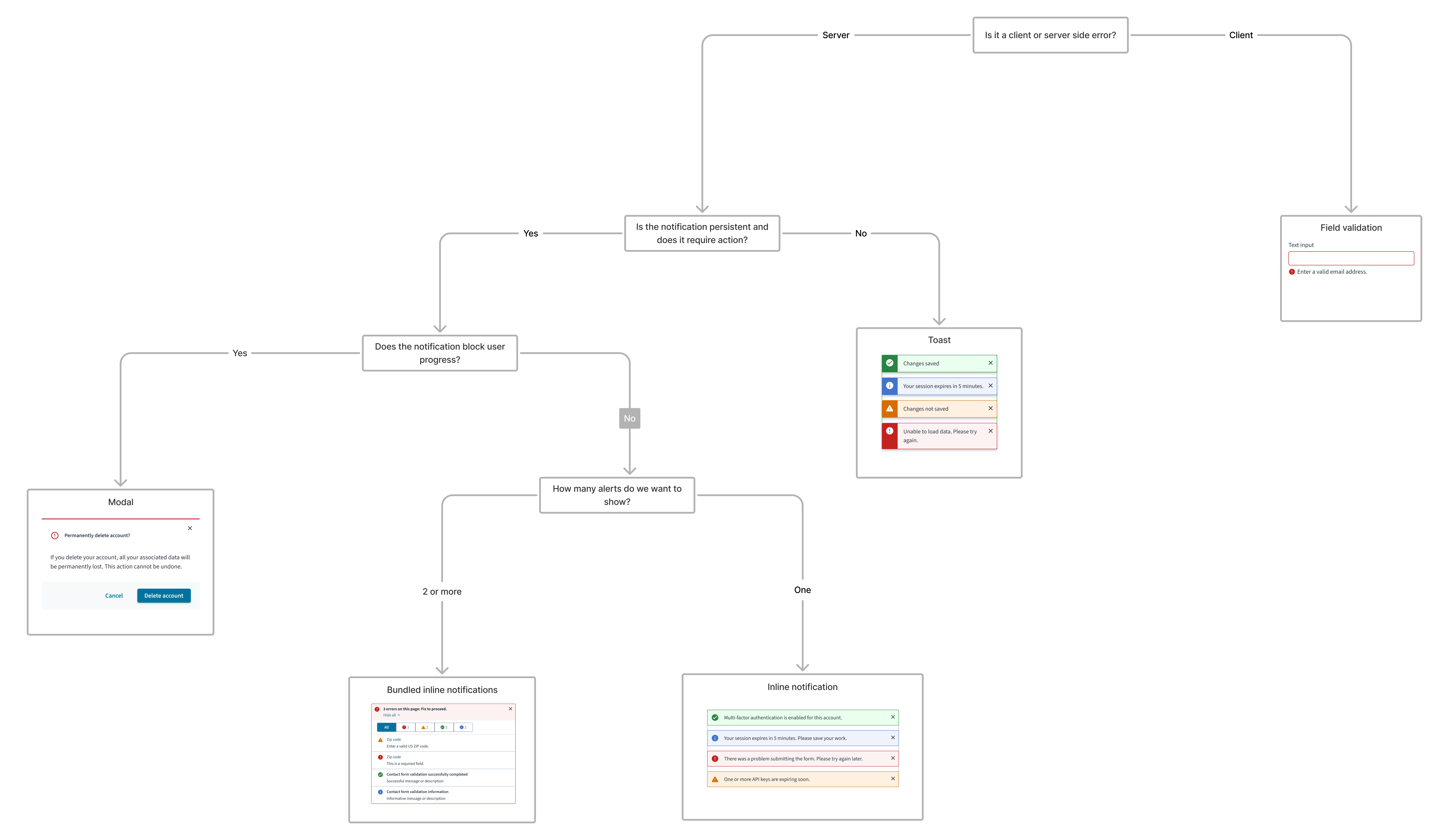
For a detailed guide on when to use validation and messaging mechanisms, explore the following UI component decision tree.
Validation mechanisms
| Type | Purpose | When to use | Feedback method |
|---|---|---|---|
| Client-side validation | Validate individual fields in real-time | When a field loses focus (click or tab out) | Built-in input behavior: alert status on fields |
| Server-side validation | Validate data after a form, step, or page is submitted to the server | For complex or back-end validations | Alert status on fields, toast, modal, or inline notification |
Client-side validation
Client-side validations are performed as soon as the user finishes inputting data in a field. Validation is triggered when the field loses focus—that is, when the user tabs away or clicks outside of the field. This validation is almost instantaneous and helps users fix errors as and when they occur.
Jutro recommends using alert status notifications on fields to display client-side validation messages. Many input components, such as the text input component, feature these built-in alert statuses that provide contextual, field-level feedback directly on the field. These statuses visually communicate the result of the user's input or the system's validation. You can enable these statuses by using the error state in the input field, and this behavior is supported across all input types.
For an example of how to use the error state with inputs to display alert statuses, see Use error text to guide users in the text input component documentation.
Server-side validation
These validations are performed when a form, step, page, or process is submitted to the server. The server returns the results of the validation using different mechanisms, depending on the urgency and severity of the message.
Jutro recommends using client-side validations wherever possible to ensure faster error recovery. Different notification types like inline notification, toast, and modal, in conjunction with field status messages, can be used to display server-side validation messages.
For tasks involving steps or pages, include validations at each of the pages rather than at the end of the process. This reduces cognitive overload with errors and promotes better way-finding around errors.
Messaging-handling mechanisms
| Notification type | Urgency | Purpose | Trigger | Placement/Location | Validation type |
|---|---|---|---|---|---|
| Field-level feedback | High | Show real-time validation status on fields | When field loses focus (click or tab out), or after form submission | Directly on the field | Client side |
| Inline notification | Medium | Provides contextual feedback near fields or sections | After server-side validation | Near related input or section | Server side |
| Toast | Low | Brief status update for system feedback | After server-side validation | Top right of viewport | Server side |
| Modal | High | Blocks flow to show critical errors or actions | After server-side validation | Above dimmed main content | Server side |
Message types (by severity)
Each messaging type can have the following levels of severity:
- Error
- Warning
- Success
- Informational
Modals are used for critical messages that need the user's focused attention. For messages that require less attention, use any other means of messaging available.
Error messages
Error messages inform users of errors, unsuccessful actions, or critical issues that might prevent the user from continuing with their task. Error messages must provide users with sufficient information to resolve the issue or alternatives to completing the task.
Examples include the following:
- Invalid or incorrect field entries
- Missing required fields
- Exceeding limits
- System failures
Warning messages
Warning messages inform users of conditions that might not block the user's current flow, but can cause errors in their task at a later stage or step.
Examples include the following:
- Issues with form entries like duplicate entries
- Updates affecting the task flow
- Notification of inactivity or session expiration
- Page or flow blocked due to insufficient permissions
Success messages
Success messages inform users that a task was completed successfully. These messages can be in response to a user action or automatic background processes.
Examples include the following:
- Correct field value
- Successful create, update, or delete
- Valid data selections
Informational messages
Informational messages inform users of helpful information that may aid in task completion or note next steps.
Examples include the following:
- Fields that must be completed before promotion
- Notification that an object is read-only
- System-level updates such as object available for editing
Content
General writing guidelines
- Use sentence case for all aspects of designing Guidewire product interfaces. Don't use title case.
- Use present tense verbs and active voice in most situations.
- Use common contractions to lend your copy a more natural and informal tone.
- Use plain language. Avoid unnecessary jargon and complex language.
- Keep words and sentences short.
For guidance on how to write notifications, see Writing effective messages.
To view component-level style guidance, click on the Usage tab for each component on the Jutro Design System site, and then navigate to the Content section.
Accessibility
Jutro components have been validated to meet the WCAG 2.1 AA accessibility guidelines. However, changes made by content authors can affect accessibility conformance. Refer to the following guidance and the WAI-ARIA Authoring Practices for more information:
- Provide all necessary instructions and cues for the user to complete a task.
- Ensure validation messages are in a logical reading order and can be completed and submitted using a keyboard.
- Labels must be programmatically associated with their corresponding elements.
- Color alone must not be used to denote the state of a field. Use supporting text and icons to make it accessible for screen reader technologies.
- Icons or graphics can be used as the only visual label (without visual text) only if the meaning of the icon is visually self-evident AND if there is a programmatically associated semantic label available to assistive technologies.
- Longer error messages must be associated with inputs using
aria-describedby. This ensures that, when users navigate to an input field, the screen reader announces the error that is displayed. For more information aboutaria-describedby, see Describing aria-describedby. - Provide error summaries and the means to navigate to individual errors when possible.
Responsiveness
Jutro message-handling mechanisms are responsive as long as the component, page layout, or pattern that uses them are responsive.
Theming
By default, theming and branding match that of the application unless overridden.
Patterns may be themed to meet specific branding requirements and customer needs. This includes visual elements such as colors, typography, icons, buttons, and other components and graphical elements.