Inline notification
Usage
Overview
Inline notifications give clear and immediate feedback related to forms, processes, and section-level actions performed by the user. They help users stay informed about the status of their actions, guiding them toward successful task completion or alerting them to issues that need attention.
For a detailed guide on when to use inline notifications, explore the following UI component decision tree.
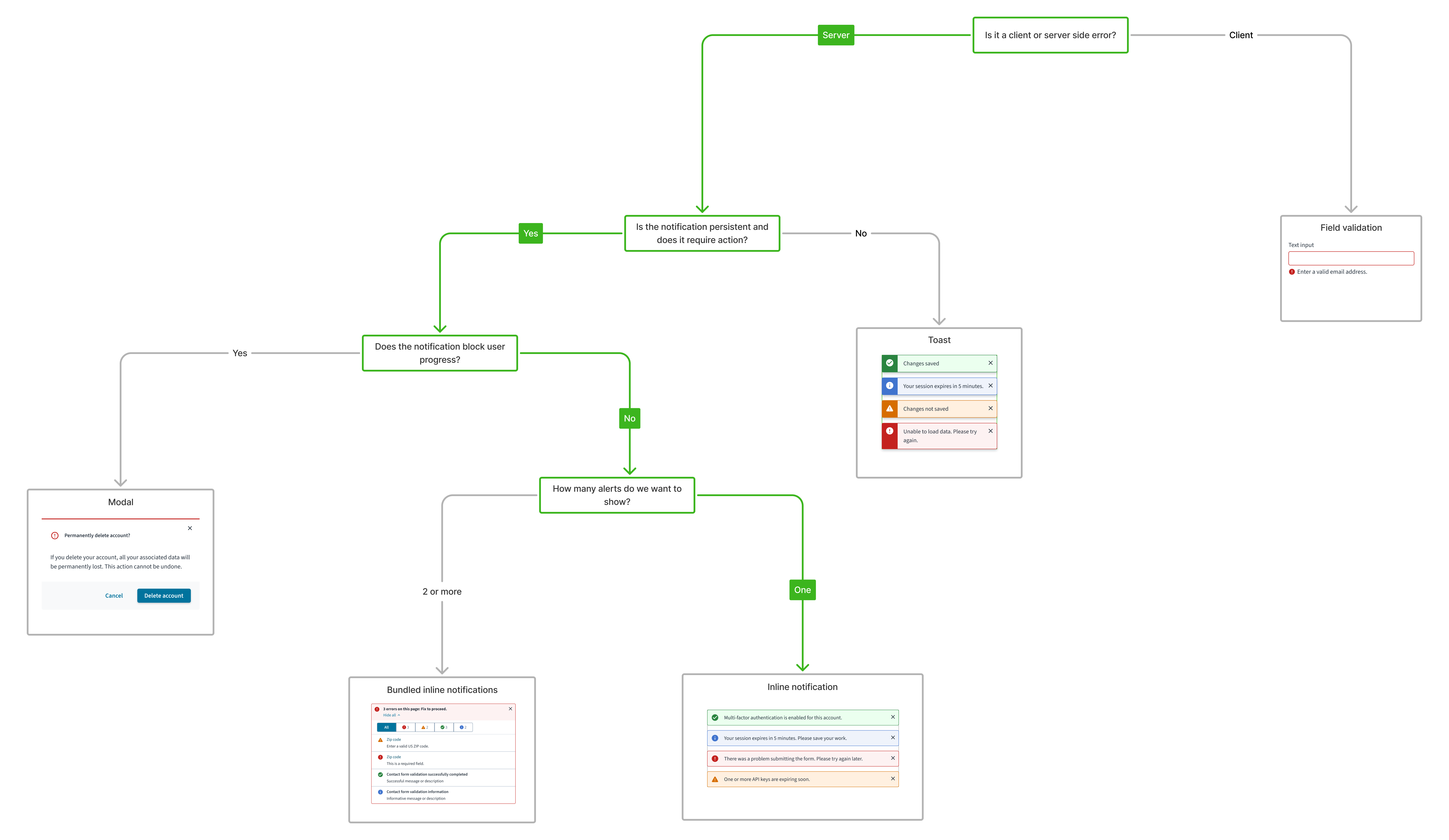
Inline notifications bundle variant displays multiple related messages in a single, compact block to reduce clutter and provide a clear overview of all relevant feedback in one place.
For a detailed guide on when to use bundled inline notifications, explore the following UI component decision tree.
When to use
- When the message relates to the content or an object on the current page.
- For instant feedback on a process, such as confirmation that a form submission is successful.
- To help users identify validation errors or other issues during form submission.
- To notify users of highly important and actionable information.
When not to use
For system-level notifications about events or actions that occur within the app. Instead, use toasts.
Types
Inline notifications are based on the severity of the message. They include the following types:
| Type | Icon | Purpose |
|---|---|---|
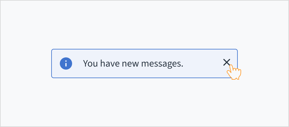
| Info |  | Inform users of helpful information that may aid in task completion or note next steps. |
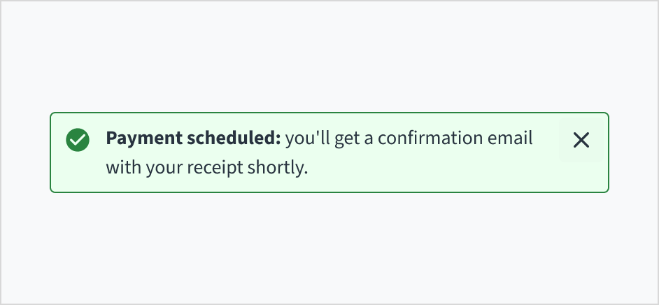
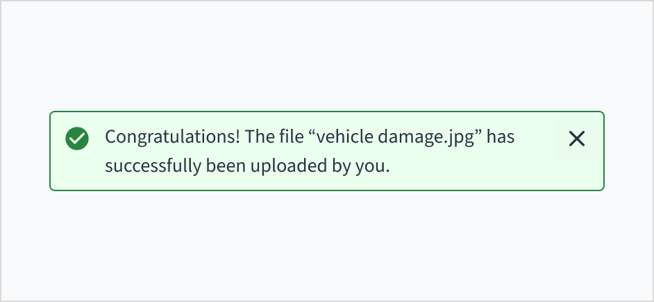
| Success |  | Inform users that a task was completed successfully. |
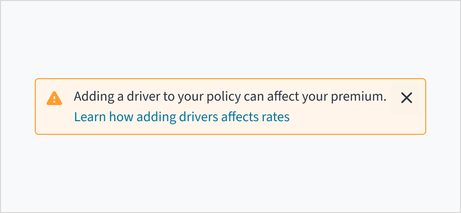
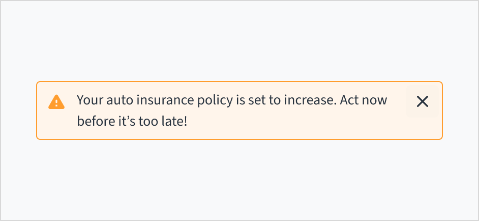
| Warning |  | Inform users of conditions that might not block the user's current flow, but can cause errors in their task at a later stage or step. |
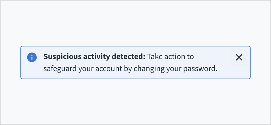
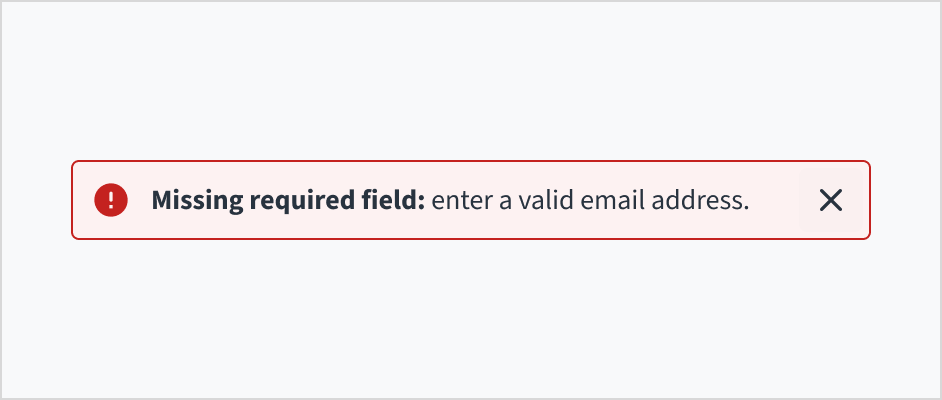
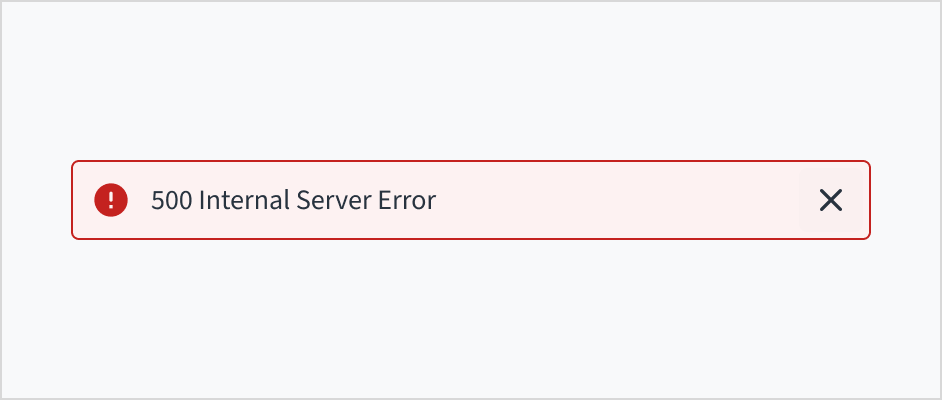
| Error |  | Inform users of errors, unsuccessful actions, or critical issues that might prevent the user from continuing with their task. |
Formatting
Anatomy
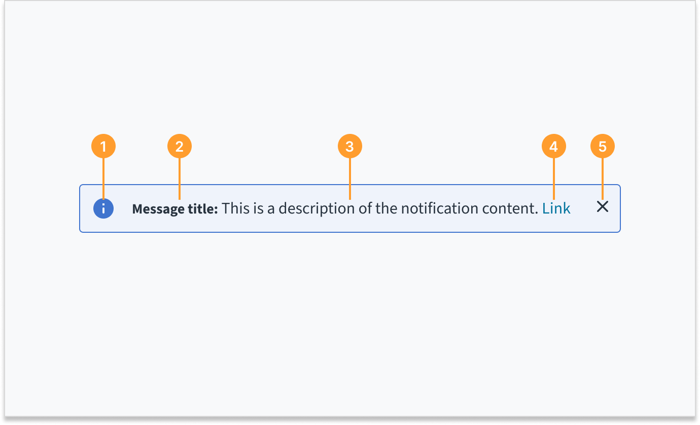
Inline notifications consist of the following elements:
- Icon: Provides a visual indication of the message severity.
- Title (optional): Gives a brief, at-a-glance summary of the notification's content or purpose.
- Description: Describes the nature of the notification, its significance, or required action.
- Link (optional): Enables users to view further details.
- Close button (optional): Dismisses the notification.
Bundled inline notifications
Inline notifications can accommodate various usage patterns, including the bundling of alerts. This section details the bundled variant, which allows for grouping messages of the same or different severities for improved clarity and space efficiency. Use this approach instead of stacking inline notifications, which can push critical content out of view.
Bundling alerts of the same severity
 Bundling alerts of the same severity
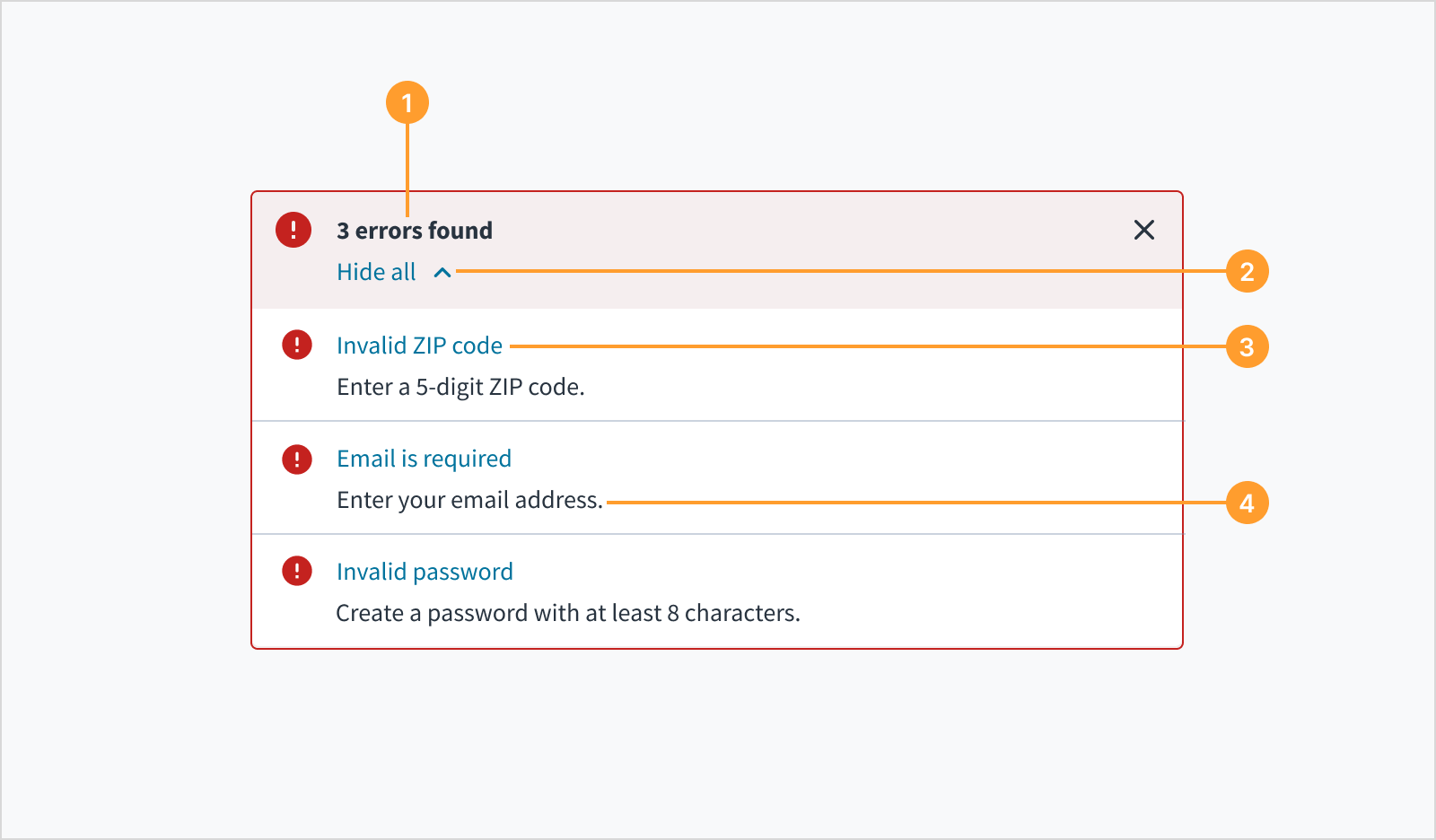
When multiple messages of the same severity arise in the app, the messages may be bundled together so that it's easier to scan and act on the messages.
- Title: Gives the number of the alerts and an optional title message.
- Hide/show control: Expands to view messages or collapses from view.
- Alert position navigation link: Indicates where the alert has occurred and gives users the ability to navigate to the trigger.
- Description: Provides contextual information about the message.
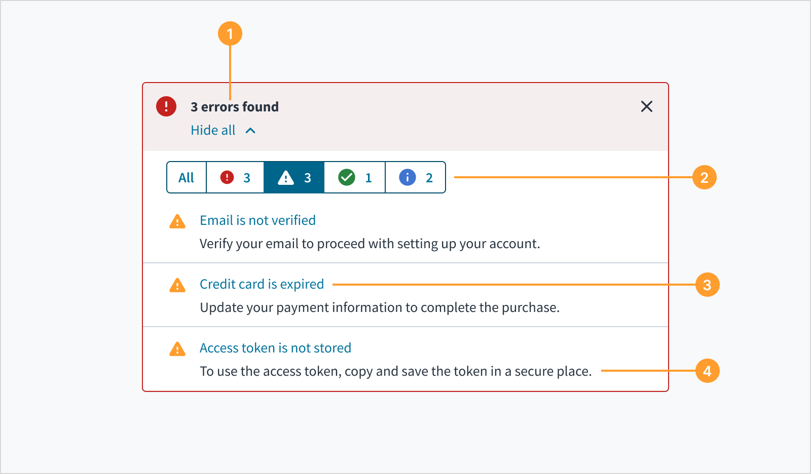
Bundling alerts of different severities
 Bundling alerts of the different severities
When multiple messages of different severities arise in the app, the messages may be bundled together so that it is easier to scan and act on the messages.
- Title: Gives the number of alerts in order of highest priority. For example, if there are 3 errors and 3 warnings, the title should communicate the number of errors found and may include an optional title message.
- Message toggle: Enables the user to toggle between alert groups. Each toggle contains an icon, which indicates the category of the alert, and the number of messages.
- Navigation link: Indicates where the alert has occurred and gives users the ability to navigate to the trigger.
- Description: Provides contextual information about the message.
Sizing and placement
Inline notifications are placed near the relevant area of the UI. They can expand in width to fill the container or content area that they relate to.
The height of inline messages grows with content up to 2 lines of wrapped text.
Content
General writing guidelines
- Use sentence case for all aspects of designing Guidewire product interfaces. Don't use title case.
- Use present tense verbs and active voice in most situations.
- Use common contractions to lend your copy a more natural and informal tone.
- Use plain language. Avoid unnecessary jargon and complex language.
- Keep words and sentences short.
Inline notification title
Titles are optional for inline notifications and only to be used when you can concisely communicate the notification's main message. They should be short, descriptive, and explain the most important piece of information.
Inline notification description
Descriptions consist of 1 or 2 short sentences. They inform users about the notification's significance and any necessary steps they need to take.
Writing for different message types
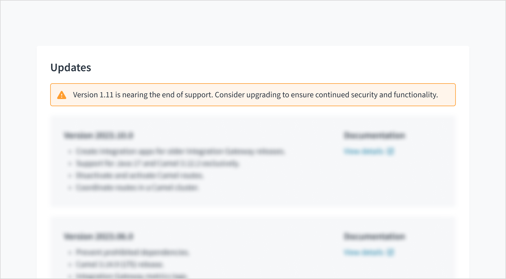
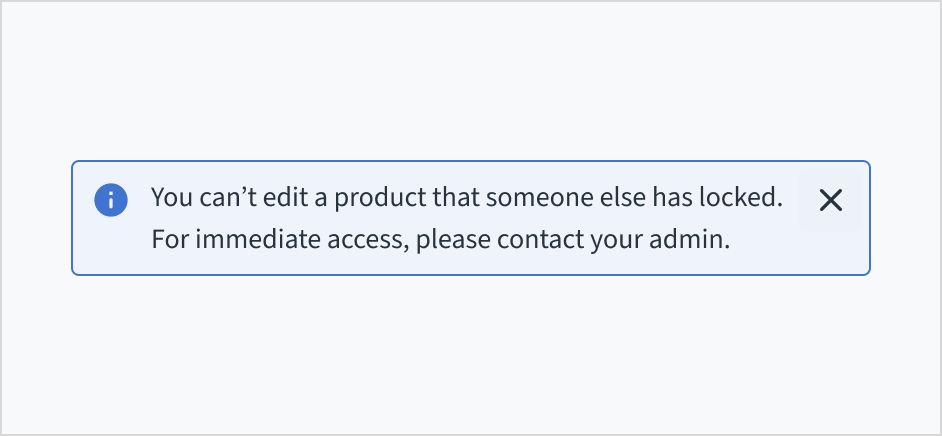
Info
Info messages convey non-critical information or updates to users without requiring action. Use them to inform people about something that might help or impact them.
Success
Success messages inform users that a task or action has been completed successfully. For frequent and simple actions, such as uploading a file or saving a document, keep the success message short and practical. You can use a celebratory tone for significant achievements and messages that are more infrequent in nature.
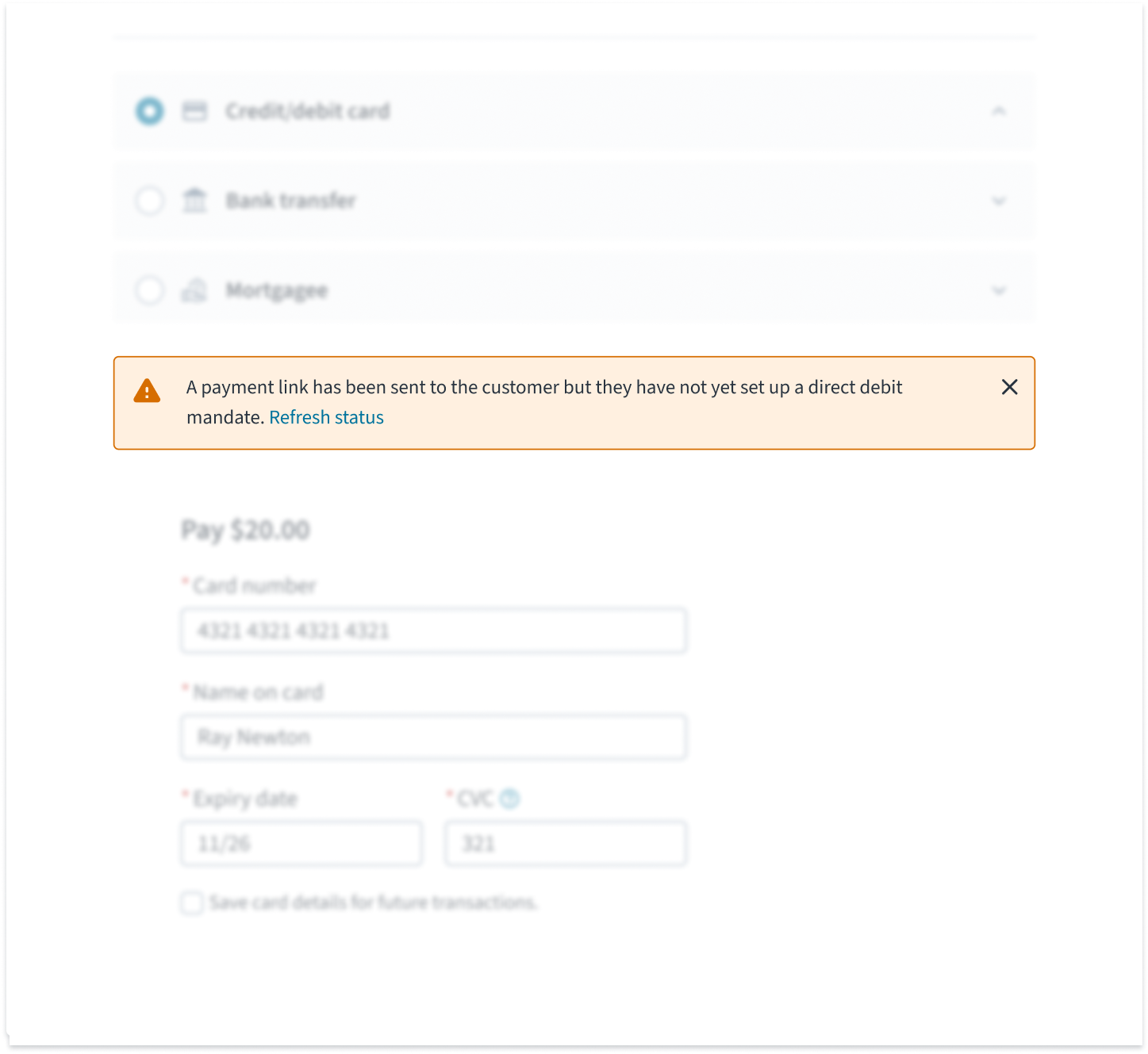
Warning
Warning messages alert users to potential issues that might need their attention within the context of their current task or interaction. If the warning comes before an action, explain what will happen if the user proceeds. Provide an alternative where possible.
Error
Error messages indicate that a task has failed or has errors that prevent the user from progressing to the next stage. When writing for error messages:
- Explain the problem and what went wrong as precisely as you can.
- Suggest how to solve the problem and carry on forward. If the problem can't be solved at that time, tell the user what can be done to help them, an who they can turn to.
- Use language that is simple, clear, and direct. Avoid confusing people with technical details or jargon.
- Try to use error messages that are relevant and specific to the context they appear in. The more generic, the less helpful.
- Don't blame users and accept if something is our fault.
Behaviors
Dismissal
Inline notifications appear only one at a time. They exist until the user dismisses them, until issue resolution, or when the user navigates away from the current page.
The close button is optional. It appears as a small "X" in the top-right corner of the inline notification. Don't include a close button if it's critical for the user to read or interact with the notification.
Interactions
This image illustrates a typical form validation flow. A bundled inline notification first alerts the user to multiple errors, which are then detailed by individual field-level messages for easy correction.
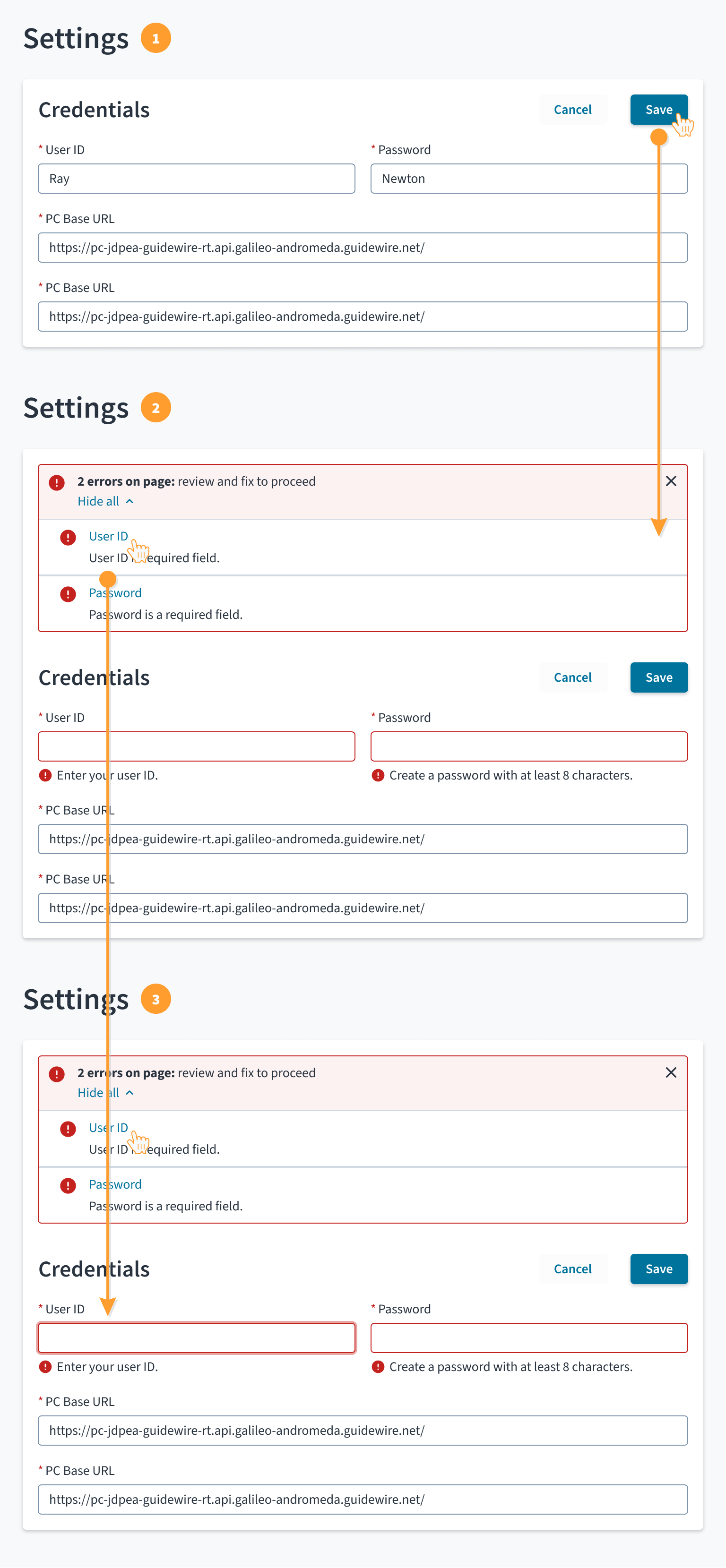
- Form submission: The user submits the form (a section of a page in this example) using the commit action ("Save" in this example).
- Two types of messaging are used in this scenario:
- Bundled inline notifications to indicate the form submission has failed
- Field status messages to indicate problems with field input values
- Recovery aid: When the user clicks on the alert position navigation link, focus shifts to the corresponding field and the user is able to review and make corrections.
Accessibility
The contrast ratio of textual elements against their background is above 4.5:1 as per WCAG 2.1 AA requirements. Non-textual content that needs to convey meaning (such as icons and keyboard focus visibility) has a contrast ratio of at least 3:1 with its adjacent colors. All content is visible and functional up to and including 400% without requiring scrolling in two dimensions.
This component has been validated to meet the WCAG 2.1 AA accessibility guidelines. However, changes made by the content author can affect accessibility conformance.
Follow the guidance below when using this component in your applications:
- Ensure that inline notifications persist until the user dismisses them, until issue resolution, or when the user navigates away from the current page.
- Don't include a close button if it's critical for the user to read or interact with the notification.