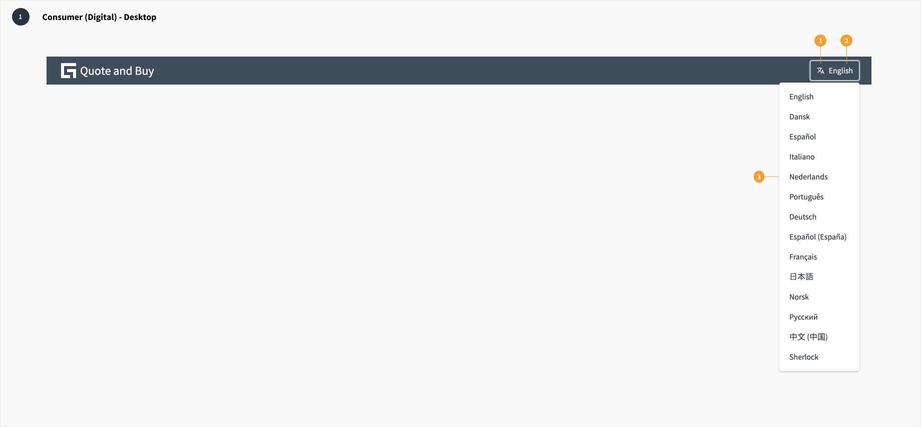
The language selector should be prominently featured in the first experience an end user has with a consumer application. All subsequent interactions depend upon a user being able to understand the content of the UI, so other functions should be secondary at this point.
Use the Jutro "translate" icon along with a text label to help a user identify the language selector even if the UI initially presents in a language they do not understand.
Avoid using flags to represent languages. This practice is problematic because a language may be spoken in multiple countries, and multiple languages can be spoken in a single country.
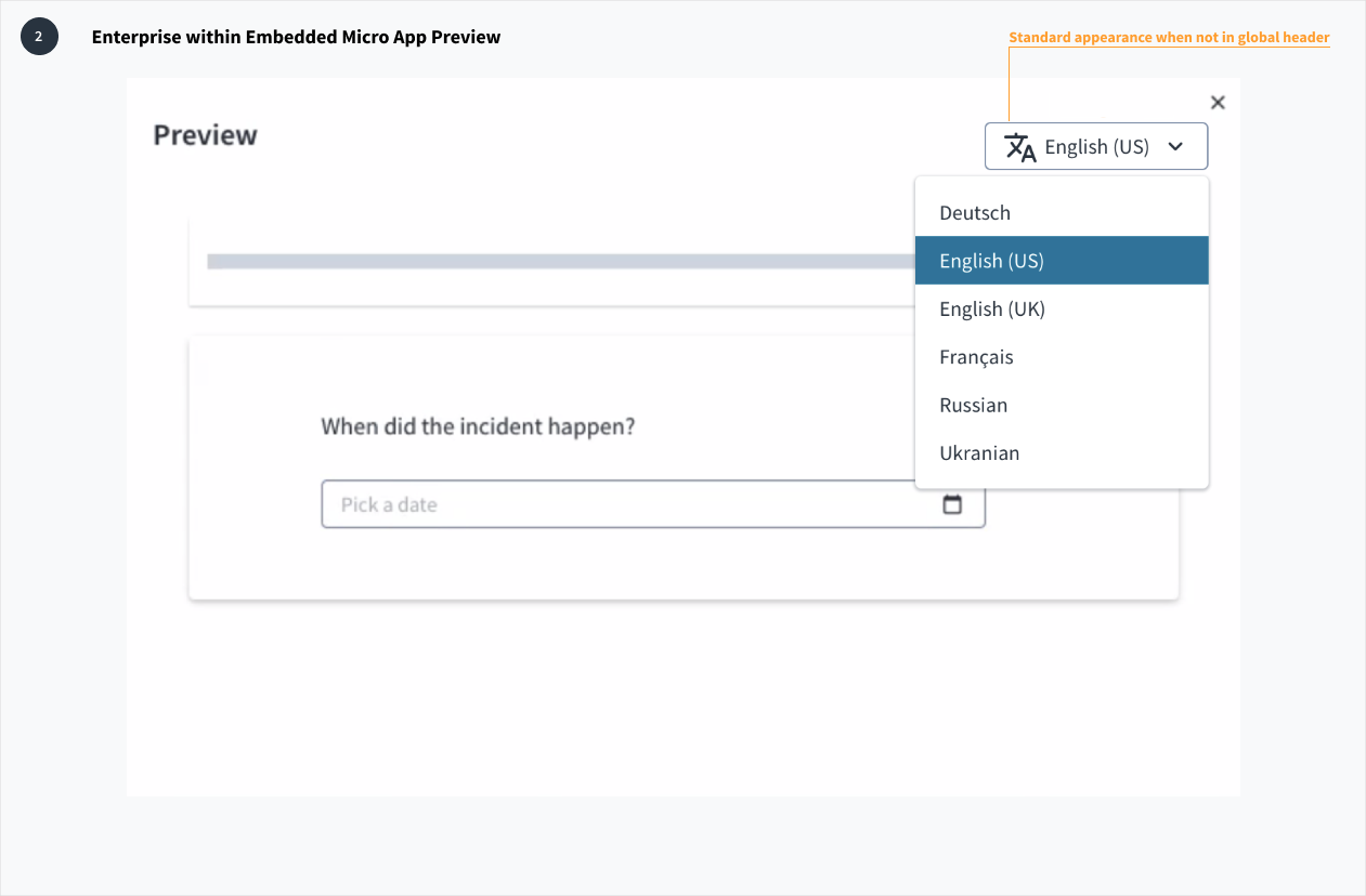
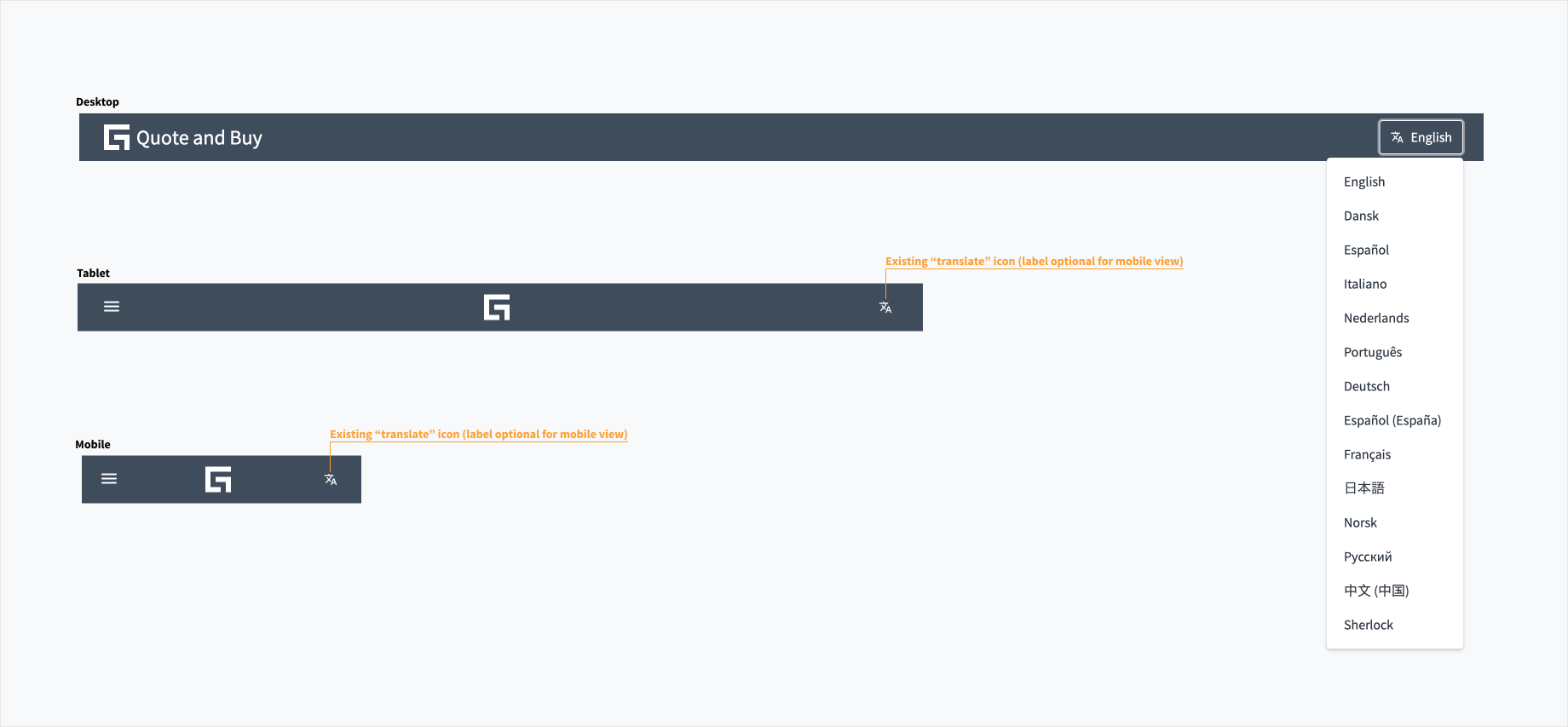
Use the "translate" icon in conjunction with a language label for desktop view. A label is optional for tablet and mobile views.
When the language selector appears in the global header, hide the select border and expand the "translate" icon to maintain consistency with appearance and functional pattern.
The language selector component automatically adjusts to any screen size, including desktop, tablet, and mobile. In tablet and mobile views, the text label is optional.
Clicking the language selector produces a standard dropdown select menu, which includes a list of available languages from which users may choose. Upon the selection of a suitable language, the UI changes without any interference to the user's flow.
Make sure to understand the Design System components API surface, and the implications and trade-offs. Learn more in our introduction to the component API.
By default, the LanguageSelector component will populate its list of languages automatically based on your LanguageContext. You can override this by supplying a list of language ISO codes to the availableLanguageValues property.