Loader components indicate that the system is processing a command, such as loading an app, submitting a form, performing a computation, or saving updates. Use loaders when the system needs users to wait for an unspecified amount of time. This reassures users that system processing is underway and that the system is working.
Loader components come in two variants: loader and inline loader.
Loaders are used for processes like data retrieval and slow computations. They help to manage user expectations and provide feedback during full-page loading.
Inline loader
Inline loaders provide visual feedback that an action is being processed, such as Create, Update, and Delete.
Loader
A. Loading indicator: Appears in a looped animation as the Guidewire logo.
Inline loader
A. Loading indicator: Appears as two arrows that rotate clockwise. When data is successfully processed, the loading indicator changes to a green checkmark.
B. Label (optional): Assistive text that explains the loading status.
Inline loaders can have optional text that describes the action taking place. For example, “Creating account…”.
The label should change to reflect processing status. For example, if a user is creating an account, the label might read “Account created” when the action is finished.
Inline loaders may be used without accompanying text in certain situations, such as when they appear in an input field.
Do use labels that are short, meaningful, and accurate to the pending action.
Both the inline loader and the loader components use the WAI-ARIA role of "alert" to ensure that screen reader users are notified of the same information. The element with role="alert" uses an aria-labelledby association with a <div> of class="jutCubeLoaderscreenReaderOnly" (and the value of "Loading") to provide an accessible name.
The contrast ratio of textual elements against their background is above 4.5:1 as per WCAG 2.1 AA requirements. Non-textual content that needs to convey meaning (such as icons and keyboard focus visibility) has a contrast ratio of at least 3:1 with its adjacent colors. All content is visible and functional up to and including 400% without requiring scrolling in two dimensions.
This component has been validated to meet the WCAG 2.1 AA accessibility guidelines. However, changes made by the content author can affect accessibility conformance.
If the loading message is changed, for example, ensure that it is clear and concise.
Make sure to understand the Design System components API surface, and the implications and trade-offs. Learn more in our introduction to the component API.
Controls whether the Loader UI is shown or the children components. For Boolean values, if set to false, the Loader UI is displayed; if set to true the children are displayed. For Promise values, the Loader UI is displayed until the promise has completed, then the children are displayed.
A function to render a component to display when loading. By default, it will display the built in BrandedLoader component that displays an animation using the guidewire logo.
Controls whether the Inline Loader shows its loading or completed versions. For Boolean values, if set to false, the loading version is displayed; if set to true, the success version is displayed. For Promise values, the loading version is displayed until the promise has completed, then the completed version is displayed. For Promise arrays, they behave like Promise values except it will be considered loading until every promise in the array has been fulfilled.
An Icon component or icon name. For example, SearchIcon or 'gw-search', to be shown when content has completed loading. Note that this icon will not show unless there is also a successMessage value.
An Icon component or icon name. For example, SearchIcon or 'gw-search', to be shown when content has completed loading. Note that this icon will not show unless there is also a successMessage value.
You can use the renderLoader property to define a custom loader instead of the default loader. This property is a function that returns any React element, it could be as simple as the text shown in the example or more complex animation like the default loader displays.
An inline loader is a component that states whether content is currently loading. A basic inline loader will display a default icon when the content is loading, and nothing at all when the content is not loading.
<InlineLoader loading={loadingStatus}// true, false, or Promise />
There are two ways to change the component between its loading and not loading versions:
If the loading property is a Boolean, it will display the default loading icon when this property's value is true.
If the loading property is a Promise, it will initially show the default loading icon but automatically update when the promise's asynchronous operation completes.
You can use the the successMessage and loadingMessage properties to add custom text to the inline loader component. When there is a success message, it will also show this text next to a check mark icon.
<InlineLoader loading={loadingStatus}// true, false, or Promise loadingMessage="Loading..." successMessage="Success!" />
You can use the the loadingIcon and successIcon properties to add custom icons to the inline loader component's messaging. Note that, as stated previously, there needs to be also be a success message for any content to be displayed when loading is complete.
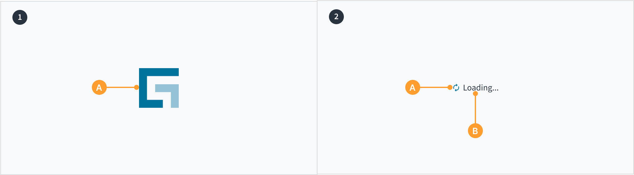 Loader (left) and inline loader (right)