Link
Usage
Overview
Link is a component that acts as a navigational element. It can appear in-line with text or on its own. You can attach a link to an icon, image, or text.
When to use
To navigate users to another location, either on the same page or to a different page or site.
When not to use
- To submit data or take action. Use the button component.
- To build a site's breadcrumbs. Use a dedicated breadcrumb component.
Types
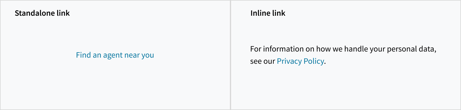
There are 2 types of links: standalone and inline.
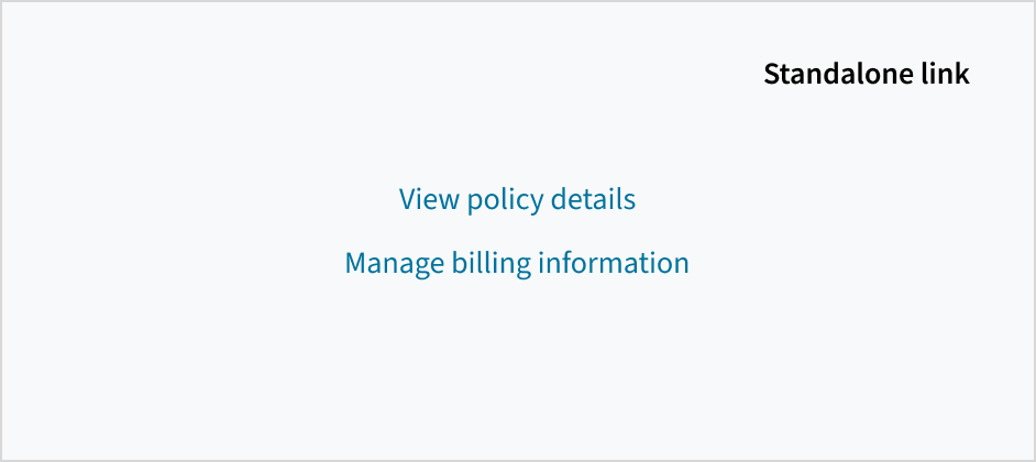
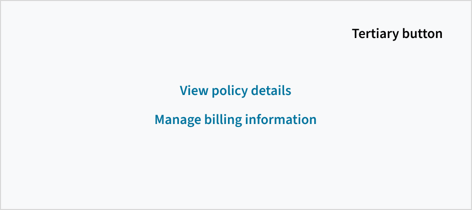
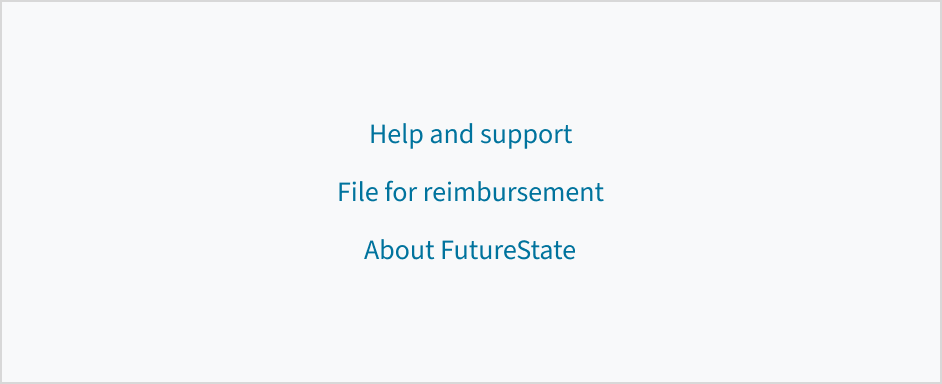
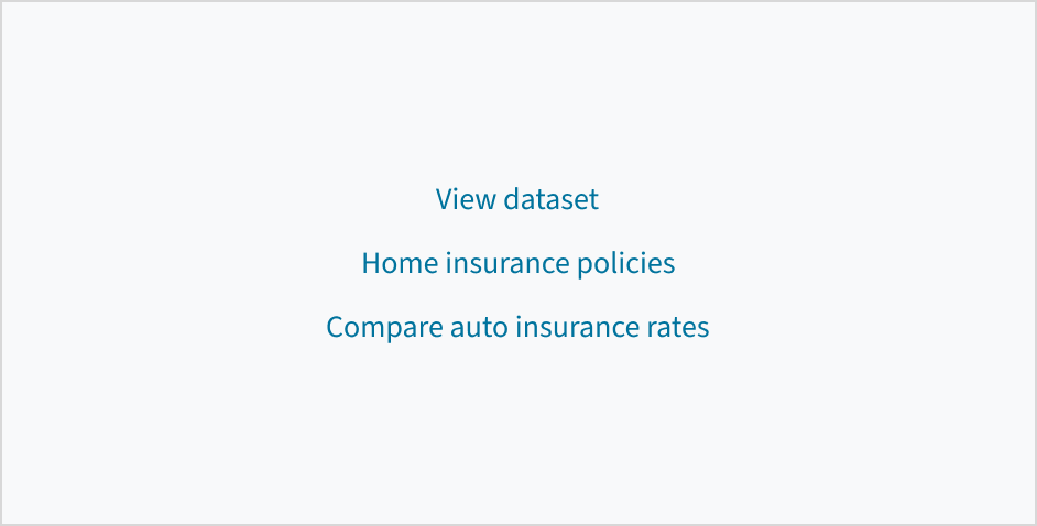
Standalone links appear on their own or directly after the content.
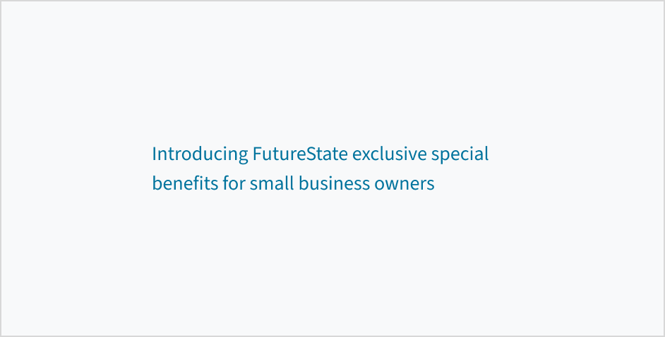
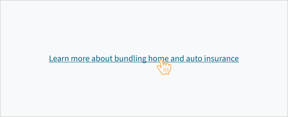
Inline links appear within a body of text, such as a sentence or paragraph.
Formatting
Anatomy
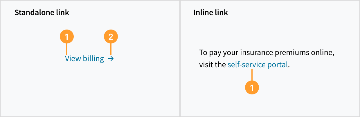
The link component consists of the following elements:
- Label: Descriptive text that provides context and explains where the link leads to.
- Icon (optional): Visual indicator that helps users more easily recognize what happens after clicking.
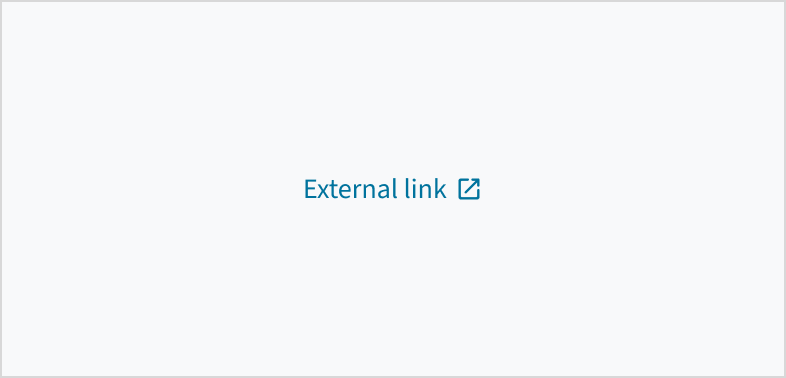
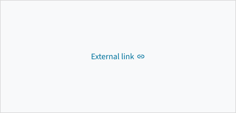
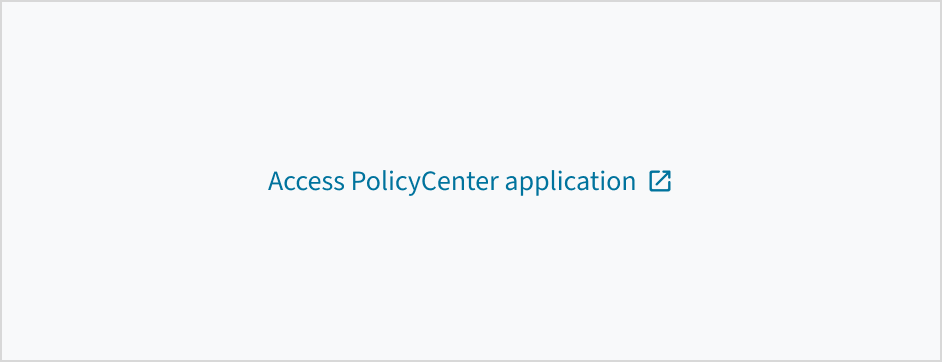
External links
When a link is navigating the user outside of an app, use the gw-open-in-new icon.
Content
General writing guidelines
- Use sentence case for all aspects of designing Guidewire product interfaces. Don't use title case.
- Use present tense verbs and active voice in most situations.
- Use common contractions to lend your copy a more natural and informal tone.
- Use plain language. Avoid unnecessary jargon and complex language.
- Keep words and sentences short.
Standalone links
Link text should be short and to the point. Use noun phrases, verb phrases, or short descriptive phrases that incorporate relevant keywords related to the link's destination.
Don't use full sentences for standalone links.
Inline links
Link text must include enough context to communicate the purpose or destination of the link without relying on surrounding context. Many users don't read the adjacent content. For this reason, the terms used in links should be understandable when taken out of context and read alone. Aim for short but meaningful link phrases that indicate the linked content using relevant keywords.
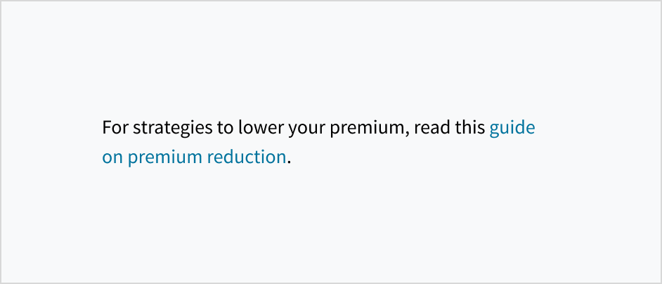


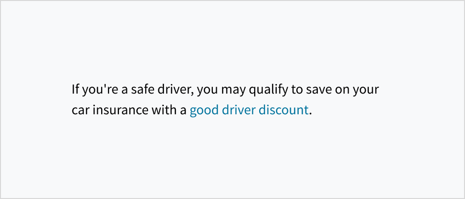

Use meaningful labels
Links must be specific, descriptive, and able to stand alone. Write link text so that even if your users read only the link label, and none of the surrounding text, they can still fully understand what they'll find at that link.
Be succinct
While there isn't a maximum word count for links, each word included in the link should support the goal of helping users to find what they need. Get to the point so that users will quickly understand the link as they scan and process the page. Try to front-load links with the most important words.
Link punctuation
Standalone links are not full sentences and don't have punctuation at the end.
If an inline link comes at the end of a sentence, don't include the punctuation mark in the link.
Capitalization
Use sentence case when writing link text. Capitalize only the following words:
- The first letter of the first word in a sentence or phrase
- Proper nouns, such as the names of brands, products, and services
For more information on how to implement sentence case capitalization, see Capitalization.
Behaviors
States
The link component has states for enabled, hover, active, focus, disabled, and visited.
| Visual | State | Description |
|---|---|---|
 | Enabled (default) | Communicates to the user that the element is enabled for interaction. |
 | Hover | Provides feedback indicating that the user has placed a cursor over the element (desktop only). Links are underlined when hovered. |
 | Active | Provides feedback indicating that the user is clicking or tapping the element. |
 | Focus | Provides feedback indicating that the user has highlighted the element, typically using an input method such as a keyboard or voice. |
 | Disabled | Communicates to the user that the element is not currently available for interaction. |
 | Visited | Indicates that the user has previously clicked on and viewed the linked content. |
Interactions
Mouse
Users can open the link by clicking anywhere on the label or the associated icon.
Keyboard
Pressing the Enter key on a focused link activates the link and moves focus to the link destination.
Screenreader
On focus, the role 'link' is voiced by a screen reader, as is its textual value (for example, 'Link, more information'). When you use the disabled link, the ARIA state is set to aria-disabled='true'. The state is voiced by a screen reader as 'dimmed/not available'. When the link becomes active, the aria-disabled state changes to 'false'.
Accessibility
The contrast ratio of textual elements against their background is above 4.5:1 as per WCAG 2.1 AA requirements. Non-textual content that needs to convey meaning (such as icons and keyboard focus visibility) has a contrast ratio of at least 3:1 with its adjacent colors. All content is visible and functional up to and including 400% without requiring scrolling in two dimensions.
This component has been validated to meet the WCAG 2.1 AA accessibility guidelines. However, changes made by the content author can affect accessibility conformance.
Follow the guidance below when using this component in your applications:
- Ensure that any color changes meet the required threshold of 4.5:1.
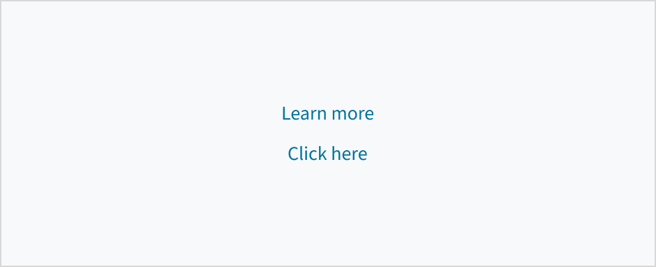
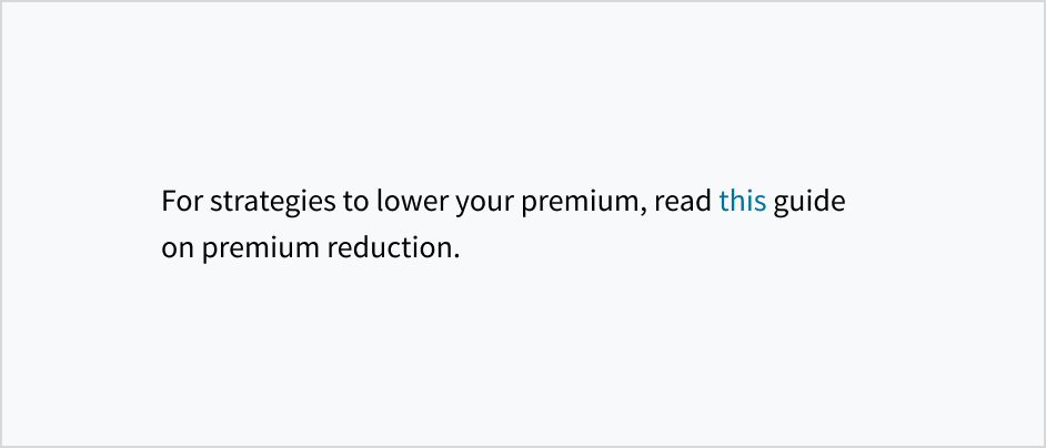
- Avoid using words and phrases such as “Click here” or “here” as link text. Instead, create meaningful link text that makes sense on its own.