Usage
Overview
The error boundary component is a wrapper component that accepts children components and some optional customizations. When a child component renders normally, the error boundary component doesn't do anything. However, if a child component throws an error during rendering, the error boundary component kicks in and replaces this component with a predefined error UI.
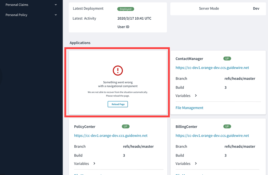
Under the hood, the error boundary component catches JavaScript errors thrown by React components and reports them to Jutro events by default, but this behavior can be changed if needed. It also presents a recovery action and prevents the whole application from crashing.
The error UI consists of an icon, an error text and a detailed error text, and an action button. You can customize all of them, and you can use the component anywhere in your application. By default, it is used around the template Jutro application and wraps all micro frontends as well. All the parameters for the error boundary component and examples of the different styles, such as card or full height, are available in Storybook.
Wrap a component with error boundary
You can wrap any component in an error boundary component. However, we recommend that you use it mainly for components that rely on network calls, interact with APIs or databases, as these are more likely to fail. You can wrap a component with an error boundary component like this:
const MyComponentWithBoundary = (props) => (
  <ErrorBoundary noticeStyle="card">
    <MyComponent {...props} />
  </ErrorBoundary>
);
Customization
You can customize all parts of the error boundary component using either metadata or JSX, and you can also decide whether to show the technical error that a child component has thrown.
For example, you can configure the metadata so that the technical error represented by the showErrorMessage property is visible like this:
{
  "id": "generated-f620b8f5-44fd-43a4-b828-1a88a51c80f5",
  "type": "container",
  "component": "ErrorBoundary",
  "content": [
    {
      "id": "generated-fb18c51a-a30e-4488-a66a-8d99d948c24f",
      "type": "element",
      "component": "BadComponent"
    }
  ],
  "componentProps": {
    "showErrorMessage": true
  }
}
You can do the same in JSX by passing an additional prop, showErrorMessage, like this:
const BasicTemplate: ErrorBoundaryStory = (args) => (
  <ErrorBoundary
    showErrorMessage
    {...args}>
    <BadComponent />
  </ErrorBoundary>
);
You can pass and customize other props such as noticeStyle, mainMessage, detailedMessage, and actions with their respective callback functions the same way.
You can also replace the default error UI component with a custom component. Check out Storybook for more customization examples.
Code
<ErrorBoundary>
  <BadComponent />
</ErrorBoundary>
Import statement
import { ErrorBoundary } from '@jutro/components';
Component contract
Make sure to understand the Design System components API surface, and the implications and trade-offs. Learn more in our introduction to the component API.
Properties
Note: You can also include pass properties for your fallback component to an error boundary. If you are using the default fallback component, see the error notice component property table for a list of additional properties. childrenrequired
DescriptionChildren to be wrapped by the error boundary.
fallbackComponent
DescriptionAn optional custom component to render when an error occurs.
Default value[ErrorNotice](#error-notice-properties)
onError
DescriptionAn optional action to be triggered when errors occur.
Default valuejutroEventsReporter
Error notice properties
These additional properties will be available if the default value for the fallback component is used.
actions
Type{label: IntlMessageShape, callback: func}[]
DescriptionAn array of label-callback objects to be displayed as recovery action buttons. See IntlMessageShape for details on the type for the label property.
Default value{label: 'Reload Page', callback: () => window.location.reload()}[]
detailedMessage
DescriptionA more detailed message to be displayed below the main message on the error UI.
Default value'We were not able to recover from the situation automatically. Please reload the page.'
error
DescriptionThe error object with technical information.
icon
DescriptionAn Icon component to render on the component. The value must be an Icon component or the icon's name. For example, CheckIcon or 'gw-check'.
Default valueErrorOutlineIcon
mainMessage
DescriptionThe main message to be displayed to the user on the error UI.
Default value'Something went wrong with a component'
noticeStyle
Type'card' | 'plain' | 'fullHeight'
DescriptionThe notice container visual style.
showErrorMessage
DescriptionIf set to true, the error message from the Error object will be shown.
Hooks
No hooks are available for error boundary.
Translation keys
The following translation keys are defined for the error notice component that is used as the default value for the fallback component:
| Key | Used for |
|---|
jutro-components.widgets.ErrorNotice.mainMessage | Default value for the main message property. |
jutro-components.widgets.ErrorNotice.detailedMessage | Default value for the detailed message property. |
jutro-components.widgets.ErrorNotice.actionLabel | Label for the button in the default value for the actions property. |
There are no translations for error boundary.
For information on how to manage translations, see our section about Internationalization.
Escape hatches
For more information, see our documentation about escape hatches.
Examples
Check out the Usage section for details about how to design an error boundary properly, and the different configuration options we provide.
Basic error boundary example
Error boundaries are wrappers that will render a fallback component if one of its children has an error.
<ErrorBoundary>
  <BadComponent />
</ErrorBoundary>
Customization example
You can pass props to the error boundary component that will be passed to its fallback component.
<ErrorBoundary
  noticeStyle="card"
  showErrorMessage>
  <BadComponent />
</ErrorBoundary>
Simple custom fallback example
You can define your own fallback component to render when an error occurs.
function AlternateFallback () {
    return (
        <strong>An error occurred.</strong>
    )
}

...

<ErrorBoundary fallbackComponent={AlternateFallback}>
    <BadComponent/>
</ErrorBoundary>
Custom fallback with error message example
An object will be passed to the fallback component that contains the JavaScript error object as one of its properties.
function AlternateFallback({error}) {
return (
<span><strong>An error occurred:</strong> {error.message}</span>
)
}
...
<ErrorBoundary fallbackComponent={AlternateFallback}>
<BadComponent/>
</ErrorBoundary>
Custom fallback with props example
Additional props passed to the error boundary component will be added as props for the component passed to fallbackComponent.
function MakeToast(error) {
    ToastProvider.toast({
    message: error.message,
    autoClose: 3000,
    type: "error",
    });
}

function AlternateFallback({error, buttonLabel}) {
    return (
        <>
          <ToastProvider />
          <Button label={buttonLabel} onClick={(error) => MakeToast(error)}/>
        </>
    )
}

...

<ErrorBoundary
      fallbackComponent={AlternateFallback}
      buttonLabel="Click for notification"
    >
    <BadComponent/>
</ErrorBoundary>