Switch
Usage
Overview
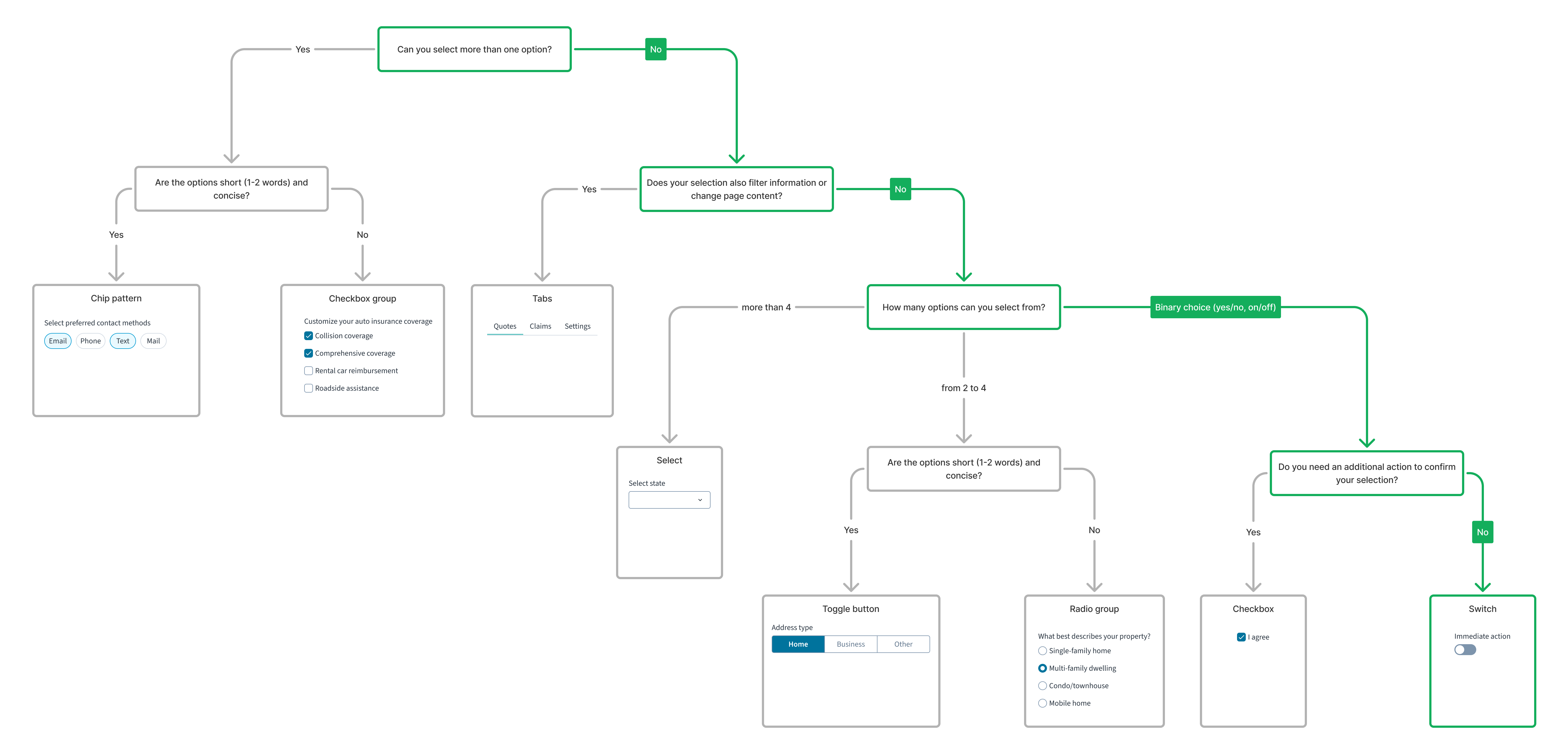
Switch is a component that alternates between two possible states: active and inactive. The switch is used for global options, such as in settings pages when the user needs to turn something on or off.
For a detailed guide on when to use this component, explore the following UI component decision tree.
When to use
To toggle an application state between two options such as on/off and active/inactive. Ensure that switches take effect immediately and don't require additional action.
When not to use
- For a true/false selection within a form. Instead, use the radio group or toggle button group.
- If pressing a button is required to apply a setting. Instead, use checkbox.
Formatting
Anatomy
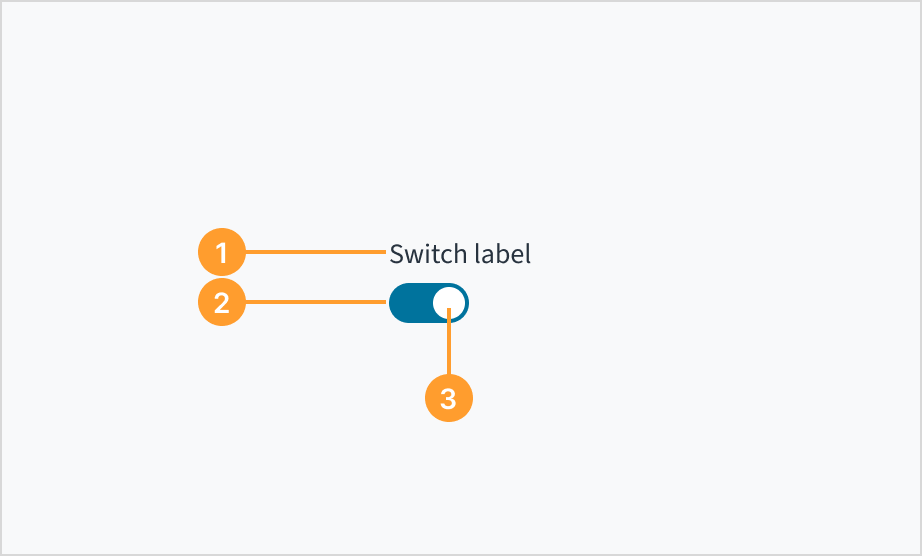
The switch consists of the following elements:
- Label: concise text that describes the specific function or setting the switch controls.
- Track: horizontal path along which users slide the switch handle.
- Handle: movable element users slide along the track to toggle the switch state.
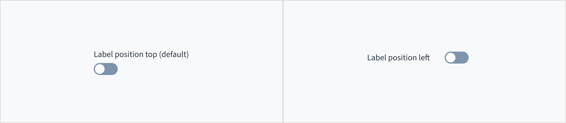
Label placement
The label for the switch can appear at the top (default and recommended) or on the left of the input itself.
Content
General writing guidelines
- Use sentence case for all aspects of designing Guidewire product interfaces. Don't use title case.
- Use present tense verbs and active voice in most situations.
- Use common contractions to lend your copy a more natural and informal tone.
- Use plain language. Avoid unnecessary jargon and complex language.
- Keep words and sentences short.
Label text
Labels must clearly communicate which function or setting the switch controls, such as "Autosave".


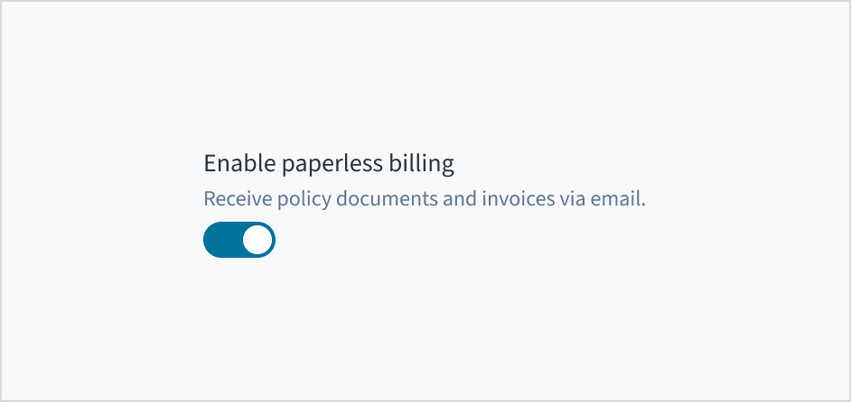
Help text
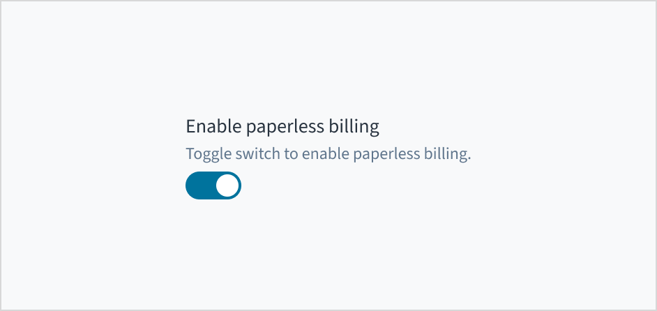
Switches are a well-known selection control and generally don't require additional explanation. That is, you don't need to instruct users to "toggle" the switch.
Use permanent help text when the information is essential for understanding the switch's function and must always be visible.
Behaviors
States
The switch has two main states: deselected and selected.
| Visual | State | Description |
|---|---|---|
 | Deselected | Indicates "off" state. |
 | Selected | Indicates "on" state. |
In addition to the deselected and selected states, switches also have states for enabled, hover, active, focus, and disabled.
| Visual | State | Description |
|---|---|---|
 | Enabled | Communicates to the user that the element is enabled for interaction (default state). |
 | Hover | Indicates that the user has placed a cursor over the element. |
 | Active | Indicates that the user is clicking or tapping the element. |
| Focus | Provides feedback indicating the user has highlighted the element, typically using an input method such as a keyboard or voice. The focus state can be used with all other states (including Disabled). |
 | Disabled | Communicates to the user that the element is disabled and not interactive. The element is greyed out. |
Interactions
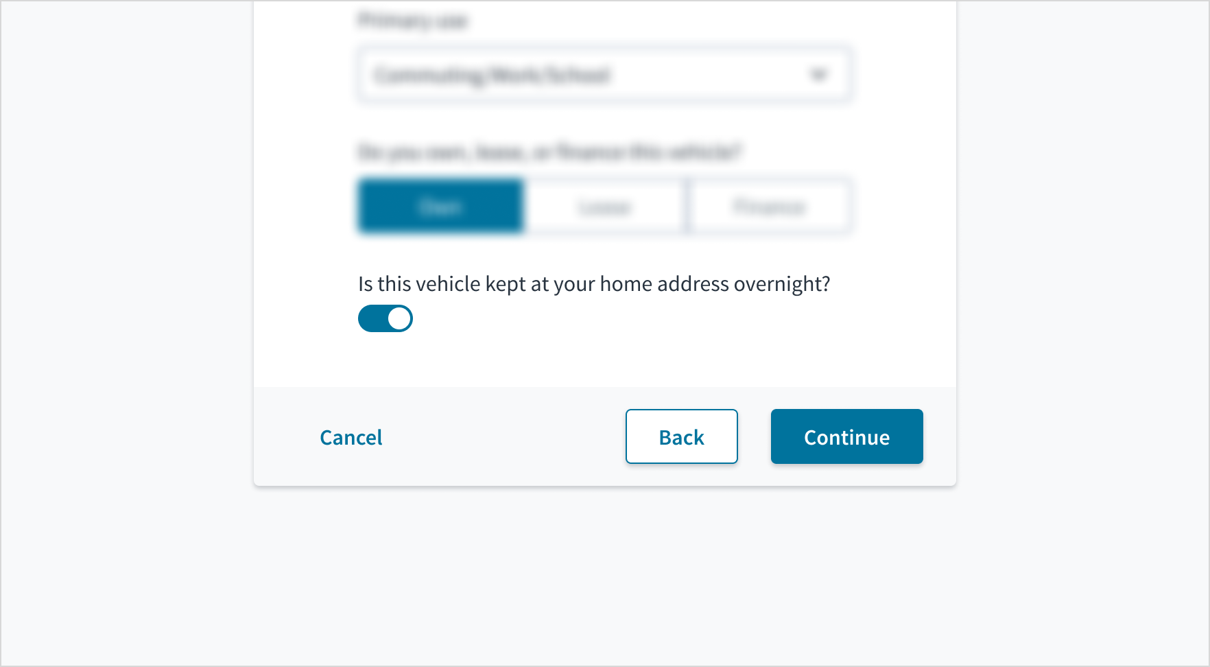
Mouse
A user interacts with a switch component by clicking on it with a mouse to toggle between its on and off states. To indicate the new state, the track changes color and the handle changes position.

Keyboard
The switch component is keyboard-focusable. The Space key activates and deactivates the switch.
Screenreader
The switch is of type 'input' and also includes the aria role of 'switch'. It derives its accessible name from the value of the text label & includes this name as part of an aria-label attribute. Changing the value of the label in Storybook also changes the aria-label value. The aria-checked value toggles from 'true' to 'false' depending on the state of the element; this change is voiced by screen readers as 'on' and 'off' respectively.
Accessibility
The contrast ratio of textual elements against their background is above 4.5:1 as per WCAG 2.1 AA requirements. Non-textual content that needs to convey meaning (such as icons and keyboard focus visibility) has a contrast ratio of at least 3:1 with its adjacent colors. All content is visible and functional up to and including 400% without requiring scrolling in two dimensions.
This component has been validated to meet the WCAG 2.1 AA accessibility guidelines. However, changes made by the content author can affect accessibility conformance.
When using this component within your application, ensure that the switch label text is meaningful and understandable.