HeaderPanel
Usage
Overview
The header spans the full width of the viewport and is the topmost element in the browser window. It remains persistent throughout the product experience, ensuring consistency in navigation. As a flexible composite component, the header can include various elements depending on the use case. Currently, as a starting point, we use the header pattern to maintain alignment and consistency across products.
When to use
The global header is a mandatory element in every application, ensuring consistent navigation and a unified user experience across products.
Anatomy
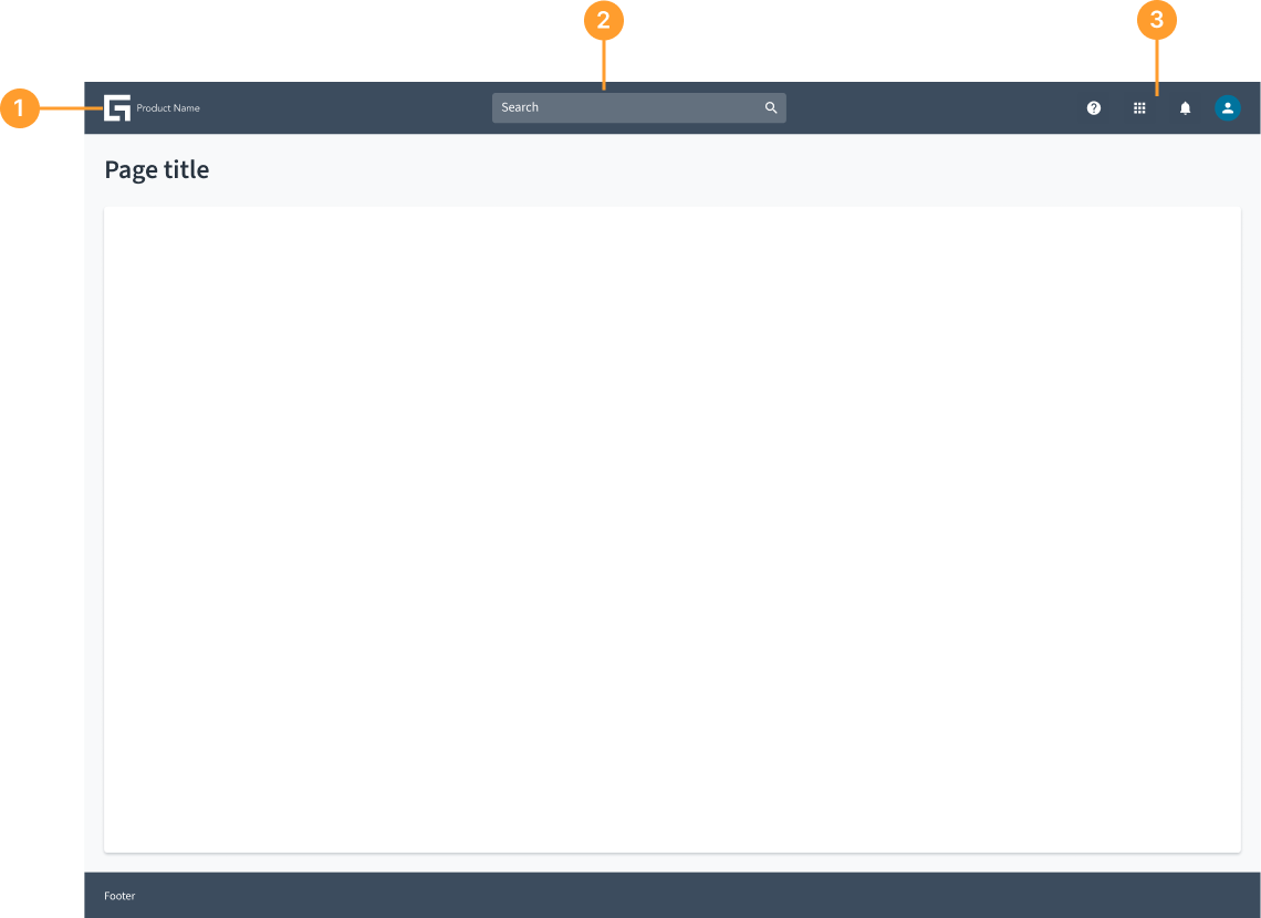
The header typically consists of the following elements:
- Product name/Logo: Represents the brand or application.
- Search bar: Enables users to quickly find content.
- Global actions: May include help, notifications, settings, and user profile.
Not all elements are required. Only what is necessary for your specific use case. The header is an open and flexible component that can accommodate various elements based on specific use cases. Teams can customize it by adding different components, tools, and functionalities as needed while maintaining a streamlined experience.
Best practices
- The global header must always include a product name. The product name in both the header and the navigation pane must be identical and in title case.
- The Guidewire "G" logo type functions as a button. Clicking it will redirect users to the Home landing page.
Responsiveness
- The global header is optimized for standard desktop and tablet displays.
- On tablets, the Guidewire G logo type and product name are centered, and the context text string is hidden. Users need to click the settings icon to view the context information in a panel.