FooterPanel
Usage
Overview
The footer is a persistent UI component located at the bottom of the screen. It serves as a supplementary navigation or functional area, providing users with additional controls, secondary navigation links, or contextual information relevant to the current page or application state.
When to use
- To provide links to important but non-primary pages, such as About Us, Careers, Help Center, Blog, or Contact Us.
- If users may need a quick way to navigate to frequently searched sections without scrolling back up.
- If the page requires privacy policies, terms of service, accessibility statements, or disclaimers, a footer is the best place to put them.
Anatomy
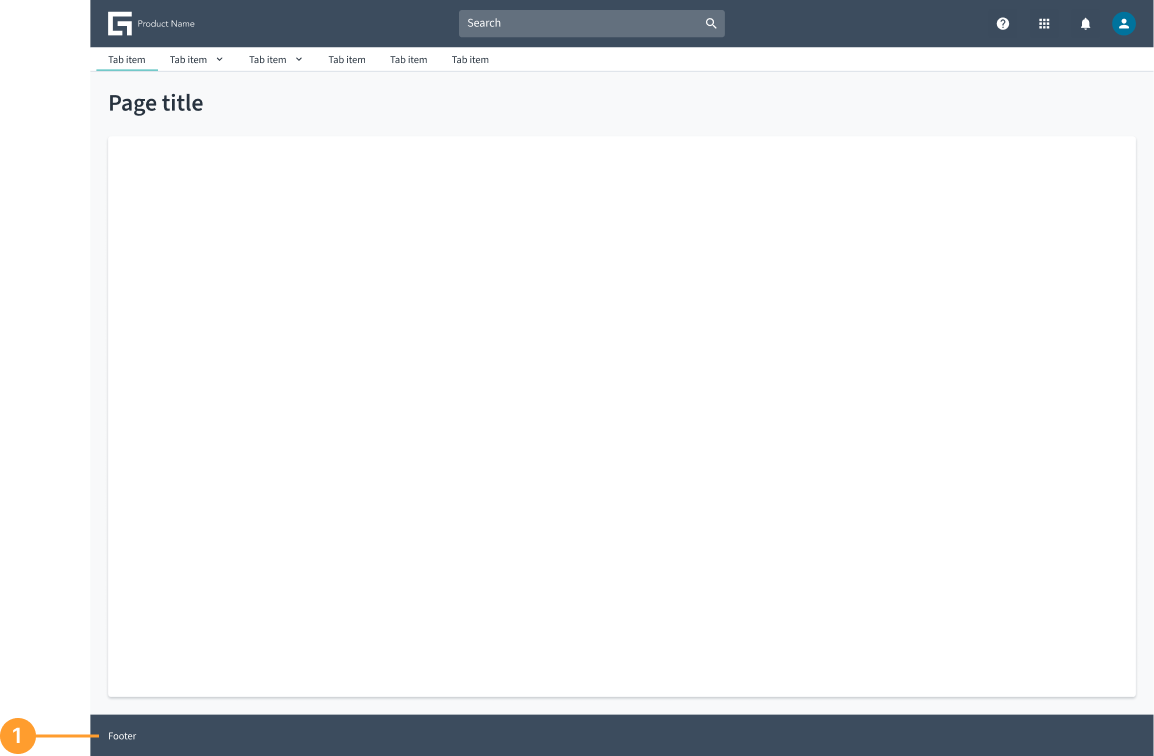
- Footer container: The footer component is positioned at the bottom of the page and serves as a consistent area for displaying secondary content.
Best practices
- Ensure the footer is lightweight and non-intrusive.
- Only include what is necessary for your specific use case. The footer is an open and flexible component that can accommodate various elements based on specific use cases. Teams can customize it by adding different components, tools, and functionalities as needed while maintaining a streamlined experience.
Usage examples
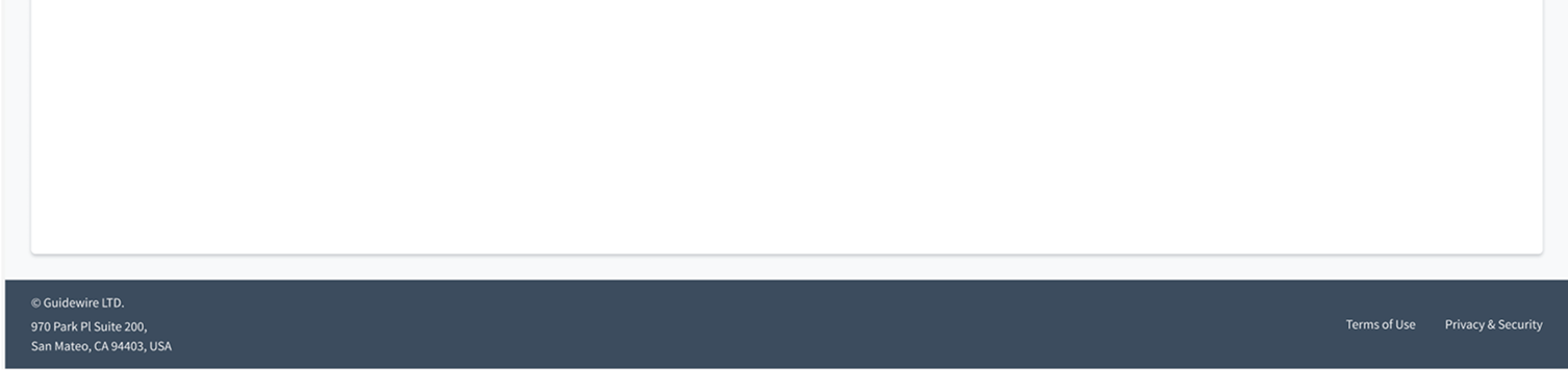
The following example, which includes contact information and links to legal content, illustrates the open and flexible nature of the footer.