SubheaderPanel
Examples
Check out the Usage section for details about how to design a SubheaderPanel properly, and the different configuration options we provide.
Basic example
The SubheaderPanel component is a wrapper that will designate which components make up the page subheader.
<SubheaderPanel>
<h1>Sample subheading text</h1>
</SubheaderPanel>
Usage
The subheader is a secondary navigation or informational component that appears below the header. It provides users with additional context, filters, breadcrumbs, or actions related to the current page or section. The subheader enhances usability by offering relevant controls while maintaining a clean interface.
When to use
The page includes filters, sorting, or quick actions.
When not to use
- The main header already provides all necessary information and controls.
- The content within the subheader is too complex.
Anatomy
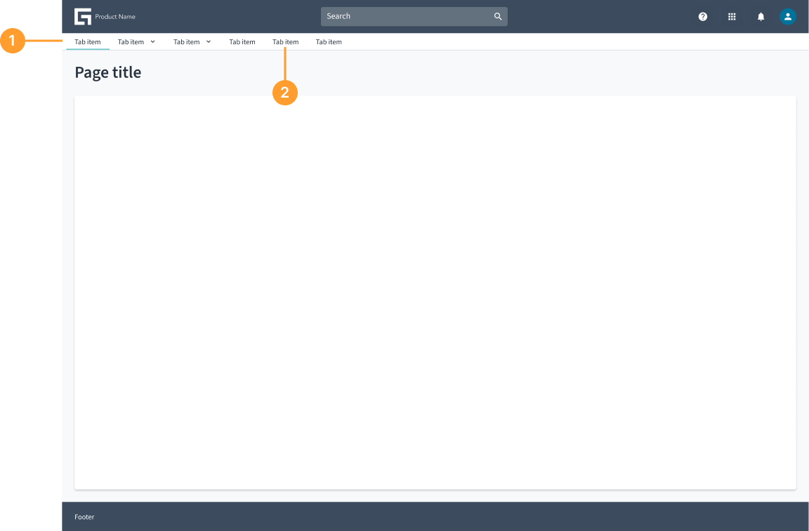
- Subheader container: The main structure that holds subheader elements. The subheader is always positioned below the main header.
- Tabs (if applicable): Enables users to switch between different sections or views within the subheader.
Not all elements are required. Include only what is necessary for your specific use case. The subheader is an open and flexible component that can accommodate various elements based on specific use cases. Teams can customize it by adding different components, tools, and functionalities as needed while maintaining a streamlined experience.
Usage examples
Examples of subheader usage, showcasing its open and flexible nature.
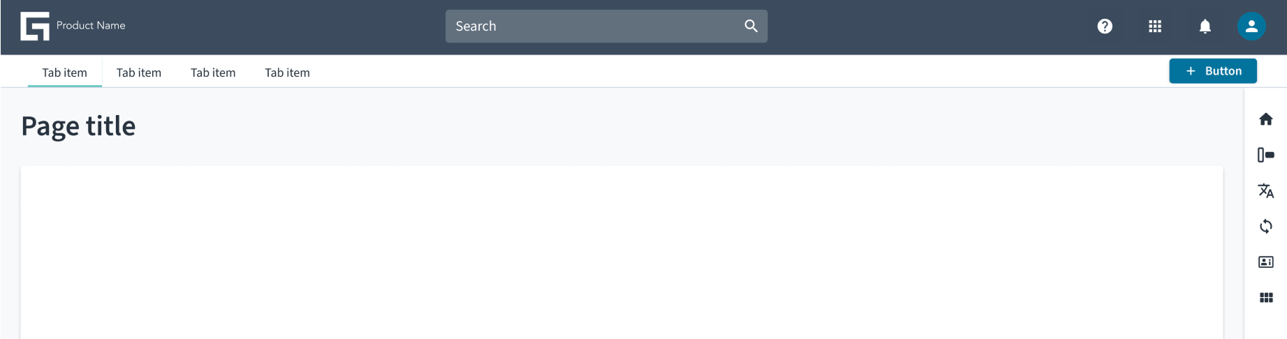
Subheader with tabs
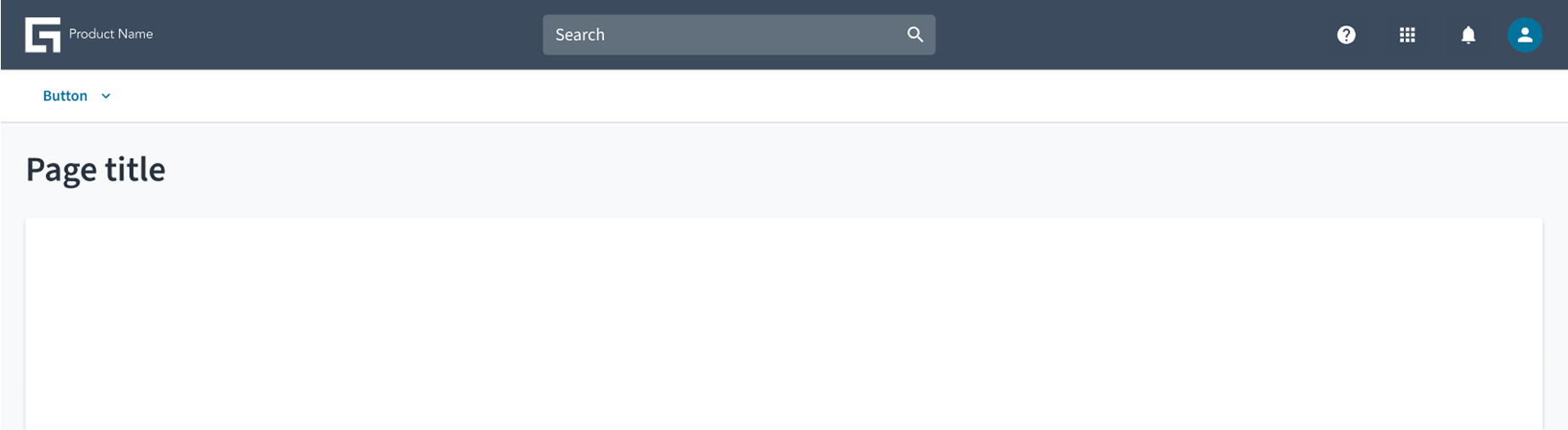
Subheader with buttons
Related elements
Code
<SubheaderPanel>
<h1>Sample subheading text</h1>
</SubheaderPanel>
Import statement
import { SubheaderPanel } from '@jutro/components';
Component contract
Make sure to understand the Design System components API surface, and the implications and trade-offs. Learn more in our introduction to the component API.
Properties
children
required- Type
node
DescriptionContent of the SubheaderPanel.
className
- Type
string
DescriptionCSS class name for this component.
position
- Type
'relative'| 'fixed' | 'sticky'
DescriptionPosition of the SubheaderPanel. If 'relative', then it will render based on where the component is positioned in the page code. If 'fixed', it will always render at top of the page but below a HeaderPanel component if present. If 'sticky', it will render based on where the component is positioned in the page code, but when your view passes under the subheader it will remain at the top of the window but below a HeaderPanel, if present.
Default value'relative'
Hooks
No hooks are available for SubheaderPanel.
Translation keys
There are no translations for SubheaderPanel.
For information on how to manage translations, see our section about Internationalization.
Escape hatches
For more information, see our documentation about escape hatches.