Usage
Overview
Date picker is a component that is composed of two primary elements: a date picker field and a dropdown calendar. The calendar component visually represents a date and provides a consistent navigation experience through day, month, and year views. This inline calendar allows users to browse and select dates within a view.
When to use
- To select a date close to the current date.
- To select a date and store it in an input field.
- To browse through different date views, such as days, months, and years.
- For a visual representation of the date.
When not to use
- To select a date in the distant past or future. In this case, use the date input.
- To select a date range. In this case, use date range.
- To select only the month and year, without a specific day. In this case, use the month picker.
- To select only the year, without specifying the month or day. In this case, use the year picker.
- To select a specific time. In this case, use the time picker.
Anatomy
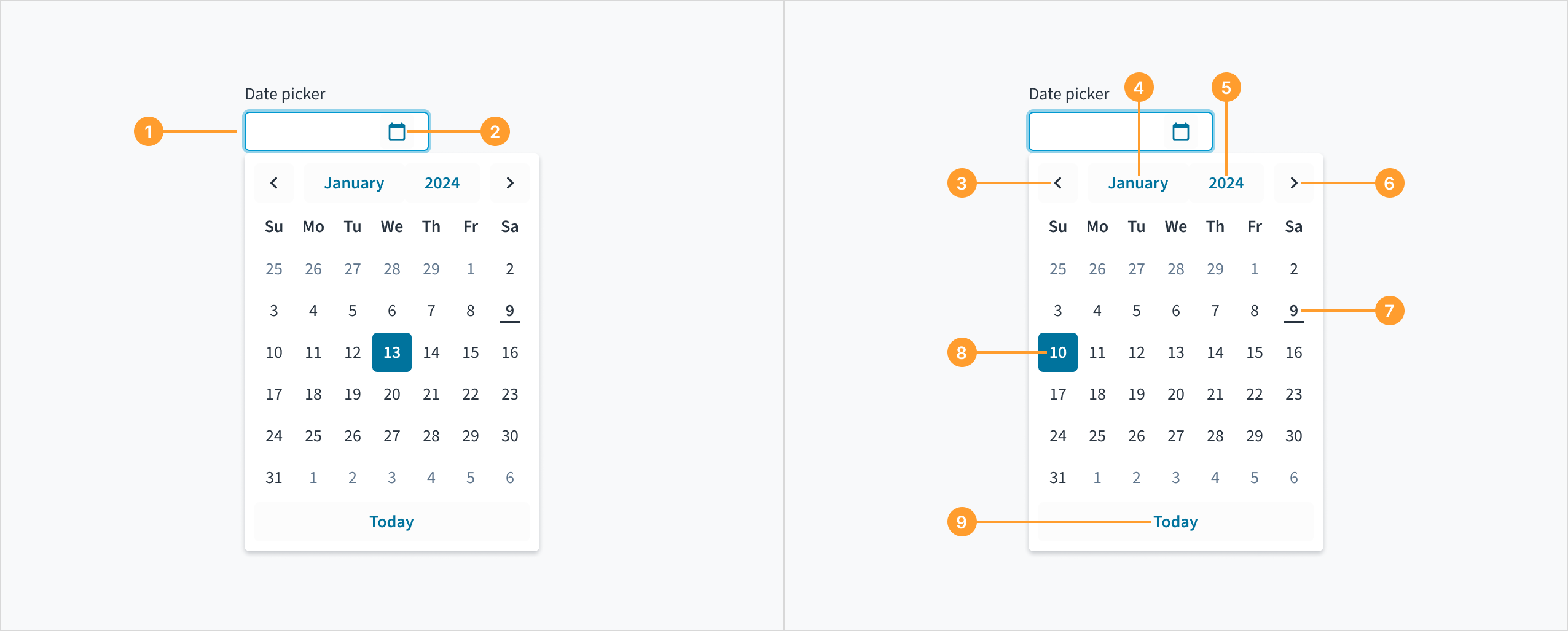
The date picker component consists of the following elements:
- Date picker field: An input field where the user can manually enter the day, month, and year.
- Calendar icon: An icon button that triggers the dropdown calendar when clicked.
- Previous month button: A navigational control for viewing and selecting dates from the previous month.
- Month button: A control for selecting a different month.
- Year button: A control for selecting a different year.
- Next month button: A navigational control for viewing and selecting dates from the next month.
- Current date: The current date, with a line displayed underneath to visually indicate it.
- Selected date: The specific date chosen by the user and highlighted or emphasized within the date picker interface.
- “Today” button: A button that automatically populates the date picker field with the current day, month, and year when clicked.
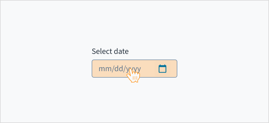
The format of the date displayed in the date picker depends on the user's locale. This means that the date format will vary based on the user's location and language settings.
For example, in the United States, the date format is typically MM/DD/YYYY, while in many European countries, the format is DD/MM/YYYY.
The date format is shown as a placeholder within the date picker to assist the user as they enter the date. This ensures that the format remains visible throughout the input process.

A placeholder within the input field guides users on the expected date format as they type.
Content
General writing guidelines
- Use sentence case for all aspects of designing Guidewire product interfaces. Don't use title case.
- Use present tense verbs and active voice in most situations.
- Use common contractions to lend your copy a more natural and informal tone.
- Use plain language. Avoid unnecessary jargon and complex language.
- Keep words and sentences short.
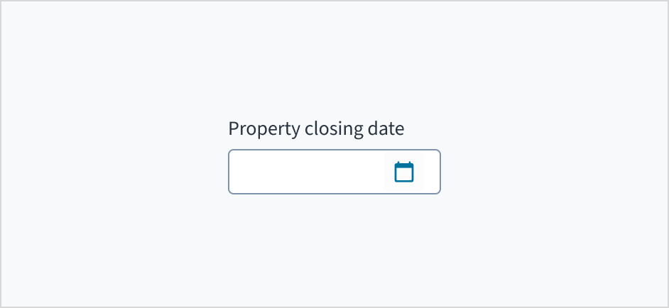
Include a label
Label the date picker with clear, descriptive text. This label should communicate its purpose and the specific type of date being selected.
Do position a permanent label outside the field.
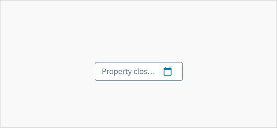
Don't use placeholder text as a replacement for the label.
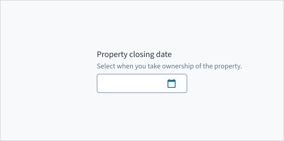
Add help text if it's meaningful
Use help text to provide context and communicate what date to select. Here are some examples of what you might include:
- Hints that assist the user in choosing the appropriate date
- More context for why the user needs to select a specific date
Only use help text for pertinent information. Avoid restating the same details that appear in the label. Write help text in sentence case, using 1-2 short, complete sentences that end with a period.
Do use help text to show context.
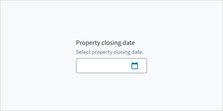
Don't use help text to simply restate the same information that appears in the label.
Behaviors
States
The date picker component behaves like an input field, with the same interactive states.
Interactions
Mouse
Users can enter the day, month, and year manually in the date picker field or click the calendar icon to select the day, month, and year from a dropdown.
Keyboard
The date picker is expanded and collapsed with Spacebar. Users navigate through the options using the arrow keys and select by means of the Spacebar or Enter key.
A calendar widget appears when the user tabs to the date picker input field. The current date is highlighted and keyboard-only users can enter the date manually here. Users can also place keyboard focus on the widget by pressing the down arrow key when it is expanded. Navigate through the calendar with the arrow keys. 'Previous', 'Month', 'Year', and 'Next' buttons are focusable using the Tab key when the widget is open.
Screenreader
Users are informed of the pre-populated date value when they tab to the date picker input field, and that this value is currently selected. The date can be entered manually from this input field. While focus remains on the pre-populated date, a calendar widget is also available. Users can also move focus into the widget by pressing the down arrow key. Navigation through the calendar portion of the widget is accomplished using the arrow keys, and the value currently in focus is voiced by screen readers through a WAI-ARIA aria-label attribute. The 'Previous', 'Month', 'Year', and 'Next' buttons are focusable using the Tab key when the widget is open. React date picker does not currently enable keyboard navigation to the 'Today' link.
The date picker component allows users to move the caret (the blinking text cursor) between different sections of the date (MM/DD/YYYY). However, users cannot delete individual digits within a section. Deleting any digit erases the entire section (MM, DD, or YYYY), requiring users to retype it. This behavior is consistent across date components, where the input mask formats the input as the user types.
Accessibility
The contrast ratio of textual elements against their background is above 4.5:1 as per WCAG 2.1 AA requirements. Non-textual content that needs to convey meaning (such as icons and keyboard focus visibility) has a contrast ratio of at least 3:1 with its adjacent colors. All content is visible and functional up to and including 400% without requiring scrolling in two dimensions.
This component has been validated to meet the WCAG 2.1 AA accessibility guidelines. However, changes made by the content author can affect accessibility conformance.
When using this component, ensure the label clearly communicates which date the user needs to input or select.
Code
<DatePicker
  label="Choose Date"
  onChange={(event, value) =>
    console.log('The date chosen is', value.day, value.month, value.year)
  }
/>
Import statement
import { DatePicker } from '@jutro/components/new';
Component contract
Make sure to understand the Design System components API surface, and the implications and trade-offs. Learn more in our introduction to the component API.
Properties
labelrequired
DescriptionLabel associated with the input field, also passed as a default value to ,aria-label'.
className
DescriptionCSS class name for this component.
disabled
DescriptionIf set to true, the component is rendered in disabled state.
Type'vshort' | 'short' | 'long' | 'abbreviated' | 'full'
displayOnly
DescriptionIf set to true, displays the component value in plain text. Consider using readonly instead, if possible, because plain text is worse for accessibility than readonly inputs.
hideLabel
DescriptionIf set to true, the label is not visible.
DescriptionHides the Today button in the calendar.
initialValue
Type{ day: number, month: number, year: number }
DescriptionInitial value of the input. Value must be in object format with day, month, and year property where month is indexed from 1. If the value prop is specified along with this prop, this prop's value is discarded.
labelPosition
maxDate
Type{ day: number, month: number, year: number }
DescriptionMaximum allowed day value.
minDate
Type{ day: number, month: number, year: number }
DescriptionMinimum allowed day value.
onBlur
Typefunction (FocusEvent<HTMLInputElement>)
DescriptionA callback called after the component is focused.
onChange
Typefunction (React.ChangeEvent<HTMLInputElement>, { day: number, month: number, year: number })
DescriptionCallback invoked when component value is changed.
onFocus
Typefunction (FocusEvent<HTMLInputElement>)
DescriptionA callback called after the component is focused.
placeholder
DescriptionPlaceholder to display on an empty component.
readOnly
DescriptionIf set to true, component is rendered in a read-only state. For values in plain text, consider using displayOnly.
required
DescriptionIf set to true, the component is rendered as required and the label includes an asterisk.
secondaryLabel
DescriptionSecondary label text to display.
stateMessages
DescriptionAn object with a list of error messages for the current state.
Type{ text: intlMessageShape, trigger: string } | intlMessageShapetext
DescriptionText to show tooltip content.
trigger
DescriptionThe trigger to show the tooltip.
DescriptionText to be displayed in the tooltip or tooltip object that includes: text - to show tooltip content, trigger - to set tooltip trigger.
value
Type{ day: number, month: number, year: number }
DescriptionValue of the input. Takes precedence over initialValue. The value must be in object format with day, month, and year property where month is indexed from 1. If this prop is passed, the component works in a controlled mode and its value will change only if this prop changes.
Hooks
No hooks are available for date picker.
Translation keys
The date picker component defines the following translation keys:
| Key | Used for |
|---|
| jutro-components.fields.DatePicker.chooseDate | The label text for the input field. |
| jutro-components.fields.DatePicker.placeholderDay | The day part of the placeholder. Must be two repeated characters. |
| jutro-components.fields.DatePicker.placeholderMonth | The month part of the placeholder. Must be two repeated characters. |
| jutro-components.fields.DatePicker.placeholderYear | The year part of the placeholder. Must be four repeated characters. |
date picker also inherits the following translations:
| Key | Used for |
|---|
| jutro-components.DateCalendar.previousMonth | The label text for the Previous month button. |
| jutro-components.DateCalendar.nextMonth | The label text for the next month button. |
| jutro-components.DateCalendar.currentDay | The label text for go to the current date button. |
| jutro-components.DateCalendar.currentDayAriaLabel | The label text for the button to select the current date as the value. |
| jutro-components.MonthSkeleton.previousYear | The label text for the previous year button. |
| jutro-components.MonthSkeleton.nextYear | The label text to go to the next year button. |
| jutro-components.MonthSkeleton.currentMonth | The label text to go to the current month button. |
| jutro-components.MonthSkeleton.currentMonthAriaLabel | The label text for the button to select the current month as the value. |
| jutro-components.YearCalendar.previousYears | The label text for the previous year range button. |
| jutro-components.YearCalendar.currentYear | The label text for the go to current year button. |
| jutro-components.YearCalendar.currentYearAriaLabel | The label text for the button to select the current year as the value. |
The date is formatted according to the selected locale. For example, if the locale is en-US, then the date January 20th, 2024 is formatted as "01/20/2024". If the locale is en-GB, it is formatted as "20/01/2024".
Escape Hatches
For more information, see our documentation about escape hatches.
Examples
Check out the Usage section for details about how to design a date picker properly, and the different configuration options we provide.
Basic date picker example
You can add an input that allows a user to enter a date either manually or through a calendar modal.
<DatePicker
  label="Choose date"
  onChange={(event, value) =>
    console.log('The date chosen is', value.day, value.month, value.year)
  }
/>
Min/Max example
You can limit the range of dates a user can select.
Note: This does not include validation, it only limits the options in a dropdown. A user can manually enter any date.
<DatePicker
  label="Choose date"
  minDate={{ day: 1, month: 1, year: 2022 }}
  maxDate={{ day: 31, month: 12, year: 2023 }}
/>
Validation example
You can use the onChange property to call a function that updates stateMessages to display errors to the user.
The following example displays errors for invalid dates or dates that are not in 2022.
function DatePickerMinMaxValidation() {
  const [validationMessages, setValidationMessages] = useState({});
  const minDate = { day: 1, month: 1, year: 2022 };
  const maxDate = { day: 31, month: 12, year: 2022 };

  function JutroDateToString(date) {
    return `${date.year}-${String(date.month).padStart(2, '0')}-${String(
      date.day
    ).padStart(2, '0')}`;
  }

  const parseErrorCode = (errorObject: { errorCode?: string }) => {
    if (!errorObject) {
      return;
    }

    const { errorCode } = errorObject;

    if (errorCode === 'INVALID_DATE') {
      return { error: ['Please enter a valid date.'] };
    }

    if (errorCode === 'MIN_EXCEEDED') {
      return {
        error: [`Please enter a date after ${JutroDateToString(minDate)}.`],
      };
    }

    if (errorCode === 'MAX_EXCEEDED') {
      return {
        error: [`Please enter a date before ${JutroDateToString(maxDate)}.`],
      };
    }
  };

  const onChange = useCallback((e, newValue, errorObject) => {
    setValidationMessages({});
    const errorDetected = parseErrorCode(errorObject);

    if (errorDetected) {
      setValidationMessages(errorDetected);
    }
  }, []);

  return (
    <DatePicker
      label="Choose date"
      onChange={onChange}
      minDate={minDate}
      maxDate={maxDate}
      stateMessages={validationMessages}
    />
  );
}