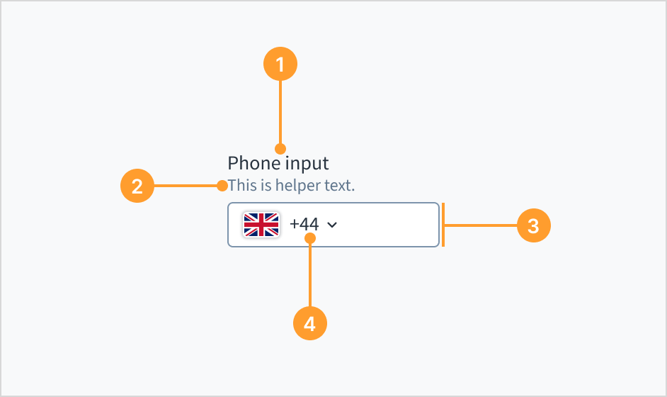
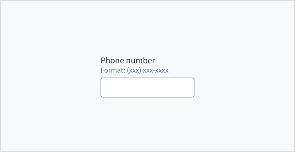
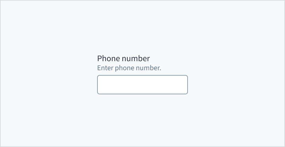
Helper text: Provides extra context, hints, or helpful information to aid the user. Often used to explain specific requirements for correctly filling out a field.
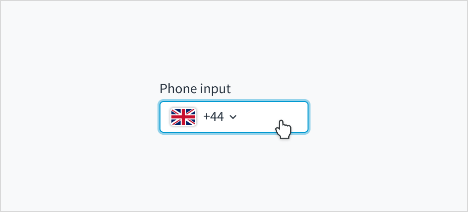
Phone input field: Enhanced field that enables users to enter their phone number. It only accepts numeric inputs and is automatically formatted.
Country code selector (optional): Dropdown that enables selection of country codes from a list. The code is prefixed with the associated country flag to help with recognition.
Use help text to provide guidance about what to input and how. Here are some examples of what you might include in help text:
Context to aid the user, such as how the information will be used
Hints for what kind of information goes inside the input field
Formatting examples or requirements
Only use help text for pertinent information. Avoid using help text that simply restates the same information that appears in the label.
Use sentence case for help text. Write the help text as 1-2 short, complete sentences that end with a period. When showing formatting examples, you don't need to end with a period.
Do use help text to provide additional aid or context to the user.
Don't use help text to simply restate the same information that appears in the label.
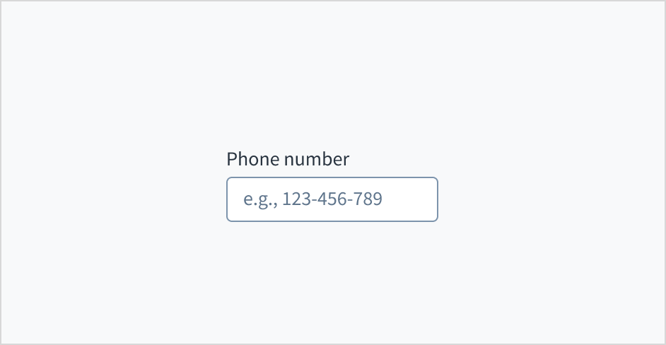
Don't put placeholder text in the phone entry field. Placeholder text strains users' short-term memory because it disappears once a value is entered. It also poses additional burdens for users with visual and cognitive impairments.
Instead, place hints and instructions, including formatting examples and requirements, outside of the field.
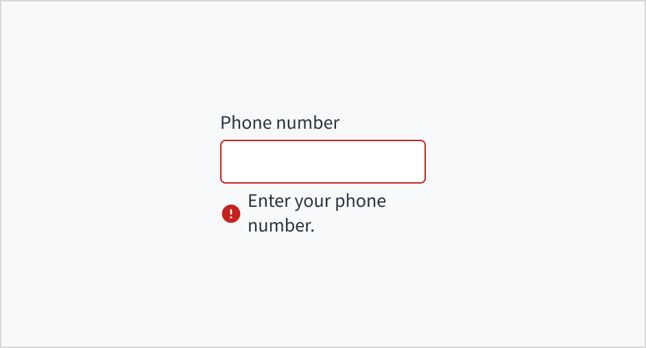
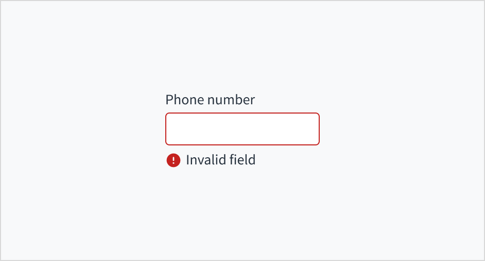
Error message text tells a user how to fix the error. In the case of the phone input field, errors are often related to something that must be fixed for in-line validation. For example, if the user doesn't fill out a required field that asks for their phone number, you can use error text to guide them to a solution: "Enter your phone number."
Use sentence case for error text. Write 1-2 short, complete sentences that end with a period.
Do use error text to guide the user and show them a solution.
Don't write ambiguous error messages or leave users guessing as to how to resolve a problem.
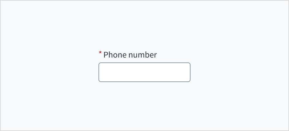
Use an asterisk (*) to indicate required fields. The asterisk precedes the field label. This helps users to easily locate which fields are required by scanning just the left-most character of the label.
In addition to marking required fields with an asterisk, it is recommended to include clear instructions at the top of the form, such as "All fields marked with an asterisk are mandatory," to ensure users understand the meaning of the asterisk.
Do use an asterisk to indicate that a field is required.
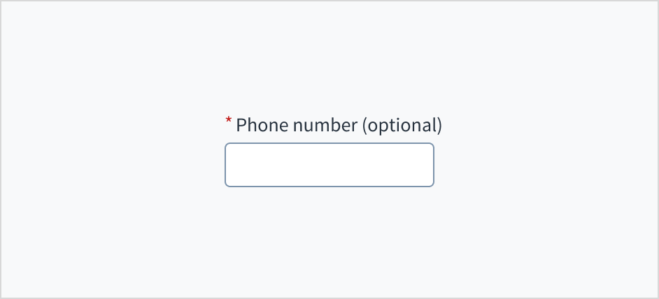
Don't use an asterisk to denote anything that is optional.
The phone input field appears with no value (default), placeholder text, or a filled input.
Visual
State
Description
No value (default)
Indicates to the user that no value has been entered and there is no placeholder.
Placeholder
Indicates to the user that no value has been entered. The placeholder is grayed out.
Filled input
Indicates to the user that the input is filled with data.
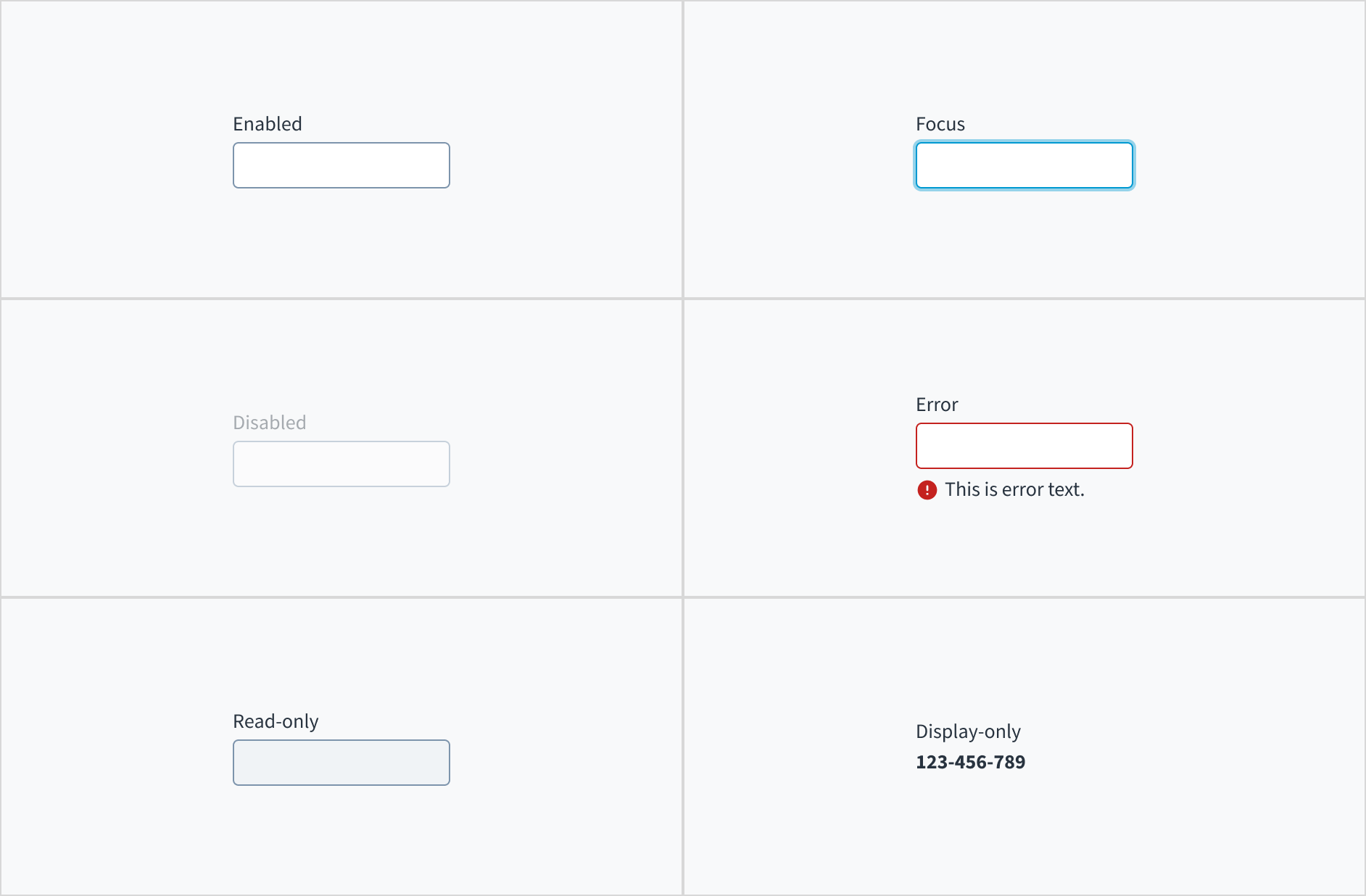
Phone input fields also have interactive states for enabled, focus, disabled, error, read-only, and display-only.
State
Description
Enabled
Indicates to the user that the element is enabled for interaction.
Focus
Indicates to the user which UI element in the system is focused.
Disabled
Indicates to the user that the input value can't be changed because of local factors. For example, a checkbox above the input field must be checked to access this input field. The user can take action to enable it by interacting with the page.
Error
Indicates that the user has made a validation error. Error text provides corrective feedback to users.
Read-only
Indicates to the user that the input value can't be changed because of outside factors. For example, lack of write access. The user can take action to enable it by, for example, contacting an administrator.
Display-only
The display-only state is used for two cases:
A UI element is used in display mode.
A UI element is displayed in edit mode, but is never editable.
The contrast ratio of textual elements against their background is above 4.5:1 as per WCAG 2.1 AA requirements. Non-textual content that needs to convey meaning (such as icons and keyboard focus visibility) has a contrast ratio of at least 3:1 with its adjacent colors. All content is visible and functional up to and including 400% without requiring scrolling in two dimensions.
This component has been validated to meet the WCAG 2.1 AA accessibility guidelines. However, changes made by the content author can affect accessibility conformance.
When using this component within your application, ensure that labels and instructions are meaningful and concise. Provide supplemental instructions if necessary.
Note: There are deprecated versions of this component. Switch to a version of the docs older than 10.0.x to view their docs.
Make sure to understand the Design System components API surface, and the implications and trade-offs. Learn more in our introduction to the component API.
If set to true, displays the component value in plain text. Consider using readonly instead, if possible, because plain text is worse for accessibility than readonly inputs.
Initial value of input. If value prop is specified along with this prop, this prop's value is discarded. Accepts object with phoneNumber and optionally countryCode.
Value of input. Takes precedence over initialValue. If this prop is passed, component works in controlled mode and its value will change only if this prop changes. Accepts object with phoneNumber and optionally countryCode.
There are multiple translation keys associated with the PhoneInput component, but they can be grouped into two groups: placeholder default and country names.
The name of the country associated with the specific country code.
This is the list of country codes that you can use with the above translation key:
ac ad ae af ag ai al am ao ar as at au aw ax az ba bb be bf bg bh bi bj bl bm bn
bo bq br bs bt bw by bz ca cc cd cf cg ch ci ck cl cm cn co cr cu cv cw cx cy cz
de dj dk dm do dz ec ee eg eh er es et fi fj fk fm fo fr ga gb gd ge gf gg gh gi
gl gm gn gp gq gr gt gu gw gy hk hn hr ht hu id ie il im in io iq ir is it je jm
jo jp ke kg kh ki km kn kp kr kw ky kz la lb lc li lk lr ls lt lu lv ly ma mc md
me mf mg mh mk ml mm mn mo mp mq mr ms mt mu mv mw mx my mz na nc ne nf ng ni nl
no np nr nu nz om pa pe pf pg ph pk pl pm pr ps pt pw py qa re ro rs ru rw sa sb
sc sd se sg sh si sj sk sl sm sn so sr ss st sv sx sy sz tc td tg th tj tk tl tm
tn to tr tt tv tw tz ua ug us uy uz va vc ve vg vi vn vu wf ws xk ye yt za zm zw
Jutro inputs have implemented imperative handlers as a mechanism to provide access to some common native features that might be useful for you. The following features are available:
Set focus to allow you to set the user focus into a specific component
Blur to remove the focus from the component
Scroll to the component so that you can take the user to a specific area of the page.
These features are provided through the ref property, which exposes them as follows:
Phone number validation and formatting are constantly evolving to adapt to the new rules defined by every country. PhoneNumberInput is built to support these standards and is getting updated to reflect new rules as they appear. These updates can modify the component behavior to support the specific rule requirements.
When the country code is entered in the phone number input, it will be automatically used to set the value of the country selector and the code will be removed from the number input. If an invalid code is used, the automatic change will not be applied.
Although you are responsible for the error handling, the PhoneNumberInputcomponent has certain internal validation and transformation mechanisms, and their results are available to you to support the validation process.
The onChange event provides a third parameter with the result of the validation performed, an object containing a numeric errorCode that identifies the problem so you can map it to a custom error message.
The errorCode validation logic is done by passing the code to the intl-tel-input library, which can be updated independently.
Although some Jutro components might provide complementary features or a helper function to facilitate the validation process, it is your responsibility as a developer to handle the validation of any user input (using or not using the complementary helpers) and to decide what error messages to show.
Jutro components behave based on the developer implementation.
When are error messages displayed?
Error messages are only displayed when you pass them to the component through the stateMessages property. This property receives an object with the following content:
The component displays every error message provided in the same order as in the array.
When does validation occur?
This is your decision as a developer. As components do not determine when the validation is performed or when the error must be displayed, you need to implement the logic to handle it according to the project requirements, for example while the user is editing the content, when the component loses focus, and on form submission.
Although you are not required to pass a country code to the PhoneNumberInput, the component will not behave as a phone number input without a country code. You have 3 different options to provide it:
Using the countries prop: you can pass a single ISO country code that will be used as default and the country numeric code will be displayed.
<PhoneNumberInput
  label="Phone input component with US set as default"
  countries={['US']}
/>
Using the initialValue prop: this initializes the input component and it will not show the country numeric code. The phone related features, however, will work normally.
Using the value prop: this makes the component controlled. The component is initialized and it will not show the country numeric code. The phone related features, however, will work normally.
The PhoneNumberInput component displays a dropdown selector for country codes when you specify more than one ISO country code in the countries property. If you do not provide an initialValue, the first country code in the array is the initial value displayed in the dropdown.
The PhoneNumberInput component manages the placeholder to be displayed depending on the selected country. However, you can override it and set a custom placeholder.
<PhoneNumberInput label="Phone input component with a custom placeholder" countries={['PL','US']} placeholder="this is a custom placeholder" />
The PhoneNumberInput component does not provide a specific validation logic but it provides a way to include the developer validation and use the stateMessages property to display any required error messages.
This is an example of handling validation when onChange event is triggered.
exportfunctionPhoneNumberInputValidation(){ const[validationMessages, setValidationMessages]=useState({}); const onChange =useCallback((e, newValue, errorCode)=>{ const componentPhoneNumber = newValue.phoneNumber; const componentCountryCode = newValue.countryCode; const componentErrorCode = errorCode?.errorCode; setValidationMessages({}); if(componentErrorCode && componentErrorCode !=0){ setValidationMessages({ error:['The phone number is not correct'], }); }else{ if( componentPhoneNumber && componentCountryCode && componentCountryCode =='ES'&& componentPhoneNumber.indexOf('6')==0 ){ setValidationMessages({ error:['Only landline numbers are accepted for Spain'], }); } } },[]); return( <PhoneNumberInput countries={['ES','US']} label="Accepts any US number but accepts only landline numbers for Spain" secondaryLabel="Landline numbers cannot start by 6" stateMessages={validationMessages} onChange={onChange} /> ); }
PhoneNumberInputand other inputs allow using a ref property to access some native behaviors. However, only certain features are exposed. In this example, when you click the button, the focus will automatically be set in the input below.
exportfunctionPhoneNumberRef(){ const inputRef =useRef(null); constsetFocus=(e)=>{ inputRef?.current?.focus(); }; return( <div> <Button label="Set the focus on input" onClick={setFocus}></Button> <PhoneNumberInput label="Get the focus from the button" countries={['ES','US']} ref={inputRef} /> </div> ); }
New @jutro/components/PhoneNumberInput component introduced replacing PhoneNumberField and IntlPhoneNumberField.
The previous phone-related components, PhoneNumberField and IntlPhoneNumberField were deprecated and moved to the @jutro/legacy package. To view their documentation, switch to a version of the documentation older than 10.0.